
 Web Front-end
HTML Tutorial
A simple summary and effect of two-dimensional, three-dimensional and gradient processes in CSS 3 (animations are difficult to post)
Web Front-end
HTML Tutorial
A simple summary and effect of two-dimensional, three-dimensional and gradient processes in CSS 3 (animations are difficult to post)
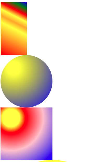
A simple summary and effect of two-dimensional, three-dimensional and gradient processes in CSS 3 (animations are difficult to post)

/*Gradient
.testb{
background-image: url(img/5.jpg);
height: 200px;
/*Direction Spacing Gradient*/
/*above above below*/
/*1 Reflection does not occupy the space of the document flow. The level is higher than the document flow
2 The reflection is based on the label (width and height)*/
-webkit-box-reflect: above 20px -webkit-linear-gradient(top,rgba(0,0,0,0) 0% ,rgba(0,0,0,0.5) 100%);
}
宽 The 4 borders are relatively wide and the color of the 4 frames is different. In the corner of the encounter, a triangle of different colors will be formed.5
border-radius: 50px 0 50px 50px; used for cutting round cornersmaking
.textG{
width: 200px;
height: 100px;
border-radius: 100px 100px 100px 100px/50px 50px 50px 50px;
}
2. Movement in a two-dimensional plane
.test{transform:rotate(0deg) translate(0px,0px) scale(1);(rotate translate scale)
.test:hover{transform:rotate(720deg) translate(500px,300px) scale(2);}
分 The three effects can also be used separately, and the effects of different sequential effects are different.
3. Animation effects in three-dimensional space
P Body {Perspective: 1000px;}/*Add perspective points to body*/
.
St.test {Transform: Rotate (0Deg) Translate (0px, 0px) scale (1);
.test:hover{transform:rotate(720deg) translate(500px,300px) scale(2);}(changed position)
D /*can set the Z -axis effect on the 3D effect* /
Four. Frame animation
R @Keyframes Animation Name (self -taken) { 0%(from){transform:…}
100%(to){transform:…}
.test:hover{
/*The animation effect is assigned in the same way as the transition*/ animation:movet 1s ease;
/*Infinite loop of word count for animation execution infinite */ animation-iteration-count: infinite; }

Hot AI Tools

Undresser.AI Undress
AI-powered app for creating realistic nude photos

AI Clothes Remover
Online AI tool for removing clothes from photos.

Undress AI Tool
Undress images for free

Clothoff.io
AI clothes remover

AI Hentai Generator
Generate AI Hentai for free.

Hot Article
Hot Tools

Notepad++7.3.1
Easy-to-use and free code editor

SublimeText3 Chinese version
Chinese version, very easy to use

Zend Studio 13.0.1
Powerful PHP integrated development environment

Dreamweaver CS6
Visual web development tools

SublimeText3 Mac version
God-level code editing software (SublimeText3)
Hot Topics
 1384
1384
 52
52

 What is the purpose of the <progress> element?
Mar 21, 2025 pm 12:34 PM
What is the purpose of the <progress> element?
Mar 21, 2025 pm 12:34 PM
The article discusses the HTML <progress> element, its purpose, styling, and differences from the <meter> element. The main focus is on using <progress> for task completion and <meter> for stati
 What is the purpose of the <datalist> element?
Mar 21, 2025 pm 12:33 PM
What is the purpose of the <datalist> element?
Mar 21, 2025 pm 12:33 PM
The article discusses the HTML <datalist> element, which enhances forms by providing autocomplete suggestions, improving user experience and reducing errors.Character count: 159
 What is the purpose of the <meter> element?
Mar 21, 2025 pm 12:35 PM
What is the purpose of the <meter> element?
Mar 21, 2025 pm 12:35 PM
The article discusses the HTML <meter> element, used for displaying scalar or fractional values within a range, and its common applications in web development. It differentiates <meter> from <progress> and ex
 What is the viewport meta tag? Why is it important for responsive design?
Mar 20, 2025 pm 05:56 PM
What is the viewport meta tag? Why is it important for responsive design?
Mar 20, 2025 pm 05:56 PM
The article discusses the viewport meta tag, essential for responsive web design on mobile devices. It explains how proper use ensures optimal content scaling and user interaction, while misuse can lead to design and accessibility issues.
 Is HTML easy to learn for beginners?
Apr 07, 2025 am 12:11 AM
Is HTML easy to learn for beginners?
Apr 07, 2025 am 12:11 AM
HTML is suitable for beginners because it is simple and easy to learn and can quickly see results. 1) The learning curve of HTML is smooth and easy to get started. 2) Just master the basic tags to start creating web pages. 3) High flexibility and can be used in combination with CSS and JavaScript. 4) Rich learning resources and modern tools support the learning process.
 What is the purpose of the <iframe> tag? What are the security considerations when using it?
Mar 20, 2025 pm 06:05 PM
What is the purpose of the <iframe> tag? What are the security considerations when using it?
Mar 20, 2025 pm 06:05 PM
The article discusses the <iframe> tag's purpose in embedding external content into webpages, its common uses, security risks, and alternatives like object tags and APIs.
 The Roles of HTML, CSS, and JavaScript: Core Responsibilities
Apr 08, 2025 pm 07:05 PM
The Roles of HTML, CSS, and JavaScript: Core Responsibilities
Apr 08, 2025 pm 07:05 PM
HTML defines the web structure, CSS is responsible for style and layout, and JavaScript gives dynamic interaction. The three perform their duties in web development and jointly build a colorful website.
 What is an example of a starting tag in HTML?
Apr 06, 2025 am 12:04 AM
What is an example of a starting tag in HTML?
Apr 06, 2025 am 12:04 AM
AnexampleofastartingtaginHTMLis,whichbeginsaparagraph.StartingtagsareessentialinHTMLastheyinitiateelements,definetheirtypes,andarecrucialforstructuringwebpagesandconstructingtheDOM.
