

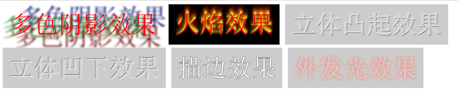
1. Effect picture display:
This is a text effect that I learned a long time ago. But it's still very practical and interesting. You can use the text-shadow property provided by CSS3 to add a shadow effect to the text on the page, so you can replace some cumbersome images that have been used before. So far, mainstream browsers such as Safari, FireFox, Chrome and Opera all support this feature.
2. Introducing the text-shadow property of CSS3
The text-shadow attribute can add a shadow effect to the text on the page. The basic syntax is as follows:
text-shadow:none|
text-shadow:none|
The text-shadow attribute has an initial value of None and applies to all elements.
color: indicates color
length: Represents a length value composed of a floating point number and a unit identifier. It can be a negative value and specifies the horizontal extension distance of the shadow.
If you don’t understand the basic syntax above, please look at the example below
<span style="color: #800000;"><style type="text/css">
    p</span>{<span style="color: #ff0000;">
        text-shadow</span>:<span style="color: #0000ff;">0.1em 0.1em 0.3em #333333</span>;
    }<span style="color: #800000;">
</style></span>The first value of the text-shadow attribute represents the horizontal displacement, the second value represents the vertical displacement, the positive value is to the right or downward, the negative value is to the left or upward, and the third value represents the blur radius (the value is optional), the fourth value represents the color of the shadow (this value is optional), this color value can be placed before or after the length value of the shadow effect. If no color is specified, the value of the color attribute will be used instead.
The text-shadow attribute accepts a comma-separated list of shadow effects to apply to the text of the element. Shadow effects are applied in the order given, so it is possible to cover each other, but not the text itself. Shadow effects do not change the dimensions of the border, but may extend beyond its bounds. (You can try to delete the padding style of the p tag in this example, and you will find that the shadow of the flame effect text exceeds the boundary).
3. The text shadow effect code is as follows
The main use is the shadow list of text-shadow, and using reasonable color matching, we can achieve the desired effect.
<span style="color: #800000;"><style type="text/css">
        p</span>{<span style="color: #ff0000;">
            font-size</span>:<span style="color: #0000ff;">5em</span>;<span style="color: #ff0000;">
            margin</span>:<span style="color: #0000ff;">5px</span>;<span style="color: #ff0000;">
            padding</span>:<span style="color: #0000ff;">20px</span>;<span style="color: #ff0000;">
            display</span>:<span style="color: #0000ff;"> inline-block</span>;
        }<span style="color: #800000;">
        .p1</span>{<span style="color: #ff0000;">
            text-shadow</span>:<span style="color: #0000ff;"> 0.2em 0.5em 0.1em #600,-0.3em 0.1em 0.1em #060,0.4em -0.3em 0.1em #006</span>;<span style="color: #ff0000;">
            color</span>:<span style="color: #0000ff;">red</span>;
        }<span style="color: #800000;">
        .p2</span>{<span style="color: #ff0000;">
            background</span>:<span style="color: #0000ff;">black</span>;<span style="color: #ff0000;">
            text-align</span>:<span style="color: #0000ff;">left</span>;<span style="color: #ff0000;">
            text-shadow</span>:<span style="color: #0000ff;"> 0 -5px 4px #FF3,2px -10px 6px #fd3,-2px -15px 11px #f80,2px -25px 18px #f20</span>;<span style="color: #ff0000;">
            color</span>:<span style="color: #0000ff;">red</span>;
        }<span style="color: #800000;">
        .p3</span>{<span style="color: #ff0000;">
            text-shadow</span>:<span style="color: #0000ff;"> -1px -1px white,1px 1px #333</span>;<span style="color: #ff0000;">
            color</span>:<span style="color: #0000ff;">#D1D1D1</span>;<span style="color: #ff0000;">
            font-weight</span>:<span style="color: #0000ff;"> bold</span>;<span style="color: #ff0000;">
            background</span>:<span style="color: #0000ff;"> #CCC</span>;
        }<span style="color: #800000;">
        .p4</span>{<span style="color: #ff0000;">
            text-shadow</span>:<span style="color: #0000ff;"> 1px 1px white,-1px -1px #333</span>;<span style="color: #ff0000;">
            color</span>:<span style="color: #0000ff;">#D1D1D1</span>;<span style="color: #ff0000;">
            font-weight</span>:<span style="color: #0000ff;"> bold</span>;<span style="color: #ff0000;">
            background</span>:<span style="color: #0000ff;"> #CCC</span>;
        }<span style="color: #800000;">
        .p5</span>{<span style="color: #ff0000;">
            text-shadow</span>:<span style="color: #0000ff;"> -1px 0 black,0 1px black,1px 0 black,0 -1px black</span>;<span style="color: #ff0000;">
            color</span>:<span style="color: #0000ff;">#ffffff</span>;<span style="color: #ff0000;">
            background</span>:<span style="color: #0000ff;"> #CCC</span>;
        }<span style="color: #800000;">
        .p6</span>{<span style="color: #ff0000;">
            text-shadow</span>:<span style="color: #0000ff;"> 0 0 0.2em #F87,0 0 0.2em #f87</span>;<span style="color: #ff0000;">
            color</span>:<span style="color: #0000ff;">#d1d1d1</span>;<span style="color: #ff0000;">
            background</span>:<span style="color: #0000ff;"> #CCC</span>;
        }<span style="color: #800000;">
</style></span><span style="color: #0000ff;"><</span><span style="color: #800000;">p </span><span style="color: #ff0000;">class</span><span style="color: #0000ff;">="p1"</span><span style="color: #0000ff;">></span>多色阴影效果<span style="color: #0000ff;"></</span><span style="color: #800000;">p</span><span style="color: #0000ff;">></span> <span style="color: #0000ff;"><</span><span style="color: #800000;">p </span><span style="color: #ff0000;">class</span><span style="color: #0000ff;">="p2"</span><span style="color: #0000ff;">></span>火焰效果<span style="color: #0000ff;"></</span><span style="color: #800000;">p</span><span style="color: #0000ff;">></span> <span style="color: #0000ff;"><</span><span style="color: #800000;">p </span><span style="color: #ff0000;">class</span><span style="color: #0000ff;">="p3"</span><span style="color: #0000ff;">></span>立体凸起效果<span style="color: #0000ff;"></</span><span style="color: #800000;">p</span><span style="color: #0000ff;">></span> <span style="color: #0000ff;"><</span><span style="color: #800000;">p </span><span style="color: #ff0000;">class</span><span style="color: #0000ff;">="p4"</span><span style="color: #0000ff;">></span>立体凹下效果<span style="color: #0000ff;"></</span><span style="color: #800000;">p</span><span style="color: #0000ff;">></span> <span style="color: #0000ff;"><</span><span style="color: #800000;">p </span><span style="color: #ff0000;">class</span><span style="color: #0000ff;">="p5"</span><span style="color: #0000ff;">></span>描边效果<span style="color: #0000ff;"></</span><span style="color: #800000;">p</span><span style="color: #0000ff;">></span> <span style="color: #0000ff;"><</span><span style="color: #800000;">p </span><span style="color: #ff0000;">class</span><span style="color: #0000ff;">="p6"</span><span style="color: #0000ff;">></span>外发光效果<span style="color: #0000ff;"></</span><span style="color: #800000;">p</span><span style="color: #0000ff;">></span>
Rational use of the text-shadow attribute helps us achieve some simpler special text effects, which can save the page from loading some complicated static image resources.
Finally, thanks for reading.


![[Web front-end] Node.js quick start](https://img.php.cn/upload/course/000/000/067/662b5d34ba7c0227.png)


