Example of *Lottery
Now that I have learned the transition effect, I have begun to have the awareness of making animation effects. I will implement some cool gadgets.
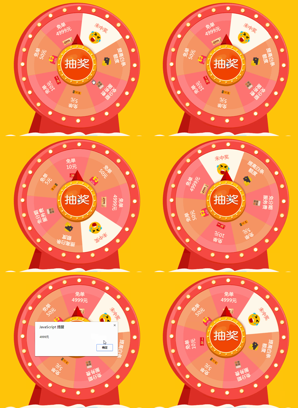
Adding transition animation effects to a web page will make people look beautiful, not stiff, and interesting. Header, animation is one of the main manifestations of the beauty of a web page. Here is an example of a lottery using a transition effect.
First come the renderings:
 The implementation of this requires the use of some js code.
Required picture:
 This picture is the location of pointer.png.
turntable-bg.jpg这张是背景图,在背景位置。

这张是turntable.png位置的。

You need these three pictures. If you want to implement it, just save these three pictures and import them. If not, please change it to the corresponding picture name and put it in the same file.
Code:
<!DOCTYPE html>
<html>
<head>
    <meta charset="UTF-8">
    <title>抽奖</title>
    <!-- 这里是css部分 -->
    <style>
        #bg{
            width: 650px;
            height: 600px;
            margin: 0 auto;
            background: url(turntable-bg.jpg) no-repeat;
            position: relative;
        }
        img[src^="pointer"]{
            position: absolute;
            z-index: 10;
            top: 155px;
            left: 247px;
        }
        img[src^="turntable"]{
            position: absolute;
            z-index: 5;
            top: 60px;
            left: 116px;
            transition: all 4s;
        }

    </style>
</head>
<body>
<!-- 这里是HTML结构部分 -->
    <div id="bg">
        <img src="pointer.png" alt="pointer">
        <img src="turntable.png" alt="turntable">
    </div>
    <!-- 这里是js部分 -->
    <script>
        var oPointer=document.getElementsByTagName("img")[0];
        var oTurntable=document.getElementsByTagName("img")[1];
        var cat=51.4;
        var num=0;
        var offOn=true;
        document.title="";

        oPointer.onclick=function(){
            if(offOn){
            oTurntable.style.transform="rotate(0deg)";
            offOn=!offOn;
            ratating();
            }
        }

        function ratating(){
            var timer=null;
            var rdm=0;
            clearInterval(timer);
            timer=setInterval(function(){
                if(Math.floor(rdm/360)<3){
                    rdm=Math.floor(Math.random()*3600);
                }else{
                    oTurntable.style.transform="rotate("+rdm+"deg)";
                    clearInterval(timer);
                    setTimeout(function(){
                        offOn=!offOn;
                        num=rdm%360;
                        if(num<=cat*1){
                        alert("4999元");
                        }else if(num<=cat*2){
                            alert("条50元");
                            }else if(num<=cat*3){
                            alert("10元");
                            }else if(num<=cat*4){
                            alert("5元");
                            }else if(num<=cat*5){
                            alert("免息服务");
                            }else if(num<=cat*6){
                            alert("提交白金");
                            }else if(num<=cat*7){
                            alert("未中奖");
                            }
                    },4000);
                }
            },30);
        }
    </script>
</body>
</html>
There are not many css and HTML codes, mainly to achieve transition settings, and to use position positioning to achieve cascading, so that elements can be separated from the document flow, js code It is about getting clicks on elements and
events. Clicking on the pointer will rotate, so you need to add a click event to the pointer, and then determine whether the rotation has stopped. If not, you can’t call the function ratating() even if you click. This
function executes the turntable Rotate and determine where the pointer stops, and then pop up the corresponding content. The process of rotating in the function is to obtain the elements of the turntable, and then use js to control the properties of css
- transform: rotate(). We have not used this before. Can the attribute directly achieve the rotation effect in css? It is implemented together with the pseudo-class selector: hover and transition attributes. Since css cannot implement numerical operations and mouse clicks, js is used to implement and control css attributes to realize the click rotation function. However, Let’s not talk about the use of timers for the moment. The idea is to use js to implement number operations, mouse clicks and css attribute control to achieve the rotation effect.
Math.random() is the generation of random numbers, and Math.floor() rounds down.
Another example that someone said today:
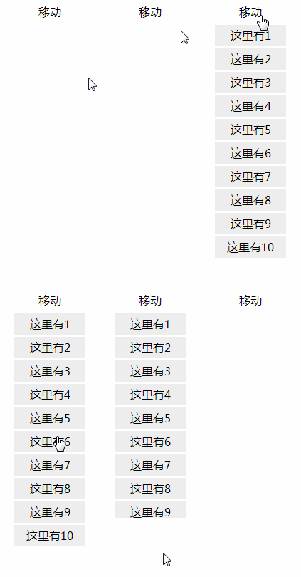
Pure CSS drop-down menu:
Rendering
The implementation of this is very simple, mainly: the use of hover and transition attributes. Code:<!DOCTYPE html>
<html>
<head>
<meta charset="UTF-8">
<title>css</title>
<style>
*{
margin: 0;
padding:0;
font-size: 16px;
font-family: "微软雅黑";
}
#container{
width: 100px;
margin: 0 auto;
text-align: center;
position: relative;
}
#container ul{
list-style: none;
}
#container span{
display: inline-block;
width: 100px;
height: 30px;
line-height: 30px;
cursor: pointer;
}
#container ul{
height: 0;
width: 100px;
overflow: hidden;
transition: all 1s;
position: absolute;
top: 30px;
left: 0px;
}
#container:hover ul{
height: 330px;
}
#container ul li{
background: #eee;
margin-top: 3px;
cursor: pointer;
height: 30px;
line-height: 30px;
}
</style>
</head>
<body>
<div id="container">
<span>移动</span>
<ul>
<li>这里有1</li>
<li>这里有2</li>
<li>这里有3</li>
<li>这里有4</li>
<li>这里有5</li>
<li>这里有6</li>
<li>这里有7</li>
<li>这里有8</li>
<li>这里有9</li>
<li>这里有10</li>
</ul>
</div>
</body>
</html>
Because ul is a scalable object, it needs to be separated from the document flow. If it is not practical, it will affect the layout. Just give it an absolute position.
The above is the content of the roulette lottery in the example. For more related content, please pay attention to the PHP Chinese website (www.php.cn)!

Hot AI Tools

Undresser.AI Undress
AI-powered app for creating realistic nude photos

AI Clothes Remover
Online AI tool for removing clothes from photos.

Undress AI Tool
Undress images for free

Clothoff.io
AI clothes remover

AI Hentai Generator
Generate AI Hentai for free.

Hot Article

Hot Tools

Notepad++7.3.1
Easy-to-use and free code editor

SublimeText3 Chinese version
Chinese version, very easy to use

Zend Studio 13.0.1
Powerful PHP integrated development environment

Dreamweaver CS6
Visual web development tools

SublimeText3 Mac version
God-level code editing software (SublimeText3)

Hot Topics
 What is the purpose of the <datalist> element?
Mar 21, 2025 pm 12:33 PM
The article discusses the HTML <datalist> element, which enhances forms by providing autocomplete suggestions, improving user experience and reducing errors.Character count: 159
 How do I use HTML5 form validation attributes to validate user input?
Mar 17, 2025 pm 12:27 PM
The article discusses using HTML5 form validation attributes like required, pattern, min, max, and length limits to validate user input directly in the browser.
 What is the purpose of the <iframe> tag? What are the security considerations when using it?
Mar 20, 2025 pm 06:05 PM
The article discusses the <iframe> tag's purpose in embedding external content into webpages, its common uses, security risks, and alternatives like object tags and APIs.
 What is the purpose of the <progress> element?
Mar 21, 2025 pm 12:34 PM
The article discusses the HTML <progress> element, its purpose, styling, and differences from the <meter> element. The main focus is on using <progress> for task completion and <meter> for stati
 What is the purpose of the <meter> element?
Mar 21, 2025 pm 12:35 PM
The article discusses the HTML <meter> element, used for displaying scalar or fractional values within a range, and its common applications in web development. It differentiates <meter> from <progress> and ex
 What are the best practices for cross-browser compatibility in HTML5?
Mar 17, 2025 pm 12:20 PM
Article discusses best practices for ensuring HTML5 cross-browser compatibility, focusing on feature detection, progressive enhancement, and testing methods.
 What is the viewport meta tag? Why is it important for responsive design?
Mar 20, 2025 pm 05:56 PM
The article discusses the viewport meta tag, essential for responsive web design on mobile devices. It explains how proper use ensures optimal content scaling and user interaction, while misuse can lead to design and accessibility issues.
 How do I use the HTML5 <time> element to represent dates and times semantically?
Mar 12, 2025 pm 04:05 PM
This article explains the HTML5 <time> element for semantic date/time representation. It emphasizes the importance of the datetime attribute for machine readability (ISO 8601 format) alongside human-readable text, boosting accessibilit


