A brief discussion on Web adaptation
Foreword
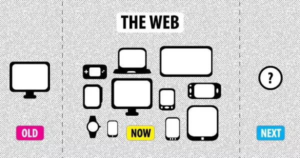
With the popularity of mobile devices, mobile web occupies an increasingly important position in the work of front-end engineers. Mobile devices are updated frequently and there are many mobile phone manufacturers. The problem is that the screen width and resolution of each machine are different. This adds difficulty to us when writing the front-end interface, and the adaptation problem is becoming more and more prominent nowadays. I remember when I first started developing mobile products, I asked the designer for design drawings of different screens, and the results were predictable. This blog post shares some experience in handling multi-screen adaptation. I hope it will be beneficial to everyone.
Special note: Before starting all this, engineers who develop mobile interfaces, please add the following meta to the head:

Easy things to do - width adaptive
The so-called width adaptive is strictly an extension of the PC-side adaptive layout method on the mobile side. This layout method is used when full-screen layout is needed when dealing with the PC front-end interface. Its implementation is also relatively simple. The outer container elements are spread over the ground according to percentages, and the sub-elements inside are fixed or floated left and right.

Since the parent element adopts a percentage layout method, its width will stretch infinitely as the screen stretches. Since the child elements are floated, their positions will also be fixed at both ends. This width adaptation has a new method in the new era. With the popularity of elastic layout, it is often replaced by scalable layout methods such as flex or box, becoming more and more "flexible". If you need to know about flexible layout, please go to the Flex layout tutorial and the braised box layout tutorial to compare.
Differentiation between big and small - fully adaptive
"Completely adaptive" is Luzhu's name for this solution. Since Luzhu can't find the official name now, we'll call it that for the time being. This solution is much improved compared to the previous one. Not only is the width adaptive, but the size and height of all elements in the interface will be adjusted according to the devices with different resolutions and screen widths. Elements, fonts, pictures, heights, etc. The value of the attribute. To put it simply, on different screens, the fonts and element height and width you see are different. Here, some people will say that they are using familiar media queries to adjust styles according to different screen widths. I thought so before, but you need to consider that many elements on the interface need to set fonts. If you use media query to set different attributes for each element on different devices, how many screens will our css have? How many times will it increase. In fact, here, we use js and css familiar rem to solve this problem.
The REM attribute refers to setting the font size of an element relative to the root element. It can also be used to set a series of units such as height that can be marked in px.
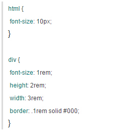
Using the above writing method, div inherits the font-size of the html node and defines a series of style attributes for itself. At this time, 1em is calculated as 10px, which is the font-size value of the root node. Therefore, at this time, the height of the div is 20px, the width is 30px, the border is 1px, and the font size is 10px; once we have such a method, we can naturally set different root node font sizes according to different screen widths. Assume that our current design standard is iPhone5s, and the screen resolution of the iPhone5 series is 640. In order to unify the standards, we set the font-size of the root element under the iPhone5 resolution to 100px;
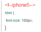
So based on this, a ratio value of 6.4 can be calculated. We can know the font size of the root element under devices with other mobile phone resolutions:

In the head, we add the above code to dynamically change the font-size value of the root node and get the following results:


Next we can use rem to set the relative values of various attributes based on the font size of the root element. Of course, if it is a mobile device, the screen will have an upper and lower limit. We can control the resolution to be within a certain range. If it exceeds this range, we will no longer increase the font size of the root element:

Normally, you don’t need to consider the dynamic stretching and shrinking of the screen. Of course, if the user turns on the screen rotation setting and changes the width of the screen after the web page is loaded, then we have to consider this issue. Solving this problem is also very simple. You can dynamically switch element styles by monitoring screen changes:

In order to improve performance and make the code run more perfectly, you can add a throttle function to it:

By the way, solve the problem of the ratio between high-fidelity annotation and actual development value
If your design draft standard is iPhone 5, then when you get the design draft, you will definitely find that you cannot write the CSS according to the high-fidelity annotation at all, but take each value in half. This is because the resolution of mobile devices is different. The designers made the annotations on real iPhone 5 machines, and the resolution of the iPhone 5 series is 640. In fact, we only need to follow the 320 standard during development. In order to save time and not have to cut the annotation in half every time, we can scale the entire web page to simulate increasing the resolution. This method is very simple, just set different metas for different devices:

This setting can also solve the problem of 1px pixels looking too thick on Android machines, because on Android machines with 1px pixels, the 1px of the border is compressed to 0.5px. In short, it’s done once and for all! The mobile web terminals of Taobao and NetEase News adopt the above method and adapt to the screens of various devices. If you are interested, you can refer to it. Here is the complete code:

Let elements fly - media inquiries
Using the new CSS attribute media query feature, you can also achieve the layout style we mentioned above. Set root element font size for dimensions:
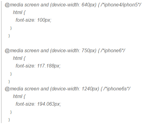
This method is also feasible. The disadvantage is that the flexibility is not high. You need to calculate the precise value of each device yourself, so you can only take the range value. Considering that there are many device screens and varying resolutions, it is impossible to write the CSS code for each model. But it also has the advantage that there is no need to monitor the browser window changes, it will follow the dynamic changes of the screen. Of course, the usage of media queries is not just as simple as here. Compared with the second kind of adaptation, there are many places that the former is far behind. The most obvious thing is that it can display different layout styles according to different devices! Please note that it is not as simple as changing the font and height, it directly changes the layout style!

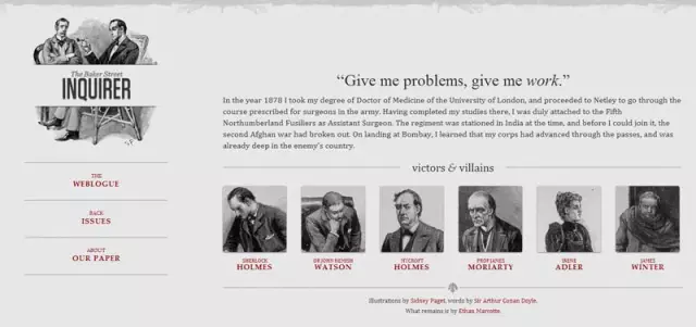
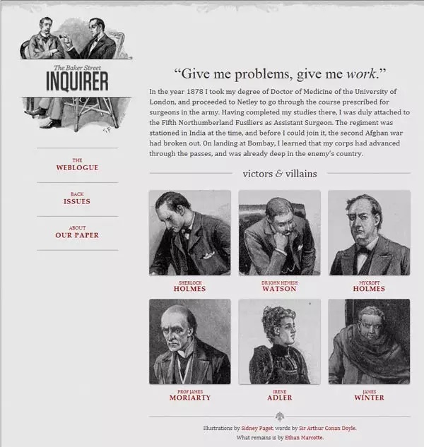
This kind of adaptive layout is generally used to be compatible with PC and mobile devices. Due to the large screen span, the elements of the interface are far beyond what can be satisfied by changing the size. At this time, it is necessary to redesign the layout and layout of the entire interface:
If the screen width is greater than 1300 pixels
If the screen width is between 600 pixels and 1300 pixels, the 6 pictures are divided into two rows.
If the screen width is between 400 pixels and 600 pixels, the navigation bar moves to the head of the web page.

Many CSS frameworks often use such multi-terminal solutions. The famous bootstrap uses this method for grid layout.
Summary
No matter which adaptive method, our goal is to make the developed web page look good on various screens: If the user group targeted by your project is only people who use a certain model of phone, then you can use the first automatic method. way of adaptation. If your customers are mainly mobile, but your customers have a variety of device types, it is recommended to use the second method. If you are ambitious and need to build an integrated web application that is compatible with PC, PAD, and mobile terminals, then the third option is obviously the most suitable for you. Each method has its own pros and cons. Weighing the pros and cons according to needs and rationally implementing adaptive layout requires constant practice and exploration. The road is long and far away, I will search up and down.
References
-
Responsive Web Design
-
Mobile front-end adaptive solutions and comparison
-
Mobile web adaptation tool-rem
Copyright Statement: Source: Selling BBQ Fsky, link: www.cnblogs.com/constantince/p/5708930.html

Hot AI Tools

Undresser.AI Undress
AI-powered app for creating realistic nude photos

AI Clothes Remover
Online AI tool for removing clothes from photos.

Undress AI Tool
Undress images for free

Clothoff.io
AI clothes remover

Video Face Swap
Swap faces in any video effortlessly with our completely free AI face swap tool!

Hot Article

Hot Tools

Notepad++7.3.1
Easy-to-use and free code editor

SublimeText3 Chinese version
Chinese version, very easy to use

Zend Studio 13.0.1
Powerful PHP integrated development environment

Dreamweaver CS6
Visual web development tools

SublimeText3 Mac version
God-level code editing software (SublimeText3)

Hot Topics
 1386
1386
 52
52
 What is the purpose of the <progress> element?
Mar 21, 2025 pm 12:34 PM
The article discusses the HTML <progress> element, its purpose, styling, and differences from the <meter> element. The main focus is on using <progress> for task completion and <meter> for stati
 Is HTML easy to learn for beginners?
Apr 07, 2025 am 12:11 AM
HTML is suitable for beginners because it is simple and easy to learn and can quickly see results. 1) The learning curve of HTML is smooth and easy to get started. 2) Just master the basic tags to start creating web pages. 3) High flexibility and can be used in combination with CSS and JavaScript. 4) Rich learning resources and modern tools support the learning process.
 What is the purpose of the <datalist> element?
Mar 21, 2025 pm 12:33 PM
The article discusses the HTML <datalist> element, which enhances forms by providing autocomplete suggestions, improving user experience and reducing errors.Character count: 159
 What is the viewport meta tag? Why is it important for responsive design?
Mar 20, 2025 pm 05:56 PM
The article discusses the viewport meta tag, essential for responsive web design on mobile devices. It explains how proper use ensures optimal content scaling and user interaction, while misuse can lead to design and accessibility issues.
 What is the purpose of the <iframe> tag? What are the security considerations when using it?
Mar 20, 2025 pm 06:05 PM
The article discusses the <iframe> tag's purpose in embedding external content into webpages, its common uses, security risks, and alternatives like object tags and APIs.
 The Roles of HTML, CSS, and JavaScript: Core Responsibilities
Apr 08, 2025 pm 07:05 PM
HTML defines the web structure, CSS is responsible for style and layout, and JavaScript gives dynamic interaction. The three perform their duties in web development and jointly build a colorful website.
 What is the purpose of the <meter> element?
Mar 21, 2025 pm 12:35 PM
The article discusses the HTML <meter> element, used for displaying scalar or fractional values within a range, and its common applications in web development. It differentiates <meter> from <progress> and ex
 Understanding HTML, CSS, and JavaScript: A Beginner's Guide
Apr 12, 2025 am 12:02 AM
WebdevelopmentreliesonHTML,CSS,andJavaScript:1)HTMLstructurescontent,2)CSSstylesit,and3)JavaScriptaddsinteractivity,formingthebasisofmodernwebexperiences.


