
 Web Front-end
JS Tutorial
Detailed explanation of Bootstrap's four image styles_javascript skills
Web Front-end
JS Tutorial
Detailed explanation of Bootstrap's four image styles_javascript skills
Detailed explanation of Bootstrap's four image styles_javascript skills

In this chapter, we will learn about Bootstrap’s support for images. Bootstrap provides four classes that can apply simple styles to images, namely:
img-rounded adds border-radius:6px to get image rounded corners
img-circle Add border-radius:50% to make the entire image circular
img-thumbnail adds some padding and a gray border
img-responsive image responsive
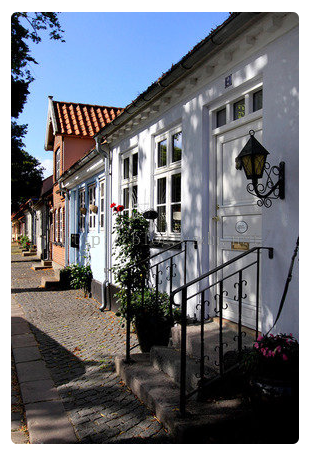
1. img-rounded
<!doctype html>
<html lang="en">
<head>
  <!--网站编码格式,UTF-8 国际编码,GBK或 gb2312 中文编码-->
  <meta http-equiv="content-type" content="text/html;charset=utf-8" />
  <meta http-equiv="X-UA-Compatible" content="IE=edge">
  <meta name="Keywords" content="关键词一,关键词二">
  <meta name="Description" content="网站描述内容">
  <meta name="Author" content="Yvette Lau">
  <meta name = "viewport" content = " width = device-width, initial-scale = 1 ">
  <title>BootstrapDemo</title>
  <!--css js 文件的引入-->
  <link rel="stylesheet" type="text/css" href="../bootstrap-3.3.5-dist/css/bootstrap.min.css">
</head>
  <body style="padding: 20px;">
    <div class = "container">
      <img src = "5.jpg" class="img-rounded" >
    </div>
  </body>
</html> .img-rounded{border-radius:6px;}
Effect:
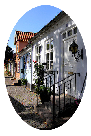
2. img-circle
<body style="padding: 20px;">
  <div class = "container">
    <img src = "5.jpg" class="img-circle" >
  </div>
</body> .img-circle{border-radius:50%;}
Effect (because the width and height of this image are different, it will appear as an ellipse. If the width and height are set to the same, a circle will appear):
3. img-thumbnail
<body style="padding: 20px;">
  <div class = "container">
    <img src = "5.jpg" class="img-thumbnail" >
    <img src = "4.jpg" class="img-thumbnail" >
    <img src = "3.jpg" class="img-thumbnail" >
  </div>
</body>.img-thumbnail{display:inline-block;max-width:100%;height:auto;padding:4px;line-height:1.42857143;
background-color:#FFF;border:1px solid #DDD;border-radius:4px;transition:all 0.2s ease-in-out;}
Effect:
4. img-responsize
<body style="padding: 20px;">
  <div class = "container" style = "width:150px;">
    <img src = "5.jpg" class="img-responsive" width="400px" >
  </div>
</body> .img-responsive{display:block;max-width:100%;height:auto;}
Effect (width attribute value in img is ignored):
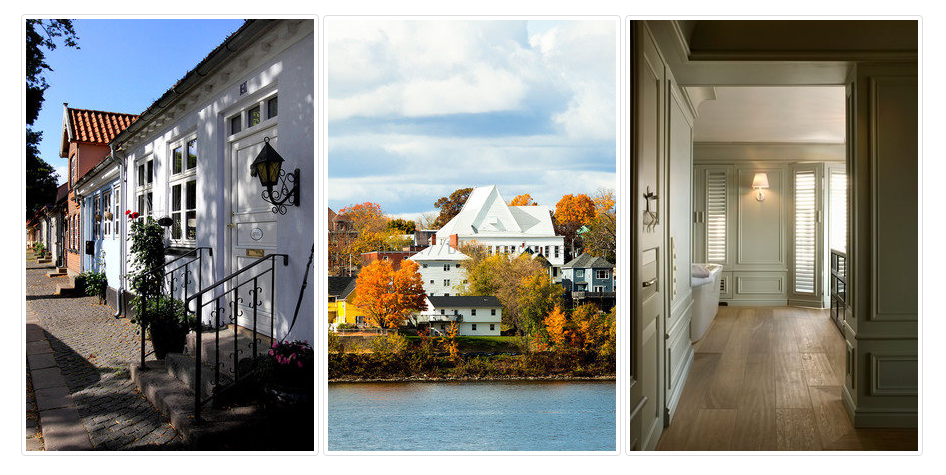
The above content introduces you to the relevant knowledge of Bootstrap’s four image styles step by step. I hope you like it.

Hot AI Tools

Undresser.AI Undress
AI-powered app for creating realistic nude photos

AI Clothes Remover
Online AI tool for removing clothes from photos.

Undress AI Tool
Undress images for free

Clothoff.io
AI clothes remover

AI Hentai Generator
Generate AI Hentai for free.

Hot Article
Hot Tools

Notepad++7.3.1
Easy-to-use and free code editor

SublimeText3 Chinese version
Chinese version, very easy to use

Zend Studio 13.0.1
Powerful PHP integrated development environment

Dreamweaver CS6
Visual web development tools

SublimeText3 Mac version
God-level code editing software (SublimeText3)
Hot Topics
 1378
1378
 52
52

 How to get the bootstrap search bar
Apr 07, 2025 pm 03:33 PM
How to get the bootstrap search bar
Apr 07, 2025 pm 03:33 PM
How to use Bootstrap to get the value of the search bar: Determines the ID or name of the search bar. Use JavaScript to get DOM elements. Gets the value of the element. Perform the required actions.
 How to do vertical centering of bootstrap
Apr 07, 2025 pm 03:21 PM
How to do vertical centering of bootstrap
Apr 07, 2025 pm 03:21 PM
Use Bootstrap to implement vertical centering: flexbox method: Use the d-flex, justify-content-center, and align-items-center classes to place elements in the flexbox container. align-items-center class method: For browsers that do not support flexbox, use the align-items-center class, provided that the parent element has a defined height.
 How to resize bootstrap
Apr 07, 2025 pm 03:18 PM
How to resize bootstrap
Apr 07, 2025 pm 03:18 PM
To adjust the size of elements in Bootstrap, you can use the dimension class, which includes: adjusting width: .col-, .w-, .mw-adjust height: .h-, .min-h-, .max-h-
 How to insert pictures on bootstrap
Apr 07, 2025 pm 03:30 PM
How to insert pictures on bootstrap
Apr 07, 2025 pm 03:30 PM
There are several ways to insert images in Bootstrap: insert images directly, using the HTML img tag. With the Bootstrap image component, you can provide responsive images and more styles. Set the image size, use the img-fluid class to make the image adaptable. Set the border, using the img-bordered class. Set the rounded corners and use the img-rounded class. Set the shadow, use the shadow class. Resize and position the image, using CSS style. Using the background image, use the background-image CSS property.
 How to set up the framework for bootstrap
Apr 07, 2025 pm 03:27 PM
How to set up the framework for bootstrap
Apr 07, 2025 pm 03:27 PM
To set up the Bootstrap framework, you need to follow these steps: 1. Reference the Bootstrap file via CDN; 2. Download and host the file on your own server; 3. Include the Bootstrap file in HTML; 4. Compile Sass/Less as needed; 5. Import a custom file (optional). Once setup is complete, you can use Bootstrap's grid systems, components, and styles to create responsive websites and applications.
 How to use bootstrap button
Apr 07, 2025 pm 03:09 PM
How to use bootstrap button
Apr 07, 2025 pm 03:09 PM
How to use the Bootstrap button? Introduce Bootstrap CSS to create button elements and add Bootstrap button class to add button text
 How to write split lines on bootstrap
Apr 07, 2025 pm 03:12 PM
How to write split lines on bootstrap
Apr 07, 2025 pm 03:12 PM
There are two ways to create a Bootstrap split line: using the tag, which creates a horizontal split line. Use the CSS border property to create custom style split lines.
 How to view the date of bootstrap
Apr 07, 2025 pm 03:03 PM
How to view the date of bootstrap
Apr 07, 2025 pm 03:03 PM
Answer: You can use the date picker component of Bootstrap to view dates in the page. Steps: Introduce the Bootstrap framework. Create a date selector input box in HTML. Bootstrap will automatically add styles to the selector. Use JavaScript to get the selected date.
