

HD adaptation for mobile terminals

Why do we need to adapt?——More and more screen sizes

How to adapt?
Understand a few concepts:
Retina screen: It can compress more pixels into a screen, thereby achieving a higher resolution and improving the fineness of the screen display.
dpr: = physical pixel / device independent pixel [in a certain direction, x direction or y direction]
Under normal screen: 1 css pixel corresponds to 1 physical pixel (1:1).
Retina screen: 1 css pixel corresponds to 4 physical pixels (1:4)
Example: iPhone4 and subsequent products
dpr=2: 4, 4s, 5, 5s, 6, 6s
dpr=3: 6+ and 6s+
Major premise for adaptation:
1. Text adaptation problem:
px: relative length unit relative to the monitor screen resolution
em: inherit from parent 20px -10px -5px
rem: relative html value 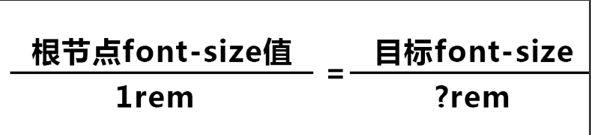
determine the root node font The px value of -size can determine the rem value of the target node
1. js control
!(function (doc, win) {
		var docEl = doc.documentElement,
			resizeEvt = 'orientationchange' in window ? 'orientationchange' : 'resize',
		recalc = function () {
			var clientWidth = docEl.clientWidth;
			if (!clientWidth) return;
			docEl.style.fontSize = 100 * (clientWidth / 640) + 'px';
		};
		if (!doc.addEventListener) return;
		win.addEventListener(resizeEvt, recalc, false);
		doc.addEventListener('DOMContentLoaded', recalc, false);
	})(document, window);
2. Media inquiry @media
@media screen and (min-width: 320px) {html { font-size: 100px;}}

@media screen and (min-width: 360px) {html {  font-size: 112.5px;}}

@media screen and (min-width: 400px) {html {font-size: 125px;}}

@media screen and (min-width: 440px) {html {font-size: 137.5px;}}

@media screen and (min-width: 480px) {html {font-size: 150px;}}
3. Determine DPR Taobao’s flexible adaptation solution
4. Powerful unit - vw Use the unit vw to achieve dynamic calculation
Image HD problem:
Twice the image (@2x), and then the image container is reduced by 50%.
For example: image size, 400×600;
1.img tag: width: 200px; height: 300px;
2. Background image: width: 200px; height: 300px; background-image: url(image@2x.jpg) ; background-size: 200px 300px;
Such shortcomings are obvious, under normal screen:
1) @2x pictures are also downloaded, resulting in a waste of resources.
2) The picture will lose some sharpness (or chromatic aberration) due to downsampling. So the best solution is: load images of different sizes under different dprs. Get the parameters through the url, and then you can control the image quality or crop the image into different sizes.
Summary:
1. Base size iPhone 6, when adapting upward and downward, the interface adjustment is minimal
2. Adaptation rules: text flow, control elasticity, image scaling

Hot AI Tools

Undresser.AI Undress
AI-powered app for creating realistic nude photos

AI Clothes Remover
Online AI tool for removing clothes from photos.

Undress AI Tool
Undress images for free

Clothoff.io
AI clothes remover

AI Hentai Generator
Generate AI Hentai for free.

Hot Article
Hot Tools

Notepad++7.3.1
Easy-to-use and free code editor

SublimeText3 Chinese version
Chinese version, very easy to use

Zend Studio 13.0.1
Powerful PHP integrated development environment

Dreamweaver CS6
Visual web development tools

SublimeText3 Mac version
God-level code editing software (SublimeText3)
Hot Topics
 1376
1376
 52
52

 What is the purpose of the <progress> element?
Mar 21, 2025 pm 12:34 PM
What is the purpose of the <progress> element?
Mar 21, 2025 pm 12:34 PM
The article discusses the HTML <progress> element, its purpose, styling, and differences from the <meter> element. The main focus is on using <progress> for task completion and <meter> for stati
 What is the purpose of the <datalist> element?
Mar 21, 2025 pm 12:33 PM
What is the purpose of the <datalist> element?
Mar 21, 2025 pm 12:33 PM
The article discusses the HTML <datalist> element, which enhances forms by providing autocomplete suggestions, improving user experience and reducing errors.Character count: 159
 What are the best practices for cross-browser compatibility in HTML5?
Mar 17, 2025 pm 12:20 PM
What are the best practices for cross-browser compatibility in HTML5?
Mar 17, 2025 pm 12:20 PM
Article discusses best practices for ensuring HTML5 cross-browser compatibility, focusing on feature detection, progressive enhancement, and testing methods.
 What is the purpose of the <meter> element?
Mar 21, 2025 pm 12:35 PM
What is the purpose of the <meter> element?
Mar 21, 2025 pm 12:35 PM
The article discusses the HTML <meter> element, used for displaying scalar or fractional values within a range, and its common applications in web development. It differentiates <meter> from <progress> and ex
 How do I use the HTML5 <time> element to represent dates and times semantically?
Mar 12, 2025 pm 04:05 PM
How do I use the HTML5 <time> element to represent dates and times semantically?
Mar 12, 2025 pm 04:05 PM
This article explains the HTML5 <time> element for semantic date/time representation. It emphasizes the importance of the datetime attribute for machine readability (ISO 8601 format) alongside human-readable text, boosting accessibilit
 How do I use HTML5 form validation attributes to validate user input?
Mar 17, 2025 pm 12:27 PM
How do I use HTML5 form validation attributes to validate user input?
Mar 17, 2025 pm 12:27 PM
The article discusses using HTML5 form validation attributes like required, pattern, min, max, and length limits to validate user input directly in the browser.
 What is the viewport meta tag? Why is it important for responsive design?
Mar 20, 2025 pm 05:56 PM
What is the viewport meta tag? Why is it important for responsive design?
Mar 20, 2025 pm 05:56 PM
The article discusses the viewport meta tag, essential for responsive web design on mobile devices. It explains how proper use ensures optimal content scaling and user interaction, while misuse can lead to design and accessibility issues.
 What is the purpose of the <iframe> tag? What are the security considerations when using it?
Mar 20, 2025 pm 06:05 PM
What is the purpose of the <iframe> tag? What are the security considerations when using it?
Mar 20, 2025 pm 06:05 PM
The article discusses the <iframe> tag's purpose in embedding external content into webpages, its common uses, security risks, and alternatives like object tags and APIs.
