Usage of flexible layout 'em' in CSS3
I have been using CSS for a long time, but I have always used "px" to set the relevant attributes of web elements, and I have not dared to use "em". The main reason is that I don’t know much about it and only know a little conceptual stuff. Some time ago, I was required to use “em” as the unit setting element in the project, so I learned about “em” from scratch. With a little understanding, I specially compiled a blog post to share with you today, hoping to be of some help to the children.
This tutorial will guide you on how to use "em" to create a basic flexible layout, and learn how to calculate it? How to use "em" to elastically expand the layer? And how to expand content such as text and images? Let’s start today’s “em” trip with these questions.
What is flexible layout?
User text size and flexible layout
The default text size rendered by the user's browser is "16px". In other words, the text size of "body" in the Web page is "16px" by default rendered by the user's browser. Of course, the user can change this font size setting if he wishes. The user can change the browser's default font size through UI controls.
There is a key point in elastic designAll elements in the web page use the "em" unit value. "em" is a relative size. We can set it like 1em, 0.5em, 1.5em, etc., and "em" can also be specified to three decimal places, such as "1.365em". And "relative" means:
- Relative calculations must have a reference object, so relative here refers to the font-size relative to the parent element of the element. For example: if you set the font size to "16px" in a , the descendant elements of thiswill inherit its font size, unless the display setting is reset in its descendant elements. . At this time, if you set the font size of its child element to "0.75em", then its font size is calculated to be equivalent to "0.75 X 16px = 12px";
- If the user changes the text size through the browser's UI control, then our entire page will also be enlarged (or reduced), so that the user will not cause the entire page to crash after changing the browser's font (I think this phenomenon is like Everyone has encountered it. If you don’t believe it, try a project you have made yourself. You will find it very scary).
You can check out this flexible layout sample. At this time, you use the browser's UI controls to change the text size or directly "ctrl +" and "ctrl -". You will find this elastic layout instance. When you change the font size in the browser, the browsing will zoom in and out accordingly. It will not affect the layout of the entire page. Note: All the HTML and CSS for this example will be used throughout this tutorial.
As for other examples of flexible layout, you can browse Dan Cederholm’s Simplebites and change the text size to browse.
After experiencing it, do you think the flexible layout page is very flexible and as precise as "px"? Therefore, as long as we master the basic relationship between "font-size", "px" and "em", we can quickly create precise layouts using CSS.
Elastigirl of CSS introduces EM
Elastigirl's "em" is extremely powerful and flexible, no matter what the font size is, whether it is 12px, 16 or 60, he can calculate its value.
em is actually a typesetting test unit, and there is a little story about its origin. I won’t tell you this little story because you are not here to listen to my story. I think you will still like it. Know what he's doing in CSS.
In CSS, "em" is actually a vertical measurement. An em is equal to the vertical space required by a letter in any font, and has nothing to do with the horizontal space it occupies, so:
If the font size is 16px, then 1em=16px.
Getting Started
Before we start to understand this "em" in CSS, we need to know its default font size under the browser. It just so happens that we did this before. In all modern browsers, the default font size is "16px". Therefore the default setting in the browser will be:
1em = 16px
So when a CSS selector is written, the browser has a default font size of "16px". At this time, the
in our web page inherits this "font-size:16px;" unless you explicitly set the "font-size" value of in the CSS style to change its inheritance. value. In this way, "1em = 16px", "0.5em = 8px", "10em = 160px", etc., then we can also use "em" to specify the size of any element.Set Body’s font-size
Many seniors have gained experience from many years of practice. They suggest that we set the font size required for the body text in
, or set it to "10px", which is equivalent to ("0.625em or 62.5%") , in order to facilitate the calculation of its sub-elements. Both are desirable. But we all know that the default font of is "16px". At the same time, we also know that we have changed its default value. To prevent the flexible layout from being broken, we need to recalculate and re-adjust. So the perfect setup is:<span class="tag">body <span class="rules">{<span class="rule"><span class="attribute">font-size:<span class="value"><span class="number">1em;<span class="rule">} </span></span></span></span></span></span></span>Copy after loginBut under that unloved IE, there will be a problem with "em". When adjusting the font size, it will also break our flexible layout, but fortunately, there is a way to solve it:
			<span class="tag">html <span class="rules">{<span class="rule"><span class="attribute">font-size:<span class="value"> <span class="number">100%;<span class="rule">}
<br />		</span></span></span></span></span></span></span>
Copy after loginFormula conversion——PXtoEM
If you are the first to create a flexible layout, it is best to have a calculator by your side, because we will have to do a lot of calculations at the beginning, so you can rest assured with it.
Pixels are too close for us, so we'll start with that as well. First we need to calculate the ratio between 1px and em, and then know the px value we need. Through the previous introduction, everyone knows that 1em is always equal to the font size of the parent element, so we can completely calculate it through the following formula:
1 ÷ font-size of parent element × pixel value to be converted = em value
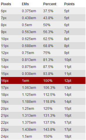
You can refer to the conversion table below (the value when the body font is 16px)

Next let’s look at a very simple example “Use CSS EM to create a 960px width flexible layout”
HTML Markup
<span class="tag"><<span class="title">body> <span class="tag"><<span class="title">div <span class="attribute">id=<span class="value">"container"> …<span class="tag"></<span class="title">div> <span class="tag"></<span class="title">body> <br /><br /> </span></span></span></span></span></span></span></span></span></span>
Copy after loginConvert 960px to em
1 ÷ 16px × 960px = 60em
The prerequisite for this calculated value is "font-size:16px" of
.CSS Code
			<span class="tag">html <span class="rules">{
				<span class="rule"><span class="attribute">font-size:<span class="value"> <span class="number">100%;
			<span class="rule">}

			<span class="tag">body <span class="rules">{
				<span class="rule"><span class="attribute">font-size:<span class="value"> <span class="number">1em;
			<span class="rule">}

			<span class="id">#container <span class="rules">{
				<span class="rule"><span class="attribute">width:<span class="value"> <span class="number">60em;
			<span class="rule">}
<br />		</span></span></span></span></span></span></span></span></span></span></span></span></span></span></span></span></span></span></span></span></span>
Copy after loginThrough the above examples, I think everyone can understand it more vividly, because there are examples available. In fact, we can convert the above calculation formula, which will make your calculations more convenient:
The pixel value that needs to be converted ÷ the font-size = em value of the parent element
Then our example "960px" above can be converted into an "em" value like this
960px ÷ 16px = 60em
Above we have witnessed the calculation method of converting "px" into "em". Next, let's take a look at the example of making the flexible layout shown above. Below we will mainly implement it step by step.
Build a flexible container
To create a centering effect like the flexible layout example, we first need to create an HTML structure. Here I create a
and name it "wrap"<span class="tag"><<span class="title">body> <span class="tag"><<span class="title">div <span class="attribute">id=<span class="value">"wrap"> content here<span class="tag"></<span class="title">div> <span class="tag"></<span class="title">body> </span></span></span></span></span></span></span></span></span></span>
Copy after loginWe want this container to be "740px" wide, suitable for an instance with an "800px × 600px" display. So how many "em" does "740px" equal? This is what we need to be concerned about, let’s take a look together:
1. Convert "740px" to "em" and set it to our container "div#wrap": We all know that the parent element
of "div#wrap" sets the font to "16px", then this When no additional display settings are made, its child elementwill inherit the "font-size" value, so that we can easily get: "The relationship between 1px and 1em"1em = 16px, that is, 1px = 1 ÷ 16 = 0.0625em
In this way, our "740px" can be easily converted into "em"
0.0625em × 740 = 46.25em
Of course, you can also convert according to the calculation formula we listed earlier, so that you have a better concept in mind and it is not easy to make mistakes:
1 ÷ 16 × 740 = 46.25em (1 ÷ font-size of parent element × pixel value to be converted = em value)
In this way, You can use the above formula to calculate the "em" value of any width or height you need, you only need to know "1px equals how many em", and the other is what is the "px" value you want to convert , with these parameters you can get the "em" value you want.
2. Create CSS styles: Now we can write styles for "div#wrap". The elastic layout example clearly tells us that a width of "740px" is set for "div#wrap" in the center, with The upper and lower "margin" is "24px", and has a border effect of "1px", then we first calculate the corresponding "em value" according to the above formula, and then write it into the CSS style:
<span class="tag">html <span class="rules">{<span class="rule"><span class="attribute">font-size:<span class="value"> <span class="number">100%;<span class="rule">} <span class="tag">body <span class="rules">{<span class="rule"><span class="attribute">font-size:<span class="value"> <span class="number">1em;<span class="rule">} <span class="id">#wrap <span class="rules">{ <span class="rule"><span class="attribute">width:<span class="value"> <span class="number">46.25em;<span class="comment">/*740px ÷ 16 = 46.25em */ <span class="rule"><span class="attribute">margin:<span class="value"> <span class="number">1.5em auto;<span class="comment">/*24px ÷ 16 = 1.5em*/ <span class="rule"><span class="attribute">border:<span class="value"> <span class="number">0.0625em solid <span class="hexcolor">#ccc;<span class="comment">/*1px ÷ 16 = 0.0625em*/ <span class="rule">} </span></span></span></span></span></span></span></span></span></span></span></span></span></span></span></span></span></span></span></span></span></span></span></span></span></span></span></span></span></span></span></span></span>Copy after login现在我们就轻松的创建了一个包含内容的弹性容器:弹性布局样例。
文本样式与em
首先我们在前面那个创建的
中插入一个和一个
:
			<span class="tag"><<span class="title">div <span class="attribute">id=<span class="value">"wrap">
				<span class="tag"><<span class="title">h1>...<span class="tag"></<span class="title">h1>
				<span class="tag"><<span class="title">p>...<span class="tag"></<span class="title">p>
			<span class="tag"></<span class="title">div>
<br />		</span></span></span></span></span></span></span></span></span></span></span></span></span></span>
Copy after login在弹性布局样例实例中,我们标题使用了“18px”,而段落设置的是“12px”字体,同时其行高是“18px”。18px将是我们实现弹性布局的一个重要值,可以使用他们都按正比变化。(有关于标题和段落的排版介绍,大家感兴趣可以点击Richard Rutter的basic leading和vertical rhythm以及chapter on vertical motion的相关介绍)。
根据CSS继承一说,我们在“div#wrap”的内容容器中没有显式的设置字体大小,这样整个“div#wrap”将继承了其父元素“body”的字体——“16px”。
1、给段落设置样式:——“12px”的字体,“18px”的行高以及margin值
从CSS继承中,我们可以得知我们所有段落继承了其父元素“div#wrap”的“font-size:16px”。同时我们通过前面的介绍得知1px = 1 ÷ 16 = 0.0625em,这样一来我们就很轻松的知道“12px”等于多少个“em”
0.0625em × 12 = 0.750em
这样我们就可以给段落p设置样式:
<span class="tag">p <span class="rules">{<span class="rule"><span class="attribute">font-size:<span class="value"> <span class="number">0.75em;<span class="comment">/*0.0625em × 12 = 0.750em */<span class="rule">} </span></span></span></span></span></span></span></span>Copy after login要计算出段落所需的行高和“margin”为“18px”,来满足Richard Rutter说的basic leading,那我们就需要像下面的方法和来计算:
18 ÷ 12 = 1.5em
使用所需的行高值“18px”直接除以“字体大小12px”,这样就得到了段落“p”的“line-height”值。在本例中行高就等于字体的“1.5”倍,接着我们把“line-height”和“margin”样式加到段落“p”中
<span class="tag">p<span class="rules">{ <span class="rule"><span class="attribute">font-size:<span class="value"> <span class="number">0.75em;<span class="comment">/*0.625em × 12 = 0.750em */ <span class="rule"><span class="attribute">line-height:<span class="value"> <span class="number">1.5em;<span class="comment">/*18px(line-height) ÷ 12(font-size) = 1.5em */ <span class="rule"><span class="attribute">margin:<span class="value"> <span class="number">1.5em;<span class="comment">/*18px(margin) ÷ 12(font-size) = 1.5em */ <span class="rule">} <br /><br /></span></span></span></span></span></span></span></span></span></span></span></span></span></span></span></span></span></span>Copy after login2、给标题设置一个18px的字号
标题“h1”和段落“p”一样的原理,他也是继承他父元素“div#wrap”的“16px”的“font-size”,所以我们也是按同样的方法可以计处出他的“em”
0.0625em × 18 = 1.125em
我们可以把得出的值写到CSS样式表中
<span class="tag">h1 <span class="rules">{ <span class="rule"><span class="attribute">font-size:<span class="value"> <span class="number">1.125em;<span class="comment">/*0.625em × 18 = 1.125em*/ <span class="rule">} </span></span></span></span></span></span></span></span>Copy after login同样为了保留Richard Rutter所说的vertical rhythm,我们同样将标题“h1”的“line-height”和“margin”都设置为“18px”,使用方法前面介绍的方法。很容易得到他们的“em”值为“1em”:
<span class="tag">h1 <span class="rules">{ <span class="rule"><span class="attribute">font-size:<span class="value"> <span class="number">1.125em; <span class="comment">/*0.625em × 18 = 1.125em*/ <span class="rule"><span class="attribute">line-height:<span class="value"> <span class="number">1em; <span class="comment">/*18px(line-height) ÷ 18px(font-size) = 1em */ <span class="rule"><span class="attribute">margin:<span class="value"> <span class="number">1em; <span class="comment">/*18px(margin) ÷ 18px(font-size) = 1em */ <span class="rule">} <br /><br /></span></span></span></span></span></span></span></span></span></span></span></span></span></span></span></span></span></span>Copy after login设置图片大小——使用em
要做出弹性布局样例这样的果,我们也需要在html中插入一张图片:
			<span class="tag"><<span class="title">body>
				<span class="tag"><<span class="title">div <span class="attribute">id=<span class="value">"wrap">
					<span class="tag"><<span class="title">h1>....<span class="tag"></<span class="title">h1>
					<span class="tag"><<span class="title">p><span class="tag"><<span class="title">img <span class="attribute">src=<span class="value">"90.png" <span class="attribute">alt=<span class="value">"" /> Lorem...<span class="tag"></<span class="title">p>
				<span class="tag"></<span class="title">div>
			<span class="tag"></<span class="title">body>
		</span></span></span></span></span></span></span></span></span></span></span></span></span></span></span></span></span></span></span></span></span></span></span></span>
Copy after login我们这张图片具有“90px”的宽和高,同时具有一个右边距和底边距为“18px”设置,而且还进行左浮动。下面我们就一起来看其如何实现图片这几个样式效果:
从HTML结构中,我们很清楚的知道,图片是段落“p”的子元素,通过前面的介绍,你们知道这个段落“p”的“font-size”值被得定义为“12px”,因此我们计算图片的属性值时,不能在按“1px = 0.0625em”或者“1em=16px”来计算,我们需要使用最老的公式计算:
1 ÷ 父元素的font-size × 需要转换的像素值 = em值
这样一来,按上面所示的公式,我们就可以计算出图片的大小:
1 ÷ 12 × 90 = 7.5em
现在你就可以将计算出来的值写到样式中去:
<span class="tag">p <span class="tag">img <span class="rules">{ <span class="rule"><span class="attribute">width:<span class="value"> <span class="number">7.5em; <span class="comment">/*1 ÷12( 父元素的font-size) × 90px(图片的宽度) = 7.5em */ <span class="rule"><span class="attribute">height:<span class="value"> <span class="number">7.5em; <span class="comment">/*1 ÷12( 父元素的font-size) × 90px(图片的高度) = 7.5em */ <span class="rule">} </span></span></span></span></span></span></span></span></span></span></span></span></span></span>Copy after login我们在段落中知道了“18px”刚好是“1.5em”,现在我们也把它使用到图片的样式中:
<span class="tag">p <span class="tag">img <span class="rules">{ <span class="rule"><span class="attribute">width:<span class="value"> <span class="number">7.5em; <span class="comment">/*1 ÷12( 父元素的font-size) × 90px(图片的宽度) = 7.5em */ <span class="rule"><span class="attribute">height:<span class="value"> <span class="number">7.5em; <span class="comment">/*1 ÷12( 父元素的font-size) × 90px(图片的高度) = 7.5em */ <span class="rule"><span class="attribute">margin:<span class="value"> <span class="number">0 <span class="number">1.5em <span class="number">1.5em <span class="number">0; <span class="rule"><span class="attribute">float:<span class="value"> left; <span class="rule">} </span></span></span></span></span></span></span></span></span></span></span></span></span></span></span></span></span></span></span></span></span></span></span></span>Copy after login这样我们就制作出一个和弹性布局样例一样的效果。希望通过这样的一个实例能帮助大家了解如何使用“em”来创建一个弹性布局的方法。当然大家可能还在担心使用“em”来制作一个弹性布局,不能像“px”一样的的精确,如果你真正理解了这篇教程后,我想你不会在有这样的想法。
弹性布局的公式总结
最后我想大家肯定和我会有同一种想法,就是相关参数是的“px”值如何成功而且正确的转换成“em”值,经过上面的学习,我最后将公式总结一下:
元素自身没有设置字号大小时,元素的width、height、line-height、margin、padding、border等值转换都按下面公式转换:
1 ÷ 父元素的font-size × 需要转换的像素值 = em值
我们来看一个实例:
			<span class="tag"><<span class="title">body>
				<span class="tag"><<span class="title">div <span class="attribute">id=<span class="value">"wrapper">test<span class="tag"></<span class="title">div>
			<span class="tag"></<span class="title">body>
		</span></span></span></span></span></span></span></span></span></span>
Copy after login我们在body默认字体大小为“16px”,此时需要“div#wrapper”的相关参数值为:
			<span class="id">#wrapper <span class="rules">{
				<span class="rule"><span class="attribute">width:<span class="value"> <span class="number">200px;
				<span class="rule"><span class="attribute">height:<span class="value"> <span class="number">100px;
				<span class="rule"><span class="attribute">border:<span class="value"> <span class="number">5px solid red;
				<span class="rule"><span class="attribute">margin:<span class="value"> <span class="number">15px;
				<span class="rule"><span class="attribute">padding:<span class="value"> <span class="number">10px;
				<span class="rule"><span class="attribute">line-height:<span class="value"> <span class="number">18px;
			<span class="rule">}
		</span></span></span></span></span></span></span></span></span></span></span></span></span></span></span></span></span></span></span></span></span></span></span></span></span></span></span>
Copy after login那么我们按照上面的公式,将所在参数进行转换:
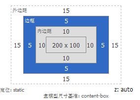
<span class="id">#wrapper <span class="rules">{ <span class="rule"><span class="attribute">width:<span class="value"> <span class="number">12.5em;<span class="comment">/*1 ÷ 16 × 200 = 12.5em值*/ <span class="rule"><span class="attribute">height:<span class="value"> <span class="number">6.25em;<span class="comment">/*1 ÷ 16 × 100 = 6.25em值*/ <span class="rule"><span class="attribute">border:<span class="value"> <span class="number">0.3125em solid red;<span class="comment">/*1 ÷ 16 × 5 = 0.3125em值*/ <span class="rule"><span class="attribute">margin:<span class="value"> <span class="number">0.9375em;<span class="comment">/*1 ÷ 16 × 15 = 0.9375em值*/ <span class="rule"><span class="attribute">padding:<span class="value"> <span class="number">0.625em;<span class="comment">/*1 ÷ 16 × 10 = 0.625em值*/ <span class="rule"><span class="attribute">line-height:<span class="value"> <span class="number">1.125em;<span class="comment">/*1 ÷ 16 × 18 = 1.125em值*/ <span class="rule">} </span></span></span></span></span></span></span></span></span></span></span></span></span></span></span></span></span></span></span></span></span></span></span></span></span></span></span></span></span></span></span></span></span>Copy after login我们一起来看计算出来的值:

接下来我需要大家在来看一个效果,这一点很关键哟,仔细看好,在同样的参数基础上稍加一条元素本身设置字体大小为:14px;,大家可以会说很简单的呀,按前面的公式计算出来加上就是了,那么我现在就按大家说的计算加上:
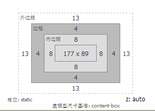
<span class="id">#wrapper <span class="rules">{ <span class="rule"><span class="attribute">font-size:<span class="value"> <span class="number">0.875em;<span class="comment">/*1 ÷ 16 × 14= 0.875em值*/ <span class="rule"><span class="attribute">width:<span class="value"> <span class="number">12.5em;<span class="comment">/*1 ÷ 16 × 200 = 12.5em值*/ <span class="rule"><span class="attribute">height:<span class="value"> <span class="number">6.25em;<span class="comment">/*1 ÷ 16 × 100 = 6.25em值*/ <span class="rule"><span class="attribute">border:<span class="value"> <span class="number">0.3125em solid red;<span class="comment">/*1 ÷ 16 × 5 = 0.3125em值*/ <span class="rule"><span class="attribute">margin:<span class="value"> <span class="number">0.9375em;<span class="comment">/*1 ÷ 16 × 15 = 0.9375em值*/ <span class="rule"><span class="attribute">padding:<span class="value"> <span class="number">0.625em;<span class="comment">/*1 ÷ 16 × 10 = 0.625em值*/ <span class="rule"><span class="attribute">line-height:<span class="value"> <span class="number">1.125em;<span class="comment">/*1 ÷ 16 × 18 = 1.125em值*/ <span class="rule">} </span></span></span></span></span></span></span></span></span></span></span></span></span></span></span></span></span></span></span></span></span></span></span></span></span></span></span></span></span></span></span></span></span></span></span></span></span></span>Copy after login此进我们在firebug下看计算出来的layout值

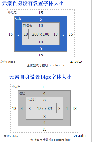
为了更好的说明问题,我把元素自身没有设置字体大小和元素自身设置了字体大小,两者在firebug计算出来值:

我截这个图的主要意图是,说明一个问题就是元素自身要是设置了字体大小后,其计算公式就不在是前面所说的,我们需要做一下修改:
1、字体计算公式依旧
1 ÷ 父元素的font-size × 需要转换的像素值 = em值
2、其它属性的计算公式需要换成
1 ÷ 元素的font-size × 需要转换的像素值 = em值
那么我们现在来计算一回:
<span class="id">#wrapper <span class="rules">{ <span class="rule"><span class="attribute">font-size:<span class="value"> <span class="number">0.875em;<span class="comment">/*1 ÷ 16 × 14= 0.875em值*/ <span class="rule"><span class="attribute">width:<span class="value"> <span class="number">14.2857em;<span class="comment">/*1 ÷ 14 × 200 = 14.2857em值*/ <span class="rule"><span class="attribute">height:<span class="value"> <span class="number">7.1429em;<span class="comment">/*1 ÷ 14 × 100 = 7.1429em值*/ <span class="rule"><span class="attribute">border:<span class="value"> <span class="number">0.357em solid red;<span class="comment">/*1 ÷ 14 × 5 = 0.357em值*/ <span class="rule"><span class="attribute">margin:<span class="value"> <span class="number">1.071em;<span class="comment">/*1 ÷ 14 × 15 = 1.071em值*/ <span class="rule"><span class="attribute">padding:<span class="value"> <span class="number">0.714em;<span class="comment">/*1 ÷ 14 × 10 = 0.714em值*/ <span class="rule"><span class="attribute">line-height:<span class="value"> <span class="number">1.2857em;<span class="comment">/*1 ÷ 14 × 18 = 1.2857em值*/ <span class="rule">} </span></span></span></span></span></span></span></span></span></span></span></span></span></span></span></span></span></span></span></span></span></span></span></span></span></span></span></span></span></span></span></span></span></span></span></span></span></span>Copy after login我们在来看一次计算出来的值:

总结
长篇介绍了一大堆,唯一想告诉大家的是以下几点
1、浏览器的默认字体大小是16px
2、如果元素自身没有设置字体大小,那么元素自身上的所有属性值如“boder、width、height、padding、margin、line-height”等值,我们都可以按下面的公式来计算
1 ÷ 父元素的font-size × 需要转换的像素值 = em值
3、这一种千万要慢慢理解,不然很容易与第二点混了。如果元素设置了字体大小,那么字体大小的转换依旧按第二条公式计算,也就是下面的:
1 ÷ 父元素的font-size × 需要转换的像素值 = em值
那么元素设置了字体大小,此元素的其他属性,如“border、width、height、padding、margin、line-height”计算就需要按照下面的公式来计算:
1 ÷ 元素自身的font-size × 需要转换的像素值 = em值
这样说,不知道大家理解了整明白了没有,如果没有整明白,可以回过头来看上面的一个实例。
Statement of this WebsiteThe content of this article is voluntarily contributed by netizens, and the copyright belongs to the original author. This site does not assume corresponding legal responsibility. If you find any content suspected of plagiarism or infringement, please contact admin@php.cn
Hot AI Tools

Undresser.AI Undress
AI-powered app for creating realistic nude photos

AI Clothes Remover
Online AI tool for removing clothes from photos.

Undress AI Tool
Undress images for free

Clothoff.io
AI clothes remover

AI Hentai Generator
Generate AI Hentai for free.

Hot Article
Repo: How To Revive Teammates1 months ago By 尊渡假赌尊渡假赌尊渡假赌R.E.P.O. Energy Crystals Explained and What They Do (Yellow Crystal)2 weeks ago By 尊渡假赌尊渡假赌尊渡假赌Hello Kitty Island Adventure: How To Get Giant Seeds1 months ago By 尊渡假赌尊渡假赌尊渡假赌How Long Does It Take To Beat Split Fiction?4 weeks ago By DDDR.E.P.O. Save File Location: Where Is It & How to Protect It?4 weeks ago By DDD
Hot Tools

Notepad++7.3.1
Easy-to-use and free code editor

SublimeText3 Chinese version
Chinese version, very easy to use

Zend Studio 13.0.1
Powerful PHP integrated development environment

Dreamweaver CS6
Visual web development tools

SublimeText3 Mac version
God-level code editing software (SublimeText3)

Hot Topics
See all articles Difficulty in updating caching of official account web pages: How to avoid the old cache affecting the user experience after version update?
Mar 04, 2025 pm 12:32 PM
The official account web page update cache, this thing is simple and simple, and it is complicated enough to drink a pot of it. You worked hard to update the official account article, but the user still opened the old version. Who can bear the taste? In this article, let’s take a look at the twists and turns behind this and how to solve this problem gracefully. After reading it, you can easily deal with various caching problems, allowing your users to always experience the freshest content. Let’s talk about the basics first. To put it bluntly, in order to improve access speed, the browser or server stores some static resources (such as pictures, CSS, JS) or page content. Next time you access it, you can directly retrieve it from the cache without having to download it again, and it is naturally fast. But this thing is also a double-edged sword. The new version is online,
 How to efficiently add stroke effects to PNG images on web pages?
Mar 04, 2025 pm 02:39 PM
This article demonstrates efficient PNG border addition to webpages using CSS. It argues that CSS offers superior performance compared to JavaScript or libraries, detailing how to adjust border width, style, and color for subtle or prominent effect
 How do I use HTML5 form validation attributes to validate user input?
Mar 17, 2025 pm 12:27 PM
The article discusses using HTML5 form validation attributes like required, pattern, min, max, and length limits to validate user input directly in the browser.
 What is the purpose of the <datalist> element?
Mar 21, 2025 pm 12:33 PM
The article discusses the HTML <datalist> element, which enhances forms by providing autocomplete suggestions, improving user experience and reducing errors.Character count: 159
 What is the purpose of the <progress> element?
Mar 21, 2025 pm 12:34 PM
The article discusses the HTML <progress> element, its purpose, styling, and differences from the <meter> element. The main focus is on using <progress> for task completion and <meter> for stati
 What are the best practices for cross-browser compatibility in HTML5?
Mar 17, 2025 pm 12:20 PM
Article discusses best practices for ensuring HTML5 cross-browser compatibility, focusing on feature detection, progressive enhancement, and testing methods.
 What is the purpose of the <meter> element?
Mar 21, 2025 pm 12:35 PM
The article discusses the HTML <meter> element, used for displaying scalar or fractional values within a range, and its common applications in web development. It differentiates <meter> from <progress> and ex
 What is the purpose of the <iframe> tag? What are the security considerations when using it?
Mar 20, 2025 pm 06:05 PM
The article discusses the <iframe> tag's purpose in embedding external content into webpages, its common uses, security risks, and alternatives like object tags and APIs.


