

Detailed explanation of CSS3 3D transformation examples

The 3D effect of CSS3 is great. This article implements two simple 3D flip effects. First look at the effects and source code. At the end of the article is a summary of the article^_^
The following CSS code does not add prefixes for simplicity, please add it yourself as appropriate (in the era of automation, it is recommended to use other methods, such as gulp-autoprefixerplug-in, because I prefer gulp #_#)
Also w3schoolThe above sentence is already outdated:
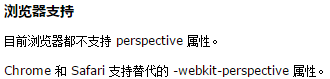
So far, modern browsers basically support unprefixed 3D transformation related properties (except for IE, and Safari9’s backface-visibility still needs to be prefixed with -webkit, and there are some minor problems with other browsers)
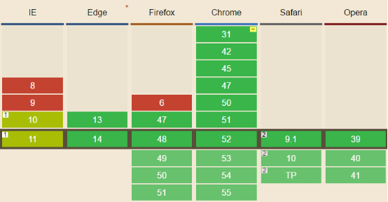
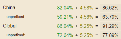
You can check each browser’s support for this CSS3 attribute through the Can I use website:
I heard that it is now popular to look at the effects and code first and then explain?
(1) Effect 1


HTML code:


<span style="font-size: 15px;"><span style="color: #0000ff;"><</span><span style="color: #800000;">div </span><span style="color: #ff0000;">class</span><span style="color: #0000ff;">='stage'</span><span style="color: #0000ff;">></span>
    <span style="color: #0000ff;"><</span><span style="color: #800000;">div </span><span style="color: #ff0000;">class</span><span style="color: #0000ff;">='container'</span><span style="color: #0000ff;">></span>
        <span style="color: #0000ff;"><</span><span style="color: #800000;">div </span><span style="color: #ff0000;">class</span><span style="color: #0000ff;">='front'</span><span style="color: #0000ff;">></</span><span style="color: #800000;">div</span><span style="color: #0000ff;">></span>
        <span style="color: #0000ff;"><</span><span style="color: #800000;">div </span><span style="color: #ff0000;">class</span><span style="color: #0000ff;">='back'</span><span style="color: #0000ff;">></</span><span style="color: #800000;">div</span><span style="color: #0000ff;">></span>
    <span style="color: #0000ff;"></</span><span style="color: #800000;">div</span><span style="color: #0000ff;">></span>
<span style="color: #0000ff;"></</span><span style="color: #800000;">div</span><span style="color: #0000ff;">></span> </span>CSS code:
<span style="font-size: 15px;"><span style="color: #800000;">.stage</span>{<span style="color: #ff0000;">
    width</span>:<span style="color: #0000ff;"> 140px</span>;<span style="color: #ff0000;">
    height</span>:<span style="color: #0000ff;"> 200px</span>;<span style="color: #ff0000;">
    perspective</span>:<span style="color: #0000ff;"> 800px</span>;
}<span style="color: #800000;">
.container</span>{<span style="color: #ff0000;">
    position</span>:<span style="color: #0000ff;"> relative</span>;<span style="color: #ff0000;">
    width</span>:<span style="color: #0000ff;"> 140px</span>;<span style="color: #ff0000;">
    height</span>:<span style="color: #0000ff;"> 200px</span>;<span style="color: #ff0000;">
    transform-style</span>:<span style="color: #0000ff;"> preserve-3d</span>;<span style="color: #ff0000;">
    transition</span>:<span style="color: #0000ff;"> 1s</span>;
}<span style="color: #800000;">
.front</span>{<span style="color: #ff0000;">
    position</span>:<span style="color: #0000ff;"> absolute</span>;<span style="color: #ff0000;">
    width</span>:<span style="color: #0000ff;"> 140px</span>;<span style="color: #ff0000;">
    height</span>:<span style="color: #0000ff;"> 200px</span>;<span style="color: #ff0000;">
    background-image</span>:<span style="color: #0000ff;"> url('http://d3.freep.cn/3tb_160824110159xh65572240.jpg')</span>;<span style="color: #ff0000;">
    background-size</span>:<span style="color: #0000ff;"> cover</span>;<span style="color: #ff0000;">
    backface-visibility</span>:<span style="color: #0000ff;"> hidden</span>;
}<span style="color: #800000;">
.back</span>{<span style="color: #ff0000;">
    position</span>:<span style="color: #0000ff;"> absolute</span>;<span style="color: #ff0000;">
    width</span>:<span style="color: #0000ff;"> 140px</span>;<span style="color: #ff0000;">
    height</span>:<span style="color: #0000ff;"> 200px</span>;<span style="color: #ff0000;">
    background-image</span>:<span style="color: #0000ff;"> url('http://d3.freep.cn/3tb_160824110159262h572240.jpg')</span>;<span style="color: #ff0000;">
    background-size</span>:<span style="color: #0000ff;"> cover</span>;<span style="color: #ff0000;">
    transform</span>:<span style="color: #0000ff;"> rotateY(180deg)</span>;<span style="color: #ff0000;">
    backface-visibility</span>:<span style="color: #0000ff;"> hidden</span>;
}<span style="color: #800000;">
.stage:hover .container</span>{<span style="color: #ff0000;">
    transform</span>:<span style="color: #0000ff;"> rotateY(180deg)</span>;
}</span>
(2)效果二

效果链接: http://codepen.io/FEwen/pen/kXOXpJ
HTML代码:
<span style="color: #0000ff;"><</span><span style="color: #800000;">ul </span><span style="color: #ff0000;">class</span><span style="color: #0000ff;">="wrap"</span><span style="color: #0000ff;">></span>
    <span style="color: #0000ff;"><</span><span style="color: #800000;">li </span><span style="color: #ff0000;">class</span><span style="color: #0000ff;">="stage"</span><span style="color: #0000ff;">></span>
        <span style="color: #0000ff;"><</span><span style="color: #800000;">div </span><span style="color: #ff0000;">class</span><span style="color: #0000ff;">='container'</span><span style="color: #0000ff;">></span>
            <span style="color: #0000ff;"><</span><span style="color: #800000;">div </span><span style="color: #ff0000;">class</span><span style="color: #0000ff;">="front"</span><span style="color: #0000ff;">><</span><span style="color: #800000;">img </span><span style="color: #ff0000;">src</span><span style="color: #0000ff;">="http://d3.freep.cn/3tb_160824132644ihf4572240.jpg"</span> <span style="color: #0000ff;">/></</span><span style="color: #800000;">div</span><span style="color: #0000ff;">></span>
            <span style="color: #0000ff;"><</span><span style="color: #800000;">p </span><span style="color: #ff0000;">class</span><span style="color: #0000ff;">="back"</span><span style="color: #0000ff;">></span>帅气的胡歌<span style="color: #0000ff;"></</span><span style="color: #800000;">p</span><span style="color: #0000ff;">></span>
        <span style="color: #0000ff;"></</span><span style="color: #800000;">div</span><span style="color: #0000ff;">></span>
    <span style="color: #0000ff;"></</span><span style="color: #800000;">li</span><span style="color: #0000ff;">></span>
    <span style="color: #0000ff;"><</span><span style="color: #800000;">li </span><span style="color: #ff0000;">class</span><span style="color: #0000ff;">="stage"</span><span style="color: #0000ff;">></span>
        <span style="color: #0000ff;"><</span><span style="color: #800000;">div </span><span style="color: #ff0000;">class</span><span style="color: #0000ff;">='container'</span><span style="color: #0000ff;">></span>
            <span style="color: #0000ff;"><</span><span style="color: #800000;">div </span><span style="color: #ff0000;">class</span><span style="color: #0000ff;">="front"</span><span style="color: #0000ff;">><</span><span style="color: #800000;">img </span><span style="color: #ff0000;">src</span><span style="color: #0000ff;">="http://d2.freep.cn/3tb_160824132644w0r4572240.jpg"</span> <span style="color: #0000ff;">/></</span><span style="color: #800000;">div</span><span style="color: #0000ff;">></span>
            <span style="color: #0000ff;"><</span><span style="color: #800000;">p </span><span style="color: #ff0000;">class</span><span style="color: #0000ff;">="back"</span><span style="color: #0000ff;">></span>美腻的赵丽颖<span style="color: #0000ff;"></</span><span style="color: #800000;">p</span><span style="color: #0000ff;">></span>
        <span style="color: #0000ff;"></</span><span style="color: #800000;">div</span><span style="color: #0000ff;">></span>
    <span style="color: #0000ff;"></</span><span style="color: #800000;">li</span><span style="color: #0000ff;">></span>
    <span style="color: #0000ff;"><</span><span style="color: #800000;">li </span><span style="color: #ff0000;">class</span><span style="color: #0000ff;">="stage"</span><span style="color: #0000ff;">></span>
        <span style="color: #0000ff;"><</span><span style="color: #800000;">div </span><span style="color: #ff0000;">class</span><span style="color: #0000ff;">='container'</span><span style="color: #0000ff;">></span>
            <span style="color: #0000ff;"><</span><span style="color: #800000;">div </span><span style="color: #ff0000;">class</span><span style="color: #0000ff;">="front"</span><span style="color: #0000ff;">><</span><span style="color: #800000;">img </span><span style="color: #ff0000;">src</span><span style="color: #0000ff;">="http://d3.freep.cn/3tb_160824235542tkj9572240.jpg"</span> <span style="color: #0000ff;">/></</span><span style="color: #800000;">div</span><span style="color: #0000ff;">></span>
            <span style="color: #0000ff;"><</span><span style="color: #800000;">p </span><span style="color: #ff0000;">class</span><span style="color: #0000ff;">="back"</span><span style="color: #0000ff;">></span>清纯的刘亦菲<span style="color: #0000ff;"></</span><span style="color: #800000;">p</span><span style="color: #0000ff;">></span>
        <span style="color: #0000ff;"></</span><span style="color: #800000;">div</span><span style="color: #0000ff;">></span>
    <span style="color: #0000ff;"></</span><span style="color: #800000;">li</span><span style="color: #0000ff;">></span>
<span style="color: #0000ff;"></</span><span style="color: #800000;">ul</span><span style="color: #0000ff;">></span> CSS代码:
<span style="color: #800000;">*</span>{<span style="color: #ff0000;">
    margin</span>:<span style="color: #0000ff;"> 0</span>;<span style="color: #ff0000;">
    padding</span>:<span style="color: #0000ff;"> 0</span>;
}<span style="color: #800000;">
.stage</span>{<span style="color: #ff0000;">
    width</span>:<span style="color: #0000ff;"> 100px</span>;<span style="color: #ff0000;">
    height</span>:<span style="color: #0000ff;"> 100px</span>;<span style="color: #ff0000;">
    perspective</span>:<span style="color: #0000ff;"> 2000px</span>;<span style="color: #ff0000;">
    list-style</span>:<span style="color: #0000ff;"> none</span>;
}<span style="color: #800000;">
.container</span>{<span style="color: #ff0000;">
     position</span>:<span style="color: #0000ff;"> relative</span>;<span style="color: #ff0000;">
     width</span>:<span style="color: #0000ff;"> 100px</span>;<span style="color: #ff0000;">
    height</span>:<span style="color: #0000ff;"> 100px</span>;<span style="color: #ff0000;">
    transform-style</span>:<span style="color: #0000ff;"> preserve-3d</span>;<span style="color: #ff0000;">
    transition</span>:<span style="color: #0000ff;"> 1s</span>;
}<span style="color: #800000;">
.front</span>{<span style="color: #ff0000;">
    position</span>:<span style="color: #0000ff;"> absolute</span>;<span style="color: #ff0000;">
    width</span>:<span style="color: #0000ff;"> 100px</span>;<span style="color: #ff0000;">
    height</span>:<span style="color: #0000ff;"> 100px</span>;<span style="color: #ff0000;">
    transform</span>:<span style="color: #0000ff;"> translateZ(50px)</span>;<span style="color: #ff0000;">
    backface-visibility</span>:<span style="color: #0000ff;"> hidden</span>;
}<span style="color: #800000;">
.front img</span>{<span style="color: #ff0000;">
    width</span>:<span style="color: #0000ff;"> 100%</span>;<span style="color: #ff0000;">
    height</span>:<span style="color: #0000ff;"> 100%</span>;
}<span style="color: #800000;">
.back</span>{<span style="color: #ff0000;">
    position</span>:<span style="color: #0000ff;"> absolute</span>;<span style="color: #ff0000;">
    display</span>:<span style="color: #0000ff;"> block</span>;<span style="color: #ff0000;">
    width</span>:<span style="color: #0000ff;"> 100px</span>;<span style="color: #ff0000;">
    height</span>:<span style="color: #0000ff;"> 100px</span>;<span style="color: #ff0000;">
    text-align</span>:<span style="color: #0000ff;"> center</span>;<span style="color: #ff0000;">
    line-height</span>:<span style="color: #0000ff;"> 100px</span>;<span style="color: #ff0000;">
    transform</span>:<span style="color: #0000ff;"> rotateY(90deg) translateZ(50px)</span>;<span style="color: #ff0000;">
    backface-visibility</span>:<span style="color: #0000ff;"> hidden</span>;
}<span style="color: #800000;">
li:nth-child(1) .back</span>{<span style="color: #ff0000;">
    background-color</span>:<span style="color: #0000ff;"> skyblue</span>;
}<span style="color: #800000;">
li:nth-child(2) .back</span>{<span style="color: #ff0000;">
    background-color</span>:<span style="color: #0000ff;"> pink</span>;
}<span style="color: #800000;">
li:nth-child(3) .back</span>{<span style="color: #ff0000;">
    background-color</span>:<span style="color: #0000ff;"> lightyellow</span>;
}<span style="color: #800000;">
.container:hover</span>{<span style="color: #ff0000;">
    transform</span>:<span style="color: #0000ff;"> rotateY(-90deg)</span>;
}
Summary:
In the above sample code, pay attention to several class names: The class name stage indicates the stage element, the class name container indicates the parent container, and the transform child elements in the container.
This is the standard nested 3D transform structure:
Stage (perspective, perspective-origin)
Parent container (transform-style: preserve3d) (various transformations)
Sub-elements (various transformations)
Child elements (various transformations)
Child elements (various transformations)
…
There is also a non-nested 3D transformation structure:
Stage (perspective, perspective-origin)
Child elements (various transformations)
Child elements (various transformations)
Child elements (various transformations)
…
You can first look at the structure above to get an intuitive understanding, which will be explained in detail below.
The main properties of CSS3 transformation are as follows:
(1) perspective (refer to the usage in the above class name stage)
Usage: Apply to stage elements. When defining the perspective attribute for an element, its child elements will get the perspective effect.
Function: Define the distance (viewing distance) of the 3D element from the view, the unit is pixels. It can be understood as the distance from the object for observation. Therefore, the smaller the value, the closer the element is to the object, and the more obvious the 3D effect is; the larger the value is, the farther the element is from the object, and the less obvious the 3D effect is, because only the 3D effect can be seen from a distance. See a piece of stuff.
Note: In practical applications, you can set multiple stage elements so that the transformation of sub-elements is implemented relative to their respective stages, then the visual effects produced by the element transformation under each stage will be consistent (reference my second example above).
(2) perspective-origin (refer to the use in the above class name stage)
Usage: Apply to stage elements, used in conjunction with perspective, child elements will get perspective effects
Function: can be understood as the position where the eyes are looking, the default stage center point
Note: Several setting methods, such as
Perspective-origin: 0px 100px; (use specific values)
Perspective-origin: 0% 50%; (Use percentage)
Perspective-origin: left center; (3 types in total: left/center/right)
(3) transform-style: preserve-3d (refer to the usage in the above class name container)
Usage: Used to animate the parent element of child elements, that is, the container
Function: has two functions. First, makes the child element have a perspective effect , and secondly, makes the child element retain the 3D position of the parent element .
Note: What is the use of this attribute? What does it have to do with perspective?
——该属性是为了嵌套3D元素而使用的!perspective和transform-style各自使得子元素具有3D透视效果,并且transform-style:preserve-3d使子元素保留父元素的3D位置,简单来说就是嵌套。如果不需要嵌套3D元素,就不需要这个属性。看下面的例子:
效果:
HTML代码:
<span style="font-size: 15px;"><span style="color: #0000ff;"><</span><span style="color: #800000;">div </span><span style="color: #ff0000;">class</span><span style="color: #0000ff;">='stage'</span><span style="color: #0000ff;">></span>
    <span style="color: #0000ff;"><</span><span style="color: #800000;">div </span><span style="color: #ff0000;">class</span><span style="color: #0000ff;">='container'</span><span style="color: #0000ff;">></</span><span style="color: #800000;">div</span><span style="color: #0000ff;">></span>
<span style="color: #0000ff;"></</span><span style="color: #800000;">div</span><span style="color: #0000ff;">></span></span>CSS代码:
<span style="font-size: 15px;"><span style="color: #800000;">.stage</span>{<span style="color: #ff0000;">
    width</span>:<span style="color: #0000ff;"> 140px</span>;<span style="color: #ff0000;">
    height</span>:<span style="color: #0000ff;"> 200px</span>;<span style="color: #ff0000;">
    perspective</span>:<span style="color: #0000ff;"> 800px</span>;
}<span style="color: #800000;">
.container</span>{<span style="color: #ff0000;">
    width</span>:<span style="color: #0000ff;"> 140px</span>;<span style="color: #ff0000;">
    height</span>:<span style="color: #0000ff;"> 200px</span>;<span style="color: #ff0000;">
    transition</span>:<span style="color: #0000ff;"> 1s</span>;<span style="color: #ff0000;">
    background-image</span>:<span style="color: #0000ff;"> url('http://d3.freep.cn/3tb_160824110159xh65572240.jpg')</span>;<span style="color: #ff0000;">
    background-size</span>:<span style="color: #0000ff;"> cover</span>;
}<span style="color: #800000;">
.stage:hover .container</span>{<span style="color: #ff0000;">
    transform</span>:<span style="color: #0000ff;"> rotateY(180deg)</span>;
}</span>
(4) backface-visibility: hidden (refer to the use in the above sub-elements for 3D transformation)
Usage: Used for animated sub-elements
Function: Under 3D perspective, by default, the content on the front can be seen through the back (see the effect in point 3), which can be set to invisible as needed.
(5) The last point - description of coordinate transformation
A stolen picture below
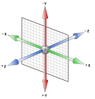
The coordinate system is relative! relatively! relatively!
The coordinate system will transform according to the transformation of the current element.
For example, if the current div applies rotateY(60deg), then the entire coordinate system will also follow rotateY(60deg), so use translateZ() always for this div It is perpendicular to the front.
(6) Last but not least, I wish you happiness every day. If you find that I have made any mistakes, please tell me!

Hot AI Tools

Undresser.AI Undress
AI-powered app for creating realistic nude photos

AI Clothes Remover
Online AI tool for removing clothes from photos.

Undress AI Tool
Undress images for free

Clothoff.io
AI clothes remover

AI Hentai Generator
Generate AI Hentai for free.

Hot Article
Hot Tools

Notepad++7.3.1
Easy-to-use and free code editor

SublimeText3 Chinese version
Chinese version, very easy to use

Zend Studio 13.0.1
Powerful PHP integrated development environment

Dreamweaver CS6
Visual web development tools

SublimeText3 Mac version
God-level code editing software (SublimeText3)
Hot Topics
 1385
1385
 52
52

 What is the purpose of the <progress> element?
Mar 21, 2025 pm 12:34 PM
What is the purpose of the <progress> element?
Mar 21, 2025 pm 12:34 PM
The article discusses the HTML <progress> element, its purpose, styling, and differences from the <meter> element. The main focus is on using <progress> for task completion and <meter> for stati
 What is the purpose of the <datalist> element?
Mar 21, 2025 pm 12:33 PM
What is the purpose of the <datalist> element?
Mar 21, 2025 pm 12:33 PM
The article discusses the HTML <datalist> element, which enhances forms by providing autocomplete suggestions, improving user experience and reducing errors.Character count: 159
 Is HTML easy to learn for beginners?
Apr 07, 2025 am 12:11 AM
Is HTML easy to learn for beginners?
Apr 07, 2025 am 12:11 AM
HTML is suitable for beginners because it is simple and easy to learn and can quickly see results. 1) The learning curve of HTML is smooth and easy to get started. 2) Just master the basic tags to start creating web pages. 3) High flexibility and can be used in combination with CSS and JavaScript. 4) Rich learning resources and modern tools support the learning process.
 What is the purpose of the <meter> element?
Mar 21, 2025 pm 12:35 PM
What is the purpose of the <meter> element?
Mar 21, 2025 pm 12:35 PM
The article discusses the HTML <meter> element, used for displaying scalar or fractional values within a range, and its common applications in web development. It differentiates <meter> from <progress> and ex
 What is the purpose of the <iframe> tag? What are the security considerations when using it?
Mar 20, 2025 pm 06:05 PM
What is the purpose of the <iframe> tag? What are the security considerations when using it?
Mar 20, 2025 pm 06:05 PM
The article discusses the <iframe> tag's purpose in embedding external content into webpages, its common uses, security risks, and alternatives like object tags and APIs.
 What is the viewport meta tag? Why is it important for responsive design?
Mar 20, 2025 pm 05:56 PM
What is the viewport meta tag? Why is it important for responsive design?
Mar 20, 2025 pm 05:56 PM
The article discusses the viewport meta tag, essential for responsive web design on mobile devices. It explains how proper use ensures optimal content scaling and user interaction, while misuse can lead to design and accessibility issues.
 The Roles of HTML, CSS, and JavaScript: Core Responsibilities
Apr 08, 2025 pm 07:05 PM
The Roles of HTML, CSS, and JavaScript: Core Responsibilities
Apr 08, 2025 pm 07:05 PM
HTML defines the web structure, CSS is responsible for style and layout, and JavaScript gives dynamic interaction. The three perform their duties in web development and jointly build a colorful website.
 What is an example of a starting tag in HTML?
Apr 06, 2025 am 12:04 AM
What is an example of a starting tag in HTML?
Apr 06, 2025 am 12:04 AM
AnexampleofastartingtaginHTMLis,whichbeginsaparagraph.StartingtagsareessentialinHTMLastheyinitiateelements,definetheirtypes,andarecrucialforstructuringwebpagesandconstructingtheDOM.
