CSS3_02
1. Transformation attribute: transform: value: transform-function (conversion function);
2. Transformation origin: the center of the default element; change the transformation origin: transform-origin: value: number/percentage/keyword;
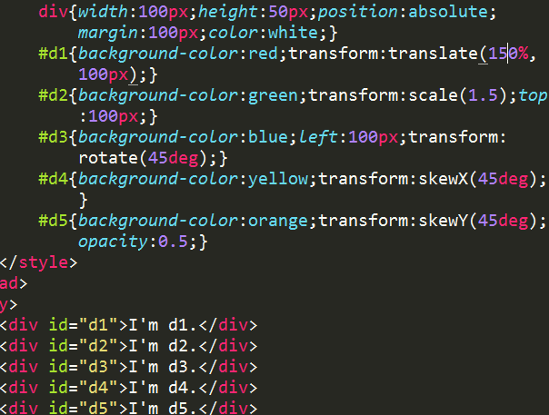
3. 2D transformation: Attribute: transform: Value: ① Displacement: translate Positive move down;); ② Scale: scale (value)/scale (x, y)/scale X (x)/scale Y (y); (* scaling function, 0~1 to reduce, >1 to enlarge;); ③ Rotation: rotate (n deg); (* n is clockwise, the coordinate axis changes after rotation;); ④ Tilt: skew (x deg, y deg)/skew X (x deg)/skew Y (y deg);


4. The parent attribute of 3D conversion: perspective: value: px; (* The distance from the human eye to the projection plane, acting on the parent element and space element, so that the child element obtains a 3D perspective effect;);
5. 3D transformation: Attribute: transform: Value: ①3D rotation: a. rotate X (x deg)/rotate Y (y deg)/rotate Z (z deg); b. rotate3d (x, y, z, n deg); (* x, y, z values 0 or 1;); ② 3D displacement: translate Z (z)/translate3d (x, y, z); ③ 3D display: transform-style: value: a, flat ( Default, 2D shape;); b. preserve-3d (convert to 3D element state;) (* used for space elements);


6. Transition: ① Transition property: transition-property: Value: property (css property name, multiple commas separated;); ② Transition time: transition-duration: Value: s/ms; ③ Transition time speed curve function :transition-timing-function: Values: a, ease (default, slow, fast;); b, linear (uniform speed;); c, ease-in (slow, fast;); d, ease-out (fast, slow;); e. ease-in-out (slowly fast slowly;); ④ Transition delay time: transition-delay: value: s/ms; ⑤ Abbreviation: transition: property duration timing-function delay;


7. Animation: ①Declare animation: @keyframes name { 0%{status of animation start}...50%{}...100%{status of animation end}} (* Compatibility: @-webkit-keyframes name{ }); ② Call animation: a. Call animation name attribute: animation-name:; b. Animation execution duration attribute: animation-duration:; c. Animation speed time curve function: animation-timing-function:; d. Animation delay :animation-delay:; Number of animation playbacks: animation-iteration-count: Value: numerical value/infinite (infinite times); e. Animation playback direction: animation-direction: Value: normal (forward)/reverse (reverse) /alternate (odd, positive, even inverse); ③ Animation synthesis: animation: name duration timing-function delay iteration-count direction; ④ Fill status before and after animation playback: animation-fill-mode: Value: none/forwards (keep last after completion One state)/backwards (the delay time remains in the first state)/both; ⑤Animation play state: animation-play-state: value: paused (pause)/running (play);


Hot AI Tools

Undresser.AI Undress
AI-powered app for creating realistic nude photos

AI Clothes Remover
Online AI tool for removing clothes from photos.

Undress AI Tool
Undress images for free

Clothoff.io
AI clothes remover

Video Face Swap
Swap faces in any video effortlessly with our completely free AI face swap tool!

Hot Article

Hot Tools

Notepad++7.3.1
Easy-to-use and free code editor

SublimeText3 Chinese version
Chinese version, very easy to use

Zend Studio 13.0.1
Powerful PHP integrated development environment

Dreamweaver CS6
Visual web development tools

SublimeText3 Mac version
God-level code editing software (SublimeText3)

Hot Topics
 1390
1390
 52
52
 Is HTML easy to learn for beginners?
Apr 07, 2025 am 12:11 AM
HTML is suitable for beginners because it is simple and easy to learn and can quickly see results. 1) The learning curve of HTML is smooth and easy to get started. 2) Just master the basic tags to start creating web pages. 3) High flexibility and can be used in combination with CSS and JavaScript. 4) Rich learning resources and modern tools support the learning process.
 The Roles of HTML, CSS, and JavaScript: Core Responsibilities
Apr 08, 2025 pm 07:05 PM
HTML defines the web structure, CSS is responsible for style and layout, and JavaScript gives dynamic interaction. The three perform their duties in web development and jointly build a colorful website.
 What is an example of a starting tag in HTML?
Apr 06, 2025 am 12:04 AM
AnexampleofastartingtaginHTMLis,whichbeginsaparagraph.StartingtagsareessentialinHTMLastheyinitiateelements,definetheirtypes,andarecrucialforstructuringwebpagesandconstructingtheDOM.
 Understanding HTML, CSS, and JavaScript: A Beginner's Guide
Apr 12, 2025 am 12:02 AM
WebdevelopmentreliesonHTML,CSS,andJavaScript:1)HTMLstructurescontent,2)CSSstylesit,and3)JavaScriptaddsinteractivity,formingthebasisofmodernwebexperiences.
 Gitee Pages static website deployment failed: How to troubleshoot and resolve single file 404 errors?
Apr 04, 2025 pm 11:54 PM
GiteePages static website deployment failed: 404 error troubleshooting and resolution when using Gitee...
 How to implement adaptive layout of Y-axis position in web annotation?
Apr 04, 2025 pm 11:30 PM
The Y-axis position adaptive algorithm for web annotation function This article will explore how to implement annotation functions similar to Word documents, especially how to deal with the interval between annotations...
 How to use CSS3 and JavaScript to achieve the effect of scattering and enlarging the surrounding pictures after clicking?
Apr 05, 2025 am 06:15 AM
To achieve the effect of scattering and enlarging the surrounding images after clicking on the image, many web designs need to achieve an interactive effect: click on a certain image to make the surrounding...
 Why do you need to call Vue.use(VueRouter) in the index.js file under the router folder?
Apr 05, 2025 pm 01:03 PM
The necessity of registering VueRouter in the index.js file under the router folder When developing Vue applications, you often encounter problems with routing configuration. Special...


