

CSS completion triangle

Achieve this by setting the border attribute of the div!
Set the height and width attributes to 0px respectively, set the border value on the 4 sides to the same width, and see the effect by adjusting the color of the border.
<span style="color: #0000ff;"><</span><span style="color: #800000;">style</span><span style="color: #0000ff;">></span><span style="background-color: #f5f5f5; color: #800000;">
    div</span><span style="background-color: #f5f5f5; color: #000000;">{</span><span style="background-color: #f5f5f5; color: #ff0000;">height</span><span style="background-color: #f5f5f5; color: #000000;">:</span><span style="background-color: #f5f5f5; color: #0000ff;"> 0px</span><span style="background-color: #f5f5f5; color: #000000;">;</span><span style="background-color: #f5f5f5; color: #ff0000;">width</span><span style="background-color: #f5f5f5; color: #000000;">:</span><span style="background-color: #f5f5f5; color: #0000ff;"> 0px</span><span style="background-color: #f5f5f5; color: #000000;">;</span><span style="background-color: #f5f5f5; color: #ff0000;">
        border-top</span><span style="background-color: #f5f5f5; color: #000000;">:</span><span style="background-color: #f5f5f5; color: #0000ff;"> <span style="color: #888888;">20px</span> solid red</span><span style="background-color: #f5f5f5; color: #000000;">;</span><span style="background-color: #f5f5f5; color: #ff0000;">
        border-left</span><span style="background-color: #f5f5f5; color: #000000;">:</span><span style="background-color: #f5f5f5; color: #0000ff;"> 20px solid blue</span><span style="background-color: #f5f5f5; color: #000000;">;</span><span style="background-color: #f5f5f5; color: #ff0000;">
        border-right</span><span style="background-color: #f5f5f5; color: #000000;">:</span><span style="background-color: #f5f5f5; color: #0000ff;"> 20px solid gray</span><span style="background-color: #f5f5f5; color: #000000;">;</span><span style="background-color: #f5f5f5; color: #ff0000;">
        border-bottom</span><span style="background-color: #f5f5f5; color: #000000;">:</span><span style="background-color: #f5f5f5; color: #0000ff;"> 20px solid pink</span><span style="background-color: #f5f5f5; color: #000000;">;</span>
    <span style="background-color: #f5f5f5; color: #000000;">}</span>
    <span style="color: #0000ff;"></</span><span style="color: #800000;">style</span><span style="color: #0000ff;">></span>
<span style="color: #0000ff;"></</span><span style="color: #800000;">head</span><span style="color: #0000ff;">></span>
<span style="color: #0000ff;"><</span><span style="color: #800000;">body</span><span style="color: #0000ff;">></span>
    <span style="color: #0000ff;"><</span><span style="color: #800000;">div</span><span style="color: #0000ff;">></</span><span style="color: #800000;">div</span><span style="color: #0000ff;">></span>
<span style="color: #0000ff;"></</span><span style="color: #800000;">body</span><span style="color: #0000ff;">></span>You will get a square composed of 4 triangles. As shown below:

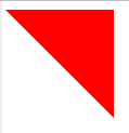
Next, just set the color of the other three sides to remove the triangle to get the triangle. At this time, set the border-color to transparent and you will get the triangle.
<span style="color: #000000;">div{height: 0px;width: 0px;
        border-top: 20px solid red;
        border-left: 20px solid transparent;
        border-right: 20px solid transparent;
        border-bottom: 20px solid transparent;
}</span>Get the following picture:

In addition, transparent is the color value, which is equivalent to rgba(0,0,0,0), and the transparency is 0. However, is not supported in IE6 and will be displayed as shown below by default:

==================To be added later======================
<span style="color: #800000;">div</span>{<span style="color: #ff0000;">
        height</span>:<span style="color: #0000ff;"> 0</span>;<span style="color: #ff0000;">
        width</span>:<span style="color: #0000ff;"> 0</span>;<span style="color: #ff0000;">
        border-top</span>:<span style="color: #0000ff;"> 100px solid red</span>;<span style="color: #ff0000;">
        border-left</span>:<span style="color: #0000ff;"> 100px solid transparent</span>;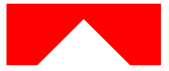
}Occasionally I saw on Baidu that such a setting would form 2 triangles, which I never thought of before, so I recorded it, hehe, the effect is as follows:
==================Subsequent addition (pseudo-class)======================
Pseudo classes (::before and ::after) to make triangles and dialog triangle borders
<span style="color: #800000;">
    div</span>{<span style="color: #ff0000;">margin</span>:<span style="color: #0000ff;"> 20px auto</span>;<span style="color: #ff0000;">height</span>:<span style="color: #0000ff;"> 200px</span>;<span style="color: #ff0000;">width</span>:<span style="color: #0000ff;"> 200px</span>;<span style="color: #ff0000;">position</span>:<span style="color: #0000ff;"> relative</span>;<span style="color: #ff0000;">background</span>:<span style="color: #0000ff;"> red</span>}<span style="color: #800000;">
    div::after</span>{<span style="color: #ff0000;">
        content</span>:<span style="color: #0000ff;"> ''</span>;<span style="color: #ff0000;">
        position</span>:<span style="color: #0000ff;"> absolute</span>;<span style="color: #ff0000;">
        border</span>:<span style="color: #0000ff;"> 100px solid transparent</span>;<span style="color: #ff0000;">
        border-bottom-color</span>:<span style="color: #0000ff;"> #fff</span>;<span style="color: #ff0000;">
        top</span>:<span style="color: #0000ff;"> 0px</span>;<span style="color: #ff0000;">
        left</span>:<span style="color: #0000ff;"> 0px</span>;
}First set all pseudo-class elements to be invisible. The size of border depends on the size of height and width. If it is the border of top and bottom, it is half of height. And control the position through positioning. The effect is as follows:

The situation here is both after and before.
<span style="color: #800000;">div</span>{<span style="color: #ff0000;">margin</span>:<span style="color: #0000ff;"> 20px auto 0</span>;<span style="color: #ff0000;">height</span>:<span style="color: #0000ff;"> 200px</span>;<span style="color: #ff0000;">width</span>:<span style="color: #0000ff;"> 500px</span>;<span style="color: #ff0000;">position</span>:<span style="color: #0000ff;"> relative</span>;<span style="color: #ff0000;">background</span>:<span style="color: #0000ff;"> red</span>}<span style="color: #800000;">
    div::after</span>{<span style="color: #ff0000;">
        content</span>:<span style="color: #0000ff;"> ''</span>;<span style="color: #ff0000;">
        position</span>:<span style="color: #0000ff;"> absolute</span>;<span style="color: #ff0000;">
        border</span>:<span style="color: #0000ff;"> 250px solid transparent</span>;<span style="color: #ff0000;">
        border-bottom-color</span>:<span style="color: #0000ff;"> #fff</span>;<span style="color: #ff0000;">
        top</span>:<span style="color: #0000ff;"> -200px</span>;<span style="color: #ff0000;">
        left</span>:<span style="color: #0000ff;"> 0px</span>;
}When the height and width of the parent element are different, take the bottom part as an example and set the border size to half the width of the parent element. At this time, the top corner of the triangle will be exactly in the center of the parent element, and then adjust the top , let the triangle move up. Note that top should be set to a negative value at this time. The effect is as follows:
There is also the triangular shape in the WeChat dialog box that we often see. I admire the master’s thinking and use two overlapping elements to achieve it, similar to the picture below
The code is as follows:
<span style="color: #800000;">div</span>{<span style="color: #ff0000;">height</span>:<span style="color: #0000ff;"> 100px</span>;<span style="color: #ff0000;">width</span>:<span style="color: #0000ff;"> 100px</span>;<span style="color: #ff0000;">border</span>:<span style="color: #0000ff;"> 1px solid #ccc</span>;<span style="color: #ff0000;">margin</span>:<span style="color: #0000ff;"> 10px auto</span>;<span style="color: #ff0000;">position</span>:<span style="color: #0000ff;"> relative</span>;}<span style="color: #800000;">
    div:before</span>{<span style="color: #ff0000;">
        content</span>:<span style="color: #0000ff;"> ''</span>;<span style="color: #ff0000;">
        height</span>:<span style="color: #0000ff;"> 0</span>;<span style="color: #ff0000;">
        width</span>:<span style="color: #0000ff;"> 0</span>;<span style="color: #ff0000;">
        position</span>:<span style="color: #0000ff;"> absolute</span>;<span style="color: #ff0000;">
        border</span>:<span style="color: #0000ff;"> 10px solid transparent</span>;<span style="color: #ff0000;">
        border-left-color</span>:<span style="color: #0000ff;"> #ccc</span>;<span style="color: #ff0000;">
        top</span>:<span style="color: #0000ff;"> 40px</span>;<span style="color: #ff0000;">
        left</span>:<span style="color: #0000ff;"> 100px</span>;
    }<span style="color: #800000;">
    div:after</span>{<span style="color: #ff0000;">
        content</span>:<span style="color: #0000ff;"> ''</span>;<span style="color: #ff0000;">
        height</span>:<span style="color: #0000ff;"> 0</span>;<span style="color: #ff0000;">
        width</span>:<span style="color: #0000ff;"> 0</span>;<span style="color: #ff0000;">
        position</span>:<span style="color: #0000ff;"> absolute</span>;<span style="color: #ff0000;">
        border</span>:<span style="color: #0000ff;"> 9px solid transparent</span>;<span style="color: #ff0000;">
        border-left-color</span>:<span style="color: #0000ff;"> #fff</span>;<span style="color: #ff0000;">
        top</span>:<span style="color: #0000ff;"> 41px</span>;<span style="color: #ff0000;">
        left</span>:<span style="color: #0000ff;"> 100px</span>;
}A lot of code can be merged here, but to make it more intuitive, I’ll leave it like this for now.
Principle: By setting two pseudo elements and positioning them separately, overlap each other, leaving a 1px non-overlapping area to achieve the effect. Of course, you can adjust top, left, right, and bottom to control the direction of the triangle.

Hot AI Tools

Undresser.AI Undress
AI-powered app for creating realistic nude photos

AI Clothes Remover
Online AI tool for removing clothes from photos.

Undress AI Tool
Undress images for free

Clothoff.io
AI clothes remover

AI Hentai Generator
Generate AI Hentai for free.

Hot Article
Hot Tools

Notepad++7.3.1
Easy-to-use and free code editor

SublimeText3 Chinese version
Chinese version, very easy to use

Zend Studio 13.0.1
Powerful PHP integrated development environment

Dreamweaver CS6
Visual web development tools

SublimeText3 Mac version
God-level code editing software (SublimeText3)
Hot Topics


 Difficulty in updating caching of official account web pages: How to avoid the old cache affecting the user experience after version update?
Mar 04, 2025 pm 12:32 PM
Difficulty in updating caching of official account web pages: How to avoid the old cache affecting the user experience after version update?
Mar 04, 2025 pm 12:32 PM
The official account web page update cache, this thing is simple and simple, and it is complicated enough to drink a pot of it. You worked hard to update the official account article, but the user still opened the old version. Who can bear the taste? In this article, let’s take a look at the twists and turns behind this and how to solve this problem gracefully. After reading it, you can easily deal with various caching problems, allowing your users to always experience the freshest content. Let’s talk about the basics first. To put it bluntly, in order to improve access speed, the browser or server stores some static resources (such as pictures, CSS, JS) or page content. Next time you access it, you can directly retrieve it from the cache without having to download it again, and it is naturally fast. But this thing is also a double-edged sword. The new version is online,
 How do I use HTML5 form validation attributes to validate user input?
Mar 17, 2025 pm 12:27 PM
How do I use HTML5 form validation attributes to validate user input?
Mar 17, 2025 pm 12:27 PM
The article discusses using HTML5 form validation attributes like required, pattern, min, max, and length limits to validate user input directly in the browser.
 What are the best practices for cross-browser compatibility in HTML5?
Mar 17, 2025 pm 12:20 PM
What are the best practices for cross-browser compatibility in HTML5?
Mar 17, 2025 pm 12:20 PM
Article discusses best practices for ensuring HTML5 cross-browser compatibility, focusing on feature detection, progressive enhancement, and testing methods.
 How to efficiently add stroke effects to PNG images on web pages?
Mar 04, 2025 pm 02:39 PM
How to efficiently add stroke effects to PNG images on web pages?
Mar 04, 2025 pm 02:39 PM
This article demonstrates efficient PNG border addition to webpages using CSS. It argues that CSS offers superior performance compared to JavaScript or libraries, detailing how to adjust border width, style, and color for subtle or prominent effect
 What is the purpose of the <datalist> element?
Mar 21, 2025 pm 12:33 PM
What is the purpose of the <datalist> element?
Mar 21, 2025 pm 12:33 PM
The article discusses the HTML <datalist> element, which enhances forms by providing autocomplete suggestions, improving user experience and reducing errors.Character count: 159
 What is the purpose of the <meter> element?
Mar 21, 2025 pm 12:35 PM
What is the purpose of the <meter> element?
Mar 21, 2025 pm 12:35 PM
The article discusses the HTML <meter> element, used for displaying scalar or fractional values within a range, and its common applications in web development. It differentiates <meter> from <progress> and ex
 How do I use the HTML5 <time> element to represent dates and times semantically?
Mar 12, 2025 pm 04:05 PM
How do I use the HTML5 <time> element to represent dates and times semantically?
Mar 12, 2025 pm 04:05 PM
This article explains the HTML5 <time> element for semantic date/time representation. It emphasizes the importance of the datetime attribute for machine readability (ISO 8601 format) alongside human-readable text, boosting accessibilit
 What is the purpose of the <progress> element?
Mar 21, 2025 pm 12:34 PM
What is the purpose of the <progress> element?
Mar 21, 2025 pm 12:34 PM
The article discusses the HTML <progress> element, its purpose, styling, and differences from the <meter> element. The main focus is on using <progress> for task completion and <meter> for stati
