Transform and transition in CSS
transform: Convert
Move, scale, rotate, stretch or stretch elements.
Method: translate():
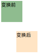
The element moves from its current position, according to the given left (x coordinate) and top (y coordinate) position parameters
There are two divs, their css styles are as follows:
<span style="font-size: 14px;">.before {
            width: 70px;
            height: 70px;
            background-color: #8fbc8f;
        }

 .after {
            width: 70px;
            height: 70px;
            background-color: #ffe4c4;
            -webkit-transform: translate(50px, 30px);
            -moz-transform: translate(50px, 30px);
            -ms-transform: translate(50px, 30px);
            -o-transform: translate(50px, 30px);
            transform: translate(50px, 30px);
        }
</span>
The results are as follows:

rotate()
The element is rotated clockwise by the given angle. Negative values are allowed and the element will be rotated counterclockwise.
There are two divs, their css styles are as follows
<span style="font-size: 14px;">.before {
            width: 70px;
            height: 70px;
            background-color: #8fbc8f;
        }

.after {
            width: 70px;
            height: 70px;
            background-color: #ffe4c4;
            -webkit-transform: rotate(20deg);
            -moz-transform: rotate(20deg);
            -ms-transform: rotate(20deg);
            -o-transform: rotate(20deg);
            transform: rotate(20deg);
        }
</span>The results are as follows:

scale()
The size of the element will increase or decrease according to the given width (X-axis) and height (Y-axis) parameters
There are two divs, their css styles are as follows:
<span style="font-size: 14px;">.before {
            width: 70px;
            height: 70px;
            background-color: #8fbc8f;
        }

.after {
            width: 70px;
            height: 70px;
            background-color: #ffe4c4;
            -webkit-transform: scale(1.5, 0.8);/*宽度变为原来的1.5倍,高度变为原来的0.8倍*/
            -moz-transform: scale(1.5, 0.8);
            -ms-transform: scale(1.5, 0.8);
            -o-transform: scale(1.5, 0.8);
            transform: scale(1.5, 0.8);
        }
</span>The results are as follows:

skew()
The element flips by the given angle, according to the given horizontal (X-axis) and vertical (Y-axis) parameters
<span style="font-size: 14px;">.before {
            width: 70px;
            height: 70px;
            background-color: #8fbc8f;
        }

.after {
            width: 70px;
            height: 70px;
            background-color: #ffe4c4;
            -webkit-transform: skew(20deg, 20deg);/*围绕 X 轴把元素翻转20度,围绕 Y 轴翻转20度*/
            -moz-transform: skew(20deg, 20deg);
            -ms-transform: skew(20deg, 20deg);
            -o-transform: skew(20deg, 20deg);
            transform: skew(20deg, 20deg);
        }
</span>
The results are as follows:

transition: transition
The effect of elements gradually changing from one style to another
There is a div with the following css style:
<span style="font-size: 14px;">div {
            width:100px;
            height:100px;
            background-color: #87cefa;
            -webkit-transition: width 2s;/*时长为2s的宽度变化效果*/
            -moz-transition: width 2s;
            -o-transition: width 2s;
            transition: width 2s;
        }
div:hover{
            width:300px;
        }
</span>
Hot AI Tools

Undresser.AI Undress
AI-powered app for creating realistic nude photos

AI Clothes Remover
Online AI tool for removing clothes from photos.

Undress AI Tool
Undress images for free

Clothoff.io
AI clothes remover

AI Hentai Generator
Generate AI Hentai for free.

Hot Article

Hot Tools

Notepad++7.3.1
Easy-to-use and free code editor

SublimeText3 Chinese version
Chinese version, very easy to use

Zend Studio 13.0.1
Powerful PHP integrated development environment

Dreamweaver CS6
Visual web development tools

SublimeText3 Mac version
God-level code editing software (SublimeText3)

Hot Topics
 What is the purpose of the <datalist> element?
Mar 21, 2025 pm 12:33 PM
The article discusses the HTML <datalist> element, which enhances forms by providing autocomplete suggestions, improving user experience and reducing errors.Character count: 159
 How do I use HTML5 form validation attributes to validate user input?
Mar 17, 2025 pm 12:27 PM
The article discusses using HTML5 form validation attributes like required, pattern, min, max, and length limits to validate user input directly in the browser.
 What is the purpose of the <iframe> tag? What are the security considerations when using it?
Mar 20, 2025 pm 06:05 PM
The article discusses the <iframe> tag's purpose in embedding external content into webpages, its common uses, security risks, and alternatives like object tags and APIs.
 What is the purpose of the <progress> element?
Mar 21, 2025 pm 12:34 PM
The article discusses the HTML <progress> element, its purpose, styling, and differences from the <meter> element. The main focus is on using <progress> for task completion and <meter> for stati
 What is the purpose of the <meter> element?
Mar 21, 2025 pm 12:35 PM
The article discusses the HTML <meter> element, used for displaying scalar or fractional values within a range, and its common applications in web development. It differentiates <meter> from <progress> and ex
 What are the best practices for cross-browser compatibility in HTML5?
Mar 17, 2025 pm 12:20 PM
Article discusses best practices for ensuring HTML5 cross-browser compatibility, focusing on feature detection, progressive enhancement, and testing methods.
 What is the viewport meta tag? Why is it important for responsive design?
Mar 20, 2025 pm 05:56 PM
The article discusses the viewport meta tag, essential for responsive web design on mobile devices. It explains how proper use ensures optimal content scaling and user interaction, while misuse can lead to design and accessibility issues.
 How do I use the HTML5 <time> element to represent dates and times semantically?
Mar 12, 2025 pm 04:05 PM
This article explains the HTML5 <time> element for semantic date/time representation. It emphasizes the importance of the datetime attribute for machine readability (ISO 8601 format) alongside human-readable text, boosting accessibilit


