Various special effects of filter in css3
Various special effects of filter in css3
The filter attribute in css3 can be said to be simple, easy to use and powerful. These effects are applied to pictures to achieve some special effects (can also be applied to vidio, only picture special effects are discussed here).
Browser Compatibility
At present, the compatibility of major browsers with CSS3 is very good. The latest version can support CSS3. Older versions below IE9 still do not support it. However, this is not the point. Microsoft is ready to abandon these antiques. . In addition, IE filters can also be used, which will be discussed separately.
The effects currently supported in the specification are:
grayscale Grayscale The value is a decimal between 0-1
sepia Brown The value is a decimal between 0-1
saturate The saturation value is num
hue-rotate The hue rotation value is angle
invert, the inversion value is a decimal between 0-1
opacity, the transparency value is a decimal between 0-1
brightness, the brightness value is a decimal between 0-1
contrast value is num
blur blur value is length
drop-shadow shadow
usage is the standard CSS writing method, such as:
-webkit-filter: blur(2px);
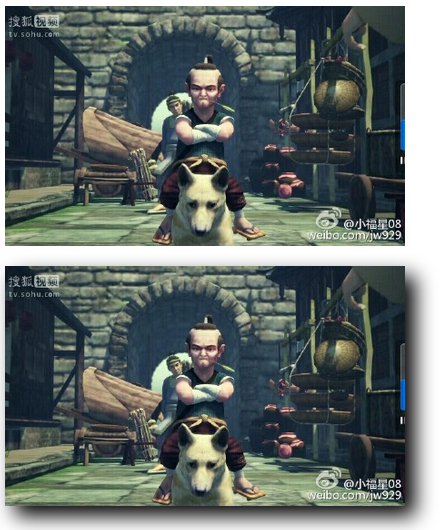
The test browser is Chrom browser version 44.0, The upper part of the sample image is the original image, and the lower part is the image after adding the fifter effect.
grayscale
If there is no value in this effect parameter, it will be rendered at 100%, and the value between 0-1 is different grayscale. The following example is 100% rendering: -webkit-filter:grayscale(1) ;
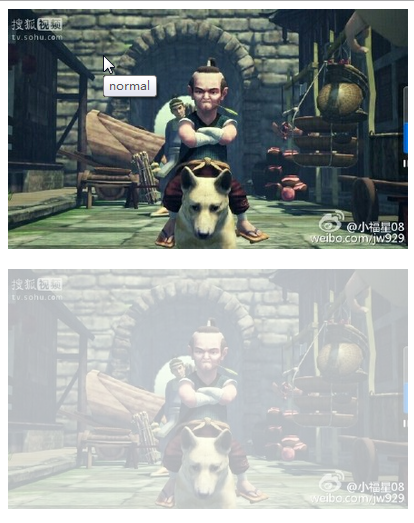
sepia
Brown is the effect of the nostalgia function in Meitu Xiuxiu, and the value is also 0-1. -webkit-filter:sepia(1) ;

saturate saturate
This attribute changes the saturation of the image. The value range is a number. The default value is 100%. The example is 800%: -webkit-saturate (6) ;

hue-rotate hue rotation
Hue-rotate is used to change the hue of the image. The default value is 0deg and the value is angle. Example: -webkit-filter:hue-rotate(180deg)

invert reverse color
The effect of invert is somewhat similar to that of a photo negative, example: -webkit-filter:invert(1)

opacity transparency
This attribute is often encountered, example: -webkit- filter:opacity(0.3)

brightness brightness
Change the brightness of the image, the default value is 100%, example: -webkit-filter:brightness(0.5)
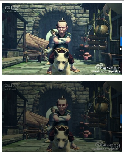
contrast contrast
This attribute value Similar to saturate, example 500%: -webkit-filter:contrast(5)
blur blur
This attribute changes the clarity of the image, the default value is 0, example: -webkit-filter:blur(1px)

drop-shadow shadow
This is similar to box-shadow, adding to the image Shadow, example: -webkit-filter:drop-shadow(10px 10px 10px #000)

Of course, adding multiple attributes is also possible, example: -webkit-filter:saturate(10) hue-rotate(500deg ) grayscale(0.3) sepia(0.7) contrast(2.5) invert(0.2) brightness(1.2);

Hot AI Tools

Undresser.AI Undress
AI-powered app for creating realistic nude photos

AI Clothes Remover
Online AI tool for removing clothes from photos.

Undress AI Tool
Undress images for free

Clothoff.io
AI clothes remover

Video Face Swap
Swap faces in any video effortlessly with our completely free AI face swap tool!

Hot Article

Hot Tools

Notepad++7.3.1
Easy-to-use and free code editor

SublimeText3 Chinese version
Chinese version, very easy to use

Zend Studio 13.0.1
Powerful PHP integrated development environment

Dreamweaver CS6
Visual web development tools

SublimeText3 Mac version
God-level code editing software (SublimeText3)

Hot Topics
 1386
1386
 52
52
 Working With GraphQL Caching
Mar 19, 2025 am 09:36 AM
If you’ve recently started working with GraphQL, or reviewed its pros and cons, you’ve no doubt heard things like “GraphQL doesn’t support caching” or
 Building an Ethereum app using Redwood.js and Fauna
Mar 28, 2025 am 09:18 AM
With the recent climb of Bitcoin’s price over 20k $USD, and to it recently breaking 30k, I thought it’s worth taking a deep dive back into creating Ethereum
 Vue 3
Apr 02, 2025 pm 06:32 PM
It's out! Congrats to the Vue team for getting it done, I know it was a massive effort and a long time coming. All new docs, as well.
 Can you get valid CSS property values from the browser?
Apr 02, 2025 pm 06:17 PM
I had someone write in with this very legit question. Lea just blogged about how you can get valid CSS properties themselves from the browser. That's like this.
 A bit on ci/cd
Apr 02, 2025 pm 06:21 PM
I'd say "website" fits better than "mobile app" but I like this framing from Max Lynch:
 Using Markdown and Localization in the WordPress Block Editor
Apr 02, 2025 am 04:27 AM
If we need to show documentation to the user directly in the WordPress editor, what is the best way to do it?
 Comparing Browsers for Responsive Design
Apr 02, 2025 pm 06:25 PM
There are a number of these desktop apps where the goal is showing your site at different dimensions all at the same time. So you can, for example, be writing
 Stacked Cards with Sticky Positioning and a Dash of Sass
Apr 03, 2025 am 10:30 AM
The other day, I spotted this particularly lovely bit from Corey Ginnivan’s website where a collection of cards stack on top of one another as you scroll.


