css positioning
There are three types of positioning, namely relative positioning: position:relative;, absolute positioning: position:absolute;, fixed positioning: fixed;
Relative positioning
Relative positioning is to fine-tune the position of the element, so that the element is relative to its original position. Make position adjustments. In other words, if a box wants to adjust its position, then it must use relative positioning
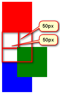
without going off the mark. The original position is still occupied and separated
relative positioning without going off the mark. The real position is In its original position, it's just that the shadow has gone out and can float everywhere.
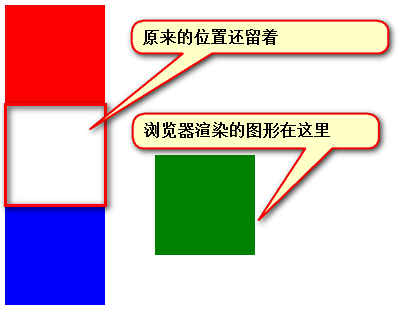
Usage of relative positioning
There are pitfalls in relative positioning, so it is generally not used for the "capping" effect. Page, the effect is minimal. Just two functions:
1) Fine-tuning elements
2) As a reference for absolute positioning, you can use left and right to describe the movement of the right and left of the box; you can use top and bottom to describe the movement of the box Movement down and up.
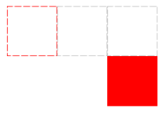 How to implement the above picture:
方法1:
position:relative;
top:100px;
left:200px;

方法2:
position:relative;
bottom:-100px;
right:-200px;

方法3:
position:relative;
top:100px;
right:-200px;

方法4:
position:relative;
bottom:-100px;
left:200px;
Absolute positioning
Absolute positioning is more flexible than relative positioning
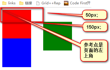 Absolute positioning is out of standard
Absolutely positioned boxes are out of standard document flow. Therefore, all the properties of standard document flows are no longer followed after absolute positioning. After absolute positioning, the label does not distinguish between so-called inline elements and block-level elements. You can set the width and height without display:block;.
Reference point
The reference point of absolute positioning. If it is described by top, then the positioning reference point is the upper left corner of the page, not the upper left corner of the browser:
 If it is described by bottom, then it is the top left corner of the browser. Screen window size, corresponding to the lower left corner of the page:
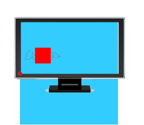 Taking the box as the reference point
An absolutely positioned element. If there is an element that is also positioned in the parent element, then the parent element will be used as the reference point.
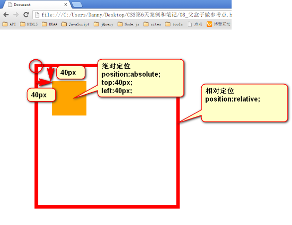 If you want to listen to the nearest ancestor element that has been positioned, it may not be the father, it may be the grandfather:
<div class="box1">      →  相对定位
        <div class="box2">  →  没有定位
            <p></p>         → 绝对定位,将以box1为参考,因为box2没有定位,box1就是最近的父辈元素
        </div>
    </div>

    <div class="box1">      →  相对定位
        <div class="box2">  → 相对定位
            <p></p>         → 绝对定位,将以box2为参考,因为box2是自己最近的父辈元素
        </div>
</div>Not necessarily relative positioning, any positioning can be used as a reference point
<div> → 绝对定位 <p></p> → 绝对定位,将以div作为参考点。因为父亲定位了。</div>
子绝父绝、子绝父相、子绝父固,都是可以给儿子定位的。但是,工程上子绝、父绝,没有一个盒子在标准流里面了,所以页面就不稳固,没有任何实战用途。工程上,“子绝父相”有意义,父亲没有脱标,儿子脱标在父亲的范围里面移动。
<div class=”box1”>          → 绝对定位
    <div class=”box2”>      → 相对定位
        <div class=”box3”>  → 没有定位
            <p></p>         → 绝对定位,以box2为参考定位。
        </div>
    </div>
</div>绝对定位的儿子,无视参考的那个盒子的padding。
<!DOCTYPE html PUBLIC "-//W3C//DTD XHTML 1.0 Transitional//EN" "http://www.w3.org/TR/xhtml1/DTD/xhtml1-transitional.dtd">
<html xmlns="http://www.w3.org/1999/xhtml" xml:lang="en">
<head>
    <meta http-equiv="Content-Type" content="text/html;charset=UTF-8">
    <title>Document</title>
    <style type="text/css">
        *{
            margin: 0;
            padding: 0;
        }
        div{
            width: 200px;
            height: 200px;
            border: 10px solid red;
            padding: 100px;
            padding-top: 150px;
            position: relative;
            margin: 100px;
        }
        p{
            width: 100px;
            height: 100px;
            background-color: orange;
            position: absolute;
            top: 40px;
            left: 40px;
        }
    </style>
</head>
<body>
    <div>
        字字字字字字字字字字字字字字字字字字字字字字字字字字字字字字字字字字字字字字字字字字字字字字字字字字字字字字字字字字字字
        <p></p>
    </div>
</body>
</html>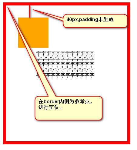
绝对定位的盒子居中
绝对定位之后,所有标准流的规则,都不适用了。所以 margin:0 auto; 失效。绝对定位的盒子居中,只需 left:50%; margin-left: 负的宽度的一半。
<!DOCTYPE html PUBLIC "-//W3C//DTD XHTML 1.0 Transitional//EN" "http://www.w3.org/TR/xhtml1/DTD/xhtml1-transitional.dtd">
<html xmlns="http://www.w3.org/1999/xhtml" xml:lang="en">
<head>
    <meta http-equiv="Content-Type" content="text/html;charset=UTF-8">
    <title>Document</title>
    <style type="text/css">
        div{
            width: 400px;
            height: 60px;
            background-color: green;
            position: absolute;
            left: 50%;
            margin-left: -200px;
        }
    </style>
</head>
<body>
    <div></div>
</body>
</html>固定定位
固定定位,就是相对浏览器窗口定位。页面如何滚动,这个盒子显示的位置不变,固定定位脱标。
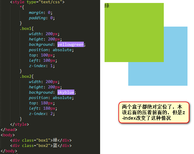
z-index
z-index值表示谁压着谁。数值大的压盖住数值小的。
1)只有定位了的元素,才能有z-index值。也就是说,不管相对定位、绝对定位、固定定位,都可以使用z-index值。而浮动的东西不能用。
2) z-index值没有单位,就是一个正整数。默认的z-index值是0。
3) 如果大家都没有z-index值,或者z-index值一样,那么谁写在HTML后面,谁在上面能压住别人。定位了的元素,永远能够压住没有定位的元素。
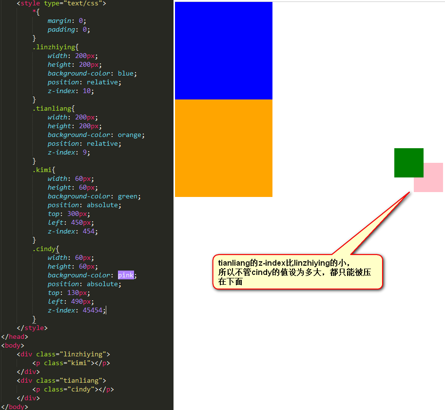
4)父元素的z-index小了,子元素设置的z-index再大也没用。


Hot AI Tools

Undresser.AI Undress
AI-powered app for creating realistic nude photos

AI Clothes Remover
Online AI tool for removing clothes from photos.

Undress AI Tool
Undress images for free

Clothoff.io
AI clothes remover

Video Face Swap
Swap faces in any video effortlessly with our completely free AI face swap tool!

Hot Article

Hot Tools

Notepad++7.3.1
Easy-to-use and free code editor

SublimeText3 Chinese version
Chinese version, very easy to use

Zend Studio 13.0.1
Powerful PHP integrated development environment

Dreamweaver CS6
Visual web development tools

SublimeText3 Mac version
God-level code editing software (SublimeText3)

Hot Topics
 1386
1386
 52
52
 Working With GraphQL Caching
Mar 19, 2025 am 09:36 AM
If you’ve recently started working with GraphQL, or reviewed its pros and cons, you’ve no doubt heard things like “GraphQL doesn’t support caching” or
 Building an Ethereum app using Redwood.js and Fauna
Mar 28, 2025 am 09:18 AM
With the recent climb of Bitcoin’s price over 20k $USD, and to it recently breaking 30k, I thought it’s worth taking a deep dive back into creating Ethereum
 Vue 3
Apr 02, 2025 pm 06:32 PM
It's out! Congrats to the Vue team for getting it done, I know it was a massive effort and a long time coming. All new docs, as well.
 Can you get valid CSS property values from the browser?
Apr 02, 2025 pm 06:17 PM
I had someone write in with this very legit question. Lea just blogged about how you can get valid CSS properties themselves from the browser. That's like this.
 A bit on ci/cd
Apr 02, 2025 pm 06:21 PM
I'd say "website" fits better than "mobile app" but I like this framing from Max Lynch:
 Using Markdown and Localization in the WordPress Block Editor
Apr 02, 2025 am 04:27 AM
If we need to show documentation to the user directly in the WordPress editor, what is the best way to do it?
 Comparing Browsers for Responsive Design
Apr 02, 2025 pm 06:25 PM
There are a number of these desktop apps where the goal is showing your site at different dimensions all at the same time. So you can, for example, be writing
 Stacked Cards with Sticky Positioning and a Dash of Sass
Apr 03, 2025 am 10:30 AM
The other day, I spotted this particularly lovely bit from Corey Ginnivan’s website where a collection of cards stack on top of one another as you scroll.


