1. Features of Float
1. Apply text around pictures
2. Create a block-level box
3. Multi-column floating layout
4. The width and height of floating elements are adaptive, but their values can be set .
2. Core problem solved
Text surrounding the image: The img tag and multiple text labels are placed in a container. If the img floats, the text labels will surround the image.
<img src="/static/imghw/default1.png"  data-src="../img/a.jpg"  class="lazy"     style="max-width:90%" alt="">
        <p>001文件内容文件内容文内容文件内容<br/>
        文件内容文件内容文件内容文件内容文件内内容文件内容<br/>
        文件内容文件内容文件内容文件内容文件内容<br/>
        文件内容文件内容文件内容文件内容文内容文件内容文件内容<br/>
        <p>p标签文件内容文件内容文件内容文件内容文件内容文容文件内容文件内容文件内容</p>
        <div>Div标签文件内容文件内容文件内容文件内容文件内容文件内容</div>
        文件内容文件内容文件内容文件件内容文件内容文件内容<br/>
        文件内容文件内容文件内容文件内容文件内容文件内容文件内容文件内容<br/>
        文件内容文件内容文件内容文件内容文件内容文件内内容文件内容<br/>
        文件内容文件内容文件内容文件容文件内容文件内容<br/>
        文件内容文件内容文件内容文件容文件内容文件内容<br/>
        </p>
2.1 This is a problem
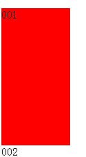
The floating element is adjacent to the normal element, and the float is not cleared between the floating element and the normal element. At this time, the normal element will be covered by the floating element, but the contained content will surround it Floating elements are displayed.
<div style="width: 100px; height: 200px; background: red;float: left;" >001</div>
<div style="width: 100px; height: 200px; background: gray;float: none;" ><p>002</p></div>

001 floats, 002 does not float, but the 002 element itself is covered by 001, but the content is displayed around 001.
3. Non-core and main application areas
Column layout: let the blocks be arranged horizontally first, and then put the excess part into a new row.
Main features
1. The parent height collapses (this is also a serious problem)
.wrap{
           background:red;
           padding:10px;
           width:auto;
        }
        .left{
            background:gray;
            width:200px;
            height:100px;
            float:left;
        }
        .right{
            background:yellow;
            width:100px;
            height:100px;
            float:left;
}<div class="wrap">
<div class="left">left</div>
<div class="right">right</div></div>
2. The width and height become adaptive child elements, but the width and height settings are valid
.wrap{
           background:red;
           padding:10px;
           float:left;
        }
        .left{
            width:100px;
            background:gray;
        }
        .right:{
            width:200px;
            background:yellow;
}<div class="wrap">
<div class="left">left</div>
<div class="right">right</div></div>
2. Solve the problem of high collapse
First of all, we need to understand the two basic concepts of BFC and IFC, because they are closely related to browser rendering.
1.BFC (Block Level Formatting Context)
It is an independently rendered area, stipulating how to lay out the inside of the area, and has nothing to do with the outside. The main rules are as follows:
1.1 The internal box will be vertical, a Place one after another
1.2 The distance in the vertical direction of the Box is determined by margin, and the Margin of two adjacent boxes belonging to the same BFC will overlap
1.3 The BFC area will not overlap with float
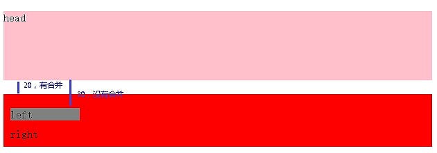
.head{
            background:pink;
            margin: 20px 0px;
            height:100px;
        }
        .wrap{
           background:red;
           padding:10px;
           margin:20px 0px;
           overflow:hidden;
        }
        .left{
            width:100px;
            background:gray;
            margin:10px 0px;
        }
        .right:{
            width:200px;
            background:yellow;
            margin:20px 0px;
}<div class="head">head</div>
<div class="wrap">
<div class="left">left</div>
<div class="right">right</div>
</div>
head and. There are 20px margins at the top and bottom between the two wrap boxes, but overlap occurs; between
.head and .left, .head has a 20px margin, and .left has a 10px margin, but this does not happen. Overlap, because .wrap causes it to create a BFC(overflow:hidden).
1.4 The left margin of each box touches the left side of the containing border box (the same as the right side), and the same is true for floats
2. IFC (line-level formatting context)
Boxes start from the top of the containing block, one by one One is placed horizontally. The space occupied by the horizontal margins, borders, and padding are all put together (display is inline, inline-block; elements with inline characteristics have the following characteristics). The rules are as follows:
2.1 The width and height cannot be specified
2.2 Margin, Padding, and border are invalid in the vertical direction
2.3 The left side of the line box is close to the left side of the containing block, and the right side of the line box is close to the right side of its containing box, and Floating blocks can be inserted between the edge of the containing block and the line box.
2.4 The height of the inline box is determined by line-height.
For examples in this section, you can refer to the inline element in the display chapter.
3. The solution
is mainly implemented based on the principle of BFC. Because BFC renders the entire area, the width and height will also be calculated. This is also the legendary solution for clearing floats
3.1 Method of creating BFC in parent container
3.1.1 Method of creating BFC
a) Values of Float except none;
b) Values of Overflow except visible;
c) Display value is table-cell, table-caption, inline-block, flex, inline-flex, etc.
d) Position value is absloute, fixed
e) Fieldset element
3.1.2 Clear float
a) Float、overflow、display三种方式都可以清除浮动,但position、fieldset虽然创建了bfc但不可以清除浮动(也就是不能解决高度塌陷的问题)。主要原因为:position、fieldset都需要子元素来撑开父容器的高度,但子元素浮动后又不存在高度,所以失效。
b) Float、overflow、display示例代码:
.wrap{
            background: gray;
            padding: 10px;
            overflow: auto;
        }
        .left, .right{
            background: red;
            float: left;
            width: 200px;
            height: 100px;
        }
        .right{
            background: yellow;
        }
        .footer{
            background: pink;
}<div class="wrap" >
<div class="left">left</div>
<div class="right">right</div>
</div><div class="footer">footer</div>
3.1.3 最后一个子元素clear:both
利用clear:both触发父容器重新计算高度的原理实现,示例代码如下:
.wrap{
            background: gray;
            padding: 10px;
        }
        .left, .right{
            background: red;
            float: left;
            width: 200px;
            height: 100px;
        }
        .right{
            background: yellow;
        }
        .footer{
            background: pink;
        }
        .clear{
            clear: both;
            zoom: 1;
}<div class="wrap" >
<div class="left">left</div>
<div class="right">right</div>
<div class="clear"></div>
</div>
<div class="footer">footer</div>3.1.4 After添加最后一个子元素
利用css的:after伪元素实现,动态插入元素并清除浮动:
.wrap{
            background: gray;
            padding: 10px;
        }
        .wrap:after{
            content: '';
            display: block;
            overflow: hidden;
            clear: both;
        }
        .left, .right{
            background: red;
            float: left;
            width: 200px;
            height: 100px;
        }
        .right{
            background: yellow;
        }
        .footer{
            background: pink;
}<div class="wrap" >
<div class="left">left</div>
<div class="right">right</div>
</div>
<div class="footer">footer</div>4. 总结
1. 利用bfc方式清除浮动,简单、浏览器支持良好,但在IE6-版本支持存在问题。但是存在以下局限性,要适环境而用:
a) Overflow方式:滚动条会被隐藏,如果子内容超高则存在显示不全的问题;
b) Float方式:让父容器浮动,那么就存在对父容器同辈元素的影响;
c) Dipslay方式:让父容器变为table或者flex等,都存在不明确的影响,大家都不推荐使用。
2. 最佳解决方案:利用:after添加一个伪元素并给予clear:both和zoom:1来实现清除浮动,兼容性好,对环境影响最小。


