

Teach you step by step how to create a pure CSS icon library

The purpose of writing this article is actually to improve my icon library: iconoo, so let’s get straight to the point and star it, young ladies! (Should I join a github mutual fan group?)

Now that the topic is over, let’s get to the point.
In web development, we often use some small icons (plus, minus, cross, etc.). There are usually two methods:
Use images directly;
Use css/svg to draw icons directly in the browser.
Option 1: Since there are many icon images and the size is small, in order to reduce requests, we often use sprite technology to put the icons together in the same image. You can also imagine that it would be quite troublesome to modify and maintain a bunch of sprite images of icons! A better solution now is to use webpack to import images, and convert the small images directly into base64 and insert them into css. It is relatively simple to use images directly, which is also the more mainstream approach at present.
Option 2: Compared with option 1, it can obviously reduce the size of the resource. It only requires a few css/svg commands to draw beautiful icons, and it is not limited by the size of the image. It can be large or small and is very flexible. At first glance, the pile of code in Solution 2 may seem very difficult, but in fact many simple icons are very easy to implement.
The next step is the hands-on teaching time of Uncle Qieguo that the girls are most looking forward to.
Hand-in-hand teaching time
Using CSS to draw lines uses nothing more than two attributes: border & box-shadow. The shape can be deformed using border-radius and transform, and the position can be adjusted using attributes such as absolute positioning, transform, and margin. CSS drawing, once you have done it a few times, you will know what it is about. In the final analysis, it is still geometry. If you feel that geometry is brain-burning, then just use iconoo~~~
The basic principles have been said, let’s take a look at it, first look at the simplest plus sign:
.plus {
    box-sizing : border-box;
    display    : inline-block;
    position   : relative;
    font-size  : 20px;
}

.plus:before, .plus:after {
    content        : '';
    pointer-events : none;
    position       : absolute;
    left           : 50%;
    top            : 50%;
    transform      : translate(-50%, -50%);
    box-shadow     : inset 0 0 0 1em;
}

.plus:before {
    width  : 1em;
    height : 2px;
}

.plus:after {
    height : 1em;
    width  : 2px;
}The code is still very simple, first of all we use it here When it comes to the two pseudo-classes of before and after, the available tags are added. Otherwise, there is only one tag, and it is too difficult to make fun of it. As the name suggests, content is content, in which you can add various characters, even control characters such as line breaks. Pointer-events:none eliminates mouse pointer events, so that the element is penetrable. Please search for the specific details by yourself, so I won’t go into details here. The core of drawing is to draw two horizontal and vertical lines by setting the width, height and shadow of two pseudo-classes. The position is achieved by absolute positioning + reverse offset, cleverly utilizing the different percentage references of these two properties. Centered horizontally and vertically. All sizes except line width (2px) use the relative unit of em, so adjusting the value of font-size can adjust the size of the icon. To adjust the line width, just change the size of all px units at the same time.
Advanced gameplay
First, let’s take a look at this picture icon:

This graphic should have been talked about a lot online, but I was still confused when I first saw it. . . After analysis, the outermost border can obviously be made with border, and then it is very simple to use a before to make dots. The key is how to draw the two mountains? Box-shadow seems to be able to make multi-layer borders, and then add Does the rotation appear? Finally, just hide the part outside the border. The drawing process is as follows:

.icon-img {
    display: inline-block;
    position: relative;
    box-sizing: border-box;
    width: 90px;
    height: 80px;
    border: 5px solid;
    border-radius: 10px;
    color: #2ba5bb;
    overflow: hidden;
}

.icon-img:before,.icon-img:after {
    content: '';
    pointer-events: none;
    position: absolute;
}

.icon-img:before {
    width: 10px;
    height: 10px;
    top: 18px;
    right: 20px;
    box-shadow: inset 0 0 0 1em;
    border-radius: 50%;
}

.icon-img:after {
    width: 60px;
    height: 50px;
    left: 0;
    bottom: -27px;
    box-shadow: inset 0 0 0 50px,30px -20px 0 0;
    transform: rotate(45deg);
}The code was temporarily put together, and it was not made into em units. Uh, why do we need to use em units?
When we use icons, the size may be different every time, but the size of the icon is related, and it is quite laborious to adjust. Of course, you can think of using zoom and scale to zoom, but the zoom line width will also change accordingly. When setting em, set font-size at the icon level, and then the icon itself and its descendants will use this font-size as a reference. Only adjusting the font-size will complete the proportional scaling of the icon.
Let’s look at another one with deformation:

You can actually guess how it is drawn at a glance. The geometric relationship seems to be relatively simple, but it is very complicated to map it to the CSS rules. Let’s take a look at the process first:

.icon-codepen {
    display: inline-block;
    position: relative;
    box-sizing: border-box;
    color: #2ba5bb;
    width: 2px;
    height: 10px;
    box-shadow: inset 0 0 0 32px,0 15px,-11px 7px,11px 7px;
}

.icon-codepen:before,
.icon-codepen:after {
    content: '';
    pointer-events: none;
    position: absolute;
    width: 11px;
    height: 4px;
}

.icon-codepen:before {
    right: 2px;
    top: 3px;
    transform: skew(0,-35deg) scaleY(0.6);
    box-shadow: inset 0 0 0 32px,0 13px,11px 26px,12px 39px;
}

.icon-codepen:after {
    left: 2px;
    top: 3px;
    transform: skew(0,35deg) scaleY(0.6);
    box-shadow: inset 0 0 0 32px,0 13px,-11px 26px,-12px 39px;
}The difficulty lies in the deformation of length and width. The simpler method for deformation is to use a transformation matrix to solve it. If you don't learn graphics well, it will be more painful. If you don't pursue a single label, you can represent each edge with a label, which will be easy to handle.
Uncle, how about I want to show off
? Think these are just gadgets? Want to show off? Okay, uncle will teach you!

Mona Lisa? What the hell? I will tell you that this can also be drawn with a single tag and pure CSS?
http://codepen.io/jaysalvat/p... Click to preview and see for yourself, The Mona Lisa, made up of thousands of box-shadows, gave me endocrine disorders just looking at it. . .
Static is not enough, let’s get some dynamic:

http://codepen.io/fbrz/pen/iqtlkClick to preview, don’t say much, take it without thanks!
More CSS stuff , please go to codepen to search for treasures! If the codepen cannot be opened, you can go to my blog to download the corresponding css file! What, no download link is provided? F12 Dafa is started!
The beginning and the end are echoed
The Chinese teacher said Okay, the article should echo the theme of sublimation from beginning to end, so one more time: The purpose of writing this article is actually to improve my icon library: iconoo, so let’s get straight to the point, star, young and young women!

Hot AI Tools

Undresser.AI Undress
AI-powered app for creating realistic nude photos

AI Clothes Remover
Online AI tool for removing clothes from photos.

Undress AI Tool
Undress images for free

Clothoff.io
AI clothes remover

AI Hentai Generator
Generate AI Hentai for free.

Hot Article
Hot Tools

Notepad++7.3.1
Easy-to-use and free code editor

SublimeText3 Chinese version
Chinese version, very easy to use

Zend Studio 13.0.1
Powerful PHP integrated development environment

Dreamweaver CS6
Visual web development tools

SublimeText3 Mac version
God-level code editing software (SublimeText3)
Hot Topics


 What does placeholder mean in vue
May 07, 2024 am 09:57 AM
What does placeholder mean in vue
May 07, 2024 am 09:57 AM
In Vue.js, the placeholder attribute specifies the placeholder text of the input element, which is displayed when the user has not entered content, provides input tips or examples, and improves form accessibility. Its usage is to set the placeholder attribute on the input element and customize the appearance using CSS. Best practices include being relevant to the input, being short and clear, avoiding default text, and considering accessibility.
 What does span mean in js
May 06, 2024 am 11:42 AM
What does span mean in js
May 06, 2024 am 11:42 AM
The span tag can add styles, attributes, or behaviors to text. It is used to: add styles, such as color and font size. Set attributes such as id, class, etc. Associated behaviors such as clicks, hovers, etc. Mark text for further processing or citation.
 What does rem mean in js
May 06, 2024 am 11:30 AM
What does rem mean in js
May 06, 2024 am 11:30 AM
REM in CSS is a relative unit relative to the font size of the root element (html). It has the following characteristics: relative to the root element font size, not affected by the parent element. When the root element's font size changes, elements using REM will adjust accordingly. Can be used with any CSS property. Advantages of using REM include: Responsiveness: Keep text readable on different devices and screen sizes. Consistency: Make sure font sizes are consistent throughout your website. Scalability: Easily change the global font size by adjusting the root element font size.
 How to introduce images into vue
May 02, 2024 pm 10:48 PM
How to introduce images into vue
May 02, 2024 pm 10:48 PM
There are five ways to introduce images in Vue: through URL, require function, static file, v-bind directive and CSS background image. Dynamic images can be handled in Vue's computed properties or listeners, and bundled tools can be used to optimize image loading. Make sure the path is correct otherwise a loading error will appear.
 What is node in js
May 07, 2024 pm 09:06 PM
What is node in js
May 07, 2024 pm 09:06 PM
Nodes are entities in the JavaScript DOM that represent HTML elements. They represent a specific element in the page and can be used to access and manipulate that element. Common node types include element nodes, text nodes, comment nodes, and document nodes. Through DOM methods such as getElementById(), you can access nodes and operate on them, including modifying properties, adding/removing child nodes, inserting/replacing nodes, and cloning nodes. Node traversal helps navigate within the DOM structure. Nodes are useful for dynamically creating page content, event handling, animation, and data binding.
 What language is the browser plug-in written in?
May 08, 2024 pm 09:36 PM
What language is the browser plug-in written in?
May 08, 2024 pm 09:36 PM
Browser plug-ins are usually written in the following languages: Front-end languages: JavaScript, HTML, CSS Back-end languages: C++, Rust, WebAssembly Other languages: Python, Java
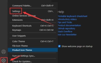 How to set unknown attributes in vscode vscode method to set unknown attributes
May 09, 2024 pm 02:43 PM
How to set unknown attributes in vscode vscode method to set unknown attributes
May 09, 2024 pm 02:43 PM
1. First, open the settings icon in the lower left corner and click the settings option. 2. Then, find the CSS column in the jumped window. 3. Finally, change the drop-down option in the unknownproperties menu to the error button.
 What do ref and id in vue do?
May 02, 2024 pm 08:42 PM
What do ref and id in vue do?
May 02, 2024 pm 08:42 PM
In Vue.js, ref is used in JavaScript to reference a DOM element (accessible to subcomponents and the DOM element itself), while id is used to set the HTML id attribute (can be used for CSS styling, HTML markup, and JavaScript lookup).
