Create 3D scenes with H5 Amazing CSS3D
We know that 3D representation allows us to see the display effect of real objects from different angles through a plane.
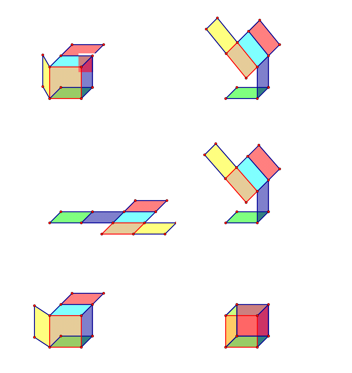
In the computer world, the 3D world is composed of points. Two points can form a straight line, three points that are not on a straight line can form a triangular surface, and countless triangular surfaces can form objects of various shapes, as follows picture.

The principle of the model parser in Three is to store the vertices of the model in an array, and then use the face function in three to obtain the indexes of three or four vertices in the fixed-point array to form a spatial plane. By repeating this process, the model is completely constructed.
So, the more complex the object, the more mesh splicing is required. There is no ability to establish a spatial plane based on coordinates in CSS.
(As a digression, in fact, CSS has an attribute related to coordinates, which is clip-path. The characteristics of this attribute give CSS3 certain modeling capabilities. For implementation methods, please refer to this article 3D created by pure clip-path Model renderer)
CSS3 to achieve 3D panorama
. The previous article introduced some manifestations of Web3D. Here we focus on how to achieve 3D panorama with CSS3. Next, we will explore Three's solution to realize panorama, because the threshold and learning cost of WebGL are still relatively high, and it is not suitable for rapid development. There have been articles on the CSS3D Panorama of the Creation Festival that have explored the technology, but none of them have gone into depth about the specific implementation methods.
To clearly understand the implementation method, you must have a certain understanding of CSS3 transform and perspective.
I won’t go into details about the principles. You can read this article first to get a general idea of CSS3D.
Play with CSS 3D - Principle
CSS panorama can be achieved by creating a column or cube and then using mapping. Some people may ask, can a sphere work? In fact, it is not possible. The sphere model is composed of countless tiny planes spliced together to form a coherent surface, and CSS lacks the property to distort the plane. We can build the sphere model using Clip-3d mentioned above, but the texture problem cannot be solved.
Sky Box
I believe that many colleagues who have created or learned about 3D panoramas know this concept. In fact, Skybox is a cube. By pasting different pictures on the six sides, the edges can fit seamlessly, and then the perspective is extended into the inside of the box. It can be imagined that we are standing inside a giant cube box, and we can see different scenes by moving our perspective.
1. Texture
Let’s look at a sky box texture. The edge pointed by the cutter head represents the edge that needs to be seamlessly fitted.
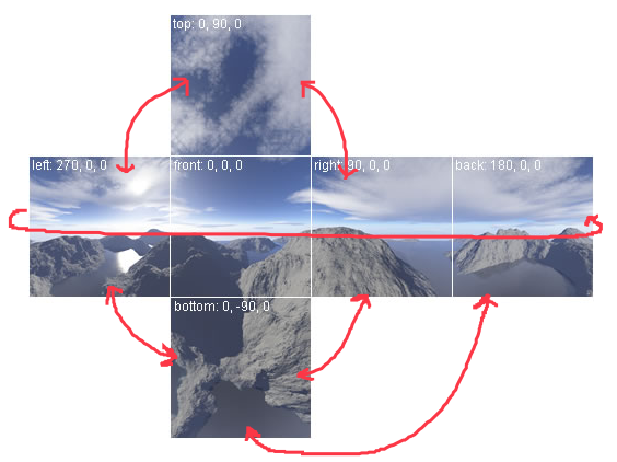
As you can see from the picture above, as long as the images on the two surfaces that fit each other can be seamlessly spliced, then by performing certain rotation transformations on each surface, the sky box can be created.
Then the question is, how to take pictures like this? This requires some professional software, such as pano2vr, max, etc. In fact, panoramas created using these professional tools have very high requirements for image quality and stitching, and relying solely on changes in CSS3 cannot give them a good experience.
But what we are discussing today is the panorama created by H5 for certain operational activities. This panorama may not necessarily actually exist, or there may be a certain proportion gap between it and the real scene. For example, the starry sky and the bottom of the sea. For the creation of this kind of panorama whose fit can be artificially changed, we can use existing high-definition pictures and convert them into six-sided panoramas through PS.
Post an article Create a Skybox From Photos
In fact, the main idea is to
outline the selection of six faces on a large picture>
select an adjacent face of a face in the large image and rotate it to the box that needs to be assembled Make them fit perfectly on a certain surface>
After obtaining the most reasonable six-sided map, observe whether new edges are created, and use tools such as masks to blend them naturally.
2. After the texture construction is completed, the cube can be created. First, cut out the six created faces and name the marked positions with front, back, left, right...
 .sence {      -webkit-perspective: 1000px;    }
    .cube {      width: 500px;      height: 500px;      margin: 100px auto;      transform-style: preserve-3d;    }
    .cube img {      width: 130px;      height: 130px;      position: absolute;    }
    .cube img:nth-child(1) {    }
    .cube img:nth-child(2) {      transform:  rotateY(180deg);    }
    .cube img:nth-child(3) {      transform:  rotateY(90deg);    }
    .cube img:nth-child(4) {      transform:  rotateY(-90deg);    }
    .cube img:nth-child(5) {      transform:  rotateX(90deg);    }
.cube img:nth-child(6) { transform: rotateX(-90deg); }<div class="sence">
<div class="cube">
<img src="/static/imghw/default1.png" data-src="img/skybox/front.jpg" class="lazy" alt="" />
<img src="/static/imghw/default1.png" data-src="img/skybox/back.jpg" class="lazy" alt="" />
<img src="/static/imghw/default1.png" data-src="img/skybox/left.jpg" class="lazy" alt="" />
<img src="/static/imghw/default1.png" data-src="img/skybox/right.jpg" class="lazy" alt="" />
<img src="/static/imghw/default1.png" data-src="img/skybox/top.jpg" class="lazy" alt="" />
<img src="/static/imghw/default1.png" data-src="img/skybox/bottom.jpg" class="lazy" alt="" />
</div>
</div>Prepare 6 faces and load the textures. By rotating, each face is rotated to the corresponding position. For example, the surface on the left is obtained by rotating the picture originally facing us 90° counterclockwise around the Y axis. (Note that counterclockwise rotation of the Y-axis is a positive number)
At this time, you will get an effect like the picture below:
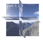
But since the rotation center of each face is at its center, it cannot yet form a cube. So we need to allow each surface to have a certain displacement.
Post a coordinate system diagram to help everyone understand.
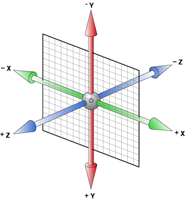
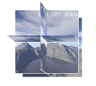
Now first move the front to where it should be. Since the lens of the panorama is inside the cube, you can imagine that we need to move the picture backward. The distance moved is obviously half the length of the side of the cube. Here it's 65px. Get the result below.
.cube img:nth-child(1) {
  transform: translateZ(-65px);
     }
Looking at it this way, does the back displacement be translateZ(65px), left is translateX(-65px), and top translateY(-65px)? But the result is not what we want.
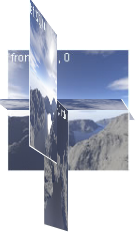
Looking back at the map of the spatial coordinate system above, we will find that after the plane is rotated, the positions of its corresponding three axes also change. For example, after the picture is rotated around Y, the Z axis points in the horizontal direction of the screen. After rotating around X, the Z axis points vertically. Therefore, we can easily find that in fact, to move the veneer to the correct position, we only need to ask them to translateZ(-width/2px).
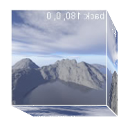
In order to make it easier for everyone to understand, I have set up a larger perspective here. To get a panoramic effect, we just need to zoom in and let it enter the box.

Next, bind the gesture and you can make it move.
Part of the code:
viewer.on('touchstart', function(e) {
    x1 = e.targetTouches[0].pageX; - $(this).offset().left;
    y1 = e.targetTouches[0].pageY; - $(this).offset().top;
});

viewer.on('touchmove',function(){
    var dist_x = x2 - x1,
        dist_y = y2 - y1,
        deg_x = Math.atan2(dist_y, perspective) / Math.PI * 180,
        deg_y = -Math.atan2(dist_x, perspective) / Math.PI * 180,
        i,
        c_x_deg += deg_x;
        c_y_deg += deg_y;

    cube.css('transform', 'rotateX(' + deg_x + 'deg) rotateY(' + deg_y + 'deg)');
})Math.atan2(y,x) method: Get the angle from the x-axis to the point (x,y). It is difficult to understand the left system of space. You can imagine that the angle of rotation of a plane with the Z axis of space as the Y axis around the positive direction of the X axis is the angle of rotation of the cube around the Y axis of space.
Cylinder
Cylinder panorama is not too complicated. Regarding the method of creating a cylindrical shape, you can refer to this article CSS3 3D transforms series tutorial-3D carousel
With this foundation, we can write a function to quickly construct a cylindrical panorama.
Let’s take a look at the page structure first
<style>
  body {
    height: 100%;
    overflow: hidden;
  }
    .scene {
      width: 100%;
      height: 1170px;
      transform: translateX(-50%) translateY(-50%);
      top: 50%;
      left: 50%;
      position: absolute;
    }
    .cube {
      transform-style: preserve-3d;
      height: 100%;
      width: 100%;
      margin: 0px auto;
    }
    .cube_bg {
      transform-style: preserve-3d;
      height: 100%;
      width: 128px;
      margin: 0px auto;
    }
    .cube_bg div {
      height: 100%;

      /* 这里为圆柱形的每个面都设定了同样的背景图 那么在建造柱形时不再需要手动切图 */
      background-image: url("img/zao/zao.png");

      background-repeat: no-repeat;
      position: absolute;
      top: 0;
    }
</style>

<body>
  <div class="scene">
    <div class="cube">
      <div class="cube_bg">
        <!--
        这里是柱形全景背景贴图
        -->
      </div>
      <div class="cube_item">
        <!--
        这里是柱形全景中的小元件
        -->
      </div>
    </div>
  </div>
</body>function creCylinder(lenZ,pieceWid,angle,slice){
/*
pieceWid 表示单个柱形块状宽度
angle表示柱形内角
slice表示有多少个面拼接
slice越多,拼合的面越接近曲面
*/
var l = pieceWid*slice; // 画布全长
var ag = angle/slice // 旋转角度
var html = '';
/*
设置每个面的旋转角度和位移 因为要分割成多个面,所以应该为每个面的背景图设置不同的`background-position`
*/
for(var i=0,len=slice;i<len;i++){
html+='<div style="transform: rotateY(-'+ag*i+'deg) '+
'translateZ('+lenZ+'px);'+
'width:'+(pieceWid)+'px;'+
'background-position: -'+(i*pieceWid)+'px 0;'+
'background-size: '+(l)+'px 100%;"></div>';
}
return html;
}
function renderPano(pieceWid,angle,slice){
var vw = $(window).width();
var RADIAN = 0.017453293; // 弧度制 将角度转成弧度
var innerAngle = angle/(2*slice); //内角,用来计算translateZ
// 这里的原理和上文旋转木马链接一致
var lenZ = -(pieceWid/2)*Math.tan((90-innerAngle)*RADIAN);
/*
因为默认是由画布的最左端开始旋转 所以处于我们面前的是画布的最左端和最右端及其连接处
要想画布中央显示再我们面前,这里需要给cube_bg加上一定的绕Y旋转角度
*/
var rotate = ((angle/slice)*(slice-1))/2,
perspective = -lenZ-5;
var cube_bg = $('.cube_bg'),
scene = $('.scene');
var cylinder = creCylinder(lenZ,pieceWid,angle,slice);
cube_bg.html(cylinder).css('transform','rotateY('+rotate+'deg)');
scence.css('-webkit-perspective',perspective+'px');
//最后调用一下
renderPano(128,360,20);Here is an explanation of why perspective should be set to -lenZ-5
Look at a picture, the lenZ above is the translateZ value, which is a negative value.
perspective is the distance from the lens to the screen, because the lens is inside the cylinder at this time, so the image behind the cylinder cannot be seen.
When the perspective value is -lenZ, the back surface of the cylinder can be on the same plane as the lens. In order to avoid it having a certain probability of blocking the lens, we can zoom in closer to the lens. It is set to -lenZ-5. At this time, it can be ensured that the lens is inside the cylinder, and at the same time, the panoramic view of the cylinder can be observed from a wider angle.
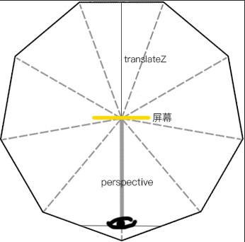
You can copy the code to experience it. The background image here is the Creation Festival background image I put together myself.
Comparison of advantages and disadvantages
I believe everyone has realized that the sky box is relatively simple to manufacture, and both the sky and the ground can be taken into consideration. However, because the fitting angle between the surfaces is too large, if the object happens to be on two surfaces that are attached to each other, it will give people the feeling of being broken at the waist. The column chart has a better solution to this situation, but the sky and ground textures are more difficult. Generally, they can only be simulated by adding background images to the scene.

Hot AI Tools

Undresser.AI Undress
AI-powered app for creating realistic nude photos

AI Clothes Remover
Online AI tool for removing clothes from photos.

Undress AI Tool
Undress images for free

Clothoff.io
AI clothes remover

AI Hentai Generator
Generate AI Hentai for free.

Hot Article

Hot Tools

Notepad++7.3.1
Easy-to-use and free code editor

SublimeText3 Chinese version
Chinese version, very easy to use

Zend Studio 13.0.1
Powerful PHP integrated development environment

Dreamweaver CS6
Visual web development tools

SublimeText3 Mac version
God-level code editing software (SublimeText3)

Hot Topics
 1376
1376
 52
52
 What is the purpose of the <progress> element?
Mar 21, 2025 pm 12:34 PM
The article discusses the HTML <progress> element, its purpose, styling, and differences from the <meter> element. The main focus is on using <progress> for task completion and <meter> for stati
 What is the purpose of the <datalist> element?
Mar 21, 2025 pm 12:33 PM
The article discusses the HTML <datalist> element, which enhances forms by providing autocomplete suggestions, improving user experience and reducing errors.Character count: 159
 What are the best practices for cross-browser compatibility in HTML5?
Mar 17, 2025 pm 12:20 PM
Article discusses best practices for ensuring HTML5 cross-browser compatibility, focusing on feature detection, progressive enhancement, and testing methods.
 What is the purpose of the <meter> element?
Mar 21, 2025 pm 12:35 PM
The article discusses the HTML <meter> element, used for displaying scalar or fractional values within a range, and its common applications in web development. It differentiates <meter> from <progress> and ex
 How do I use the HTML5 <time> element to represent dates and times semantically?
Mar 12, 2025 pm 04:05 PM
This article explains the HTML5 <time> element for semantic date/time representation. It emphasizes the importance of the datetime attribute for machine readability (ISO 8601 format) alongside human-readable text, boosting accessibilit
 How do I use HTML5 form validation attributes to validate user input?
Mar 17, 2025 pm 12:27 PM
The article discusses using HTML5 form validation attributes like required, pattern, min, max, and length limits to validate user input directly in the browser.
 What is the viewport meta tag? Why is it important for responsive design?
Mar 20, 2025 pm 05:56 PM
The article discusses the viewport meta tag, essential for responsive web design on mobile devices. It explains how proper use ensures optimal content scaling and user interaction, while misuse can lead to design and accessibility issues.
 What is the purpose of the <iframe> tag? What are the security considerations when using it?
Mar 20, 2025 pm 06:05 PM
The article discusses the <iframe> tag's purpose in embedding external content into webpages, its common uses, security risks, and alternatives like object tags and APIs.


