CSS implements movement within 1px
The previous article talked about the solution of vertical alignment of inline elements. If you are interested, you can read my previous articles. In the previous article we mentioned the issue of movement within 1px. This article gives solutions to problems within one pixel.
You may have seen the one-pixel border issue on Retina screens. Note that this is the border width and not the mobile element.
What? border less than 1px?
Yes, because someone has given relevant solutions before and there are many solutions. I will not repeat the implementation principle here. I will give you two links. If you are interested, you can jump to it.
How to implement a true 1px line on mobile devices with Retina screens?
The secret of moving web points by 5 pixels
After reading it, I was enlightened, admired, and had many ideas. Back to the focus of this article
Think about the methods to achieve movement position(top,right,bottom,left), margin, padding, vertical -align.
The above are only some methods that can be moved by specific units (px, em, rem, etc.)
Based on the principle of practice, the above solutions are not feasible. In the latest chrome, when it is less than 0.5px, it is 0 , when it is greater than or equal to 0.5px, it becomes 1px.
Because the case is too simple, I won’t do a demo. Those who are interested can practice it by themselves. I believe most of you have tried it.
So what other properties are there that can move in specific units?
Solution
Maybe you already know that there is a translate attribute of transform . That’s right, it can move within 1px!
Basic syntax:
transform: translate(12px, 50%);
transform: translateX(2em);
transform: translateY(3in);
gives the demo code of this article,
<div class="parent">
  <div class="child-first"></div>
  <div class="child-second"></div>
  <div class="child-third"></div>
</div>

<style>
  .parent {
    width: 310px;
    height: 150px;
    background-color: #666;
  }

  .parent div {
    display: inline-block;
  }

  .child-first {
    width: 100px;
    height: 100px;

    margin-top: .5px;

    transform: translateY(.3px);

    background-color: #f66;
  }

  .child-second {
    width: 100px;
    height: 100px;

    transform: translateY(.5px);

    background-color: #ff0;
  }

  .child-third {
    width: 100px;
    height: 100px;

    transform: translateY(1px);

    background-color: #06c;
  }
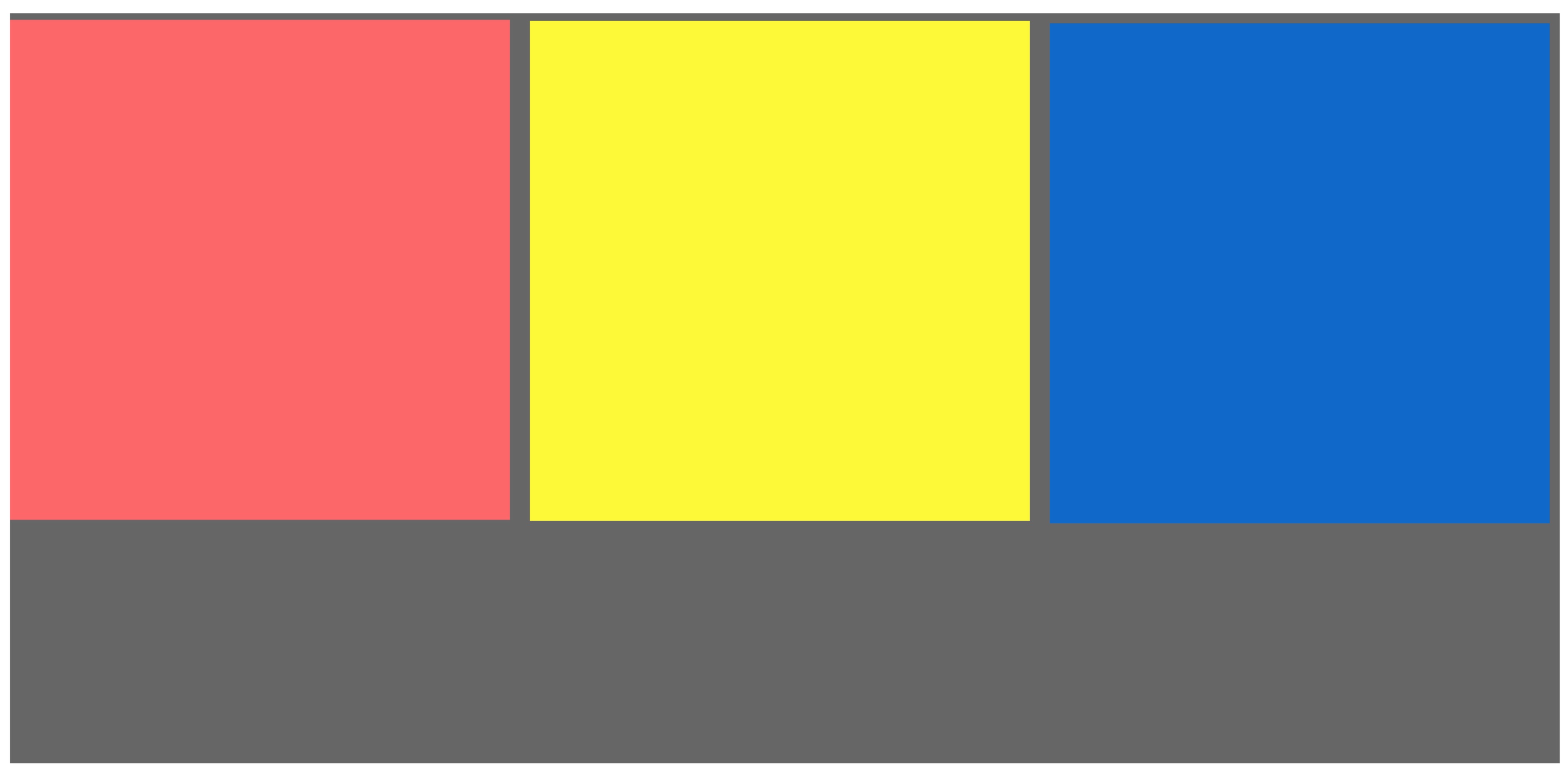
</style>The screenshot is as follows

Here for easier observation, we changed the layout to inline-block, and we found that there are gaps between elements. Looking at the code again, I found that there is no problem. So what caused this distance?
Is it a space? That’s right! When using inline-block, be sure to pay attention to unnecessary trouble caused by code indentation or line breaks (spaces are added unintentionally).
Modify as follows
<div class="parent">
  <div class="child-first"></div><div class="child-second"></div><div class="child-third"></div>
</div>
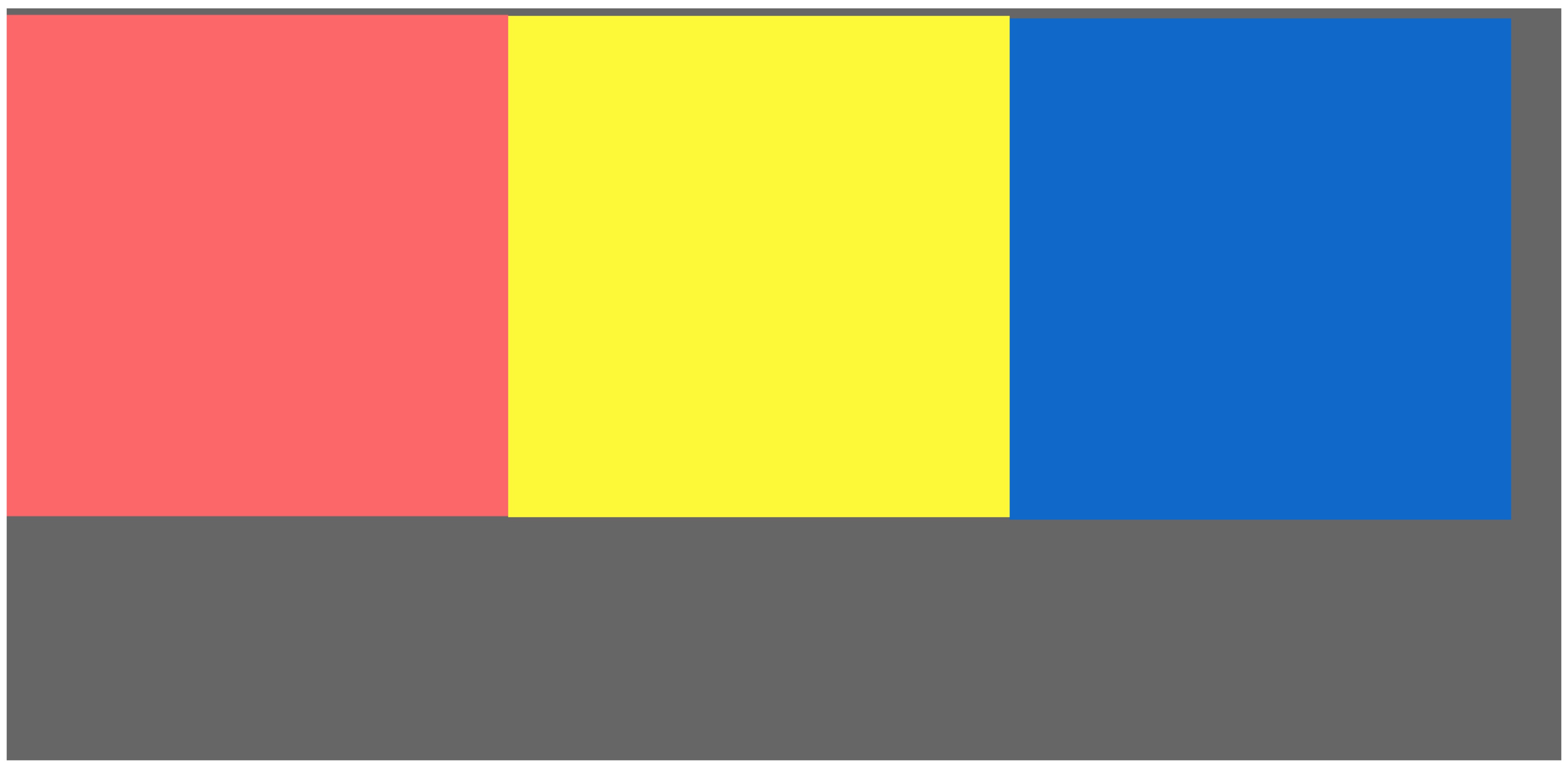
Get the final result, as shown below

Here we specially distinguish the colors of the small blocks, and the browser view is enlarged to the maximum multiple. If you still can’t see clearly, I recommend everyone to try it with your own hands,
Summary
This is the end of my method. I welcome everyone to discuss at the end. There is more than one solution. Orange has only found this one solution so far. You can also judge the screen based on js and give an offset of .5 pixels, which is also feasible. I personally think this method is simpler.

Hot AI Tools

Undresser.AI Undress
AI-powered app for creating realistic nude photos

AI Clothes Remover
Online AI tool for removing clothes from photos.

Undress AI Tool
Undress images for free

Clothoff.io
AI clothes remover

Video Face Swap
Swap faces in any video effortlessly with our completely free AI face swap tool!

Hot Article

Hot Tools

Notepad++7.3.1
Easy-to-use and free code editor

SublimeText3 Chinese version
Chinese version, very easy to use

Zend Studio 13.0.1
Powerful PHP integrated development environment

Dreamweaver CS6
Visual web development tools

SublimeText3 Mac version
God-level code editing software (SublimeText3)

Hot Topics
 1387
1387
 52
52
 How to use bootstrap in vue
Apr 07, 2025 pm 11:33 PM
Using Bootstrap in Vue.js is divided into five steps: Install Bootstrap. Import Bootstrap in main.js. Use the Bootstrap component directly in the template. Optional: Custom style. Optional: Use plug-ins.
 The Roles of HTML, CSS, and JavaScript: Core Responsibilities
Apr 08, 2025 pm 07:05 PM
HTML defines the web structure, CSS is responsible for style and layout, and JavaScript gives dynamic interaction. The three perform their duties in web development and jointly build a colorful website.
 How to write split lines on bootstrap
Apr 07, 2025 pm 03:12 PM
There are two ways to create a Bootstrap split line: using the tag, which creates a horizontal split line. Use the CSS border property to create custom style split lines.
 Understanding HTML, CSS, and JavaScript: A Beginner's Guide
Apr 12, 2025 am 12:02 AM
WebdevelopmentreliesonHTML,CSS,andJavaScript:1)HTMLstructurescontent,2)CSSstylesit,and3)JavaScriptaddsinteractivity,formingthebasisofmodernwebexperiences.
 How to resize bootstrap
Apr 07, 2025 pm 03:18 PM
To adjust the size of elements in Bootstrap, you can use the dimension class, which includes: adjusting width: .col-, .w-, .mw-adjust height: .h-, .min-h-, .max-h-
 How to use bootstrap button
Apr 07, 2025 pm 03:09 PM
How to use the Bootstrap button? Introduce Bootstrap CSS to create button elements and add Bootstrap button class to add button text
 How to set up the framework for bootstrap
Apr 07, 2025 pm 03:27 PM
To set up the Bootstrap framework, you need to follow these steps: 1. Reference the Bootstrap file via CDN; 2. Download and host the file on your own server; 3. Include the Bootstrap file in HTML; 4. Compile Sass/Less as needed; 5. Import a custom file (optional). Once setup is complete, you can use Bootstrap's grid systems, components, and styles to create responsive websites and applications.
 How to insert pictures on bootstrap
Apr 07, 2025 pm 03:30 PM
There are several ways to insert images in Bootstrap: insert images directly, using the HTML img tag. With the Bootstrap image component, you can provide responsive images and more styles. Set the image size, use the img-fluid class to make the image adaptable. Set the border, using the img-bordered class. Set the rounded corners and use the img-rounded class. Set the shadow, use the shadow class. Resize and position the image, using CSS style. Using the background image, use the background-image CSS property.


