
1.1 Rounded corner attributes
CSS3 provides 5 types of rounded corner attributes:
border-radius: Set the rounded corner styles of 4 borders at the same time.
border-top-left-radius: Set the rounded corner style of the upper left corner border.
border-top-right-radius: Set the rounded corner style of the upper right corner border.
border-bottom-left-radius: Set the rounded corner style of the lower left corner border.
border-bottom-right-radius: Set the rounded corner style of the lower right corner border.
Example:

1.2 Browser support
Minimum version support: IE 9, Chrome 4
1.3 Reference information
Specification: https://www.w3.org/TR/css3- background/#the-border-radius
Documentation: https://developer.mozilla.org/zh-CN/docs/Web/CSS/border-radius
2. The format and type of value
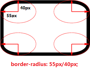
border The value of the -*-radius attribute can set the horizontal radius and vertical radius respectively; if the vertical radius is omitted, the vertical radius defaults to the value of the horizontal radius.
For each value, the supported units are fixed length and percentage. If you set the percentage format, the percentage of the horizontal radius refers to the width of the border, and the percentage of the vertical radius refers to the height of the border.
The combination is as follows (taking border-radius as an example):
1) border-radius:20px; // Indicates that the horizontal radius and vertical radius of the fillet are both 20px in length.
2) border-radius:20px/40px; // Indicates that the length of the horizontal radius of the fillet is 20px and the length of the vertical radius is 20px.
3) border-radius:20%; // Indicates that the horizontal radius and vertical radius of the fillet are both 20% of the respective border lengths.
4) border-radius:20%/30%; // Indicates that the horizontal radius of the fillet is 20% of the border width, and the vertical radius is 20% of the border height.
5) border-radius:20px/30%; // Indicates that the horizontal radius length of the fillet is 20px, and the vertical radius is 20% of the border height.
Example:
3. Border-radius 1~4 parameter description
border-radius can set the same value for the four corners at once, or you can set the rounded corner style for the four corners separately.
The secret lies in setting the number of border-radius parameters.
First, let’s take a look at the parameter description of border-radius in the CSS specification: [
It can be known that the number of parameters of border-radius ranges from 1 to 4. Here we should pay attention to the use of point horizontal radius and vertical radius respectively: first set the horizontal radius of the four corners in border-radius and then set Vertical radius of 4 corners.
The following explains the meanings of parameters 1~4 respectively:
3.1 Number of parameters: 1
Explanation: The rounded corner styles of the 4 borders all use this setting.
Example: border-radius: 20px; //The 4 border rounded corner styles are all 20px

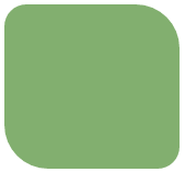
3.2 Number of parameters: 2
Description:
parameter ①: the circles of the upper left corner and lower right corner border Angular style.
The second parameter: the rounded corner style of the upper right corner and lower left corner borders.
Example: border-radius: 20px 40px; // Upper left corner and lower right corner: 20px; Upper right corner and lower left corner: 40px
3.3 Number of parameters: 3
Description:
The ① parameter: the rounded corner style of the upper left corner border.
The second parameter: the rounded corner style of the upper right corner and lower left corner borders.
The ③ parameter: the rounded corner style of the lower right corner border.
Example: border-radius:20px 40px 60px; // Upper left corner: 20px; Upper right corner and lower left corner: 40px; Lower right corner: 60px Parameters: The rounded corner style of the upper left corner border.
The second parameter: the rounded corner style of the upper right corner border. 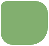
3.4 Number of parameters: 4
Description:
The first parameter: the rounded corner style of the upper left corner border.
The second parameter: the rounded corner style of the upper right corner border. 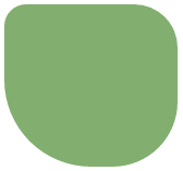
1. border-radius: 20px; // 同时设置4个边框圆角样式:水平半径和垂直半径都为20px
<br/>
<div class="div border-radius-1"></div><br/>
2.border-radius:20px 40px; // 左上角和右下角:20px;右上角和左下角:40px
<br/>
<div class="div border-radius-2"></div><br/>
3.border-radius:20px 40px 60px; // 左上角:20px;右上角和左下角:40px;右下角:60px
<br/>
<div class="div border-radius-3"></div><br/>
4.border-radius:20px 40px 60px 80px; // 左上角:20px;右上角:40px;右下角:60px;左下角:80px
<br/>
<div class="div border-radius-4"></div>
.border-radius-1{
  border-radius:20px;
}
.border-radius-2{
  border-radius:20px 40px
}
.border-radius-3{
  border-radius:20px 40px 60px;
}
.border-radius-4{
  border-radius:20px 40px 60px 80px;
}
.div{
  height:150px;
  width:160px;
  margin-left:20px;
  margin-top:10px;
  background-color: #82AF6F;
}


