Card stacking of small div layout (card-stacking)
The front-end page layout and various effects are really dazzling. The company’s designers can’t wait to use all the front-end layout and style effects on one website.
How to achieve the following layout effect? I gave this layout effect a name, called card stacking of small div layout. Then I searched on Baidu and found out that there is really such a stacking effect, such as this one: jQuery and CSS3 cool stacking card expansion and contraction effects. I googled card stacking and found this Effects for Card Stacks. Of course, the effects on the above two URLs are relatively complicated. My needs here are simple, as long as the following effects are achieved.
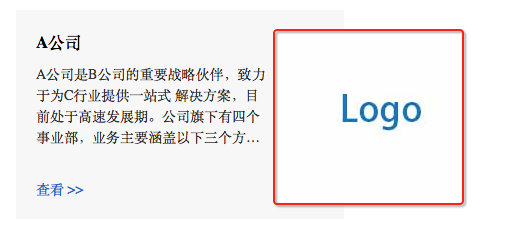
Not much to say, here’s the code:
<style>
  .container {
    margin: 50px auto;
    width: 328px;
  }

  .box {
    background: #f7f7f7;
    position: relative;
  }

  .box-content {
    padding: 20px;
    width: 70%;
  }

  .box-content-title {
    margin: 0 0 10px;
  }

  .box-content-desc {
    -webkit-box-orient: vertical;
    color: #333;
    display: -webkit-box;
    font-size: 14px;
    line-height: 1.5;
    -webkit-line-clamp: 4;
    margin-bottom: 30px;
    overflow: hidden;
    text-overflow: ellipsis;
  }

  .box-content-link {
    color: #006ec8;
    font-size: 14px;
    text-decoration: none;
  }

  .box-content-link:hover {
    text-decoration: none;
  }

  .box-img {
    position: absolute;
    right: -38%;
    top: 20px;
  }
</style>
<div class="container">
  <div class="box">
    <div class="box-content">
      <h5 id="A公司">A公司</h5>
      <div class="box-content-desc">A公司是B公司的重要战略伙伴,致力于为C行业提供一站式 解决方案,目前处于高速发展期。公司旗下有四个事业部,业务主要涵盖以下三个方面,2016年公司 年营业额达到100万元。
      </div>
      <a class="box-content-link" href="javascript:void(0);">查看 >></a>
    </div>
    <img class="box-img lazy"  src="/static/imghw/default1.png"  data-src="../../asset/images/logo/obama-card196x172.jpg"    alt="">
  </div>
</div>It’s actually very simple. The sub-element of .box, .box, is positioned relatively and adds a background color; .box-content is arranged normally and controlled by width and padding. The position of its child elements; .box-img absolute positioning, using right and top to control the position, you can basically achieve the desired effect.

Hot AI Tools

Undresser.AI Undress
AI-powered app for creating realistic nude photos

AI Clothes Remover
Online AI tool for removing clothes from photos.

Undress AI Tool
Undress images for free

Clothoff.io
AI clothes remover

AI Hentai Generator
Generate AI Hentai for free.

Hot Article

Hot Tools

Notepad++7.3.1
Easy-to-use and free code editor

SublimeText3 Chinese version
Chinese version, very easy to use

Zend Studio 13.0.1
Powerful PHP integrated development environment

Dreamweaver CS6
Visual web development tools

SublimeText3 Mac version
God-level code editing software (SublimeText3)

Hot Topics
 What does placeholder mean in vue
May 07, 2024 am 09:57 AM
In Vue.js, the placeholder attribute specifies the placeholder text of the input element, which is displayed when the user has not entered content, provides input tips or examples, and improves form accessibility. Its usage is to set the placeholder attribute on the input element and customize the appearance using CSS. Best practices include being relevant to the input, being short and clear, avoiding default text, and considering accessibility.
 What does span mean in js
May 06, 2024 am 11:42 AM
The span tag can add styles, attributes, or behaviors to text. It is used to: add styles, such as color and font size. Set attributes such as id, class, etc. Associated behaviors such as clicks, hovers, etc. Mark text for further processing or citation.
 What does rem mean in js
May 06, 2024 am 11:30 AM
REM in CSS is a relative unit relative to the font size of the root element (html). It has the following characteristics: relative to the root element font size, not affected by the parent element. When the root element's font size changes, elements using REM will adjust accordingly. Can be used with any CSS property. Advantages of using REM include: Responsiveness: Keep text readable on different devices and screen sizes. Consistency: Make sure font sizes are consistent throughout your website. Scalability: Easily change the global font size by adjusting the root element font size.
 How to introduce images into vue
May 02, 2024 pm 10:48 PM
There are five ways to introduce images in Vue: through URL, require function, static file, v-bind directive and CSS background image. Dynamic images can be handled in Vue's computed properties or listeners, and bundled tools can be used to optimize image loading. Make sure the path is correct otherwise a loading error will appear.
 What is the function of span tag
Apr 30, 2024 pm 01:54 PM
The SPAN tag is an inline HTML tag that is used to highlight text by applying attributes such as style, color, and font size. This includes emphasizing text, grouping text, adding hover effects, and dynamically updating content. It is used by placing <span> and </span> tags around the text you want to emphasize, and is manipulated via CSS styling or JavaScript. The benefits of SPAN tags include semantic clarity, styling flexibility, and ease of maintenance.
 How to wrap prompt in js
May 01, 2024 am 06:24 AM
When using the prompt() method in JavaScript, you can achieve line breaks through the following three methods: 1. Insert the "\n" character at the position where you want to break the line; 2. Use the line break character in the prompt text; 3. Use CSS's "white" -space: pre" style forces line breaks.
 What language is the browser plug-in written in?
May 08, 2024 pm 09:36 PM
Browser plug-ins are usually written in the following languages: Front-end languages: JavaScript, HTML, CSS Back-end languages: C++, Rust, WebAssembly Other languages: Python, Java
 What is node in js
May 07, 2024 pm 09:06 PM
Nodes are entities in the JavaScript DOM that represent HTML elements. They represent a specific element in the page and can be used to access and manipulate that element. Common node types include element nodes, text nodes, comment nodes, and document nodes. Through DOM methods such as getElementById(), you can access nodes and operate on them, including modifying properties, adding/removing child nodes, inserting/replacing nodes, and cloning nodes. Node traversal helps navigate within the DOM structure. Nodes are useful for dynamically creating page content, event handling, animation, and data binding.


