Interesting borders in css
border
Simply put, it is our commonly used border. A very basic usage is
border: 1px solid black;
// 等价于
border-width: 1px;
border-style: solid;
border-color: black;
The following is the effect of the demonstration:

Of course, you can also define many weird border types, such as rounded corners (radius) , maybe the compatibility is not very good), ellipse (in fact, as long as you understand the ellipse, you can draw the border at will).
border 1px solid black;
border-radius: 50%;

border-top,-right,-bottom,-left
After reading so many interesting DEMOs, do you really understand borders?
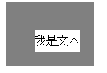
I recently came across an interesting CSS style, which gave me a deep understanding of borders. Usually when we use borders, we basically give the border a width of 1px, and occasionally 2px. We do not find the relationship between the border and the element. When we change the border-width to a larger value, the problem arises.
border: 20px solid gray;

Moreover, the border can be set independently. The values of top, right, bottom, and left are:
border: 20px solid gray;
border-top-width: 40px;
border-left-width: 40px;

How to judge the intersection of border and border?
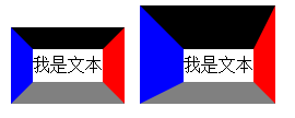
It is very important to understand this. If you also find this problem, then the following interesting things will come:
border: 20px solid;
border-top-color: black;
border-right-color: red;
border-bottom-color: gray;
border-left-color: blue;

It is actually the line connecting the inner vertex and the outer vertex that separates the border. If you divide the element Both width and height are set to 0, and a radius is added:
width: 0;
height: 0;
border-radius: 50%;

You should also understand the principle of border-radius before!
Use border to implement arrows
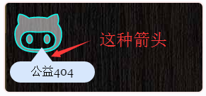
Now that we know some basic knowledge of border, we will You can implement arrows commonly seen in dialog boxes, like the following:

This needs to be achieved with the help of transparency in CSS. For example, we need a right arrow, refer to the example above when width and height are 0 , the corresponding border size is 15px, 0px, 15px, 30px, first look at the example below
border-width: 15px 0px 15px 30px;
border-color: black gray;
border-style: solid;

At this time, you need to set the colors of border-top and border-bottom to transparent,
border-color: transparent gray;

Then, for The other three angles of arrows can also be designed in the same way:

Summary
After reading this article, do you think the function of border is very powerful? In fact, some of our common bubbles and shapes can be realized with border. Haha, I really despise those students who use pictures. mutual encouragement.

Hot AI Tools

Undresser.AI Undress
AI-powered app for creating realistic nude photos

AI Clothes Remover
Online AI tool for removing clothes from photos.

Undress AI Tool
Undress images for free

Clothoff.io
AI clothes remover

AI Hentai Generator
Generate AI Hentai for free.

Hot Article

Hot Tools

Notepad++7.3.1
Easy-to-use and free code editor

SublimeText3 Chinese version
Chinese version, very easy to use

Zend Studio 13.0.1
Powerful PHP integrated development environment

Dreamweaver CS6
Visual web development tools

SublimeText3 Mac version
God-level code editing software (SublimeText3)

Hot Topics
 1377
1377
 52
52
 How to use bootstrap button
Apr 07, 2025 pm 03:09 PM
How to use the Bootstrap button? Introduce Bootstrap CSS to create button elements and add Bootstrap button class to add button text
 How to insert pictures on bootstrap
Apr 07, 2025 pm 03:30 PM
There are several ways to insert images in Bootstrap: insert images directly, using the HTML img tag. With the Bootstrap image component, you can provide responsive images and more styles. Set the image size, use the img-fluid class to make the image adaptable. Set the border, using the img-bordered class. Set the rounded corners and use the img-rounded class. Set the shadow, use the shadow class. Resize and position the image, using CSS style. Using the background image, use the background-image CSS property.
 How to resize bootstrap
Apr 07, 2025 pm 03:18 PM
To adjust the size of elements in Bootstrap, you can use the dimension class, which includes: adjusting width: .col-, .w-, .mw-adjust height: .h-, .min-h-, .max-h-
 How to write split lines on bootstrap
Apr 07, 2025 pm 03:12 PM
There are two ways to create a Bootstrap split line: using the tag, which creates a horizontal split line. Use the CSS border property to create custom style split lines.
 How to view the date of bootstrap
Apr 07, 2025 pm 03:03 PM
Answer: You can use the date picker component of Bootstrap to view dates in the page. Steps: Introduce the Bootstrap framework. Create a date selector input box in HTML. Bootstrap will automatically add styles to the selector. Use JavaScript to get the selected date.
 How to set up the framework for bootstrap
Apr 07, 2025 pm 03:27 PM
To set up the Bootstrap framework, you need to follow these steps: 1. Reference the Bootstrap file via CDN; 2. Download and host the file on your own server; 3. Include the Bootstrap file in HTML; 4. Compile Sass/Less as needed; 5. Import a custom file (optional). Once setup is complete, you can use Bootstrap's grid systems, components, and styles to create responsive websites and applications.
 How to verify bootstrap date
Apr 07, 2025 pm 03:06 PM
To verify dates in Bootstrap, follow these steps: Introduce the required scripts and styles; initialize the date selector component; set the data-bv-date attribute to enable verification; configure verification rules (such as date formats, error messages, etc.); integrate the Bootstrap verification framework and automatically verify date input when form is submitted.
 How to use bootstrap in vue
Apr 07, 2025 pm 11:33 PM
Using Bootstrap in Vue.js is divided into five steps: Install Bootstrap. Import Bootstrap in main.js. Use the Bootstrap component directly in the template. Optional: Custom style. Optional: Use plug-ins.


