Build large-scale community websites using responsive technology
Mobile is a major trend in the future. Any Internet project must put mobile strategy in a very important position, and Echo is no exception. Although Echo still uses text as the main content carrier at this stage, it must also fully consider the usage scenarios and experience of the mobile terminal.
Generally speaking, there are three mobile strategies for community websites: 1) Develop and provide native apps; 2) Make a dedicated mobile version of the website, that is, Web app; 3) Use responsive technology, using a set of codes, A website to adapt to different terminals. We weighed it up a lot and finally chose to use responsive design technology.
Responsive design is a popular front-end development technology in the past two years. Relatively speaking, it is more commonly used abroad, but it is used more conservatively in China. Its characteristic is that it only needs one set of codes to well support access from different terminals such as PCs, tablets, and mobile phones.
In fact, the principle of responsive design is very simple. Its core includes: 1. Lost grid layout; 2. Outputting different styles through media query resolution detection; 3. Adaptive content elements (such as pictures). The focus of this article is not to discuss the technical details, but to explore the advantages, disadvantages and application scenarios of responsive design from a macro perspective, and to share some of our experiences and thoughts in the process of using responsive technology to develop Echo.
Echo adopts responsive design, mainly for the following reasons:
1) Improve development focus
If you want to pursue the strongest performance and the best user experience, Native app is still the best choice. However, the cost of developing Native apps is also very high, especially for various mainstream platforms that need to be developed and tested separately. Echo’s team is very small and is starting from scratch. If we invest in the development of the website and native app at the same time from the beginning, it will not only lengthen the project cycle, but also bear high demands due to the uncertainty of demand. Change risk. Using responsive design allows us to focus all our energy on developing and maintaining a core set of code with limited resources.
2) Reduce long-term maintenance costs
If you choose to develop a dedicated mobile version of the website, although the initial difficulty is not high, in the long run, when adding new features, you need to take into account two sets of codes at the same time, and the maintenance cost is relatively high. Although the results of our adoption of responsive design still significantly increase the initial development costs, for future website maintenance, we can maintain the consistency of mobile and PC functions for a long time without having to build a website every time. When adding functionality, additional consideration needs to be given to mobile sites.
3) Based on the site’s own characteristics
Generally speaking, responsive design is very suitable for content-oriented websites. In foreign countries, typical cases of applying responsive design include: Starbucks, smashingmagazine, Sony, etc. Responsive design means that the URL of the page can be unified on the mobile and PC sides, and there is no need to frequently jump to the URL by judging the type of terminal. This has great benefits for SEO and makes it more convenient for sharing and dissemination on social networking sites. For example, the URL of the content disseminated by Echo in WeChat Moments is the same as that on the PC, but when opened in a mobile browser, what you see is an interface optimized for mobile terminals.

(Responsive design example of Starbucks website)
Although Echo is also content-based, it also has a lot of interactive operations, which is relatively complex. A community of this size is built using responsive technology , which is rare in China, so a lot of experience needs to be explored in practice. Let’s share some of the experiences summarized in Echo’s adoption of responsive design:
1) Choose a suitable framework as a starting point
Currently, there are many on the market Comprehensive framework for responsive design, such as Bootstrap, Zurb Foundation, etc. Well-known responsive design frameworks like Bootstrap have a well-matched visual style and integrate many commonly used components, allowing you to quickly start building a complete website.
But if your website’s style is more personalized (largely different from Bootstrap’s default style), and you want to have higher control over the underlying code, you can choose a more basic development framework like html5boiler as a starting point, just like Echo. , the basic CSS and JS libraries included make it easier for you to develop based on Web standards without worrying about the support of HTML5 by older browsers and the uniformity of rendering effects of various browsers. Yahoo! has launched a new lightweight responsive design framework called Pure, which is also a good choice.
2) Transformation of product design ideas
The idea of designing mobile products in the PC Internet era is often based on the PC website as the core. The PC website is designed first, and then on this basis, the functions of the mobile terminal are downgraded. However, we often ignore the mobile terminal in actual implementation. We use many new technologies in PC websites and pursue the best visual and interactive experience. This makes it very difficult to implement functional downgrades, and ultimately we have to make adjustments in terms of user experience. Weakening is a very painful process.
In the recently popular Mobile First concept, it is emphasized that when designing products, priority should be given to the presentation effect of the mobile terminal, and then progressive upgrade (Progressive Enhancement) to the PC terminal. The advantage of this is that it can force us to convert the mobile terminal into Consider it at least as important as PC. Relatively speaking, the gradual upgrade from mobile to PC is a more pleasant process, because we can focus on thinking about how to make the website experience better on PC without having to face the pain of feature reduction.
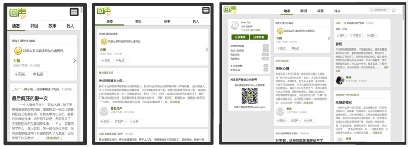
For example, the following is the rendering effect of Echo's member homepage on different terminals:

When we design products, we need to grasp the principles from macro to local, first focus on the website on different terminals The performance of the website should be comprehensively conceived, especially macro elements such as page layout and navigation. It should not only adapt to the usage characteristics of different terminals, but also consider the unity of the overall style of the website.
As can be seen from the above picture, in order to adapt to the requirements of responsive design, the Echo member homepage adopts a flow layout + card-style processing method. When browsing on different terminals, the navigation and content layout will have corresponding changes, and the overall The style can maintain good consistency.
In order to ensure the browsing experience on small-screen terminals, we did not force the PC and mobile terminals to be consistent in content, but made appropriate trade-offs and reorganizations. For example, the personal information module on the left side of the big screen is in the small screen. is placed in the slide-out menu.
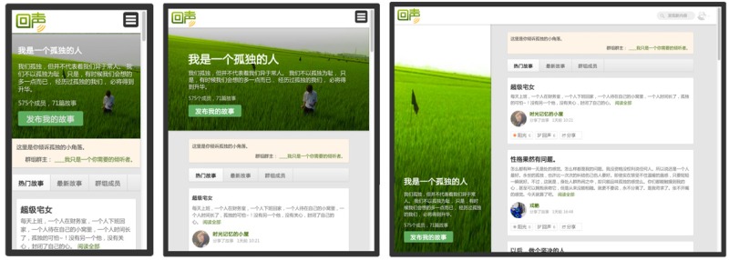
The following is an example of a group page in Echo. The difference in content layout under various screen sizes is more obvious:

3) Choose appropriate functional components
In pursuit of speed, we are developing Echo At the time, many open source components based on jQuery and supporting responsiveness were used. For example, the date picker used datepicker, new user guidance used Joyride, and the pop-up modal window used Tinybox and made responsive improvements. Using these mature open source Components can greatly save project development time.
4) Make full use of debugging tools
Chrome and Firefox browsers have many extensions that can support responsive design, which can easily test the display effect of web pages under different screen resolutions. In addition, the Chrome browser on Android can also support debugging on PC via USB. Please refer to the relevant documentation for details.
A stone from another mountain can make a jade. When developing Echo, we also drew on the design of many excellent responsive websites and analyzed their code implementation through debugging tools, such as Starbucks, Medium, Google Plus, etc. The responses of these mature websites The implementation of formula design has greatly inspired our design ideas and code planning.
There is still a lot of experience in specific details, so I won’t go into details here. The functional development of the entire website lasted for more than 2 months, and the results are quite satisfactory. At present, the traffic from mobile devices accounts for about 1/4 of the total visits. More importantly, when adding new functions in the future, we can simultaneously support the mobile terminal, and on this basis, we have also encapsulated the Android version of the mobile application. Among them, the decision to adopt responsive design plays an important role.
However, we also discovered some problems and drawbacks of responsive technology during the development of Echo. Here are some of our findings and countermeasures:
1) Loading additional content affects the access speed of the mobile phone
Nothing is absolute One set of programs that are compatible with different terminals is an advantage of responsive design, but this will also result in the need for HTML and CSS files to contain content and code for various screen resolutions. That is, even if accessed through mobile phones, people have to spend more waiting time to download the content and styles for display on the PC site.
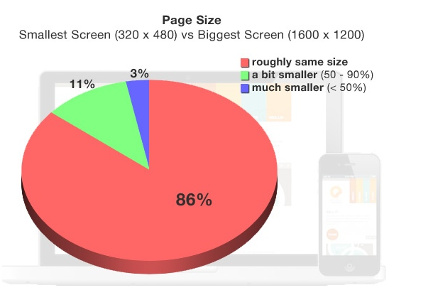
Last year, Akamai’s product architect Guy Podjarny tested 347 websites using responsive design, and he found that the content size and loading speed of these websites performed almost the same on different terminals. This situation means a reduction in user experience for Chinese mobile Internet users who have to endure lagging network speeds and high fees.

In order to improve this, we have adopted some corresponding strategies, such as: for images that consume large amounts of traffic, we have specially generated small-size thumbnails for mobile devices, so that users do not need to Load large-size, high-definition images; for Javascript and CSS files, we have adopted a caching and compression mechanism to ensure that users do not need to download repeatedly when the content is not updated, and the content transmitted through the network is as small as possible.
2) The initial implementation of responsive design is highly complex
Although responsive technology itself is not complicated, it requires a lot of extra time and effort to be well compatible with terminals of various sizes. Echo initially estimates that the development cost for this will reach more than 30%. Simply speaking from a one-time development cost, it may not save much compared to developing a separate webapp. Whether to adopt responsive design is actually a matter of balancing immediate and long-term interests. In other words, we paid a higher initial implementation cost in exchange for the convenience of long-term maintenance of the website.
Designing a responsive website requires better architectural planning than ordinary mobile sites, especially on the premise of ensuring access speed and user experience. For example, in order to optimize website access speed, the "conditional loading" method is now popular, that is, loading different content and styles according to different access terminals under the same URL.
3) The troublesome browser adaptation issue
Old browsers below IE8 do not support the mediaquery mechanism, so they cannot apply responsive technology, and their support for HTML5 is not good enough, making compatibility very difficult. . For this reason, Echo has given up on PC compatibility with IE browsers with kernels below 8.0. When these users access Echo, they will be redirected to a browser upgrade reminder page. However, since there is still a certain proportion of IE6 people in China, there is still a certain loss in terms of traffic. This is also the price we have to pay for adopting responsive design and leaning towards the mobile terminal.
4) User experience optimization is difficult
Since you have to take into account various terminals with different screen resolutions during development, it cannot be as burden-free as developing a separate mobile website. Mobile website development frameworks such as JQuery Mobile introduce many special effects in order to simulate the effects of native apps. It is also very simple for developers to call them. Relatively speaking, responsive design is more suitable for relatively plain and simple content-based websites. There is no advantage in pursuing cool effects.
Echo has made a lot of efforts in optimizing the user experience. For example: we have extensively used the asynchronous loading mechanism of content in the list pages of the entire site, and support dynamically loading more content when the page slides to the bottom. In addition, we also use the local storage of the browser to record the opening position of the user's previous page. When the user goes back through the browser, he can quickly locate the previous position. The optimization of these details makes it easier to access through mobile phones. Echo can provide a smoother experience.
5) Functional limitations
Responsive design is essentially a webapp. Compared with native applications, it has inherent deficiencies in utilizing the characteristics of mobile phones, such as taking pictures and uploading pictures, recording functions, geolocation, etc. , if your product has extremely high requirements for user experience and performance, or needs to use some native mobile phone features that HTML5 cannot support well, then it is recommended that you give priority to developing native apps.
So far, responsive design is still a controversial topic in China. Compared with native apps, responsive design has relatively few large-scale applications in China. In fact, there is no superiority between responsive design, mobile websites and native apps in terms of technology itself, only the scenarios they adapt to are different. Instead of staying in the debate, it’s better to fully understand the characteristics of responsive technology and apply it to appropriate projects. The above are some of the experiences that Echo has accumulated in responsive design. I hope it can bring you some useful inspiration.

Hot AI Tools

Undresser.AI Undress
AI-powered app for creating realistic nude photos

AI Clothes Remover
Online AI tool for removing clothes from photos.

Undress AI Tool
Undress images for free

Clothoff.io
AI clothes remover

Video Face Swap
Swap faces in any video effortlessly with our completely free AI face swap tool!

Hot Article

Hot Tools

Notepad++7.3.1
Easy-to-use and free code editor

SublimeText3 Chinese version
Chinese version, very easy to use

Zend Studio 13.0.1
Powerful PHP integrated development environment

Dreamweaver CS6
Visual web development tools

SublimeText3 Mac version
God-level code editing software (SublimeText3)

Hot Topics
 1387
1387
 52
52
 How to use bootstrap in vue
Apr 07, 2025 pm 11:33 PM
Using Bootstrap in Vue.js is divided into five steps: Install Bootstrap. Import Bootstrap in main.js. Use the Bootstrap component directly in the template. Optional: Custom style. Optional: Use plug-ins.
 The Roles of HTML, CSS, and JavaScript: Core Responsibilities
Apr 08, 2025 pm 07:05 PM
HTML defines the web structure, CSS is responsible for style and layout, and JavaScript gives dynamic interaction. The three perform their duties in web development and jointly build a colorful website.
 How to write split lines on bootstrap
Apr 07, 2025 pm 03:12 PM
There are two ways to create a Bootstrap split line: using the tag, which creates a horizontal split line. Use the CSS border property to create custom style split lines.
 Understanding HTML, CSS, and JavaScript: A Beginner's Guide
Apr 12, 2025 am 12:02 AM
WebdevelopmentreliesonHTML,CSS,andJavaScript:1)HTMLstructurescontent,2)CSSstylesit,and3)JavaScriptaddsinteractivity,formingthebasisofmodernwebexperiences.
 What Does H5 Refer To? Exploring the Context
Apr 12, 2025 am 12:03 AM
H5referstoHTML5,apivotaltechnologyinwebdevelopment.1)HTML5introducesnewelementsandAPIsforrich,dynamicwebapplications.2)Itsupportsmultimediawithoutplugins,enhancinguserexperienceacrossdevices.3)SemanticelementsimprovecontentstructureandSEO.4)H5'srespo
 How to resize bootstrap
Apr 07, 2025 pm 03:18 PM
To adjust the size of elements in Bootstrap, you can use the dimension class, which includes: adjusting width: .col-, .w-, .mw-adjust height: .h-, .min-h-, .max-h-
 How to use bootstrap button
Apr 07, 2025 pm 03:09 PM
How to use the Bootstrap button? Introduce Bootstrap CSS to create button elements and add Bootstrap button class to add button text
 How to set up the framework for bootstrap
Apr 07, 2025 pm 03:27 PM
To set up the Bootstrap framework, you need to follow these steps: 1. Reference the Bootstrap file via CDN; 2. Download and host the file on your own server; 3. Include the Bootstrap file in HTML; 4. Compile Sass/Less as needed; 5. Import a custom file (optional). Once setup is complete, you can use Bootstrap's grid systems, components, and styles to create responsive websites and applications.


