Flex layout syntax tutorial
Web page layout (layout) is a key application of CSS.
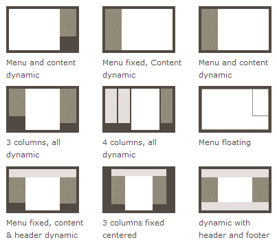
The traditional solution for layout is based on the box model and relies on the display attribute + position attribute + float attribute. It is very inconvenient for those special layouts. For example, vertical centering is not easy to achieve.

In 2009, W3C proposed a new solution - Flex layout, which can realize various page layouts simply, completely and responsively. Currently, it is supported by all browsers, which means it is now safe to use this feature.
Flex layout will become the preferred solution for future layouts. This article introduces its syntax, and the next article gives the Flex writing method of common layouts.
The following content mainly refers to the following two articles: A Complete Guide to Flexbox and A Visual Guide to CSS3 Flexbox Properties.
1. What is Flex layout?
Flex is the abbreviation of Flexible Box, which means "flexible layout" and is used to provide maximum flexibility for box-shaped models.
Any container can be designated as Flex layout.
.box{
  display: flex;
}Inline elements can also use Flex layout.
.box{
  display: inline-flex;
}Browsers with Webkit core must add the -webkit prefix.
.box{
  display: -webkit-flex; /* Safari */
  display: flex;
}Note that after setting to Flex layout, the float, clear and vertical-align attributes of child elements will be invalid.
2. Basic Concepts
Elements that use Flex layout are called Flex containers (flex containers), or "containers" for short. All its child elements automatically become container members, called Flex items (flex items), referred to as "items".

Containers have two axes by default: the horizontal main axis and the vertical cross axis. The starting position of the main axis (the intersection with the border) is called main start, and the ending position is called main end; the starting position of the cross axis is called cross start, and the ending position is called cross end.
Items are arranged along the main axis by default. The main axis space occupied by a single item is called main size, and the cross axis space occupied by a single item is called cross size.
3. Container properties
The following 6 properties are set on the container.
flex-direction
flex-wrap
flex-flow
justify-content
align-items
align-content
3.1 flex-direction attribute
The flex-direction attribute determines the direction of the main axis (ie, item arrangement direction).
.box {
  flex-direction: row | row-reverse | column | column-reverse;
}
It may have 4 values.
row (default value): The main axis is horizontal and the starting point is at the left end.
row-reverse: The main axis is horizontal and the starting point is at the right end.
column: The main axis is vertical, and the starting point is on the upper edge.
column-reverse: The main axis is vertical and the starting point is at the lower edge.
3.2 flex-wrap attribute
By default, items are arranged on a line (also called "axis"). The flex-wrap attribute defines how to wrap the line if one axis cannot fit.
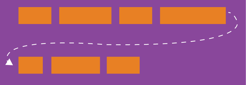
.box{
  flex-wrap: nowrap | wrap | wrap-reverse;
}It may take three values.
(1) nowrap (default): No line wrapping.

(2) wrap: wrap, the first line is at the top.

(3) wrap-reverse: Line wrap, the first line is below.

3.3 flex-flow
flex-flow属性是flex-direction属性和flex-wrap属性的简写形式,默认值为row nowrap。
.box {
  flex-flow: <flex-direction> || <flex-wrap>;
}3.4 justify-content属性
justify-content属性定义了项目在主轴上的对齐方式。
.box {
    justify-content: flex-start | flex-end | center | space-between | space-around;
}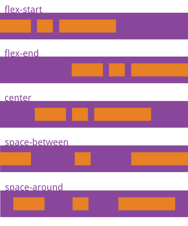
它可能取5个值,具体对齐方式与轴的方向有关。下面假设主轴为从左到右。
flex-start(默认值):左对齐
flex-end:右对齐
center: 居中
space-between:两端对齐,项目之间的间隔都相等。
space-around:每个项目两侧的间隔相等。所以,项目之间的间隔比项目与边框的间隔大一倍。
3.5 align-items属性
align-items属性定义项目在交叉轴上如何对齐。
.box {
  align-items: flex-start | flex-end | center | baseline | stretch;
}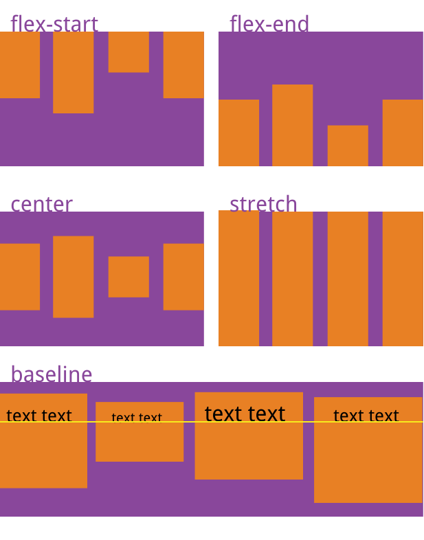
它可能取5个值。具体的对齐方式与交叉轴的方向有关,下面假设交叉轴从上到下。
flex-start:交叉轴的起点对齐。
flex-end:交叉轴的终点对齐。
center:交叉轴的中点对齐。
baseline: 项目的第一行文字的基线对齐。
stretch(默认值):如果项目未设置高度或设为auto,将占满整个容器的高度。
3.6 align-content属性
align-content属性定义了多根轴线的对齐方式。如果项目只有一根轴线,该属性不起作用。
.box {
  align-content: flex-start | flex-end | center | space-between | space-around | stretch;
}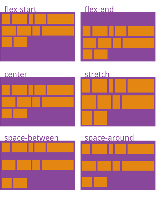
该属性可能取6个值。
flex-start:与交叉轴的起点对齐。
flex-end:与交叉轴的终点对齐。
center:与交叉轴的中点对齐。
space-between:与交叉轴两端对齐,轴线之间的间隔平均分布。
space-around:每根轴线两侧的间隔都相等。所以,轴线之间的间隔比轴线与边框的间隔大一倍。
stretch(默认值):轴线占满整个交叉轴。
四、项目的属性
以下6个属性设置在项目上。
order
flex-grow
flex-shrink
flex-basis
flex
align-self
4.1 order属性
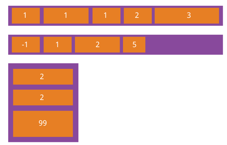
order属性定义项目的排列顺序。数值越小,排列越靠前,默认为0。
.item {
  order: <integer>;
}
4.2 flex-grow属性
flex-grow属性定义项目的放大比例,默认为0,即如果存在剩余空间,也不放大。
.item {
  flex-grow: <number>; /* default 0 */
}
如果所有项目的flex-grow属性都为1,则它们将等分剩余空间(如果有的话)。如果一个项目的flex-grow属性为2,其他项目都为1,则前者占据的剩余空间将比其他项多一倍。
4.3 flex-shrink属性
flex-shrink属性定义了项目的缩小比例,默认为1,即如果空间不足,该项目将缩小。
.item {
  flex-shrink: <number>; /* default 1 */
}
如果所有项目的flex-shrink属性都为1,当空间不足时,都将等比例缩小。如果一个项目的flex-shrink属性为0,其他项目都为1,则空间不足时,前者不缩小。
负值对该属性无效。
4.4 flex-basis属性
flex-basis属性定义了在分配多余空间之前,项目占据的主轴空间(main size)。浏览器根据这个属性,计算主轴是否有多余空间。它的默认值为auto,即项目的本来大小。
.item {
  flex-basis: <length> | auto; /* default auto */
}它可以设为跟width或height属性一样的值(比如350px),则项目将占据固定空间。
4.5 flex属性
flex属性是flex-grow, flex-shrink 和 flex-basis的简写,默认值为0 1 auto。后两个属性可选。
.item {
flex: none | [ <'flex-grow'> <'flex-shrink'>? || <'flex-basis'> ]
}该属性有两个快捷值:auto (1 1 auto) 和 none (0 0 auto)。
建议优先使用这个属性,而不是单独写三个分离的属性,因为浏览器会推算相关值。
4.6 align-self属性
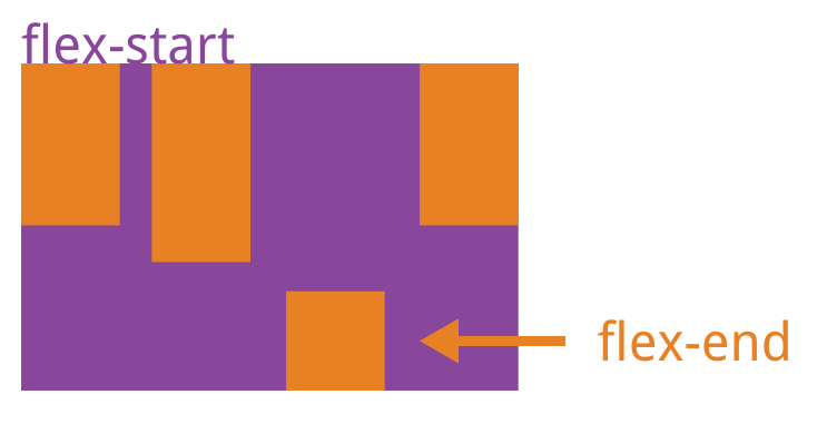
align-self属性允许单个项目有与其他项目不一样的对齐方式,可覆盖align-items属性。默认值为auto,表示继承父元素的align-items属性,如果没有父元素,则等同于stretch。
.item {
  align-self: auto | flex-start | flex-end | center | baseline | stretch;
}

Hot AI Tools

Undresser.AI Undress
AI-powered app for creating realistic nude photos

AI Clothes Remover
Online AI tool for removing clothes from photos.

Undress AI Tool
Undress images for free

Clothoff.io
AI clothes remover

AI Hentai Generator
Generate AI Hentai for free.

Hot Article

Hot Tools

Notepad++7.3.1
Easy-to-use and free code editor

SublimeText3 Chinese version
Chinese version, very easy to use

Zend Studio 13.0.1
Powerful PHP integrated development environment

Dreamweaver CS6
Visual web development tools

SublimeText3 Mac version
God-level code editing software (SublimeText3)

Hot Topics
 1377
1377
 52
52
 Tutorial on how to use Dewu
Mar 21, 2024 pm 01:40 PM
Dewu APP is currently a very popular brand shopping software, but most users do not know how to use the functions in Dewu APP. The most detailed usage tutorial guide is compiled below. Next is the Dewuduo that the editor brings to users. A summary of function usage tutorials. Interested users can come and take a look! Tutorial on how to use Dewu [2024-03-20] How to use Dewu installment purchase [2024-03-20] How to obtain Dewu coupons [2024-03-20] How to find Dewu manual customer service [2024-03-20] How to check the pickup code of Dewu [2024-03-20] Where to find Dewu purchase [2024-03-20] How to open Dewu VIP [2024-03-20] How to apply for return or exchange of Dewu
 In summer, you must try shooting a rainbow
Jul 21, 2024 pm 05:16 PM
After rain in summer, you can often see a beautiful and magical special weather scene - rainbow. This is also a rare scene that can be encountered in photography, and it is very photogenic. There are several conditions for a rainbow to appear: first, there are enough water droplets in the air, and second, the sun shines at a low angle. Therefore, it is easiest to see a rainbow in the afternoon after the rain has cleared up. However, the formation of a rainbow is greatly affected by weather, light and other conditions, so it generally only lasts for a short period of time, and the best viewing and shooting time is even shorter. So when you encounter a rainbow, how can you properly record it and photograph it with quality? 1. Look for rainbows. In addition to the conditions mentioned above, rainbows usually appear in the direction of sunlight, that is, if the sun shines from west to east, rainbows are more likely to appear in the east.
 Tutorial on how to turn off the payment sound on WeChat
Mar 26, 2024 am 08:30 AM
1. First open WeChat. 2. Click [+] in the upper right corner. 3. Click the QR code to collect payment. 4. Click the three small dots in the upper right corner. 5. Click to close the voice reminder for payment arrival.
 What software is photoshopcs5? -photoshopcs5 usage tutorial
Mar 19, 2024 am 09:04 AM
PhotoshopCS is the abbreviation of Photoshop Creative Suite. It is a software produced by Adobe and is widely used in graphic design and image processing. As a novice learning PS, let me explain to you today what software photoshopcs5 is and how to use photoshopcs5. 1. What software is photoshop cs5? Adobe Photoshop CS5 Extended is ideal for professionals in film, video and multimedia fields, graphic and web designers who use 3D and animation, and professionals in engineering and scientific fields. Render a 3D image and merge it into a 2D composite image. Edit videos easily
 Experts teach you! The Correct Way to Cut Long Pictures on Huawei Mobile Phones
Mar 22, 2024 pm 12:21 PM
With the continuous development of smart phones, the functions of mobile phones have become more and more powerful, among which the function of taking long pictures has become one of the important functions used by many users in daily life. Long screenshots can help users save a long web page, conversation record or picture at one time for easy viewing and sharing. Among many mobile phone brands, Huawei mobile phones are also one of the brands highly respected by users, and their function of cropping long pictures is also highly praised. This article will introduce you to the correct method of taking long pictures on Huawei mobile phones, as well as some expert tips to help you make better use of Huawei mobile phones.
 PHP Tutorial: How to convert int type to string
Mar 27, 2024 pm 06:03 PM
PHP Tutorial: How to Convert Int Type to String In PHP, converting integer data to string is a common operation. This tutorial will introduce how to use PHP's built-in functions to convert the int type to a string, while providing specific code examples. Use cast: In PHP, you can use cast to convert integer data into a string. This method is very simple. You only need to add (string) before the integer data to convert it into a string. Below is a simple sample code
 Honor mobile phone Hongmeng system upgrade tutorial
Mar 23, 2024 pm 12:45 PM
Honor mobile phones have always been favored by consumers because of their excellent performance and stable system. Recently, Honor mobile phones have released a new Hongmeng system, which has attracted the attention and expectations of many users. Hongmeng system is known as the system that "unifies the world". It has a smoother operating experience and higher security, allowing users to experience a new world of smartphones. Many users have expressed that they want to upgrade their Honor mobile phone system to the Hongmeng system. So, let’s take a look at the upgrade tutorial of the Honor mobile phone’s Hongmeng system. firstly, I
 A simple tutorial on converting full-width English letters to half-width letters
Mar 25, 2024 pm 09:21 PM
When using a computer to input English, sometimes we encounter the difference between full-width English letters and half-width English letters. Full-width English letters refer to the characters input by pressing the Shift key and the English letter key combination when the input method is Chinese mode. They occupy a full-width character width. Half-width English letters refer to characters input directly when the input method is English mode, and they occupy half a character width. In some cases, we may need to convert full-width English letters to half-width letters. Here is a simple tutorial: First, open a text editor or any


