

【CSS3】 CSS3: Flex Box

What is Flex layout
How to specify a container as Flex layout
Basic syntax of Flex
display
flex-direction
justify-content
align-items
flew-wrap
align-self
flex-flow
flex
order
-
Example
Dice layout
Holy Grail layout
Reference article
1. What is Flex layout? The traditional solution for layout is based on the box model and relies on the display attribute + position attribute + float attribute. It is very inconvenient for those special layouts. For example, vertical centering is not easy to achieve. Flex layout is a layout solution proposed by the W3C organization in 2009, which can realize various page layouts simply, completely and responsively. Currently, it is supported by all browsers. Flex layout will become the preferred solution for future layout.
Second, how to specify a container as Flex layout
You only need to add the display attribute with a value of flex in the container.
.box{
  display: flex;
}
Three, the basic syntax of Flex
display
Syntax: display:flex;Specify Flex.
flex-direction
Syntax:flex-direction: row | row-reverse | column | column-reverse
Specifies the order in which flexible child elements are arranged in the parent container. This can also be achieved equivalently by setting direction:rtl; or direction:ltr; , where rtl and ltr are right Abbreviation for to left, left to right. justify content
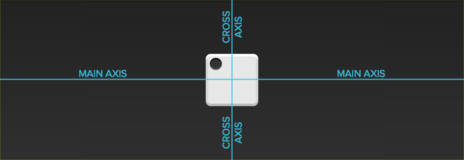
Syntax:justify-content: flex-start | flex-end | center | space-between | space- around
Content The justify-content property is applied to the flex container to align the flex items along the main axis of the flex container. Concept understanding diagram:
For space-around, the author summarized a simple formula:
x=(W2-N*W1)/(2N)
x: the width left on the two most sides.
W2: It is the width of the module.
W1: The width of a submodule (even each).
N:
align-items
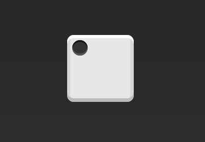
Syntax: align-items: flex-start | flex-end | center | baseline | stretch
Set the flexible box element in the side axis (vertical axis) direction alignment on.
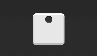
The following picture can help readers understand the baseline:

flex-wrap
Syntax: flex-flow :nowrap| warp | warp-reverse
align-content
Syntax: align-content: flex-start | flex-end | center | space-between | space-around | stretch
Set the alignment of each row.
align-self
Syntax: align-self: auto | flex-start | flex-end | center | baseline | stretch
Set the alignment of the elastic element itself in the cross-axis direction. This attribute should be distinguished from align-content. The scope of align-content is each row, but align-self is only a certain elastic element in a certain row.
flex-flow
Syntax: abbreviation for flex-direction and flex-wrap.
flex
Syntax: flex: flex-grow flex-shrink flex-basis|auto|initial|inherit;
Specify the element allocation space. It should be noted that if flex-basis is 100%, then the flex module will occupy a separate line.
oder
Syntax: order: number|initial|inherit;
Specifies the order of elastic modules. The smaller the value, the higher the priority. It can be a negative value.
Four, example
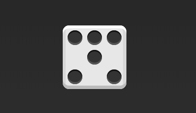
1, layout of the dice
Up to 9 points can be placed on one side of the dice.

下面,就来看看Flex如何实现,从1个点到9个点的布局。你可以到codepen查看Demo。
如果不加说明,本节的HTML模板一律如下。
<p class="box"> <span class="item">>>Copy after login
上面代码中,p元素(代表骰子的一个面)是Flex容器,span元素(代表一个点)是Flex项目。如果有多个项目,就要添加多个span元素,以此类推。
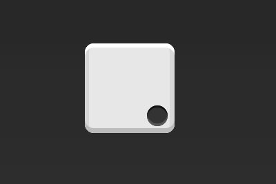
1.1 单项目
首先,只有左上角1个点的情况。Flex布局默认就是首行左对齐,所以一行代码就够了。
.box { display: flex;}Copy after login
设置项目的对齐方式,就能实现居中对齐和右对齐。
.box { display: flex; justify-content: center;}Copy after login
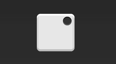
.box { display: flex; justify-content: flex-end;}Copy after login
设置交叉轴对齐方式,可以垂直移动主轴。
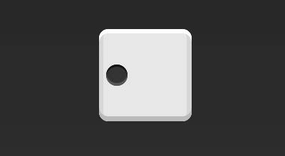
.box { display: flex; align-items: center;}Copy after login
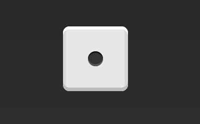
.box { display: flex; justify-content: center; align-items: center;}Copy after login
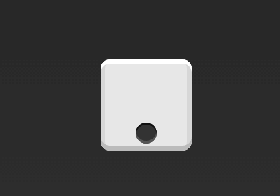
.box { display: flex; justify-content: center; align-items: flex-end;}Copy after login
.box { display: flex; justify-content: flex-end; align-items: flex-end;}Copy after login
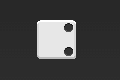
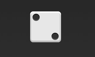
1.2 双项目
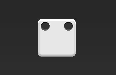
.box { display: flex; justify-content: space-between;}Copy after login
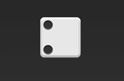
.box {  display: flex;  flex-direction: column;
justify-content: space-between;}
Copy after login
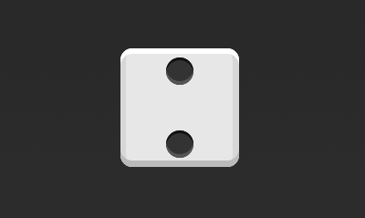
.box {  display: flex;  flex-direction: column;
justify-content: space-between;  align-items: center;}
Copy after login
.box {  display: flex;  flex-direction: column;
justify-content: space-between;  align-items: flex-end;}
Copy after login
.box { display: flex;}.item:nth-child(2) { align-self: center;}Copy after login
.box {  display: flex;
justify-content: space-between;}.item:nth-child(2) {  align-self: flex-end;}
Copy after login
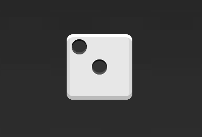
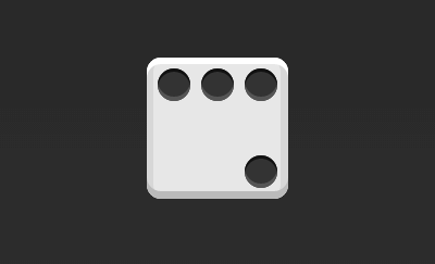
1.3 三项目
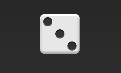
.box {  display: flex;}.item:nth-child(2) {  align-self: center;}.item:nth-child(3) {
align-self: flex-end;}
Copy after login
1.4 四项目
.box {  display: flex;  flex-wrap: wrap;  justify-content: flex-end;
align-content: space-between;}
Copy after login
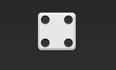
HTML代码如下。
<p class="box">  <p class="column"><span class="item">><span class="item">>  >
<p class="column"><span class="item">><span class="item">>  >>
Copy after login
CSS代码如下。
.box {  display: flex;  flex-wrap: wrap;  align-content: space-between;}
.column {  flex-basis: 100%;  display: flex;  justify-content: space-between;}
Copy after login
1.5 六项目
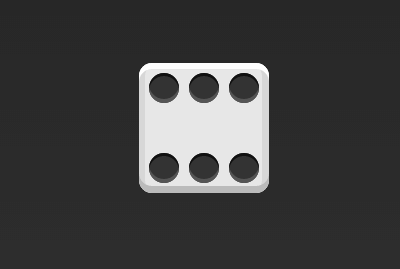
.box { display: flex; flex-wrap: wrap; align-content: space-between;}Copy after login
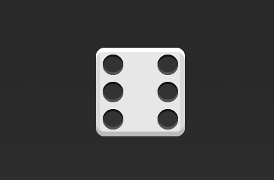
.box {  display: flex;
flex-direction: column;
flex-wrap: wrap;
align-content: space-between;
}
Copy after login
HTML代码如下。
<p class="box">  <p class="row"><span class="item">>
<span class="item">><span class="item">>  >  <p class="row"><span class="item">>  >
<p class="row"> <span class="item">> <span class="item">>  >>
Copy after login
CSS代码如下。
.box {  display: flex;  flex-wrap: wrap;}
.row{  flex-basis: 100%;  display:flex;}
.row:nth-child(2){  justify-content: center;}
.row:nth-child(3){  justify-content: space-between;}
Copy after login
1.6 九项目
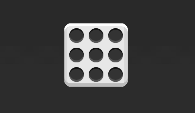
.box { display: flex; flex-wrap: wrap;}Copy after login
2,圣杯布局
圣杯布局(Holy Grail Layout)指的是一种最常见的网站布局。页面从上到下,分成三个部分:头部(header),躯干(body),尾部(footer)。其中躯干又水平分成三栏,从左到右为:导航、主栏、副栏。

HTML代码如下:
<p class="flex-container">
  <header class="header">头部header>
  <article class="main"><p>主体p>
  article>
  <aside class="aside aside1">边栏 1aside>
  <aside class="aside aside2">边栏 2aside>
  <footer class="footer">底部footer>p>
CSS代码入下:
.flex-container {
display: -webkit-flex;display: flex;
    -webkit-flex-flow: row wrap;flex-flow: row wrap;font-weight: bold;text-align: center;
}
.flex-container > * {padding: 10px;flex: 1 100%;
}
.main {text-align: left;background: cornflowerblue;
}
.header {background: coral;}
.footer {background: lightgreen;}
.aside1 {background: moccasin;}
.aside2 {background: violet;}@media all and (min-width: 600px) {.aside { flex: 1 auto; }}

@media all and (min-width: 800px) {
.main
{
flex: 3 0px;
}
.aside1
{
order: 1;
}
    .main
    { order: 2;
    }
    .aside2 { order: 3; }
    .footer
    {
    order: 4;
    }
}以上就是【CSS3】 CSS3:弹性盒子(Flex Box)的内容,更多相关内容请关注PHP中文网(www.php.cn)!

Hot AI Tools

Undresser.AI Undress
AI-powered app for creating realistic nude photos

AI Clothes Remover
Online AI tool for removing clothes from photos.

Undress AI Tool
Undress images for free

Clothoff.io
AI clothes remover

AI Hentai Generator
Generate AI Hentai for free.

Hot Article
Hot Tools

Notepad++7.3.1
Easy-to-use and free code editor

SublimeText3 Chinese version
Chinese version, very easy to use

Zend Studio 13.0.1
Powerful PHP integrated development environment

Dreamweaver CS6
Visual web development tools

SublimeText3 Mac version
God-level code editing software (SublimeText3)
Hot Topics
 1378
1378
 52
52

 What is the purpose of the <progress> element?
Mar 21, 2025 pm 12:34 PM
What is the purpose of the <progress> element?
Mar 21, 2025 pm 12:34 PM
The article discusses the HTML <progress> element, its purpose, styling, and differences from the <meter> element. The main focus is on using <progress> for task completion and <meter> for stati
 What is the purpose of the <datalist> element?
Mar 21, 2025 pm 12:33 PM
What is the purpose of the <datalist> element?
Mar 21, 2025 pm 12:33 PM
The article discusses the HTML <datalist> element, which enhances forms by providing autocomplete suggestions, improving user experience and reducing errors.Character count: 159
 What are the best practices for cross-browser compatibility in HTML5?
Mar 17, 2025 pm 12:20 PM
What are the best practices for cross-browser compatibility in HTML5?
Mar 17, 2025 pm 12:20 PM
Article discusses best practices for ensuring HTML5 cross-browser compatibility, focusing on feature detection, progressive enhancement, and testing methods.
 What is the purpose of the <meter> element?
Mar 21, 2025 pm 12:35 PM
What is the purpose of the <meter> element?
Mar 21, 2025 pm 12:35 PM
The article discusses the HTML <meter> element, used for displaying scalar or fractional values within a range, and its common applications in web development. It differentiates <meter> from <progress> and ex
 How do I use HTML5 form validation attributes to validate user input?
Mar 17, 2025 pm 12:27 PM
How do I use HTML5 form validation attributes to validate user input?
Mar 17, 2025 pm 12:27 PM
The article discusses using HTML5 form validation attributes like required, pattern, min, max, and length limits to validate user input directly in the browser.
 What is the viewport meta tag? Why is it important for responsive design?
Mar 20, 2025 pm 05:56 PM
What is the viewport meta tag? Why is it important for responsive design?
Mar 20, 2025 pm 05:56 PM
The article discusses the viewport meta tag, essential for responsive web design on mobile devices. It explains how proper use ensures optimal content scaling and user interaction, while misuse can lead to design and accessibility issues.
 What is the purpose of the <iframe> tag? What are the security considerations when using it?
Mar 20, 2025 pm 06:05 PM
What is the purpose of the <iframe> tag? What are the security considerations when using it?
Mar 20, 2025 pm 06:05 PM
The article discusses the <iframe> tag's purpose in embedding external content into webpages, its common uses, security risks, and alternatives like object tags and APIs.
 Gitee Pages static website deployment failed: How to troubleshoot and resolve single file 404 errors?
Apr 04, 2025 pm 11:54 PM
Gitee Pages static website deployment failed: How to troubleshoot and resolve single file 404 errors?
Apr 04, 2025 pm 11:54 PM
GiteePages static website deployment failed: 404 error troubleshooting and resolution when using Gitee...
