CSS layout--various centers
Centering is a situation we often encounter when using css for layout. When using CSS for centering, sometimes a single attribute can do it, and sometimes it requires certain skills to be compatible with all browsers. This article will give a brief introduction to some common methods of centering.
Note: Unless otherwise specified, the methods described in this article are compatible with mainstream browsers such as IE6+, Google, and Firefox.
First, let’s talk about some simple and harmless centering methods
1. Set the margin to auto
Specifically, set the margin-left and margin-right of the element to be centered to auto. This method can only perform horizontal centering, and is invalid for floating elements or absolutely positioned elements.
2. Use text-align:center
There is nothing to say about this. It can only horizontally center inline elements such as pictures, buttons, and text (display is inline or inline-block, etc.). But it should be noted that in the two weird browsers IE6 and 7, it can center any element horizontally.
3. Use line-height to vertically center a single line of text.
Set the line-height of the text to the height of the text’s parent container, which is suitable for situations where there is only one line of text.
4. Use tables
If you are using tables, you don’t have to worry about various centering issues at all. Just use align="center" and valign= of the td (and possibly th) elements. The two attributes "middle" can perfectly handle the horizontal and vertical centering of the content inside it, and the table will vertically center the content inside it by default. If you want to control the centering of table content in CSS, you can use vertical-align:middle for vertical centering. As for horizontal centering, it seems that there is no corresponding attribute in CSS, but in IE6 and 7 we can use text-align:center To horizontally center the elements in the table, text-align:center in IE8+ and Google, Firefox and other browsers only works on inline elements and is invalid on block elements.

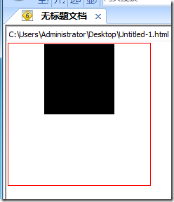
In IE6 and 7, you can control the horizontal alignment of the table content through CSS text-algin, whether the content is an inline element or a block element.
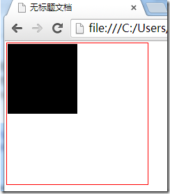
But text-align:center in IE8+, Chrome, Firefox and other browsers is not valid for block elements, and you can only use the table's own align attribute.
5. Use display:table-cell to center
For those elements that are not tables, we can use display:table-cell to simulate it as a table cell, so that we can take advantage of the convenient centering feature of the table . For example:

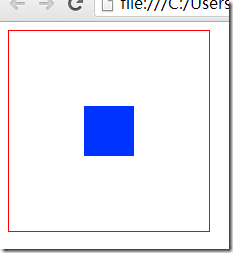
However, this method can only be used on IE8+, Google, Firefox and other browsers, and is invalid for IE6 and IE7.
The methods mentioned there are all very basic, and naturally cannot be called fancy tricks. Here are some centering methods that require the use of some skills.
6. Use absolute positioning for centering
This method only applies to elements whose width or height we already know.
The principle of centering with absolute positioning is to set the left or top attribute of the absolutely positioned element to 50%. At this time, the element is not centered, but is offset to the right or left by the width of the element compared to the centered position. Or half the height, so you need to use a negative margin-left or margin-top value to bring it back to the centered position. This negative margin value takes half the width or height of the element.
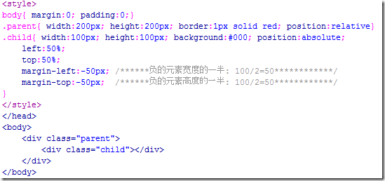
Operation effect:
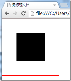
If you only want to achieve centering in one direction, you can only use left and margin-left to achieve horizontal centering, and use top and margin-top to achieve vertical centering.
7. Another method of using absolute positioning to center
This method is also only applicable to those elements whose width or height we already know, and unfortunately it only supports IE9+, Google, Firefox, etc. A modern browser based on w3c standards.
The following is a piece of code to understand this method:
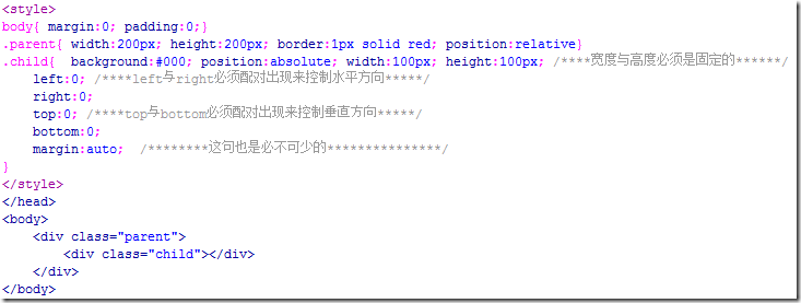
Operation effect:
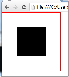
If the width and height of the element are not defined here, then its width will be determined by the values of left and right, and the height will be determined by the values of top and bottom, so the height and width of the element must be set. At the same time, if you change the values of left, right, top, and bottom, you can also offset the element in a certain direction. You can try it yourself.
8. Use floating and relative positioning to perform horizontal centering
This method is also a solution to how to horizontally center floating elements, and we do not need to know the width of the element that needs to be centered.
The principle of floating centering is: position the floating element relatively to 50% of the width of the parent element, but at this time the element is not centered yet, but is half its width wider than the centered position. In this case, it is necessary The child element inside uses a relative positioning to bring back the extra half of its width. Since relative positioning is relative to itself, half of its width only needs to be set to 50% left or right. You can get it, so you don't need to know what its actual width is.
This method of using floating and relative positioning to center has the advantage that you don’t need to know the width of the element to be centered, even if the width is constantly changing; the disadvantage is that it requires an extra element to wrap the element to be centered.
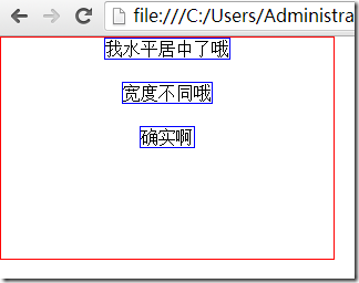
Look at the code:
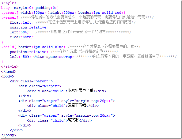
Operation effect:
9. Use font-size to achieve vertical centering
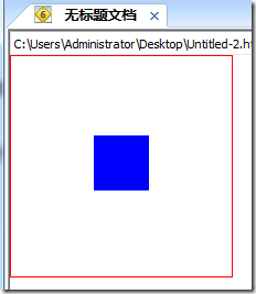
If the height of the parent element is known, make the child elements inside it horizontal and vertical Centered, you can use this method without knowing the width or height of the child elements.
This method is only valid for IE6 and IE7.
The key point of this method is to set a suitable font-size value for the parent element. The value of this value is the height of the parent element divided by 1.14, and the child element must be an inline or inline-block element. , you need to add the vertical-align:middle attribute.
As for why it is divided by 1.14 instead of other numbers, no one really knows. You just need to remember the number 1.14.
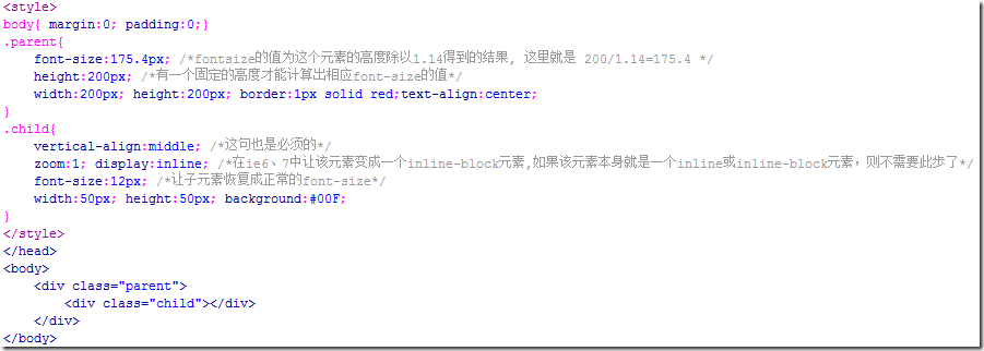
It was said in method 5 that display:table-cell can be used for centering in current browsers such as IE8+, Firefox, Google, etc., and the font-size method here is suitable for IE6 and IE7. So combining these two methods can be compatible with all browsers:
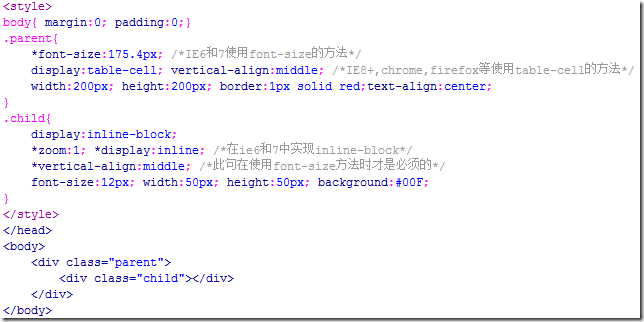
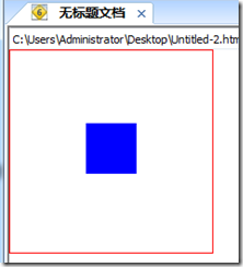
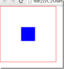
In the above example, because the element to be centered is a block element, we also need to turn it into an inline element , if the element to be centered is an inline element such as a picture, you can omit this step.
In addition, if vertical-align:middle is written in the parent element instead of the child element, this is also possible, but the value of 1.14 used when calculating font-size will become approximately 1.5.

Hot AI Tools

Undresser.AI Undress
AI-powered app for creating realistic nude photos

AI Clothes Remover
Online AI tool for removing clothes from photos.

Undress AI Tool
Undress images for free

Clothoff.io
AI clothes remover

Video Face Swap
Swap faces in any video effortlessly with our completely free AI face swap tool!

Hot Article

Hot Tools

Notepad++7.3.1
Easy-to-use and free code editor

SublimeText3 Chinese version
Chinese version, very easy to use

Zend Studio 13.0.1
Powerful PHP integrated development environment

Dreamweaver CS6
Visual web development tools

SublimeText3 Mac version
God-level code editing software (SublimeText3)

Hot Topics
 1386
1386
 52
52
 Working With GraphQL Caching
Mar 19, 2025 am 09:36 AM
If you’ve recently started working with GraphQL, or reviewed its pros and cons, you’ve no doubt heard things like “GraphQL doesn’t support caching” or
 Building an Ethereum app using Redwood.js and Fauna
Mar 28, 2025 am 09:18 AM
With the recent climb of Bitcoin’s price over 20k $USD, and to it recently breaking 30k, I thought it’s worth taking a deep dive back into creating Ethereum
 Vue 3
Apr 02, 2025 pm 06:32 PM
It's out! Congrats to the Vue team for getting it done, I know it was a massive effort and a long time coming. All new docs, as well.
 Can you get valid CSS property values from the browser?
Apr 02, 2025 pm 06:17 PM
I had someone write in with this very legit question. Lea just blogged about how you can get valid CSS properties themselves from the browser. That's like this.
 A bit on ci/cd
Apr 02, 2025 pm 06:21 PM
I'd say "website" fits better than "mobile app" but I like this framing from Max Lynch:
 Using Markdown and Localization in the WordPress Block Editor
Apr 02, 2025 am 04:27 AM
If we need to show documentation to the user directly in the WordPress editor, what is the best way to do it?
 Comparing Browsers for Responsive Design
Apr 02, 2025 pm 06:25 PM
There are a number of these desktop apps where the goal is showing your site at different dimensions all at the same time. So you can, for example, be writing
 Stacked Cards with Sticky Positioning and a Dash of Sass
Apr 03, 2025 am 10:30 AM
The other day, I spotted this particularly lovely bit from Corey Ginnivan’s website where a collection of cards stack on top of one another as you scroll.


