Discuss various centering methods in CSS
Today we will mainly talk about various centering methods in CSS.
The first thing is to center it horizontally. The easiest way is of course
margin:0 auto;
That is, set the margin-left and margin-right properties to auto to achieve the effect of horizontal centering.
What about other ways? Let me go through them one by one:
line-height
First introduce the horizontal centering method of text:
<div class="wrap">刘放</div>
Use line-height set to height:
.wrap{
  line-height: 200px;/*垂直居中关键*/
  text-align:center;

    height: 200px;
  font-size: 36px;
  background-color: #ccc;
}The effect is as follows:
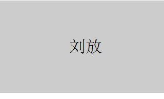
padding
Use padding and background-clip to achieve horizontal and vertical centering of divs:
<div class="parent">
  <div class="children"></div>
</div>
Set backgroun-clip to content-box, crop the background to the outer edge of the content area, and then use padding to set the difference between the outer div minus the inner div Half of it, to achieve:
.parent{
 margin:0 auto;
 width:200px;
 height:200px;
 background-color:red;
}
.children {
 width: 100px;
 height: 100px;
 padding: 50px;
 background-color: black;
background-clip:content-box;/*居中的关键*/The effect is as follows:
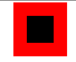
margin filling
Next, we will introduce the method of margin filling to achieve horizontal and vertical centering.
First we define the parent-child div:
Here we use the child div The margin-top is set to the height of the parent div minus half the height of the child div, and then the overflow is set to hidden to trigger the BFC of the parent div. The LESS code is as follows:
@parentWidth:200px;
@childrenWidth:50px;
.parent {
 margin:0 auto;
 height:@parentWidth;
 width:@parentWidth;
 background: red;
 overflow:hidden;/*触发BFC*/
}
.children {
 height:@childrenWidth;
 width:@childrenWidth;
 margin-left:auto;
 margin-right:auto;
 margin-top: (@parentWidth - @childrenWidth) / 2;
 background:black;
}The final centering effect is as follows:

absolute Positioning
Use position:absolute with top, left 50%, and then set the margin to a negative value to center the div horizontally and vertically. First, you still need to define the parent-child div:
<div class="parent">
  <div class="children"></div>
</div>
and then set the corresponding css:
.parent {
 position:relative;
 margin:0 auto;
 width:200px;
 height:200px;
 background-color:red;
}
.children {
 position:absolute;
 left:50%;
 top:50%;
 margin:-25px 0 0 -25px ;
 height:50px;
 width:50px;
 background-color: black;
}where The value in margin is half the width of the div. The final rendering is:
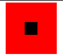
text-align centered
As we all know, text-align can center the content in a div horizontally. But what if you want to center the child div in this div? You can set the display of the child div to inline-block.
.parent {
 text-align:center;
 margin:0 auto;
 width:200px;
 height:200px;
 background:red;
}
.children {
 positiona;absolute;
 margin-top:75px;
 width:50px;
 height:50px;
 background: black;
 display:inline-block;/*使其父元素text-align生效*/
}Picture centering
General picture centering is the same as text-align. Wrap the picture in a div and set the text-align of the div to center.
You can refer to the link below:
Personal site
There is a special way to use an image as a placeholder to allow the parent container to obtain the height and width, so that the image with a -50% offset can have a reference container. Percent calculation. The advantage is that you don’t know the size of the image, and you can place any image that does not exceed the size of the parent container and it will be centered. In addition, the compatibility is good, and IE6 is smoothly compatible. The code is as follows:
<div class="parent">
  <p>
    <img class="hidden-img lazy"  src="/static/imghw/default1.png"  data-src="http://nec.netease.com/img/s/1.jpg"    alt="" />
    <img class="show-img lazy"  src="/static/imghw/default1.png"  data-src="http://nec.netease.com/img/s/1.jpg"    alt="" /></p>
</div>.parent {
position:relative;
width:100%;
height:200px;
background:red;
}
p {
position:absolute;
top:50%;
left:50%;
}
.hidden-img {
visibility:hidden;
}
.show-img {
position:absolute;
right:50%;
bottom:50%;
}The effect is as follows:

transform centered
In the above example of centered div, the width of the div is fixed. However, in actual projects, you may encounter divs with variable widths. Especially in responsive or mobile-side designs, it is more common. So here’s a method to center divs horizontally and vertically that doesn’t require a fixed width.
First go to the code:
<div class="parent">
  <div class="children">
    <div class="children-inline">我是水平垂直居中噢!</div>
  </div>
</div>.parent {
float: left;
width: 100%;
height: 200px;
background-color: red;
}
.children {
float:left;
position:relative;
top:50%;
left:50%;
}
.children-inline {
position: relative;
left: -50%;
-webkit-transform : translate3d(0, -50%, 0);
transform : translate3d(0, -50%, 0);
background-color: black;
color:white;
}The effect is as follows:
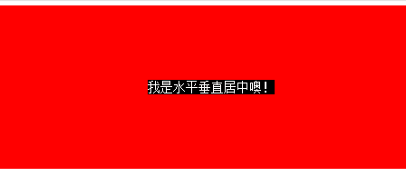
First we use float to shrink the width of the parent div of the div that needs to be centered, that is, children, and then left:50%, align the left side of children with the horizontal midline . At this time, it is not really centered yet. We need to move the children-inner left by -50% so that it is horizontally centered.
Let’s talk about the vertical direction. First set the children’s top to 50%, and then align its top edge with the vertical center line. Similarly, we need to move the children-inner upward by -50%. But this 50% cannot be calculated, so we use transform: translate3d(0, -50%, 0);
This method is very easy to use.
flex centering
Finally, let’s introduce the horizontal and vertical centering method implemented by display:flex in CSS3.
<div class="parent">
  <div class="children">我是通过flex的水平垂直居中噢!</div>
</div>
html,body{
 width: 100%;
 height: 200px;
}
.parent {
 display:flex;
 align-items: center;/*垂直居中*/
 justify-content: center;/*水平居中*/
 width:100%;
 height:100%;
 background-color:red;
}
.children {
 background-color:blue;
}The effect is as follows:
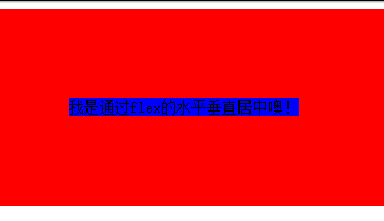
This method is the simplest, but the compatibility is not good, but as time goes by, all major browsers will be compatible.
The above is the entire discussion of various centering methods in CSS. I hope you like it.

Hot AI Tools

Undresser.AI Undress
AI-powered app for creating realistic nude photos

AI Clothes Remover
Online AI tool for removing clothes from photos.

Undress AI Tool
Undress images for free

Clothoff.io
AI clothes remover

Video Face Swap
Swap faces in any video effortlessly with our completely free AI face swap tool!

Hot Article

Hot Tools

Notepad++7.3.1
Easy-to-use and free code editor

SublimeText3 Chinese version
Chinese version, very easy to use

Zend Studio 13.0.1
Powerful PHP integrated development environment

Dreamweaver CS6
Visual web development tools

SublimeText3 Mac version
God-level code editing software (SublimeText3)

Hot Topics
 1386
1386
 52
52
 Working With GraphQL Caching
Mar 19, 2025 am 09:36 AM
If you’ve recently started working with GraphQL, or reviewed its pros and cons, you’ve no doubt heard things like “GraphQL doesn’t support caching” or
 Building an Ethereum app using Redwood.js and Fauna
Mar 28, 2025 am 09:18 AM
With the recent climb of Bitcoin’s price over 20k $USD, and to it recently breaking 30k, I thought it’s worth taking a deep dive back into creating Ethereum
 Vue 3
Apr 02, 2025 pm 06:32 PM
It's out! Congrats to the Vue team for getting it done, I know it was a massive effort and a long time coming. All new docs, as well.
 Can you get valid CSS property values from the browser?
Apr 02, 2025 pm 06:17 PM
I had someone write in with this very legit question. Lea just blogged about how you can get valid CSS properties themselves from the browser. That's like this.
 A bit on ci/cd
Apr 02, 2025 pm 06:21 PM
I'd say "website" fits better than "mobile app" but I like this framing from Max Lynch:
 Using Markdown and Localization in the WordPress Block Editor
Apr 02, 2025 am 04:27 AM
If we need to show documentation to the user directly in the WordPress editor, what is the best way to do it?
 Comparing Browsers for Responsive Design
Apr 02, 2025 pm 06:25 PM
There are a number of these desktop apps where the goal is showing your site at different dimensions all at the same time. So you can, for example, be writing
 Stacked Cards with Sticky Positioning and a Dash of Sass
Apr 03, 2025 am 10:30 AM
The other day, I spotted this particularly lovely bit from Corey Ginnivan’s website where a collection of cards stack on top of one another as you scroll.


