Detailed explanation of C# ListView usage
1. ListView class
1. Commonly used basic attributes:
(1) FullRowSelect: Set whether to row selection mode. (Default is false) Tip: This property is only meaningful in the Details view.
(2) GridLines: Set whether to display grid lines between rows and columns. (Default is false) Tip: This property is only meaningful in the Details view.
(3) AllowColumnReorder: Set whether the column header can be dragged to change the order of the columns. (Default is false) Tip: This property is only meaningful in the Details view.
(4) View: Get or set the display mode of items in the control, including Details, LargeIcon, List, SmallIcon, Tile (default is LargeIcon)
(5) MultiSelect: Set whether multiple items can be selected. (Default is false)
(6) HeaderStyle: Get or set the column header style. B Clickable: The role of the column header is similar to the button, and the operation can be performed (such as sorting) when clicking.
NonClickable: The column header does not respond to mouse clicks.
None: Do not display column headers.
(7) LabelEdit: Set whether the user can edit the label of the item in the control. For the Detail view, only the content of the first column of the row can be edited. (Default is false)
(8) CheckBoxes: Set whether to display check boxes next to each item in the control. (Default is false)
(9) LargeImageList: Large icon set. Tip: Only used in LargeIcon view.
(10) SmallImageList: Small icon set. Tip: Only used in SmallIcon view.
(11) StateImageList: Image mask. These image masks can be used as overlays for LargeImageList and SmallImageList images, which can be used to indicate an item's application-defined state. (I don’t understand it yet)
(12) SelectedItems: Get the items selected in the control.
(13) CheckedItems: Get the items selected by the current check box in the control.
(14)Soritng: Sort items in list view. (Default is None)
Ascending: Items are sorted in increasing order.
Descending: items are sorted in descending order.
None: items are not sorted.
(15) Scrollable: Set whether to display scroll bars when there is not enough space to display all items. (Default is true)
(16) HoverSelection: Set whether to automatically select an item when the mouse pointer hovers over it. (Default is false)
(17) HotTracking: Set whether the appearance of the mouse pointer changes to the form of a hyperlink when it passes through the item text. (Default is false)
(18) HideSelection: Set whether the selected item is still highlighted when the control has no focus. (Default is false)
(19) ShowGroups: Set whether to display items in groups. (Default is false);
(20) Groups: Set the grouped object collection.
(21) TopItem: Gets or sets the first visible item in the control, which can be used for positioning. (The effect is similar to the EnsureVisible method)
2. Commonly used methods:
(1) BeginUpdate: Avoid describing the control before calling the EndUpdate method. When inserting a large amount of data, it can effectively avoid control flickering and greatly increase the speed.
(2) EndUpdate: After the BeginUpdate method suspends the description, continue to describe the list view control. (end update)
(3) EnsureVisible: The list view scrolls to the item row of the specified index item. (The effect is similar to the TopItem property) (4) FindItemWithText: Find the first ListViewItem starting with the given text value. N (5) FindnearestISTIM: According to the specified search direction, look for the next item from a given point. Tip: This method can only be used in the LargeIcon or SmallIcon view.
3. Commonly used events:
(1) AfterLabelEdit: Occurs when the user finishes editing the label of the item, and the LabelEdit attribute needs to be true.
(2) BeforeLabelEdit: Occurs when the user starts editing the label of the item.
(3) ColumnClick: Occurs when the user clicks the column header in the list view control.
2. Five views of ListView:
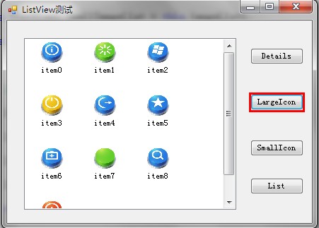
1. LargeIcon: Each item is displayed as a maximized icon with a label below it. (See the picture below for the effect)
2. SmallIcon: Each item is displayed as a small icon with a label on the right. (See the picture below for the effect)
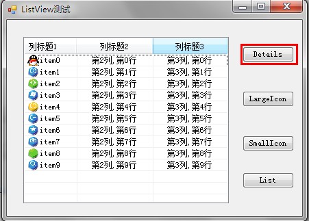
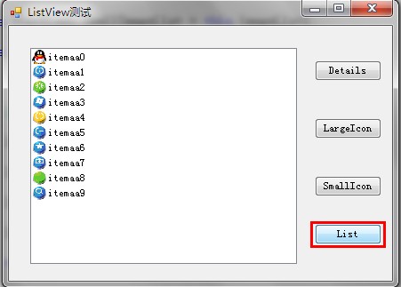
3. List: Each item is displayed as a small icon with a label on the right. Items are arranged in columns, with no column headers. (See the picture below for the effect) 4. Details: Any column can be displayed, but only the first column can contain a small icon and label, and other column items can only display text information and have column headers. (See the picture below for the effect)
5. Tile: Each item is displayed as a full-size icon with item label and sub-item information on the right side of it. (Only supported by Windows XP and Windows Server 2003 series)
①Details view:
this.listView1.SmallImageList = this.imageList1; //Bind the icon set of listView to imageList1
(1) List header creation (remember, Need to create a list header first) Create a list header.
(5) Row height setting (implemented using imageList )ColumnHeader ch= new ColumnHeader(); nbsp;ch.Text = "列标题1"; //设置列标题 ch.Width = 120; //设置列宽度 ch.TextAlign = HorizontalAlignment.Left; //设置列的对齐方式 this.listView1.Columns.Add(ch); //将列头添加到ListView控件。
ColumnHeader  ch= new ColumnHeader();

ch.Text = "列标题1";   //设置列标题

ch.Width = 120;    //设置列宽度

ch.TextAlign = HorizontalAlignment.Left;   //设置列的对齐方式

this.listView1.Columns.Add(ch);    //将列头添加到ListView控件。
this.listView1.Columns.Add("列标题1", 120, HorizontalAlignment.Left); //一步添加this.listView1.Columns.Add("列标题1", 120, HorizontalAlignment.Left); //一步添加②largeIcon view:
this.listView1.BeginUpdate();   //数据更新,UI暂时挂起,直到EndUpdate绘制控件,可以有效避免闪烁并大大提高加载速度

for (int i = 0; i < 10; i++)   //添加10行数据
{
     ListViewItem lvi = new ListViewItem();

     lvi.ImageIndex = i;     //通过与imageList绑定,显示imageList中第i项图标

     lvi.Text = "subitem" + i;

     lvi.SubItems.Add("第2列,第"+i+"行");

     lvi.SubItems.Add("第3列,第"+i+"行");

     this.listView1.Items.Add(lvi);
}

this.listView1.EndUpdate(); //结束数据处理,UI界面一次性绘制。this.listView1.BeginUpdate(); //数据更新,UI暂时挂起,直到EndUpdate绘制控件,可以有效避免闪烁并大大提高加载速度
for (int i = 0; i < 10; i++) //添加10行数据
{
ListViewItem lvi = new ListViewItem();
lvi.ImageIndex = i; //通过与imageList绑定,显示imageList中第i项图标
lvi.Text = "subitem" + i;
lvi.SubItems.Add("第2列,第"+i+"行");
lvi.SubItems.Add("第3列,第"+i+"行");
this.listView1.Items.Add(lvi);
}
this.listView1.EndUpdate(); //结束数据处理,UI界面一次性绘制。Running effect:
③SmallIcon view:foreach (ListViewItem item in this.listView1.Items)
{
for (int i = 0; i < item.SubItems.Count; i++)
{
MessageBox.Show(item.SubItems[i].Text);
}
}foreach (ListViewItem item in this.listView1.Items)
{
for (int i = 0; i < item.SubItems.Count; i++)
{
MessageBox.Show(item.SubItems[i].Text);
}
}
foreach (ListViewItem lvi in listView1.SelectedItems)  //选中项遍历
{
      listView1.Items.RemoveAt(lvi.Index); // 按索引移除
      //listView1.Items.Remove(lvi);   //按项移除
}foreach (ListViewItem lvi in listView1.SelectedItems) //选中项遍历
{
listView1.Items.RemoveAt(lvi.Index); // 按索引移除
//listView1.Items.Remove(lvi); //按项移除
}
1. Grouping:
ImageList imgList = new ImageList();

imgList.ImageSize = new Size(1, 20);// 设置行高 20 //分别是宽和高

listView1.SmallImageList = imgList; //这里设置listView的SmallImageList ,用imgList将其撑大
ImageList imgList = new ImageList();

imgList.ImageSize = new Size(1, 20);// 设置行高 20 //分别是宽和高

listView1.SmallImageList = imgList; //这里设置listView的SmallImageList ,用imgList将其撑大
Operation effect: 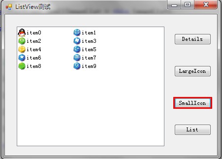
2. Search text (only matches can be found The text of the prefix can only be found Pick the first matching item):
this.listView1.Clear();  //从控件中移除所有项和列(包括列表头)。

this.listView1.Items.Clear();  //只移除所有的项。

Hot AI Tools

Undresser.AI Undress
AI-powered app for creating realistic nude photos

AI Clothes Remover
Online AI tool for removing clothes from photos.

Undress AI Tool
Undress images for free

Clothoff.io
AI clothes remover

AI Hentai Generator
Generate AI Hentai for free.

Hot Article

Hot Tools

Notepad++7.3.1
Easy-to-use and free code editor

SublimeText3 Chinese version
Chinese version, very easy to use

Zend Studio 13.0.1
Powerful PHP integrated development environment

Dreamweaver CS6
Visual web development tools

SublimeText3 Mac version
God-level code editing software (SublimeText3)

Hot Topics
 How to add next-level C compiler
Mar 03, 2025 pm 05:44 PM
This article explains how to create newline characters in C using the \n escape sequence within printf and puts functions. It details the functionality and provides code examples demonstrating its use for line breaks in output.
 What are the alternatives to NULL in C language
Mar 03, 2025 pm 05:37 PM
This article explores the challenges of NULL pointer dereferences in C. It argues that the problem isn't NULL itself, but its misuse. The article details best practices for preventing dereferences, including pre-dereference checks, pointer initiali
 Which C language compiler is better?
Mar 03, 2025 pm 05:39 PM
This article guides beginners on choosing a C compiler. It argues that GCC, due to its ease of use, wide availability, and extensive resources, is best for beginners. However, it also compares GCC, Clang, MSVC, and TCC, highlighting their differenc
 Is NULL still important in modern programming in C language?
Mar 03, 2025 pm 05:35 PM
This article emphasizes the continued importance of NULL in modern C programming. Despite advancements, NULL remains crucial for explicit pointer management, preventing segmentation faults by marking the absence of a valid memory address. Best prac
 What are the web versions of C language compilers?
Mar 03, 2025 pm 05:42 PM
This article reviews online C compilers for beginners, focusing on ease of use and debugging capabilities. OnlineGDB and Repl.it are highlighted for their user-friendly interfaces and helpful debugging tools. Other options like Programiz and Compil
 Method of copying code by C language compiler
Mar 03, 2025 pm 05:43 PM
This article discusses efficient code copying in C IDEs. It emphasizes that copying is an IDE function, not a compiler feature, and details strategies for improved efficiency, including using IDE selection tools, code folding, search/replace, templa
 C language online programming website C language compiler official website summary
Mar 03, 2025 pm 05:41 PM
This article compares online C programming platforms, highlighting differences in features like debugging tools, IDE functionality, standard compliance, and memory/execution limits. It argues that the "best" platform depends on user needs,
 C language compiler installation tutorial (computer version)
Mar 03, 2025 pm 05:41 PM
This tutorial guides users through installing C compilers on Windows, macOS, and Linux. It details installation for popular compilers (MinGW, Visual Studio, Xcode, GCC), explains environment variable configuration, and offers troubleshooting steps


