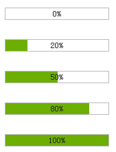
Let’s take a look at the final effect first:

The first step is to basically build the basic code and see the effect demonstration:
<!DOCTYPE html PUBLIC "-//W3C//DTD XHTML 1.0 Transitional//EN" "http://www.w3.org/TR/xhtml1/DTD/xhtml1-transitional.dtd">
<html xmlns="http://www.w3.org/1999/xhtml">
<head>
<title>制作进度条的两种方法</title>
<meta http-equiv="Content-Type" content="text/html; charset=gb2312" />
<style>
*{
margin:0;<!DOCTYPE html PUBLIC "-//W3C//DTD XHTML 1.0 Transitional//EN" "http://www.w3.org/TR/xhtml1/DTD/xhtml1-transitional.dtd">
<html xmlns="http://www.w3.org/1999/xhtml">
<head>
<title>制作进度条的两种方法</title>
<meta http-equiv="Content-Type" content="text/html; charset=gb2312" />
<style>
*{
margin:0;The third step, the second way to make a progress bar---directly use pictures + background pictures
<!DOCTYPE html PUBLIC "-//W3C//DTD XHTML 1.0 Transitional//EN" "http://www.w3.org/TR/xhtml1/DTD/xhtml1-transitional.dtd">
<html xmlns="http://www.w3.org/1999/xhtml">
<head>
<title></title>
<meta http-equiv="Content-Type" content="text/html; charset=gb2312" />
<style>
*{
margin:0;Of course, this method has some requirements for pictures. If you look carefully, you will find that the width is 2 times that of img.
In addition, the picture must be transparent gif, which means hollow. hehe. No progress bar is visible. In the example, background-position is the px value. In fact, you can use % to control it more accurately, such as: background-position:80% 50%; etc.
In general, this should be considered a skill and can be used in actual projects.
Step 4, Application
Finally we look at a simple application:
<!DOCTYPE html PUBLIC "-//W3C//DTD XHTML 1.0 Transitional//EN" "http://www.w3.org/TR/xhtml1/DTD/xhtml1-transitional.dtd">
<html xmlns="http://www.w3.org/1999/xhtml">
<head>
<title></title>
<meta http-equiv="Content-Type" content="text/html; charset=gb2312" />

<style>
*{Of course you can also use the first method. What needs to be changed in the first method is the width attribute of the progress bar.
 Commonly used search tools
 The difference between flutter and uniapp
 What are the data conversion methods in golang?
 How to enter root privileges in linux
 The difference between executeupdate and execute
 win10 upgrade patch method
 Common Linux download and installation tools
 How to turn off automatic updates in win10


