'CSS3 Practical Combat' Notes--Gradient Design (2)
Basic syntax for linear gradient design in CSS gradient design using Gecko engine
-moz-linear-gradient([
Parameter description:
Basic usage of linear gradient
/*The simplest linear gradient, you only need to specify the start color and end color, and the linear gradient will be implemented from top to bottom by default*/background: -moz-linear-gradient(red, blue) ;
Demonstration effect:
/*Gradient from the upper left corner to the lower right corner, where the top keyword sets the x-axis of the starting point, and the left keyword sets the y-axis coordinate of the starting point*/
background: -moz-linear- gradient(top left,red, blue)
Demonstration effect:
/*Set a colorful gradient from left to right, where the y-axis coordinate defaults to center, and multiple color scales are displayed evenly by step size*/background: -moz-linear-gradient(left, red, orange, yellow, green, blue, indigo, violet);
Demo effect:
/*Red gradient from the upper left corner to the lower right corner, where the red gradually weakens, And finally displayed as transparent*/background: -moz-linear-gradient(top left, red, rgba(255,0,0,0));
Demo effect:
/*Set the angle value*/background : -moz-linear-gradient(0deg, red, rgba(255,0,0,0));
Demonstration effect:
Summary: When the angle is specified, it is positioned counterclockwise along the horizontal line. Therefore, setting 0deg will create a horizontal gradient from left to right, while setting 90 degrees will create a gradient from bottom to top.
/*Colorful gradient from top to bottom, adding a green color scale at 80% of the y-axis to design a three-color gradient effect. If no position is specified, the three colors will be evenly distributed*/background: -moz-linear-gradient(top, blue, green 80%, orange);
Demonstration effect:
/*Design gradient translucent effect Background image, cover the background image with a gradient fill layer from left to right from white to transparent*/
background: -moz-linear-gradient(right, rgba(255,255,255,0), rgba(255,255,255,1)) , url(images/bg4.jpg);
Demo effect:
Basic syntax of radial gradient
-moz-radial-gradient([
Demonstration effect:
/*The simplest radial gradient, showing red, yellow and blue gradients from the middle to the outside, and setting different color scales Display position*/background: -moz-radial-gradient(red 20%, yellow 30%, blue 40%);
Demo effect:
/*Radial gradient, from red to yellow outward from the lower left corner , blue gradient display, and set the display position of the blue color scale */background: -moz-radial-gradient(bottom left, red, yellow, blue 80%);
Display effect:
/*radial gradient , the shape is circular. Display a gradient from red, yellow to blue from the middle of the left side outwards, and set the display position of the blue color scale*/background: -moz-radial-gradient(left, circle, red, yellow, blue 50%);
Demonstration effect:
/* Radial gradient, shape is ellipse. Display a gradient from red, yellow to blue from the middle outward, and set the gradient size to the cover keyword*/background: -moz-radial-gradient(ellipse cover, red, yellow, blue);
Demo effect:
Summary:
The size parameter contains multiple keywords, closest-side, closest-corner, farthest-side, farthest-corner, contain and cover. Use these keywords to define the size of the radial gradient.
In addition, the Gecko engine also defines two attributes -moz-repeating-linear-gradient and -moz-repeating-radial-gradient, which are used to define repeating linear gradients and repeating radial gradients.
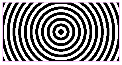
background: -moz-repeating-radial-gradient(circle, black, black 10px, white 10px, white 20px);
Demo effect:

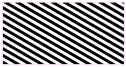
background: -moz-repeating-linear-gradient( top left 60deg,black, black 10px, white 10px, white 20px);
Demo effect:

Application of gradient
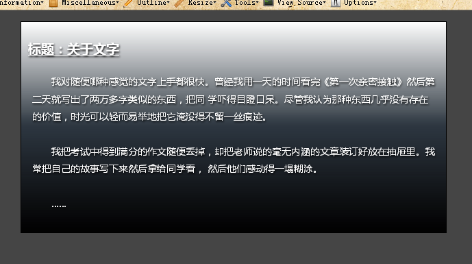
<meta http-equiv="Content-Type" content="text/html; charset=utf-8" /><title>Webkit引擎的应用</title><style type="text/css">body {/*页面初始化*/ background-color: #454545; margin:1em; padding:0;}.box {/*设计模块样式*/ -moz-border-radius: 10px;/*设计圆角*/ -moz-box-shadow: 0 0 12px 1px rgba(205, 205, 205, 1);/*设计阴影特效*/ border: 1px solid black; padding: 10px; max-width: 600px;/*最大宽度显示*/ margin: auto;/*居中显示*/ text-shadow: black 1px 2px 2px;/*设计文本包含阴影*/ color: white; background-image: -moz-linear-gradient(bottom, black, rgba(0, 47, 94, 0.2), white); /*设计直线渐变背景*/ background-color: rgba(43, 43, 43, 0.5);}.box:hover {/*设计鼠标经过时,放大阴影亮度*/ -moz-box-shadow: 0 0 12px 5px rgba(205, 205, 205, 1);}h2 {/*在标题前面添加额外内容*/ font-size: 120%; font-weight:bold; text-decoration:underline;}h2:before { content: "标题:";}p { padding: 6px; text-indent:2em; line-height:1.8em; font-size:14px;}</style></head><body><div class="box"> <h2 id="关于文字">关于文字</h2> </div></body></html>Demo effect:

More《 CSS3 Practical "Notes - Gradient Design (2) For related articles, please pay attention to the PHP Chinese website!

Hot AI Tools

Undresser.AI Undress
AI-powered app for creating realistic nude photos

AI Clothes Remover
Online AI tool for removing clothes from photos.

Undress AI Tool
Undress images for free

Clothoff.io
AI clothes remover

AI Hentai Generator
Generate AI Hentai for free.

Hot Article

Hot Tools

Notepad++7.3.1
Easy-to-use and free code editor

SublimeText3 Chinese version
Chinese version, very easy to use

Zend Studio 13.0.1
Powerful PHP integrated development environment

Dreamweaver CS6
Visual web development tools

SublimeText3 Mac version
God-level code editing software (SublimeText3)

Hot Topics
 1371
1371
 52
52
 Adding Box Shadows to WordPress Blocks and Elements
Mar 09, 2025 pm 12:53 PM
The CSS box-shadow and outline properties gained theme.json support in WordPress 6.1. Let's look at a few examples of how it works in real themes, and what options we have to apply these styles to WordPress blocks and elements.
 Working With GraphQL Caching
Mar 19, 2025 am 09:36 AM
If you’ve recently started working with GraphQL, or reviewed its pros and cons, you’ve no doubt heard things like “GraphQL doesn’t support caching” or
 Making Your First Custom Svelte Transition
Mar 15, 2025 am 11:08 AM
The Svelte transition API provides a way to animate components when they enter or leave the document, including custom Svelte transitions.
 Classy and Cool Custom CSS Scrollbars: A Showcase
Mar 10, 2025 am 11:37 AM
In this article we will be diving into the world of scrollbars. I know, it doesn’t sound too glamorous, but trust me, a well-designed page goes hand-in-hand
 Show, Don't Tell
Mar 16, 2025 am 11:49 AM
How much time do you spend designing the content presentation for your websites? When you write a new blog post or create a new page, are you thinking about
 Building an Ethereum app using Redwood.js and Fauna
Mar 28, 2025 am 09:18 AM
With the recent climb of Bitcoin’s price over 20k $USD, and to it recently breaking 30k, I thought it’s worth taking a deep dive back into creating Ethereum
 What the Heck Are npm Commands?
Mar 15, 2025 am 11:36 AM
npm commands run various tasks for you, either as a one-off or a continuously running process for things like starting a server or compiling code.
 Let's use (X, X, X, X) for talking about specificity
Mar 24, 2025 am 10:37 AM
I was just chatting with Eric Meyer the other day and I remembered an Eric Meyer story from my formative years. I wrote a blog post about CSS specificity, and


