'CSS3 Practical Combat' Notes--Gradient Design (1)
Compared with image gradients, the biggest advantage of CSS-based gradients is that they are easy to modify and support stepless scaling, making the transition more natural. Currently, only browsers based on Webkit and Gecko engines can implement CSS gradients. The Opera browser based on the Presto engine does not support gradients for the time being. Although IE based on Trident can achieve it through filters, it is not recommended.
CSS gradient design for Webkit engine (Safari 4 and above)
Basic syntax:
-webkit-gradient(
Parameter description:
Basic usage of linear gradient:
/*Simple linear gradient background color, from top to bottom, from blue to red gradient display*/background: -webkit-gradient(linear, left top, left bottom, from(blue ), to(red));
Demonstration effect:

/*From top to middle, then from middle to bottom, from blue to green, then to red gradient display*/background: -webkit -gradient(linear, left top, left bottom, from(blue), to(red), color-stop(50%, green));
Demo effect:

/*Design double gradient , from top to bottom, first from blue to white, then from black to red */background: -webkit-gradient(linear, left top, left bottom, from(blue), to(red),color -stop(0.5, #fff), color-stop(0.5, #000));
Demonstration effect:

/*Design multiple gradient effects by setting different step values, starting from the top To the bottom, first the gradient is from blue to white, then from Baise to black, and finally from black to red. */background: -webkit-gradient(linear, left top, left bottom, from(blue), to( red),color-stop(0.4, #fff), color-stop(0.6, #000));
Demonstration effect:

Summary: The color-stop() function contains two parameter values, The first parameter value specifies the corner mark position, and the second parameter specifies the color mark color. A gradient can contain multiple color stops. The position value is a decimal between 0 and 1, or a percentage between 0 and 100%, specifying the position proportion of the color stop.
Basic usage of radial gradient
/* Concentric circles (center coordinates are 200, 100), inner circle radius is 10, outer circle radius is 100, inner circle is smaller than outer circle radius, from inner circle red to outer circle green Radial gradient, the outer circle radius is displayed in green, and the inner circle is displayed in red*/background: -webkit-gradient(radial, 200 100, 10, 200 100, 100, from(red), to(green));
Effect display:
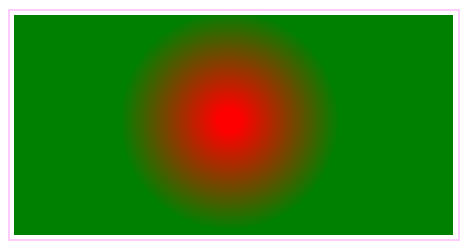
/* Concentric circles (center coordinates are 200, 100), inner circle radius is 100, outer circle radius is 100, inner circle is smaller than outer circle radius, from inner circle red to outer circle green Radial gradient. When the radius of the inner circle and the outer circle are equal, the gradient is invalid*/background: -webkit-gradient(radial, 200 100, 100, 200 100, 100, from(red), to(green));
Demo effect :

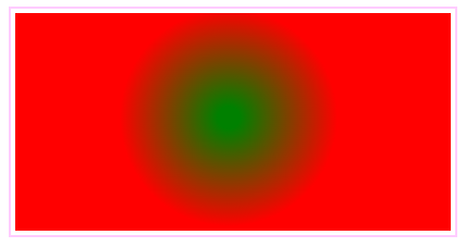
/* Concentric circles (center coordinates are 200, 100), inner circle radius is 100, outer circle radius is 10, inner circle is larger than outer circle radius, radial gradient from inner circle red to outer circle green , exceeding the inner circle radius is displayed in red, and the outer circle is displayed in green*/
background: -webkit-gradient(radial, 200 100, 100, 200 100, 10, from(red), to(green));
Demo Effect:
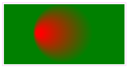
/* For non-concentric circles, if the distance between the center of the inner circle and the center of the outer circle is less than the difference in the radius of the two circles, the effect shown above will be displayed, showing a tapered radial gradient effect. The sharpness of the cone is proportional to the distance between the centers of the two circles*/background: -webkit-gradient(radial, 120 100, 10, 200 100, 100, from(red), to(green));
Demo effect:
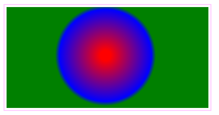
/* Concentric circles, add a blue color mark at 90% of the position from the inner circle to the outer circle, that is, within the distance from the outer ring, and design a multi-layer radial gradient, as shown in the picture below. */background: -webkit-gradient(radial, 200 100, 10, 200 100, 100, from(red), to(green), color-stop(90%, blue));
Demo effect:
/*By setting the color value of the to() function to be transparent, you can design a divergent circular effect*/background: -webkit-gradient(radial, 200 100, 10, 200 100, 90, from(red) , to(rgba(1,159,98,0)));
Demonstration effect:

/*By setting the color value of the to() function to transparent and designing similar colors, you can design a spherical effect* /background: -webkit-gradient(radial, 180 80, 10, 200 100, 90, from(#00C), to(rgba(1,159,98,0)), color-stop(98%, #0CF));
Demonstration effect:

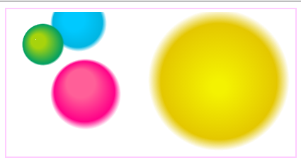
/*By defining multiple radial gradients for the background image, you can design multiple bubble effects, as shown below*/background: -webkit-gradient(radial, 45 45, 10 , 52 50, 30, from(#A7D30C), to(rgba(1,159,98,0)), color-stop(90%, #019F62)), -webkit-gradient(radial, 105 105, 20, 112 120 , 50, from(#ff5f98), to(rgba(255,1,136,0)), color-stop(75%, #ff0188)), -webkit-gradient(radial, 95 15, 15, 102 20, 40, from(#00c9ff), to(rgba(0,201,255,0)), color-stop(80%, #00b5e2)), -webkit-gradient(radial, 300 110, 10, 300 100, 100, from(#f4f201) , to(rgba(228, 199,0,0)), color-stop(80%, #e4c700)); -webkit-background-origin: padding-box; -webkit-background-clip: content-box;
Demo effect:
Gradient application defines the border of the gradient effect
Code:
<!DOCTYPE html PUBLIC "-//W3C//DTD XHTML 1.0 Transitional//EN" "http://www.w3.org/TR/xhtml1/DTD/xhtml1-transitional.dtd">
<html xmlns="http://www.w3.org/1999/xhtml">
<head>
<meta http-equiv="Content-Type" content="text/html; charset=utf-8" />
<title>Webkit引擎的渐变实现方法</title>
<style type="text/css">
div {
 border-width: 20px;
 width: 400px;
 height: 200px;
 margin: 20px;
 -webkit-border-image: -webkit-gradient(linear, left top, left bottom, from(#00abeb), to(#fff), color-stop(0.5, #fff), color-stop(0.5, #66cc00)) 20;
}
</style>
</head>

<body>
<div></div>
</body>
</html>
Demo effect:

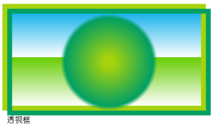
Define the fill content effect
Code:
<!DOCTYPE html PUBLIC "-//W3C//DTD XHTML 1.0 Transitional//EN" "http://www.w3.org/TR/xhtml1/DTD/xhtml1-transitional.dtd">
<html xmlns="http://www.w3.org/1999/xhtml">
<head>
<meta http-equiv="Content-Type" content="text/html; charset=utf-8" />
<title>Webkit引擎的渐变实现方法</title>
<style type="text/css">
.div1 {
 width:400px;
 height:200px;
 border:10px solid #A7D30C;
 background: -webkit-gradient(linear, left top, left bottom, from(#00abeb), to(#fff), color-stop(0.5, #fff), color-stop(0.5, #66cc00));
 float:left;
}
.div1::before {
 width:400px;
 height:200px;
 border:10px solid #019F62;
 content: -webkit-gradient(radial, 200 100, 10, 200 100, 100, from(#A7D30C), to(rgba(1, 159, 98, 0)), color-stop(90%, #019F62));
 display: block;
}
</style>
</head>

<body>
<div class="div1">透视框</div>
</body>
</html>
Display effect:
Define list icon
<!DOCTYPE html PUBLIC "-//W3C//DTD XHTML 1.0 Transitional//EN" "http://www.w3.org/TR/xhtml1/DTD/xhtml1-transitional.dtd">
<html xmlns="http://www.w3.org/1999/xhtml">
<head>
<meta http-equiv="Content-Type" content="text/html; charset=utf-8" />
<title>Webkit引擎的渐变实现方法</title>
<style type="text/css">
ul {
 list-style-image: -webkit-gradient(radial, center center, 4, center center, 8, from(#ff0000), to(rgba(0, 0, 0, 0)), color-stop(90%, #dd0000))
}
</style>
</head>

<body>
<ul>
 <li>新闻列表项1</li>
 <li>新闻列表项2</li>
 <li>新闻列表项3</li>
 <li>新闻列表项4</li>
</ul>
</body>
</html>
Demo effect:

More "CSS3 Practical" Notes - Gradient Design (1) related articles please Follow PHP Chinese website!

Hot AI Tools

Undresser.AI Undress
AI-powered app for creating realistic nude photos

AI Clothes Remover
Online AI tool for removing clothes from photos.

Undress AI Tool
Undress images for free

Clothoff.io
AI clothes remover

AI Hentai Generator
Generate AI Hentai for free.

Hot Article

Hot Tools

Notepad++7.3.1
Easy-to-use and free code editor

SublimeText3 Chinese version
Chinese version, very easy to use

Zend Studio 13.0.1
Powerful PHP integrated development environment

Dreamweaver CS6
Visual web development tools

SublimeText3 Mac version
God-level code editing software (SublimeText3)

Hot Topics
 1377
1377
 52
52
 Working With GraphQL Caching
Mar 19, 2025 am 09:36 AM
If you’ve recently started working with GraphQL, or reviewed its pros and cons, you’ve no doubt heard things like “GraphQL doesn’t support caching” or
 Making Your First Custom Svelte Transition
Mar 15, 2025 am 11:08 AM
The Svelte transition API provides a way to animate components when they enter or leave the document, including custom Svelte transitions.
 Show, Don't Tell
Mar 16, 2025 am 11:49 AM
How much time do you spend designing the content presentation for your websites? When you write a new blog post or create a new page, are you thinking about
 Building an Ethereum app using Redwood.js and Fauna
Mar 28, 2025 am 09:18 AM
With the recent climb of Bitcoin’s price over 20k $USD, and to it recently breaking 30k, I thought it’s worth taking a deep dive back into creating Ethereum
 How do you use CSS to create text effects, such as text shadows and gradients?
Mar 14, 2025 am 11:10 AM
The article discusses using CSS for text effects like shadows and gradients, optimizing them for performance, and enhancing user experience. It also lists resources for beginners.(159 characters)
 Creating Your Own Bragdoc With Eleventy
Mar 18, 2025 am 11:23 AM
No matter what stage you’re at as a developer, the tasks we complete—whether big or small—make a huge impact in our personal and professional growth.
 What the Heck Are npm Commands?
Mar 15, 2025 am 11:36 AM
npm commands run various tasks for you, either as a one-off or a continuously running process for things like starting a server or compiling code.
 Let's use (X, X, X, X) for talking about specificity
Mar 24, 2025 am 10:37 AM
I was just chatting with Eric Meyer the other day and I remembered an Eric Meyer story from my formative years. I wrote a blog post about CSS specificity, and


