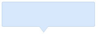
Final rendering:

Basic principle
First set an ordinary div box with a background color, and then use the triangle icon obtained in the previous post to set the div box to relative positioning mode, triangle icon Set to absolute positioning, position relative to the div box, and adjust to the appropriate position. This will get a basic tooltip, but it always looks uncomfortable without a border. We can set a border for the div box, which is not difficult, but how to set the border for the triangle icon? Here we use a clever way to superimpose two triangle icons of different colors and stagger their positions by 1px. In this way, the top border of the bottom triangle is covered and only the left and right border parts are exposed. When superimposed together, we get a triangle that looks like a border. icon.
step by step
1. First define a relatively positioned box div:
<div class="tooltips">
  </div>
css:
.tooltips{
position:relative;
width:300px;
height:80px;
line-height:60px;
background:#D7E7FC;
border-radius:4px;
}
Effect:
2. Next, we use the knowledge from the previous post Add a triangle icon to the div box:
<div class="tooltips">
  <div class="arrow "></div>
</div>
Triangle icon css:
.arrow{
  position:absolute;
  color: #D7E7FC;
  width: 0px;
  height:0px;
  line-height: 0px;
  border-width: 20px 15px 0;
  border-style: solid dashed dashed dashed;
  border-left-color: transparent;
  border-right-color: transparent;
  bottom: -20px;
  right: 50%;
}
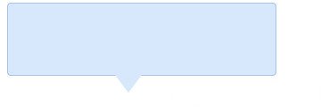
Effect:

It’s starting to take shape, and it can even be used directly, but if the tooltip background If the color coincides with the target background color, it will be difficult for us to distinguish it, so we need to define a border for it.
3. Add border
css:
.tooltips{
  position:relative;
  width:300px;
  height:80px;
  line-height:60px;
  background:#D7E7FC;
  border:1px solid #A5C4EC;
  border-radius:4px;
}
Effect:

The box has a border effect, but the small triangle below has not been "protected", which is simply a problem for Virgos Intolerable!
4. Put an elastic band on the "little triangle"
We have already said when explaining the principle that we need to use the method of superimposing two triangles. First, we define two triangle divs, one with the same background color as the border color of the box , a background color consistent with the background color of the box:
<div class="tooltips">
  <div class="arrow arrow-border"></div>
  <div class="arrow arrow-bg"></div>
</div>
css is defined as follows:
.arrow{
  position:absolute;
  width: 0px;
  height:0px;
  line-height: 0px;
  border-width: 20px 15px 0;
  border-style: solid dashed dashed dashed;
  border-left-color: transparent;
  border-right-color: transparent;
}
.arrow-border{
  color: #A5C4EC;
  bottom: -20px;
  right: 50%;
}
.arrow-bg{
  color: #D7E7FC;
  bottom: -19px;
  right: 50%;
}
Note: The difference in the bottom positions of .arrow-bg and .arrow-border is 1px (can be determined according to the border Width adjustment) The order of the two divs cannot be reversed.
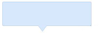
Let’s take a look at the final effect:

ok! It’s done, run it under IE6, it’s fully compatible!
For more related articles on using css to achieve fully compatible tooltip prompt boxes, please pay attention to the PHP Chinese website!
 Compare the similarities and differences between two columns of data in excel
 How to define variables in golang
 setInterval
 svg to jpg
 Can I retrieve a deleted Douyin short video?
 Usage of parseInt in Java
 How about MEX exchange
 What does class mean in c language?
 Solution to syntaxerror when running Python


