 Web Front-end
 CSS Tutorial
 High-quality web design: Examples and tips three (tips on text arrangement and font selection)
High-quality web design: Examples and tips three (tips on text arrangement and font selection)
Although designers rarely write the actual content of the website themselves, they are still crucial to the overall quality of the content. The role of the designer is to ensure that the content is presented in a way that is easy to read. There are many ways to ensure that your fonts are easy to read and use, but instead of giving you some rules and regulations on what you should and shouldn’t do, I will give you some examples and analysis of smart use of fonts.
Carefully considered examples of fonts
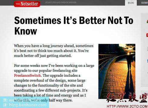
Big, beautiful fonts on The Netsetter
Titles are important in web design, and this is especially true for blog design. It has recently become popular to use large, bold fonts for titles. There are many benefits to doing this, not only improving the usability of specific blocks of content, but also helping to organize space and structure in the design. Netsetter does a great job here, as you can see the title is very readable with a large font and lots of white space around it.

White space and character spacing
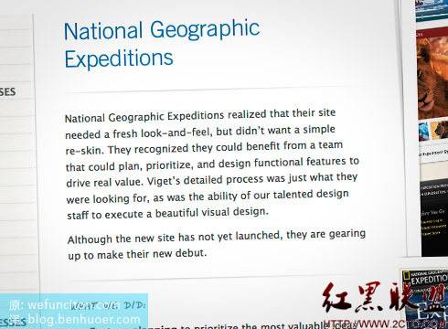
Viget’s website is a perfect example of how important fonts really are to web design. The screenshot below, from their portfolio page, once again shows how large fonts can help create open space. Even with this crisp thin line style, they used wide white spaces. Another nice touch is their excellent choice of line height [whitespace]. The line spacing is set much larger than the default value, which greatly enhances text readability. Maybe you can try this technique in your own designs next time.

Web Design Ledger, fonts that match the mood
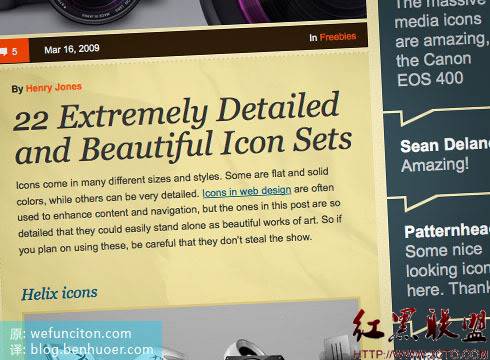
Finding the perfect font requires constant trial and error, or you still have to Fonts can be chosen based on the “mood” they represent. The example below, Web Design Ledger, gives people a retro and old-fashioned feel, while also being full of open emotions and modernity. The key to his success lies in choosing fonts that evoke corresponding emotions in people. Henry Jones (the site’s designer) chose Georgia, a popular traditional serif font for the title, which helped achieve a nostalgic retro feel. The modern feel comes from a completely different font than the title - the main content uses Helvetica, a sans-serif, slippery, open font.

Quick decisions on font selection in web design
After reading so many good examples above, you should be more comfortable choosing fonts in the future. But why do they feel so good? How should you use it in your own design next time? Is
readable?
Don’t be afraid to try bold fonts
Have you considered spacing?
Spacing plays a big role in readability
What emotion does your font give people?
Make sure the font selection suits your design style
There is a lot to be said for this, but I am no expert on this and I have only just learned how to appreciate a well-used font.
The above is the content of High-Quality Web Design: Examples and Tips Three (Tips on Text Arrangement and Font Selection). For more related content, please pay attention to the PHP Chinese website (www.php.cn)!

Hot AI Tools

Undresser.AI Undress
AI-powered app for creating realistic nude photos

AI Clothes Remover
Online AI tool for removing clothes from photos.

Undress AI Tool
Undress images for free

Clothoff.io
AI clothes remover

Video Face Swap
Swap faces in any video effortlessly with our completely free AI face swap tool!

Hot Article

Hot Tools

Notepad++7.3.1
Easy-to-use and free code editor

SublimeText3 Chinese version
Chinese version, very easy to use

Zend Studio 13.0.1
Powerful PHP integrated development environment

Dreamweaver CS6
Visual web development tools

SublimeText3 Mac version
God-level code editing software (SublimeText3)

Hot Topics
 1386
1386
 52
52
 CSS3 animation brings creative inspiration and unlimited possibilities to web designers
Sep 09, 2023 pm 08:45 PM
Overview of the creative inspiration and unlimited possibilities that CSS3 animation brings to web designers: In modern web design, animation effects have become an important factor in improving user experience and increasing website attractiveness. The emergence of CSS3 animation technology has brought more flexible, rich and creative design options to web designers. This article will explore the creative inspiration and unlimited possibilities that CSS3 animation brings to web designers, and provide some code examples. 1. Basic concepts and syntax of CSS3 animation. Before introducing CSS3 animation, we first need to
 Revealing the unique advantages of absolute positioning in web design
Jan 23, 2024 am 08:16 AM
Explore the unique advantages of absolute positioning in web design. In web design, absolute positioning is a commonly used layout method. By using absolute positioning, elements can be placed precisely at specified locations on the web page, and some special layout effects can be easily achieved. This article explores these advantages and illustrates them with specific code examples. Precise positioning of elements Absolute positioning allows precise control of the position of elements on a web page. By specifying the top, right, bottom, and left attributes of the element, the element can be
 Web design skills and practical experience sharing based on CSS3
Sep 08, 2023 pm 07:07 PM
Sharing of web design skills and practical experience based on CSS3 In today's Internet era, web design is becoming more and more important. With the advent of CSS3, designers can now use a variety of stunning effects to engage users. This article will share some web design skills and practical experience based on CSS3, aiming to help readers improve their web design level. 1. Use transition effects. Transition effects can produce smooth animation effects for elements from one state to another. By using the CSS3 transition property, we can
 Study the impact of introducing CSS third-party frameworks on web design
Jan 16, 2024 am 10:32 AM
Exploring the impact of the introduction of third-party frameworks into CSS on web design Introduction: With the rapid development of the Internet, web design has become increasingly important. In order to improve user experience and provide richer functions, developers often need to use third-party frameworks to assist design and development. This article will explore the impact of introducing CSS third-party frameworks on web design and give specific code examples. 1. What is CSS third-party framework? CSS third-party framework is a set of predefined CSS styles and components that can be called directly when building a web page. These frameworks are rich in content,
 Application fields of element selectors in web design
Jan 13, 2024 am 10:35 AM
The application of element selectors in web design requires specific code examples. In web design, element selectors are a very important CSS selector, which can help us control and adjust the styles of elements in web pages. By flexibly using element selectors, various exquisite web design effects can be achieved. 1. Basic syntax and usage of element selectors The element selector is the simplest type of CSS selector. It selects the corresponding element by specifying the tag name of the HTML element. The basic syntax of the element selector is: tag name {
 How to use CSS Positions layout to design card layout for web pages
Sep 28, 2023 am 08:17 AM
How to use CSSPositions layout to design card layout for web pages. In web design, card layout is a common and popular design method. It divides the content into independent cards, each card contains certain information, and can easily create a neat and layered page effect. In this article, we will introduce how to use CSSPositions layout to design the card layout of a web page, and attach specific code examples. Create the HTML structure First, we need to create the HTML structure to represent the card layout.
 What does h5 look like?
Apr 01, 2025 pm 05:29 PM
HTML5 (h5) is the fifth version of HTML, designed to enhance the flexibility and functionality of web development. The main features of h5 include: 1) new semantic tags, such as, et al.; 2) embedded audio and video support, such as, et al.; 3) Canvas drawing API; 4) Geolocation API. These features are implemented through the browser's JavaScript engine, making web pages more dynamic and interactive.
 How to use CSS3 technology to create cool web page effects
Sep 11, 2023 pm 12:54 PM
How to use CSS3 technology to create cool web page effects. With the development of the Internet, web design is becoming more and more important. The emergence of CSS3 technology has brought more inspiration and creative space to web designers. CSS3 has rich features and effects, which can easily achieve cool web page effects. This article will introduce some commonly used CSS3 features, and use examples to show how to use these features to create cool web page effects. Border effect Border is a common element in web design. Through the border feature of CSS3, you can add more effects to the border.


