High-quality web design and skills No. 4 (Organization of elements)
The profession of designer is attractive to many people because the process of creating creativity is really interesting. I know the process of organizing content is not that interesting, but once you develop a good habit of organizing content, you will find that it is not as boring as you think. The way you organize content always depends on the situation. For example, what type of site is this? How important is a particular piece of content on the page?
There are so many possible permutations of how and where to place content. But there are still some tips to follow. The most basic thing is to first decide what effect your design needs to achieve. For example, are you building a website that sells things? Is it for content display? Or are you making a user registration page? Promotion page? Wait...
Business by design: 37Signals
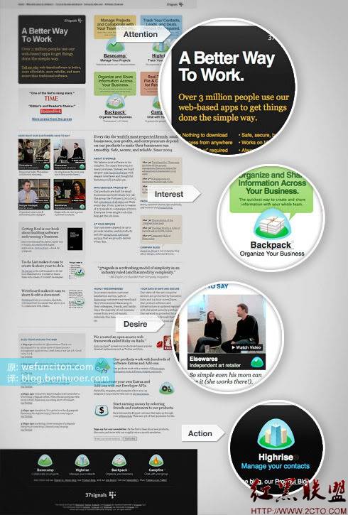
Check out this popular website from 37 signals. It's not just luck that their things sell so well. Their website makes it as easy as possible for you to learn about their products and help you make your final decision. Everything you see is exquisitely designed and presented.
As shown in the picture, they provide four top reasons for you to buy their products. Attracting attention is the first step. They made a black area, put a brief introduction about the product, and used a thick title. Then, they use some beautiful illustrations to attract your interest to introduce the advantages of the product. Then, they want to get you to want to buy, which they can do by placing customer review quotes and product award certificates. In this case, they did so through several “What our Customers have to say” videos. The last thing to be achieved is to promote purchase action (Action); 37Signals’ website has a large number of action points (links that guide users to the next step) throughout the entire page. Because the page is very long, more action points are placed at the bottom of the page. Many action points.

Designed for content (Blog): Well Medicated
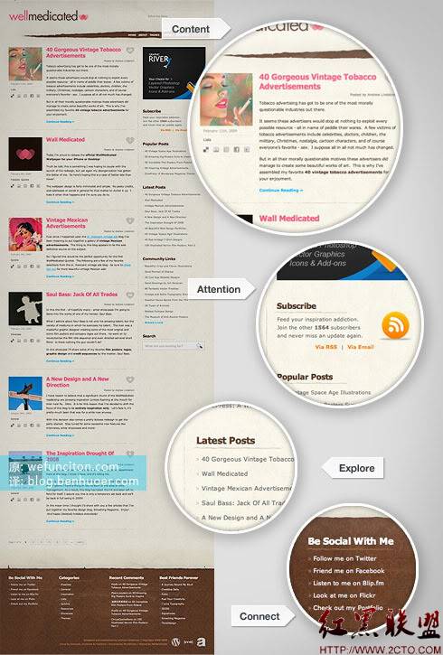
The situation is very different when designing blog pages. You don’t have to work hard to persuade your users to trust your product, your “product” is already displayed in front of them – that is, your blog content. All you have to do is make sure users can easily read your articles, explore the content, and connect with you and your blog.
Content (Content) should be the first part (one) of the blog that appears in front of readers. In the example below, a bold pink title grabs your attention and directs you directly to the content of the article. There is a preview image of a suitable size on the left, and on the right there are two or three paragraphs of article summary and a "continue reading" link. Of course, there is also the standard date and author information. This is a perfect example of what I consider “content design.” Attention can be directed to anything of interest. In this example, the beautiful RSS subscription button takes center stage. Not to mention that this focus makes readers feel connected to the content, but it also helps the site gain more subscriptions. Encouraging your readers to explore your content is as simple as adding a list of links to your latest or most popular articles on the sidebar, or making a drop-down menu, or organizing an efficient list of other content you want to push. It’s simple to do, yet effective enough, especially for bloggers. A blog is a private territory. Telling readers your contact information (Connect) through different channels can help them understand you, and it may also bring unexpected benefits.

Tips for Organizing Content
Of course you may come across times when you need to break the rules and do something unusual, but you can still follow these simple tips. To ensure good content structure and reading order.
Why are you designing?
As mentioned above, determine the goal of the design.
Use Grids
Grids help you get the most out of your pages.
Test element position
Examine the usability of the content from the visitor's perspective.
Remove all unnecessary elements
Unnecessary things should be eliminated, or at least not placed in conspicuous places
Balance of attention
Some things need to be simplified so that others Things shine brightly
The above is the content of high-quality web design and skills No. 4 (organization of elements). For more related content, please pay attention to the PHP Chinese website (www.php.cn)!

Hot AI Tools

Undresser.AI Undress
AI-powered app for creating realistic nude photos

AI Clothes Remover
Online AI tool for removing clothes from photos.

Undress AI Tool
Undress images for free

Clothoff.io
AI clothes remover

Video Face Swap
Swap faces in any video effortlessly with our completely free AI face swap tool!

Hot Article

Hot Tools

Notepad++7.3.1
Easy-to-use and free code editor

SublimeText3 Chinese version
Chinese version, very easy to use

Zend Studio 13.0.1
Powerful PHP integrated development environment

Dreamweaver CS6
Visual web development tools

SublimeText3 Mac version
God-level code editing software (SublimeText3)

Hot Topics
 1386
1386
 52
52
 Revealing the unique advantages of absolute positioning in web design
Jan 23, 2024 am 08:16 AM
Explore the unique advantages of absolute positioning in web design. In web design, absolute positioning is a commonly used layout method. By using absolute positioning, elements can be placed precisely at specified locations on the web page, and some special layout effects can be easily achieved. This article explores these advantages and illustrates them with specific code examples. Precise positioning of elements Absolute positioning allows precise control of the position of elements on a web page. By specifying the top, right, bottom, and left attributes of the element, the element can be
 CSS3 animation brings creative inspiration and unlimited possibilities to web designers
Sep 09, 2023 pm 08:45 PM
Overview of the creative inspiration and unlimited possibilities that CSS3 animation brings to web designers: In modern web design, animation effects have become an important factor in improving user experience and increasing website attractiveness. The emergence of CSS3 animation technology has brought more flexible, rich and creative design options to web designers. This article will explore the creative inspiration and unlimited possibilities that CSS3 animation brings to web designers, and provide some code examples. 1. Basic concepts and syntax of CSS3 animation. Before introducing CSS3 animation, we first need to
 Web design skills and practical experience sharing based on CSS3
Sep 08, 2023 pm 07:07 PM
Sharing of web design skills and practical experience based on CSS3 In today's Internet era, web design is becoming more and more important. With the advent of CSS3, designers can now use a variety of stunning effects to engage users. This article will share some web design skills and practical experience based on CSS3, aiming to help readers improve their web design level. 1. Use transition effects. Transition effects can produce smooth animation effects for elements from one state to another. By using the CSS3 transition property, we can
 Study the impact of introducing CSS third-party frameworks on web design
Jan 16, 2024 am 10:32 AM
Exploring the impact of the introduction of third-party frameworks into CSS on web design Introduction: With the rapid development of the Internet, web design has become increasingly important. In order to improve user experience and provide richer functions, developers often need to use third-party frameworks to assist design and development. This article will explore the impact of introducing CSS third-party frameworks on web design and give specific code examples. 1. What is CSS third-party framework? CSS third-party framework is a set of predefined CSS styles and components that can be called directly when building a web page. These frameworks are rich in content,
 Application fields of element selectors in web design
Jan 13, 2024 am 10:35 AM
The application of element selectors in web design requires specific code examples. In web design, element selectors are a very important CSS selector, which can help us control and adjust the styles of elements in web pages. By flexibly using element selectors, various exquisite web design effects can be achieved. 1. Basic syntax and usage of element selectors The element selector is the simplest type of CSS selector. It selects the corresponding element by specifying the tag name of the HTML element. The basic syntax of the element selector is: tag name {
 How to use CSS Positions layout to design card layout for web pages
Sep 28, 2023 am 08:17 AM
How to use CSSPositions layout to design card layout for web pages. In web design, card layout is a common and popular design method. It divides the content into independent cards, each card contains certain information, and can easily create a neat and layered page effect. In this article, we will introduce how to use CSSPositions layout to design the card layout of a web page, and attach specific code examples. Create the HTML structure First, we need to create the HTML structure to represent the card layout.
 What does h5 look like?
Apr 01, 2025 pm 05:29 PM
HTML5 (h5) is the fifth version of HTML, designed to enhance the flexibility and functionality of web development. The main features of h5 include: 1) new semantic tags, such as, et al.; 2) embedded audio and video support, such as, et al.; 3) Canvas drawing API; 4) Geolocation API. These features are implemented through the browser's JavaScript engine, making web pages more dynamic and interactive.
 How to use CSS3 technology to create cool web page effects
Sep 11, 2023 pm 12:54 PM
How to use CSS3 technology to create cool web page effects. With the development of the Internet, web design is becoming more and more important. The emergence of CSS3 technology has brought more inspiration and creative space to web designers. CSS3 has rich features and effects, which can easily achieve cool web page effects. This article will introduce some commonly used CSS3 features, and use examples to show how to use these features to create cool web page effects. Border effect Border is a common element in web design. Through the border feature of CSS3, you can add more effects to the border.


