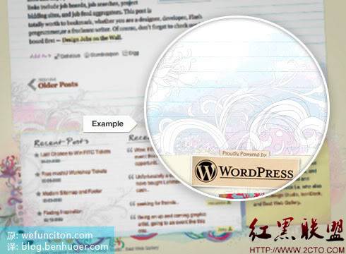
Designers are always looking for ways to create impact, always want to make a unique design and create some unprecedented effects. But sometimes self-restraint can also create impact. Quantitative changes lead to qualitative changes, and too much "good" can also bring about bad results. A good designer knows where the balance is and avoids letting too many special effects ruin a design.
Soft Gradients on the “Things” Website
I always pay attention to the subtle gradients on sites I visit. It may sound annoying, but I just can’t help but study the little details of other people’s designs to gain inspiration for my future designs. Gradient is one of the most overused design methods, but when used successfully, it can still add a lot of color to the design. It can provide a sense of realism and depth that other techniques cannot achieve. Most people don't pay much attention to gradients, but other people's use of gradients is indeed my best source of inspiration.

Projection on Icon Dock
Icon Dock’s website is simply a conference where all kinds of exquisite details come together. Pixel-level highlights, gradients, and drop shadows. But here we only focus on its projection. It’s not very big, and the transparency is turned up, carefully highlighting the content block and making it the real focus. Really beautiful~

Detailed background materials: Scouting for Girls
Material backgrounds will either make or break your design. A lot of complicated background does nothing but distract the reader. Ultimately, the design quality is greatly reduced. So, it's always best to keep your background materials subtle and soft. The Scouting for Girls website does an excellent job of using materials to create an overall style and design quality.

Distressed & Shredded Inspiration: Viget Advance
I never feel that subtler is better, in any detail” "Fineness" all presuppose visibility. People may not realize it clearly, but these details must have had an impact. The example of the blog Viget Advance can give us some inspiration in terms of distressing and shredding effects. It's just a very subtle distressing, but without this effect, the artificial paper would look bland and boring. It is these small "imperfections" that make this picture more believable and real.

Watercolor Effect on WebDesignerWall
When using the watercolor effect, the key is to make sure the colors are blended softly enough, with varying shades Suitable, and... enough "water". The watercolor effect offers many benefits to your designs: a delicate and harmonious range of colours, an appealing texture... Because of this, more and more designers are choosing to create watercolor effects in their designs.

Subtle Plants: Dara’s Garden
Below is a design full of clever plant details. There are many more lifelike botanical patterns online that are also very beautiful, but in this example I focused on the lighter, more subtle details on the background. This example shows the importance of details. The soft colors and distressed effect evoke your perception of details, but they do not become the main focus.

Tips for using subtle details
I believe that subtle details can transform a good design into something brilliant. If you're still looking for ways to make your design stand out, subtle details are a great way to try. Here are some tips for working with fine details:
Create detail layers
Don’t hang on to one brush or material, add more layers, more details
Experiment with different opacity and Color
Sometimes as little as 3% opacity can have a positive impact
Don’t shy away
Don’t worry about being too subtle or too subtle
That’s it for high-quality web design and tips Part 5 (Self-restraint and exquisite details), please pay attention to the PHP Chinese website (www.php.cn) for more related content!
 What does WeChat clone mean?
 netframework
 How to open the terminal window in vscode
 What are the free php virtual hosts abroad?
 What is the use of java
 What is a relational database
 How to make pictures scroll in ppt
 What are the seven principles of PHP code specifications?
 Detailed explanation of nginx configuration


