 Web Front-end
 CSS Tutorial
 High-Quality Web Design: Examples and Tips No. 6 (Utilizing the Full Potential of Color)
High-Quality Web Design: Examples and Tips No. 6 (Utilizing the Full Potential of Color)
Designers generally like to choose colors according to their own taste, which is really unprofessional. To decide which colors are most applicable, you should always have your brand needs in mind, and then choose a color combination that specifies its own theme and target mood.
Great example of using color in web design
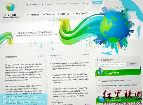
Boring does not mean colorless: Oypro
What I like about Oypro’s website is that they tell us about a “boring” industry Design accordingly doesn’t have to be “boring” either. Usually corporate websites do not allow designers to have too much visual creativity. Keeping it simple, monotonous, and pastel colors became the unwritten rule. However, the example of Oypro proves that you can create a website with enough "corporate feel" without restricting yourself.

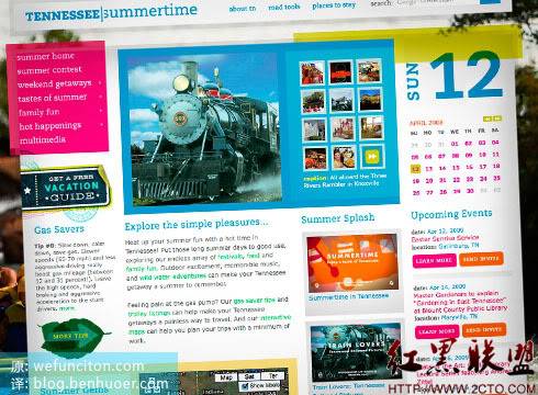
Let the colors connect: Tennessee Summertime
Summertime in Tennessee is a vibrant, bright, and very warm site. Everything looks designed to promote summer activities. The site uses a wide range of highly saturated colors in varying hues, but each color hits the mark and none is inappropriate for the theme. The color combination of a high-quality design must be closely related to the service or product it is intended to present. Good design doesn't always require going to great lengths to choose some surprising colors. The colors that are most obvious and should be used can actually create better effects. For example, Hell Design (Hell Design), it is simply unreasonable not to use the fiery red color that symbolizes hell.

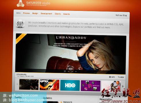
The background can also make a big difference: Saturized Studio
Just painting a dull background color will not make your design interesting. A slightly changing back is the best background. In this example we see a nice orange/red color being used with a variety of lighting and gradient effects. This approach of adding variety to the background effectively avoids blandness and dullness. Another thing to note is that the contrast between the dark orange background and the bright content area above creates a very dramatic and beautiful visual impact.

Tips for using color in web design
Color is always an area worth exploring and experimenting with. Experimenting with different combinations brings endless design possibilities. However, when choosing colors and color combinations, you should be aware of the following key points:
Try to break through
A boring theme does not necessarily have to use a boring color combination.
Variable
Try using gradients, repeating patterns, and brushes on your colorful backgrounds. It’s not easy to make a design look good with just color.
Stick to the theme
Make sure your colors are relevant to the product/service you need to present
That’s it for High-Quality Web Design: Examples and Tips No. 6 (Utilizing the Full Potential of Color) Content, please pay attention to the PHP Chinese website (www.php.cn) for more related content!

Hot AI Tools

Undresser.AI Undress
AI-powered app for creating realistic nude photos

AI Clothes Remover
Online AI tool for removing clothes from photos.

Undress AI Tool
Undress images for free

Clothoff.io
AI clothes remover

AI Hentai Generator
Generate AI Hentai for free.

Hot Article

Hot Tools

Notepad++7.3.1
Easy-to-use and free code editor

SublimeText3 Chinese version
Chinese version, very easy to use

Zend Studio 13.0.1
Powerful PHP integrated development environment

Dreamweaver CS6
Visual web development tools

SublimeText3 Mac version
God-level code editing software (SublimeText3)

Hot Topics
 1377
1377
 52
52
 Revealing the unique advantages of absolute positioning in web design
Jan 23, 2024 am 08:16 AM
Explore the unique advantages of absolute positioning in web design. In web design, absolute positioning is a commonly used layout method. By using absolute positioning, elements can be placed precisely at specified locations on the web page, and some special layout effects can be easily achieved. This article explores these advantages and illustrates them with specific code examples. Precise positioning of elements Absolute positioning allows precise control of the position of elements on a web page. By specifying the top, right, bottom, and left attributes of the element, the element can be
 Web design skills and practical experience sharing based on CSS3
Sep 08, 2023 pm 07:07 PM
Sharing of web design skills and practical experience based on CSS3 In today's Internet era, web design is becoming more and more important. With the advent of CSS3, designers can now use a variety of stunning effects to engage users. This article will share some web design skills and practical experience based on CSS3, aiming to help readers improve their web design level. 1. Use transition effects. Transition effects can produce smooth animation effects for elements from one state to another. By using the CSS3 transition property, we can
 Study the impact of introducing CSS third-party frameworks on web design
Jan 16, 2024 am 10:32 AM
Exploring the impact of the introduction of third-party frameworks into CSS on web design Introduction: With the rapid development of the Internet, web design has become increasingly important. In order to improve user experience and provide richer functions, developers often need to use third-party frameworks to assist design and development. This article will explore the impact of introducing CSS third-party frameworks on web design and give specific code examples. 1. What is CSS third-party framework? CSS third-party framework is a set of predefined CSS styles and components that can be called directly when building a web page. These frameworks are rich in content,
 CSS3 animation brings creative inspiration and unlimited possibilities to web designers
Sep 09, 2023 pm 08:45 PM
Overview of the creative inspiration and unlimited possibilities that CSS3 animation brings to web designers: In modern web design, animation effects have become an important factor in improving user experience and increasing website attractiveness. The emergence of CSS3 animation technology has brought more flexible, rich and creative design options to web designers. This article will explore the creative inspiration and unlimited possibilities that CSS3 animation brings to web designers, and provide some code examples. 1. Basic concepts and syntax of CSS3 animation. Before introducing CSS3 animation, we first need to
 How to use CSS Positions layout to design card layout for web pages
Sep 28, 2023 am 08:17 AM
How to use CSSPositions layout to design card layout for web pages. In web design, card layout is a common and popular design method. It divides the content into independent cards, each card contains certain information, and can easily create a neat and layered page effect. In this article, we will introduce how to use CSSPositions layout to design the card layout of a web page, and attach specific code examples. Create the HTML structure First, we need to create the HTML structure to represent the card layout.
 Application fields of element selectors in web design
Jan 13, 2024 am 10:35 AM
The application of element selectors in web design requires specific code examples. In web design, element selectors are a very important CSS selector, which can help us control and adjust the styles of elements in web pages. By flexibly using element selectors, various exquisite web design effects can be achieved. 1. Basic syntax and usage of element selectors The element selector is the simplest type of CSS selector. It selects the corresponding element by specifying the tag name of the HTML element. The basic syntax of the element selector is: tag name {
 How to correct color with Intel integrated graphics
Jan 12, 2024 pm 02:36 PM
We know that computers will have various problems after being used for a long time. The most common one is the monitor problem. Many users have encountered abnormal monitor colors. So what should you do if you also encounter abnormal monitor colors in Win7? Yes, today the editor has compiled for you how to correct the color of Intel integrated graphics. Let’s take a look at the details. How to correct the color of the Intel integrated graphics card 1. Calibration of the integrated graphics card is also very convenient. Click the display settings in the graphics card control panel to determine the display size and refresh rate of the monitor. Generally, 60Hz is sufficient for the LCD monitor. 2. Then click Color Correction. The brightness determines the brightness of the display. If it is too low, a lot of vivid details will be lost, and if it is too high, it will cause damage to your eyes. 3. This
 What does h5 look like?
Apr 01, 2025 pm 05:29 PM
HTML5 (h5) is the fifth version of HTML, designed to enhance the flexibility and functionality of web development. The main features of h5 include: 1) new semantic tags, such as, et al.; 2) embedded audio and video support, such as, et al.; 3) Canvas drawing API; 4) Geolocation API. These features are implemented through the browser's JavaScript engine, making web pages more dynamic and interactive.


