 Web Front-end
 CSS Tutorial
 High-Quality Web Design: Examples and Tips No. 7 (Do What Others Have Never Done)
High-Quality Web Design: Examples and Tips No. 7 (Do What Others Have Never Done)
The best websites have some unusual, strange, and even weird designs. But those attempts to challenge tradition may have changed the definition of tradition. Having said that, being completely original and creating something that no one has done before is really the hardest thing to do in the design process.
After breaking the rules, success and failure are only one step away. You can either make an amazingly clever design, or you can make a bunch of crap and be criticized. There's a reason people never do it, because some ideas are just terrible. You have to be very brave to step out of the area that people know and like. Here are some examples:
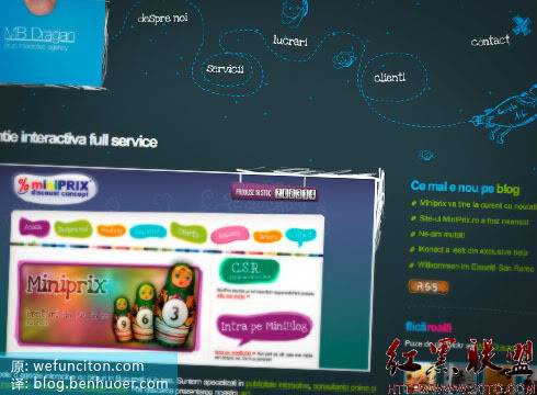
Unique navigation on MB Dragan
Not your usual site navigation, but it still looks like a website, just as good as those standard navigations. It was a bit risky, but the result was very consistent with the nature of the site. A very relevant design, it’s hard not to appreciate the coordination between the navigation and the entire design.

Visualbox (Visual Box) Very visual navigation
Visualbox’s website has only one goal, to show you their intelligent works. So they don’t use many words, and the first thing you see is their name and a selection of their works. When the mouse slides over the preview image, the project name will be displayed, and when you click it, you will slide to the corresponding position of the project on the page. This is a very efficient and practical solution, and much more engaging than simply making a list.

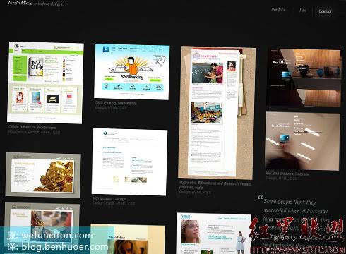
Nikola Mircic without further ado
Suppose you are an interaction designer and you need others to see your work. , can be moved enough to hire you. Nikola Mircic shows us how important being straight to the point can go in building a memorable site. As soon as you open his site, you will be greeted by works of various styles. His name and profession are prominently placed at the top of the page, and of course, there are plenty of contact links. There isn't a lot of redundant text to convince you to hire him, the work itself is a testament to his prowess. Of course, clicking on the thumbnail of the work will bring up a detailed introduction page, which has enough text. Really like the way he organizes the content.

Tips for implementing fresh ideas
The examples above are not meant to “inspire” your unique creativity, but are just some of the unique sites I’ve discovered. That's all. In fact, you shouldn't search everywhere for inspiration for new ideas, because then your ideas will be inspired by others, which is contrary to complete innovation. So if you plan on making something really extraordinary, just forget about this part!
Ensure the connection between things
If you plan to do something particularly unique, first ask yourself "Is it really necessary?", "Is this justified?", "And Does it meet the brand appeal?”… If the answer is yes, then take action!
Forget everything you know!
Well, actually it’s not all, the basic principles are still necessary. Having said that, there is no need to look for inspiration from completely new ideas, as that can easily lead to misdirection.
Ensure quality and standards
Basically I think if your new idea is good enough, it should be easy for you to judge the quality
The above is high-quality web design: examples and techniques The content of Part 7 (Doing things that others have not done), please pay attention to the PHP Chinese website (www.php.cn) for more related content!

Hot AI Tools

Undresser.AI Undress
AI-powered app for creating realistic nude photos

AI Clothes Remover
Online AI tool for removing clothes from photos.

Undress AI Tool
Undress images for free

Clothoff.io
AI clothes remover

Video Face Swap
Swap faces in any video effortlessly with our completely free AI face swap tool!

Hot Article

Hot Tools

Notepad++7.3.1
Easy-to-use and free code editor

SublimeText3 Chinese version
Chinese version, very easy to use

Zend Studio 13.0.1
Powerful PHP integrated development environment

Dreamweaver CS6
Visual web development tools

SublimeText3 Mac version
God-level code editing software (SublimeText3)

Hot Topics
 1386
1386
 52
52
 CSS3 animation brings creative inspiration and unlimited possibilities to web designers
Sep 09, 2023 pm 08:45 PM
Overview of the creative inspiration and unlimited possibilities that CSS3 animation brings to web designers: In modern web design, animation effects have become an important factor in improving user experience and increasing website attractiveness. The emergence of CSS3 animation technology has brought more flexible, rich and creative design options to web designers. This article will explore the creative inspiration and unlimited possibilities that CSS3 animation brings to web designers, and provide some code examples. 1. Basic concepts and syntax of CSS3 animation. Before introducing CSS3 animation, we first need to
 Revealing the unique advantages of absolute positioning in web design
Jan 23, 2024 am 08:16 AM
Explore the unique advantages of absolute positioning in web design. In web design, absolute positioning is a commonly used layout method. By using absolute positioning, elements can be placed precisely at specified locations on the web page, and some special layout effects can be easily achieved. This article explores these advantages and illustrates them with specific code examples. Precise positioning of elements Absolute positioning allows precise control of the position of elements on a web page. By specifying the top, right, bottom, and left attributes of the element, the element can be
 Web design skills and practical experience sharing based on CSS3
Sep 08, 2023 pm 07:07 PM
Sharing of web design skills and practical experience based on CSS3 In today's Internet era, web design is becoming more and more important. With the advent of CSS3, designers can now use a variety of stunning effects to engage users. This article will share some web design skills and practical experience based on CSS3, aiming to help readers improve their web design level. 1. Use transition effects. Transition effects can produce smooth animation effects for elements from one state to another. By using the CSS3 transition property, we can
 Study the impact of introducing CSS third-party frameworks on web design
Jan 16, 2024 am 10:32 AM
Exploring the impact of the introduction of third-party frameworks into CSS on web design Introduction: With the rapid development of the Internet, web design has become increasingly important. In order to improve user experience and provide richer functions, developers often need to use third-party frameworks to assist design and development. This article will explore the impact of introducing CSS third-party frameworks on web design and give specific code examples. 1. What is CSS third-party framework? CSS third-party framework is a set of predefined CSS styles and components that can be called directly when building a web page. These frameworks are rich in content,
 Application fields of element selectors in web design
Jan 13, 2024 am 10:35 AM
The application of element selectors in web design requires specific code examples. In web design, element selectors are a very important CSS selector, which can help us control and adjust the styles of elements in web pages. By flexibly using element selectors, various exquisite web design effects can be achieved. 1. Basic syntax and usage of element selectors The element selector is the simplest type of CSS selector. It selects the corresponding element by specifying the tag name of the HTML element. The basic syntax of the element selector is: tag name {
 How to use CSS Positions layout to design card layout for web pages
Sep 28, 2023 am 08:17 AM
How to use CSSPositions layout to design card layout for web pages. In web design, card layout is a common and popular design method. It divides the content into independent cards, each card contains certain information, and can easily create a neat and layered page effect. In this article, we will introduce how to use CSSPositions layout to design the card layout of a web page, and attach specific code examples. Create the HTML structure First, we need to create the HTML structure to represent the card layout.
 What does h5 look like?
Apr 01, 2025 pm 05:29 PM
HTML5 (h5) is the fifth version of HTML, designed to enhance the flexibility and functionality of web development. The main features of h5 include: 1) new semantic tags, such as, et al.; 2) embedded audio and video support, such as, et al.; 3) Canvas drawing API; 4) Geolocation API. These features are implemented through the browser's JavaScript engine, making web pages more dynamic and interactive.
 How to use CSS3 technology to create cool web page effects
Sep 11, 2023 pm 12:54 PM
How to use CSS3 technology to create cool web page effects. With the development of the Internet, web design is becoming more and more important. The emergence of CSS3 technology has brought more inspiration and creative space to web designers. CSS3 has rich features and effects, which can easily achieve cool web page effects. This article will introduce some commonly used CSS3 features, and use examples to show how to use these features to create cool web page effects. Border effect Border is a common element in web design. Through the border feature of CSS3, you can add more effects to the border.


