Hello! Dear front-end developers, after reading the CSS3 tutorial - the first attribute of the border, are you looking forward to its second attribute, box-shadow? Don't worry, the front-end development network will introduce it to you one by one.
First let’s look at an example:
Add box-shadow to a div element:
div
{
box-shadow: 10px 10px 5px #888888;
}Browser support:

IE9+, Firefox 4, Chrome, Opera and Safari 5.1.1 support the box-shadow attribute.
Definition and Usage:
The box-shadow property adds one or more shadows to the box.
Tip: Please use border-image-* properties to construct beautiful scalable buttons!

Syntax:
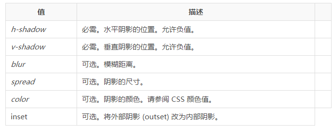
box-shadow: h-shadow v-shadow blur spread color inset;
Comments: box-shadow adds one or more shadows to the box. This property is a comma-separated list of shadows, each specified by 2-4 length values, an optional color value, and the optional inset keyword. The value for omitted length is 0.

The above is the content of CSS3 tutorial-box-shadow attribute. For more related content, please pay attention to the PHP Chinese website (www.php.cn)!


