A new beginning for div+css web page layout design (6)

Then test
<html>
<head>
<style type="text/css">
body{
margin:0;
padding:0;
} #a{
margin-top:20px;
margin-bottom:20px;
}
#b{
width:100px;
height:50px;
background:green;
}
</style> <head>
<body> <div id="a"></div>
<div id="b"></div> </body>
</html>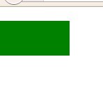
This IE6 is the same as Firefox. Note that the green top is not 40px but 20px
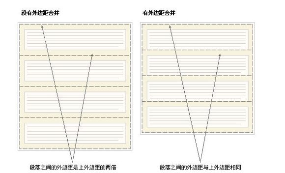
Margin merging will only occur for the vertical margins of block boxes in normal document flow. Margins between inline boxes, floated boxes, or absolutely positioned boxes are not merged.
Let’s talk about document flow. Only when you know the concept of flow can you talk about positioning
CSS has three basic positioning mechanisms: ordinary flow, floating and absolute positioning
Unless specifically specified, all boxes are Locate in the normal stream. That is, the position of an element in the normal flow is determined by the element's position in (X)HTML. Block-level boxes are arranged one after another from top to bottom, and the vertical distance between boxes is calculated from the vertical margins of the boxes. Inline boxes are arranged horizontally in a row. Their spacing can be adjusted using horizontal padding, borders, and margins. However, vertical padding, borders, and margins do not affect the height of the inline box. The horizontal box formed by a line is called a line box. The height of a line box is always high enough to accommodate all the inline boxes it contains. However, setting the row height can increase the height of this box.
The flow is like running water, from top to bottom, from left to right, just like a word document. If you insert a text in the middle of the text, the following text will be squeezed out automatically. The same is true for the normal layout of the web page
Let’s talk about the concept of block first
div, h1 or p elements are often called block-level elements. This means that these elements appear as a block of content, a "block box". In contrast, elements such as span and strong are called "inline elements" because their content appears within a line, an "inline box."
To put it simply, if you do not specify the width of the block element, its default width will be 100%, that is, the width of the browser will be the same, and a
will be automatically added at the end, so there are two Even if you set the width of the divs to 100px, they will not be horizontal. The first div will force the second div to wrap, and the second div will force the third div to wrap. . . .
Inline elements have no width and height. They are just one line. If you directly specify the width and height with CSS, it is invalid, but its width and height can only change with the content.
Blocks and inline elements can both become each other. Use the display attribute
Let’s talk about float floating
First make a big box
<html>
<head>
<style type="text/css">
body{
margin:0;
padding:0;
} #a{
width:500px;
height:500px;
border:solid;
}
.div{
width:100px;
height:100px;
background:green;
}
</style>
<head>
<body>
<div id="a"> </div>
</body>
</html>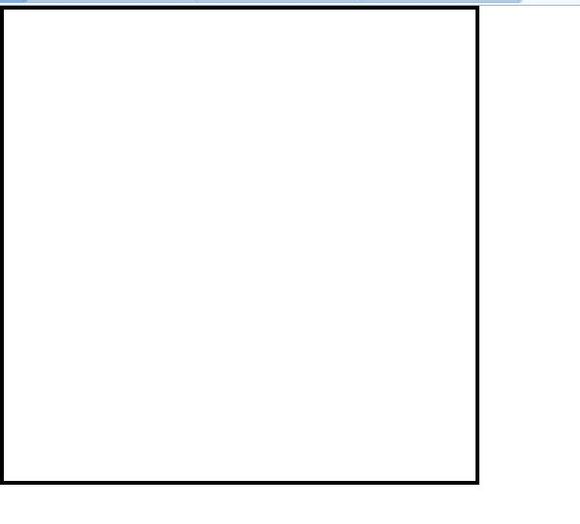
We know that if there are 2 in the big box div, then these two divs will not be arranged horizontally
<html>
<head>
<style type="text/css">
body{
margin:0;
padding:0;
} #a{
width:500px;
height:500px;
border:solid;
}
.div{
width:100px;
height:100px;
border:soild;
margin:1px;
background:green;
}
</style>
<head>
<body>
<div id="a">
<div class="div"></div>
<div class="div"></div>
</div>
</body>
</html>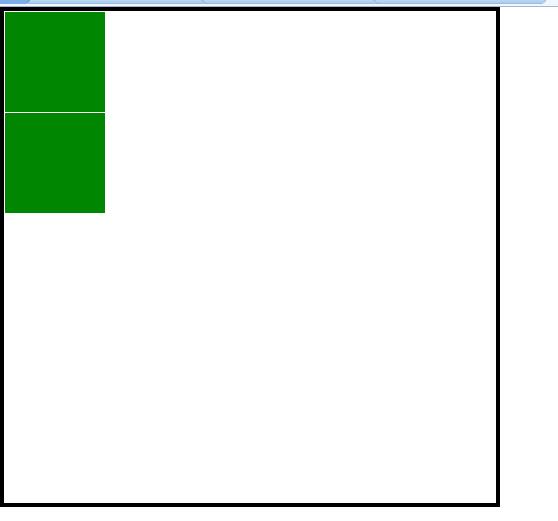
If you want them to be arranged horizontally, you have to use float
<html>
<head>
<style type="text/css">
body{
margin:0;
padding:0;
} #a{
width:500px;
height:500px;
border:solid;
}
.div{
width:100px;
height:100px;
border:soild;
margin:1px;
background:green;
float:left;
}
</style>
<head>
<body>
<div id="a">
<div class="div"></div>
<div class="div"></div>
</div>
</body>
</html>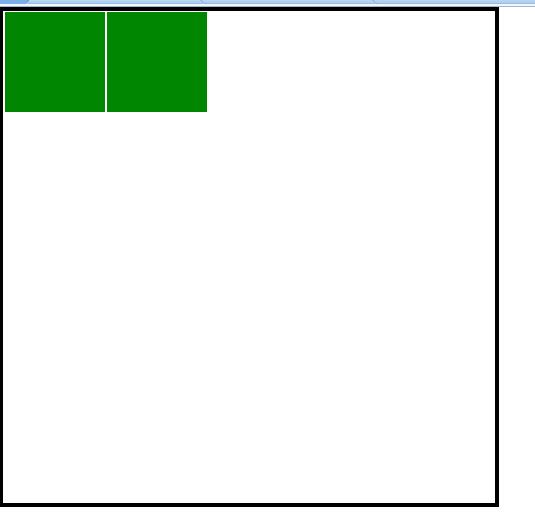
如果第2个div不设置float会怎样?
<html>
<head>
<style type="text/css">
body{
margin:0;
padding:0;
} #a{
width:500px;
height:500px;
border:solid;
}
.div{
width:100px;
height:100px;
border:soild;
margin:1px;
background:green;
float:left;
}
#b{
width:100px;
height:100px;
border:soild;
margin:1px;
background:green;
}
</style>
<head>
<body>
<div id="a">
<div class="div"></div>
<div id="b"></div>
</div>
</body>
</html>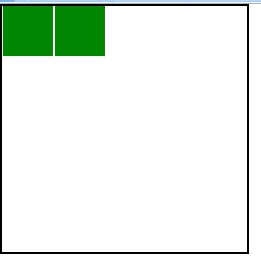
You can see that it is still the same, but the middle spacing is 2px, which means that the horizontal margins of the two divs will not overlap.
The vertical ones will. The specifics need to be verified through practice
At this time, I am looking at the Firefox browser
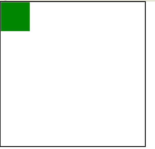
Why is there only one left? In fact, the two divs overlap.
Which browser depends on it? Of course, it is based on Firefox.
The floating box can move to the left or right until its outer edge touches the containing box or to the border of another floating box. Because the floated box is not in the document's normal flow, a block box in the document's normal flow behaves as if the floated box does not exist.
How to understand this sentence?
You can think of this big box as an airport, and the div is an airplane.
The div without float is the airplane parked on the ground, and the div with float is the airplane in the air.
The div with float will not occupy it. The space of the div on the ground, so they overlap, which is equivalent to saying that one is in the sky and the other is on the ground. This is why it is called floating, because it is a div floating in the air
The above is a new beginning of div+css web layout design ( 6), please pay attention to the PHP Chinese website (www.php.cn) for more related content!

Hot AI Tools

Undresser.AI Undress
AI-powered app for creating realistic nude photos

AI Clothes Remover
Online AI tool for removing clothes from photos.

Undress AI Tool
Undress images for free

Clothoff.io
AI clothes remover

AI Hentai Generator
Generate AI Hentai for free.

Hot Article

Hot Tools

Notepad++7.3.1
Easy-to-use and free code editor

SublimeText3 Chinese version
Chinese version, very easy to use

Zend Studio 13.0.1
Powerful PHP integrated development environment

Dreamweaver CS6
Visual web development tools

SublimeText3 Mac version
God-level code editing software (SublimeText3)

Hot Topics
 1382
1382
 52
52
 Working With GraphQL Caching
Mar 19, 2025 am 09:36 AM
If you’ve recently started working with GraphQL, or reviewed its pros and cons, you’ve no doubt heard things like “GraphQL doesn’t support caching” or
 Building an Ethereum app using Redwood.js and Fauna
Mar 28, 2025 am 09:18 AM
With the recent climb of Bitcoin’s price over 20k $USD, and to it recently breaking 30k, I thought it’s worth taking a deep dive back into creating Ethereum
 Creating Your Own Bragdoc With Eleventy
Mar 18, 2025 am 11:23 AM
No matter what stage you’re at as a developer, the tasks we complete—whether big or small—make a huge impact in our personal and professional growth.
 Vue 3
Apr 02, 2025 pm 06:32 PM
It's out! Congrats to the Vue team for getting it done, I know it was a massive effort and a long time coming. All new docs, as well.
 Can you get valid CSS property values from the browser?
Apr 02, 2025 pm 06:17 PM
I had someone write in with this very legit question. Lea just blogged about how you can get valid CSS properties themselves from the browser. That's like this.
 A bit on ci/cd
Apr 02, 2025 pm 06:21 PM
I'd say "website" fits better than "mobile app" but I like this framing from Max Lynch:
 Stacked Cards with Sticky Positioning and a Dash of Sass
Apr 03, 2025 am 10:30 AM
The other day, I spotted this particularly lovely bit from Corey Ginnivan’s website where a collection of cards stack on top of one another as you scroll.
 Comparing Browsers for Responsive Design
Apr 02, 2025 pm 06:25 PM
There are a number of these desktop apps where the goal is showing your site at different dimensions all at the same time. So you can, for example, be writing


