A simple tutorial on using Python for data analysis
Recently, Analysis with Programming joined Planet Python. As one of the first guest bloggers on this website, I am here to share how to start data analysis through Python. The specific contents are as follows:
Data import
Import local or web-side CSV files;
Data transformation;
Data statistical description;
Hypothesis testing
Single-sample t-test;
Visualization;
Create custom functions.
Data import
This is a very critical step. For subsequent analysis, we first need to import the data. Generally speaking, the data is in CSV format, and even if it is not, it can at least be converted to CSV format. In Python, our operations are as follows:
import pandas as pd

# Reading data locally
df = pd.read_csv('/Users/al-ahmadgaidasaad/Documents/d.csv')

# Reading data from web
data_url = "https://raw.githubusercontent.com/alstat/Analysis-with-Programming/master/2014/Python/Numerical-Descriptions-of-the-Data/data.csv"
df = pd.read_csv(data_url)
In order to read local CSV files, we need the corresponding module in the pandas data analysis library. The read_csv function can read local and web data.
Data Transformation
Now that there is data in the workspace, the next step is data transformation. Statisticians and scientists often remove unnecessary data from the analysis at this step. Let’s take a look at the data first:
# Head of the data
print df.head()

# OUTPUT
 Abra Apayao Benguet Ifugao Kalinga
0 1243 2934  148 3300 10553
1 4158 9235  4287 8063 35257
2 1787 1922  1955 1074  4544
3 17152 14501  3536 19607 31687
4 1266 2385  2530 3315  8520

# Tail of the data
print df.tail()

# OUTPUT
  Abra Apayao Benguet Ifugao Kalinga
74 2505 20878  3519 19737 16513
75 60303 40065  7062 19422 61808
76 6311 6756  3561 15910 23349
77 13345 38902  2583 11096 68663
78 2623 18264  3745 16787 16900
For R language programmers, the above operation is equivalent to printing the first 6 rows of data through print(head(df)), and printing the first 6 lines of data through print(tail(df) ) to print the last 6 lines of data. Of course, in Python, the default printing is 5 lines, while in R, it is 6 lines. Therefore, the R code head(df, n = 10) is df.head(n = 10) in Python, and the same is true for printing the tail of the data.
In R language, the names of data columns and rows are extracted through colnames and rownames respectively. In Python, we use the columns and index attributes to extract, as follows:
# Extracting column names
print df.columns

# OUTPUT
Index([u'Abra', u'Apayao', u'Benguet', u'Ifugao', u'Kalinga'], dtype='object')

# Extracting row names or the index
print df.index

# OUTPUT
Int64Index([0, 1, 2, 3, 4, 5, 6, 7, 8, 9, 10, 11, 12, 13, 14, 15, 16, 17, 18, 19, 20, 21, 22, 23, 24, 25, 26, 27, 28, 29, 30, 31, 32, 33, 34, 35, 36, 37, 38, 39, 40, 41, 42, 43, 44, 45, 46, 47, 48, 49, 50, 51, 52, 53, 54, 55, 56, 57, 58, 59, 60, 61, 62, 63, 64, 65, 66, 67, 68, 69, 70, 71, 72, 73, 74, 75, 76, 77, 78], dtype='int64')
Data transposition uses the T method,
# Transpose data
print df.T

# OUTPUT
   0  1  2  3  4  5  6  7  8  9
Abra  1243 4158 1787 17152 1266 5576 927 21540 1039 5424
Apayao 2934 9235 1922 14501 2385 7452 1099 17038 1382 10588
Benguet 148 4287 1955 3536 2530 771 2796 2463 2592 1064
Ifugao 3300 8063 1074 19607 3315 13134 5134 14226 6842 13828
Kalinga 10553 35257 4544 31687 8520 28252 3106 36238 4973 40140

   ...  69  70  71  72  73  74  75  76  77
Abra  ... 12763 2470 59094 6209 13316 2505 60303 6311 13345
Apayao ... 37625 19532 35126 6335 38613 20878 40065 6756 38902
Benguet ...  2354 4045 5987 3530 2585 3519 7062 3561 2583
Ifugao ...  9838 17125 18940 15560 7746 19737 19422 15910 11096
Kalinga ... 65782 15279 52437 24385 66148 16513 61808 23349 68663

   78
Abra  2623
Apayao 18264
Benguet 3745
Ifugao 16787
Kalinga 16900
Other transformations, such as sorting, use the sort attribute. Now we extract a specific column of data. In Python, you can use iloc or ix attributes. But I prefer to use ix because it is more stable. Suppose we need the first 5 rows of the first column of data, we have:
print df.ix[:, 0].head()

# OUTPUT
0  1243
1  4158
2  1787
3 17152
4  1266
Name: Abra, dtype: int64
By the way, Python's index starts from 0 instead of 1. In order to take out the first 3 columns of data from rows 11 to 20, we have:
print df.ix[10:20, 0:3]

# OUTPUT
 Abra Apayao Benguet
10 981 1311  2560
11 27366 15093  3039
12 1100 1701  2382
13 7212 11001  1088
14 1048 1427  2847
15 25679 15661  2942
16 1055 2191  2119
17 5437 6461  734
18 1029 1183  2302
19 23710 12222  2598
20 1091 2343  2654
The above command is equivalent to df.ix[10:20, ['Abra', 'Apayao', 'Benguet']].
In order to drop columns in the data, here are column 1 (Apayao) and column 2 (Benguet), we use the drop attribute, as follows:
print df.drop(df.columns[[1, 2]], axis = 1).head()

# OUTPUT
 Abra Ifugao Kalinga
0 1243 3300 10553
1 4158 8063 35257
2 1787 1074  4544
3 17152 19607 31687
4 1266 3315  8520
The axis parameter tells the function whether to drop columns or rows . If axis equals 0, then rows are discarded.
Statistical description
The next step is to describe the statistical characteristics of the data through the describe attribute:
print df.describe()

# OUTPUT
    Abra  Apayao  Benguet  Ifugao  Kalinga
count  79.000000  79.000000 79.000000  79.000000  79.000000
mean 12874.379747 16860.645570 3237.392405 12414.620253 30446.417722
std 16746.466945 15448.153794 1588.536429 5034.282019 22245.707692
min  927.000000 401.000000 148.000000 1074.000000 2346.000000
25%  1524.000000 3435.500000 2328.000000 8205.000000 8601.500000
50%  5790.000000 10588.000000 3202.000000 13044.000000 24494.000000
75% 13330.500000 33289.000000 3918.500000 16099.500000 52510.500000
max 60303.000000 54625.000000 8813.000000 21031.000000 68663.000000Hypothesis testing
Python has a good Statistical inference package. That is the stats in scipy. ttest_1samp implements the single-sample t test. Therefore, if we want to test the mean rice yield of the Abra column of the data, passing the null hypothesis, here we assume that the overall mean rice yield is 15000, we have:
from scipy import stats as ss

# Perform one sample t-test using 1500 as the true mean
print ss.ttest_1samp(a = df.ix[:, 'Abra'], popmean = 15000)

# OUTPUT
(-1.1281738488299586, 0.26270472069109496)
Returns the ancestor consisting of the following values:
t: Floating point or array type
t statistic
prob: Floating point or array type
two-tailed p-value two-sided probability value
Through the above output, see The p-value of 0.267 is much larger than α equal to 0.05, so there is no sufficient evidence to say that the average rice yield is not 150,000. Applying this test to all variables, again assuming a mean of 15,000, we have:
print ss.ttest_1samp(a = df, popmean = 15000)

# OUTPUT
(array([ -1.12817385, 1.07053437, -65.81425599, -4.564575 , 6.17156198]),
 array([ 2.62704721e-01, 2.87680340e-01, 4.15643528e-70,
   1.83764399e-05, 2.82461897e-08]))
The first array is the t-statistic, and the second array is the corresponding p-value.
Visualization
There are many visualization modules in Python, the most popular one is the matpalotlib library. As a brief mention, we can also choose the bokeh and seaborn modules. In a previous blog post, I have explained the functionality of the box-and-whisker plot module in the matplotlib library.
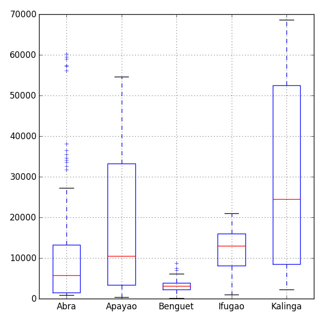
# Import the module for plotting
import matplotlib.pyplot as plt
 plt.show(df.plot(kind = 'box'))
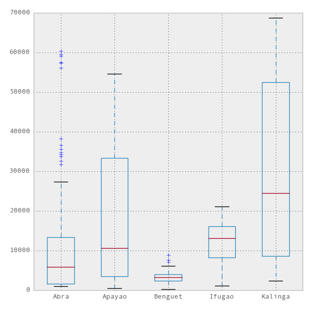
Now, we can use the ggplot theme integrated with R in the pandas module to beautify the chart. To use ggplot, we only need to add one more line to the above code,
import matplotlib.pyplot as plt
pd.options.display.mpl_style = 'default' # Sets the plotting display theme to ggplot2
df.plot(kind = 'box')
So we will get the following chart:
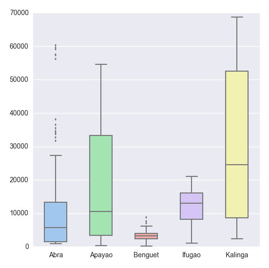
# Import the seaborn library
import seaborn as sns
 # Do the boxplot
plt.show(sns.boxplot(df, widths = 0.5, color = "pastel"))
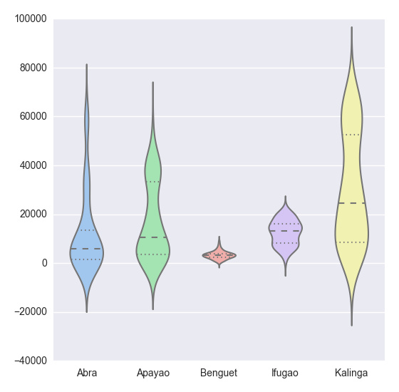
plt.show(sns.violinplot(df, widths = 0.5, color = "pastel"))
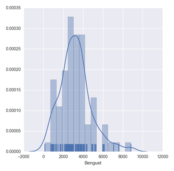
plt.show(sns.distplot(df.ix[:,2], rug = True, bins = 15))
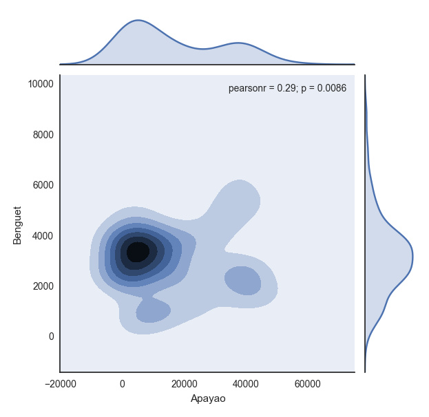
with sns.axes_style("white"):
 plt.show(sns.jointplot(df.ix[:,1], df.ix[:,2], kind = "kde"))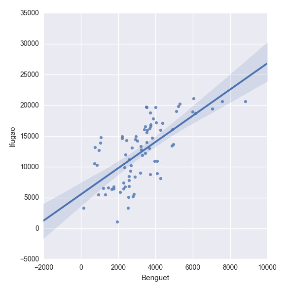
plt.show(sns.lmplot("Benguet", "Ifugao", df))创建自定义函数
在Python中,我们使用def函数来实现一个自定义函数。例如,如果我们要定义一个两数相加的函数,如下即可:
def add_2int(x, y):
 return x + y

print add_2int(2, 2)

# OUTPUT
4
顺便说一下,Python中的缩进是很重要的。通过缩进来定义函数作用域,就像在R语言中使用大括号{…}一样。这有一个我们之前博文的例子:
产生10个正态分布样本,其中u=3和o.
基于95%的置信度,计算 x_bar 和 x_bar2 ;
重复100次; 然后
计算出置信区间包含真实均值的百分比
Python中,程序如下:
import numpy as np
import scipy.stats as ss

def case(n = 10, mu = 3, sigma = np.sqrt(5), p = 0.025, rep = 100):
 m = np.zeros((rep, 4))

 for i in range(rep):
  norm = np.random.normal(loc = mu, scale = sigma, size = n)
  xbar = np.mean(norm)
  low = xbar - ss.norm.ppf(q = 1 - p) * (sigma / np.sqrt(n))
  up = xbar + ss.norm.ppf(q = 1 - p) * (sigma / np.sqrt(n))

  if (mu > low) & (mu < up):
   rem = 1
  else:
   rem = 0

  m[i, :] = [xbar, low, up, rem]

 inside = np.sum(m[:, 3])
 per = inside / rep
 desc = "There are " + str(inside) + " confidence intervals that contain "
   "the true mean (" + str(mu) + "), that is " + str(per) + " percent of the total CIs"

 return {"Matrix": m, "Decision": desc}
上述代码读起来很简单,但是循环的时候就很慢了。下面针对上述代码进行了改进,这多亏了 Python专家。
import numpy as np
import scipy.stats as ss

def case2(n = 10, mu = 3, sigma = np.sqrt(5), p = 0.025, rep = 100):
 scaled_crit = ss.norm.ppf(q = 1 - p) * (sigma / np.sqrt(n))
 norm = np.random.normal(loc = mu, scale = sigma, size = (rep, n))

 xbar = norm.mean(1)
 low = xbar - scaled_crit
 up = xbar + scaled_crit

 rem = (mu > low) & (mu < up)
 m = np.c_[xbar, low, up, rem]

 inside = np.sum(m[:, 3])
 per = inside / rep
 desc = "There are " + str(inside) + " confidence intervals that contain "
   "the true mean (" + str(mu) + "), that is " + str(per) + " percent of the total CIs"
return {"Matrix": m, "Decision": desc}更多A simple tutorial on using Python for data analysis相关文章请关注PHP中文网!

Hot AI Tools

Undresser.AI Undress
AI-powered app for creating realistic nude photos

AI Clothes Remover
Online AI tool for removing clothes from photos.

Undress AI Tool
Undress images for free

Clothoff.io
AI clothes remover

AI Hentai Generator
Generate AI Hentai for free.

Hot Article

Hot Tools

Notepad++7.3.1
Easy-to-use and free code editor

SublimeText3 Chinese version
Chinese version, very easy to use

Zend Studio 13.0.1
Powerful PHP integrated development environment

Dreamweaver CS6
Visual web development tools

SublimeText3 Mac version
God-level code editing software (SublimeText3)

Hot Topics
 1376
1376
 52
52
 How to solve the permissions problem encountered when viewing Python version in Linux terminal?
Apr 01, 2025 pm 05:09 PM
Solution to permission issues when viewing Python version in Linux terminal When you try to view Python version in Linux terminal, enter python...
 How to efficiently copy the entire column of one DataFrame into another DataFrame with different structures in Python?
Apr 01, 2025 pm 11:15 PM
When using Python's pandas library, how to copy whole columns between two DataFrames with different structures is a common problem. Suppose we have two Dats...
 What are some popular Python libraries and their uses?
Mar 21, 2025 pm 06:46 PM
The article discusses popular Python libraries like NumPy, Pandas, Matplotlib, Scikit-learn, TensorFlow, Django, Flask, and Requests, detailing their uses in scientific computing, data analysis, visualization, machine learning, web development, and H
 How does Uvicorn continuously listen for HTTP requests without serving_forever()?
Apr 01, 2025 pm 10:51 PM
How does Uvicorn continuously listen for HTTP requests? Uvicorn is a lightweight web server based on ASGI. One of its core functions is to listen for HTTP requests and proceed...
 How to dynamically create an object through a string and call its methods in Python?
Apr 01, 2025 pm 11:18 PM
In Python, how to dynamically create an object through a string and call its methods? This is a common programming requirement, especially if it needs to be configured or run...
 How to teach computer novice programming basics in project and problem-driven methods within 10 hours?
Apr 02, 2025 am 07:18 AM
How to teach computer novice programming basics within 10 hours? If you only have 10 hours to teach computer novice some programming knowledge, what would you choose to teach...
 How to handle comma-separated list query parameters in FastAPI?
Apr 02, 2025 am 06:51 AM
Fastapi ...
 What are regular expressions?
Mar 20, 2025 pm 06:25 PM
Regular expressions are powerful tools for pattern matching and text manipulation in programming, enhancing efficiency in text processing across various applications.


