

the content of this article is to introduce the practice of taobao's flexible layout solution lib-flexible, and share it with everyone for your reference. the specific content is as follows
1. page requirements
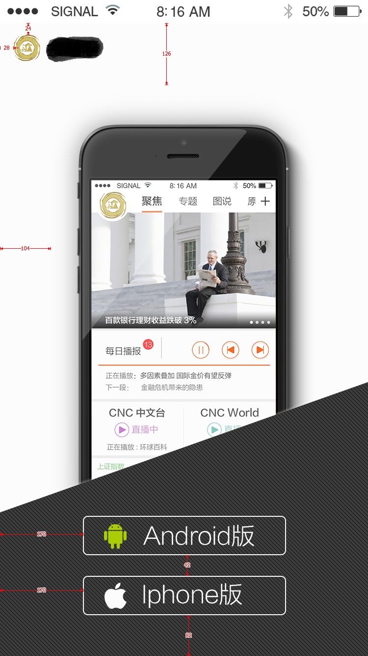
this is what the page will look like (don't comment on the design, it's not the developer's decision):

this is the dimension diagram (750*1334):
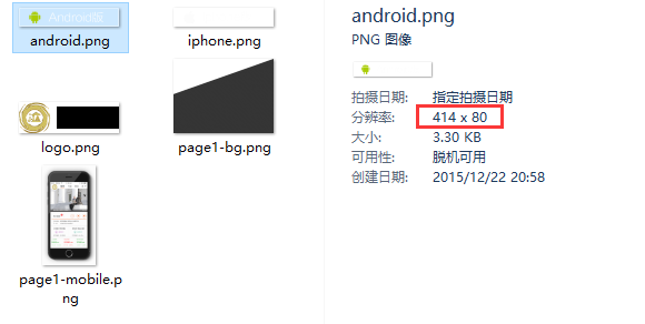
then the artist will provide cutouts of the following materials based on the 750*1334 design draft according to my requirements:

includes the background images of the two download buttons, the logo, the gradient background of the bottom trapezoid and the mobile background image of the body part. note that these pictures are all cut from the 750*1334 design draft, so the sizes are the original sizes in the design draft, such as android.png:
considering the problem of retina display, combine the following adaptation ideas:
i think the feasible solution to the retina screen problem is:
1) when devicepixelratio<=2, the pictures are uniformly cut from the 750 design draft
2) when devicepixelratio>=2, the pictures use 750*1.5=1125, which is the cut picture of the so-called @3x design draft.
i put all the cuts from the 750*1334 design draft given to me by the artist in the folder img/@2x:

then i asked her to help me enlarge the 750 design draft vector by 1.5 times, and then provided me with a @3x cutout according to the same cutout requirements, and placed it in the img/@3x folder:

theoretically the size of the image under @3x should be equal to the image under @2x*1.5, but my cut was not so perfect.
with the previous requirements introduction and material preparation, the next step is to introduce the core js file and write the css style.
2. introduce flexible.js
this step is actually very simple. just copy the content of flexible.js, create a new flexible.js file locally, open it and paste it in. i put this file under js/lib:
p>
then in the html page, introduce this js file as early as possible (in order to make the adaptation effect faster):

note: when using lib-flexible, usually do not write:
let flexible.js handle it automatically.
then in the chrome simulator, select iphone6, you should be able to see that the font-size of the html has been set to font-size: 75px:

3. writing css
basic requirements:
1) except for font-size, all other sizes are converted into values in rem units based on the size of the 750 annotation draft. the conversion method is: annotation draft size / annotation draft base font size;
2) the standard font size of the annotation draft = the width of the annotation draft / 10. for example, the width of the annotation draft is 750, and the standard font size of the annotation draft is 75; the width of the annotation draft is 640, and the standard font size of the annotation draft is 64; (so taobao this the plan can be used in any design draft size)
3) if you need to set font-size, you can follow the data-dpr attribute of html, similar to the following writing:
[data-dpr="2"] p {
  font-size: 16px;
}

[data-dpr="3"] p {
  font-size: 24px;
}
take the android download button style as an example to illustrate this usage. the size of android.png is: 414*80, so the css is written like this:
.btn {
  width: 414rem/@font-size-base;
  height: 80rem/@font-size-base;
}
because less is used, a variable is defined in advance to save the base font size of the markup:
@font-size-base: 75;
so conversion to px2rem becomes very easy as shown above. after less is compiled, the correct rem value will be calculated:
.btn {
 width: 5.52rem;
 height: 1.06666667rem;
}
at this point, the basic practice of lib-flexible is over. however, there is still another problem, which is the problem of retina screen. up to now, i have not mentioned what to do with the cutouts in the picture below by @3x. it is actually very simple. with the help of the data-dpr attribute of the html element, you can easily implement another media query to enable images under @3x when devicepixelratio>=2. let’s take the android download button style as an example. the writing is:
.btn-android {
 background-image: url("../img/@2x/android.png?v=@@version");
 [data-dpr="3"] & {
  background-image: url("../img/@3x/android.png?v=@@version");
 }
}
now it’s ok. i didn’t know what role data-dpr had at first, but now i see it’s quite useful.
note:
the above is the entire process of implementing taobao's flexible layout solution lib-flexible. i hope it will inspire everyone's learning.
 What does Taobao b2c mean?
 Taobao password-free payment
 Data encryption storage measures
 Introduction to input functions in c language
 How to solve the problem of no internet access when the computer is connected to wifi
 What should I do if the Chinese restart setting of vscode does not take effect?
 How to solve http request 415 error
 Printer installation failed
 How to connect html files and css files


![[Web front-end] Node.js quick start](https://img.php.cn/upload/course/000/000/067/662b5d34ba7c0227.png)


