

Simple CSS3 drop-down menu effect with underline follow effect

Brief Tutorial
This is a drop-down menu effect with underline following effect made using pure CSS3. The drop-down menu uses CSS3 transform and transition to create underline follow effects and drop-down menu effects.
Usage
HTML structure
The drop-down menu uses the
<nav>
  <ul id="main">
    <li>主页</li>
    <li>关于我们</li>
    <li>项目分类
      <ul class="drop">
        <p>
        <li>scss</li>
        <li>jquery</li>
        <li>html</li>
        </p>
      </ul>
    </li>
    <li>联系我们</li>
    <p id="marker"></p>
  </ul>
</nav>CSS style
The entire menu ul#mian is positioned using relative positioning. display is displayed as an inline block-level element. Menu items are sized using padding, and min-width is set to 120 pixels.
#main {
  position: relative;
  list-style: none;
  background: #6BBE92;
  font-weight: 400;
  font-size: 0;
  text-transform: uppercase;
  display: inline-block;
  padding: 0;
  margin: 50px auto;
}
#main li {
  font-size: 0.8rem;
  display: inline-block;
  position: relative;
  padding: 15px 20px;
  cursor: pointer;
  z-index: 5;
  min-width: 120px;
}
li {
  margin: 0;
}In the HTML structure, ul.drop is the drop-down menu component. Its positioning method uses absolute positioning. The p element inside it uses the translate function to move -100% on the Y axis to make it hidden (overflow:hidden is used on .drop).
.drop {
  overflow: hidden;
  list-style: none;
  position: absolute;
  padding: 0;
  width: 100%;
  left: 0;
  top: 48px;
}
.drop p {
  -webkit-transform: translate(0, -100%);
  -moz-transform: translate(0, -100%);
  -ms-transform: translate(0, -100%);
  transform: translate(0, -100%);
  -webkit-transition: all 0.5s 0.1s;
  -moz-transition: all 0.5s 0.1s;
  -ms-transition: all 0.5s 0.1s;
  transition: all 0.5s 0.1s;
  position: relative;
}
.drop li {
  display: block;
  padding: 0;
  width: 100%;
  background: #3E8760 !important;
}#marker is an underline element. It also uses absolute positioning. And set an animation transition effect of 0.35 seconds for all animations.
#marker {
  height: 6px;
  background: #3E8760 !important;
  position: absolute;
  bottom: 0;
  width: 120px;
  z-index: 2;
  -webkit-transition: all 0.35s;
  -moz-transition: all 0.35s;
  -ms-transition: all 0.35s;
  transition: all 0.35s;
}When the mouse slides over the menu item #main li element, use nth-child to determine which menu item the mouse currently slides over. Then restore the Y-axis position of the submenu in the menu item to 0, display the drop-down menu, and set the X-direction movement value of the translate function to move the underline according to different menu items.
#main li:nth-child(1):hover ul p {
  -webkit-transform: translate(0, 0);
  -moz-transform: translate(0, 0);
  -ms-transform: translate(0, 0);
  transform: translate(0, 0);
}
#main li:nth-child(1):hover ~ #marker {
  -webkit-transform: translate(0px, 0);
  -moz-transform: translate(0px, 0);
  -ms-transform: translate(0px, 0);
  transform: translate(0px, 0);
}

#main li:nth-child(2):hover ul p {
  -webkit-transform: translate(0, 0);
  -moz-transform: translate(0, 0);
  -ms-transform: translate(0, 0);
  transform: translate(0, 0);
}
#main li:nth-child(2):hover ~ #marker {
  -webkit-transform: translate(120px, 0);
  -moz-transform: translate(120px, 0);
  -ms-transform: translate(120px, 0);
  transform: translate(120px, 0);
}

#main li:nth-child(3):hover ul p {
  -webkit-transform: translate(0, 0);
  -moz-transform: translate(0, 0);
  -ms-transform: translate(0, 0);
  transform: translate(0, 0);
}
#main li:nth-child(3):hover ~ #marker {
  -webkit-transform: translate(240px, 0);
  -moz-transform: translate(240px, 0);
  -ms-transform: translate(240px, 0);
  transform: translate(240px, 0);
}

#main li:nth-child(4):hover ul p {
  -webkit-transform: translate(0, 0);
  -moz-transform: translate(0, 0);
  -ms-transform: translate(0, 0);
  transform: translate(0, 0);
}
#main li:nth-child(4):hover ~ #marker {
  -webkit-transform: translate(360px, 0);
  -moz-transform: translate(360px, 0);
  -ms-transform: translate(360px, 0);
  transform: translate(360px, 0);
}The above is the content of the simple CSS3 drop-down menu effect with underline following effect. For more related content, please pay attention to the PHP Chinese website (www.php.cn)!
Related articles:
Introduction to the simple method of making CSS drop-down menu

Hot AI Tools

Undresser.AI Undress
AI-powered app for creating realistic nude photos

AI Clothes Remover
Online AI tool for removing clothes from photos.

Undress AI Tool
Undress images for free

Clothoff.io
AI clothes remover

AI Hentai Generator
Generate AI Hentai for free.

Hot Article
Hot Tools

Notepad++7.3.1
Easy-to-use and free code editor

SublimeText3 Chinese version
Chinese version, very easy to use

Zend Studio 13.0.1
Powerful PHP integrated development environment

Dreamweaver CS6
Visual web development tools

SublimeText3 Mac version
God-level code editing software (SublimeText3)
Hot Topics


 How to achieve wave effect with pure CSS3? (code example)
Jun 28, 2022 pm 01:39 PM
How to achieve wave effect with pure CSS3? (code example)
Jun 28, 2022 pm 01:39 PM
How to achieve wave effect with pure CSS3? This article will introduce to you how to use SVG and CSS animation to create wave effects. I hope it will be helpful to you!
 How to make drop-down menu in WPS table
Mar 21, 2024 pm 01:31 PM
How to make drop-down menu in WPS table
Mar 21, 2024 pm 01:31 PM
How to make the WPS table drop-down menu: After selecting the cell where you want to set the drop-down menu, click "Data", "Validity" in sequence, and then make the corresponding settings in the pop-up dialog box to pull down our menu. As a powerful office software, WPS has the ability to edit documents, statistical data tables, etc., which provides a lot of convenience for many people who need to deal with text, data, etc. In order to skillfully use WPS software to provide us with a lot of convenience, we need to be able to master various very basic operations of WPS software. In this article, the editor will share with you how to use WPS software. Perform drop-down menu operations in the WPS table that appears. After opening the WPS form, first select the
 How to add artistic page borders in Microsoft Word
Apr 27, 2023 pm 08:25 PM
How to add artistic page borders in Microsoft Word
Apr 27, 2023 pm 08:25 PM
Are you tired of seeing the traditional black borders on your Word documents all the time? Are you looking for ways how to add some colorful and artistic borders to your documents to make them more attractive and fun? How about adding different artistic borders to different pages of your Word document? Or apply a single artistic border to all pages in the document at once? I know you’re as excited as we are about this whole artistic borders thing! Go straight to this article to learn how to successfully apply artistic borders to Word documents. Part 1: How to Apply the Same Artistic Page Border to All Pages in a Word Document Step 1: Open the Word document and click the "Design" tab in the top ribbon. Choose in DESIGN
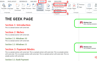 How to print a Word document without comments
Apr 18, 2023 pm 02:19 PM
How to print a Word document without comments
Apr 18, 2023 pm 02:19 PM
With Microsoft Word, comments are important, especially when the document is shared among multiple people. Everyone can add something to the document content through his/her comments, and it is very important to retain these comments for future reference. But when you need to print a document, do you really need to print comments? In some cases, yes. But for some other cases, this is a big no! In this article, we explain through 2 different solutions how to easily print a Word document without printing the comments on it. Please remember that comments are only hidden and will not be deleted. Therefore, you absolutely do not risk any part of your document here by printing it without comment. Hope you like it! Solution 1: Pass
 Use CSS skillfully to realize various strange-shaped buttons (with code)
Jul 19, 2022 am 11:28 AM
Use CSS skillfully to realize various strange-shaped buttons (with code)
Jul 19, 2022 am 11:28 AM
This article will show you how to use CSS to easily realize various weird-shaped buttons that appear frequently. I hope it will be helpful to you!
 How to hide elements in css without taking up space
Jun 01, 2022 pm 07:15 PM
How to hide elements in css without taking up space
Jun 01, 2022 pm 07:15 PM
Two methods: 1. Using the display attribute, just add the "display:none;" style to the element. 2. Use the position and top attributes to set the absolute positioning of the element to hide the element. Just add the "position:absolute;top:-9999px;" style to the element.
 5 Ways (and Fixes) to Adjust Your Screen for Monitoring on Windows 11
Apr 14, 2023 pm 03:28 PM
5 Ways (and Fixes) to Adjust Your Screen for Monitoring on Windows 11
Apr 14, 2023 pm 03:28 PM
Due to recent improvements around the world, PC parts are now available at MSRP, which has prompted many users to finally build their dream PC. Building a PC can have its challenges, and one of the tasks is fitting your screen to your monitor's display. If you can't fit a screen to your monitor on Windows 11, here's everything you need to know. let's start. How to adjust your screen for monitoring on Windows 11 in 5 ways To make your screen fit your monitor, you can adjust the resolution, scaling, or display output settings based on your current settings. We recommend that you try resizing the resolution to maintain visual quality and dpi. However, if this doesn't work for you, you can try
 How to implement lace borders in css3
Sep 16, 2022 pm 07:11 PM
How to implement lace borders in css3
Sep 16, 2022 pm 07:11 PM
In CSS, you can use the border-image attribute to achieve a lace border. The border-image attribute can use images to create borders, that is, add a background image to the border. You only need to specify the background image as a lace style; the syntax "border-image: url (image path) offsets the image border width inward. Whether outset is repeated;".
