18 kinds of vertical paging navigation button animation effects
简要教程
这是一组效果非常炫酷的垂直分页导航按钮动画特效。这组特效通用18种效果,可以用于制作幻灯片、页面切换和其它容器组件切换的分页导航按钮。
使用方法
HTML结构
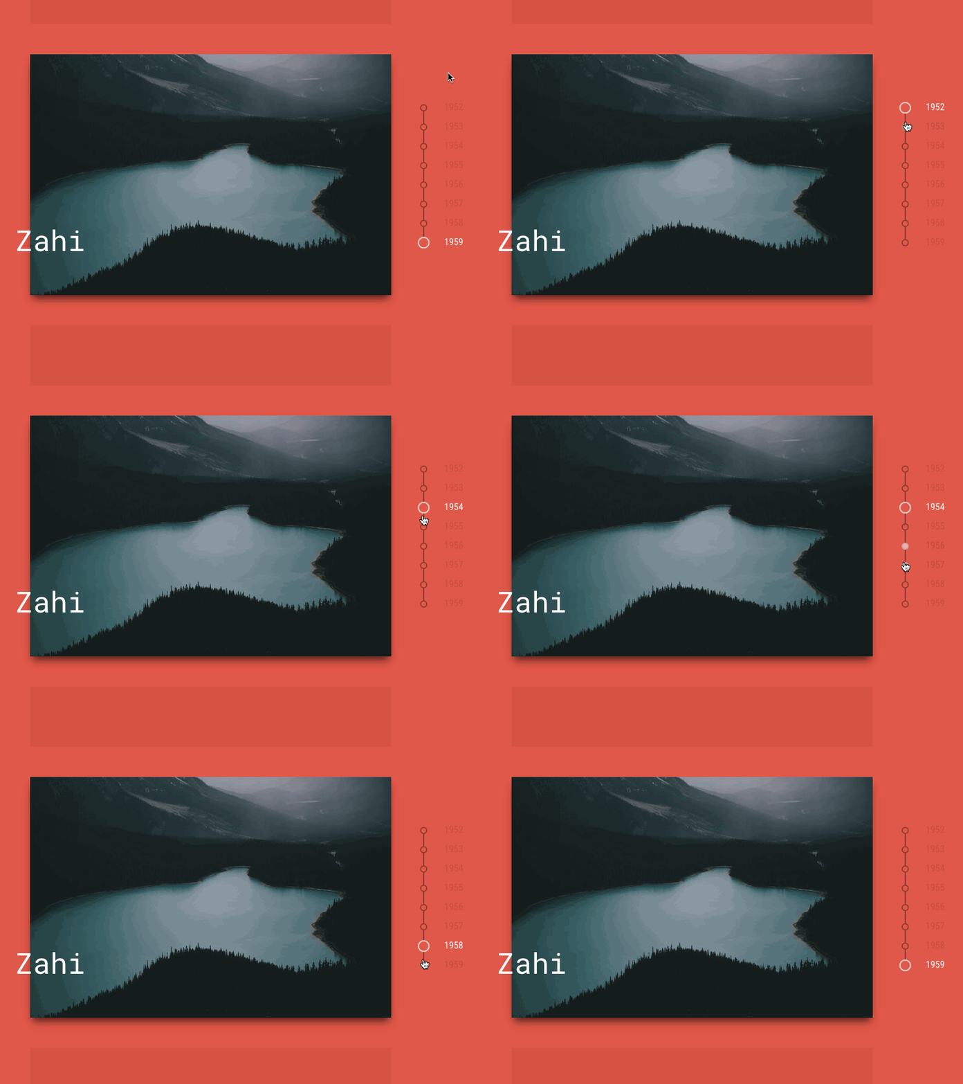
下面是这组垂直分页导航按钮动画特效中的其中一种效果的GIF动态演示图:

生成上面的垂直分页导航效果的HTML结构如下:
<nav class="nav nav--timiro">
  <button class="nav__item" aria-label="Item 1"></button>
  <button class="nav__item nav__item--current" aria-label="Item 2"></button>
  <button class="nav__item" aria-label="Item 3"></button>
  <button class="nav__item" aria-label="Item 4"></button>
  <button class="nav__item" aria-label="Item 5"></button>
  <button class="nav__item" aria-label="Item 6"></button>
  <button class="nav__item" aria-label="Item 7"></button>
  <button class="nav__item" aria-label="Item 8"></button>
</nav>
CSS样式
.nav {
  position: relative;
  width: 8em;
  margin: 0 0 0 3em;
}

.nav__item {
  line-height: 1;
  position: relative;
  display: block;
  margin: 0;
  padding: 0;
  letter-spacing: 0;
  color: currentColor;
  border: 0;
  background: none;
}

.nav__item:focus {
  outline: none;
}然后万维zahi效果设置特有的CSS样式:
/*** Zahi ***/

.nav--zahi .nav__item {
  width: 2em;
  height: 2em;
}

.nav--zahi .nav__item::before,
.nav--zahi .nav__item::after {
  content: '';
  position: absolute;
}

.nav--zahi .nav__item:not(:last-child)::before {
  top: calc(2em - 9px);
  left: 5px;
  width: 2px;
  height: calc(2em - 12px);
  background: #98322a;
}

.nav--zahi .nav__item::after {
  top: 50%;
  left: 0;
  width: 12px;
  height: 12px;
  margin: -5px 0 0 0;
  border: 2px solid #98322a;
  border-radius: 50%;
  background: #f44336;
  -webkit-transition: -webkit-transform 0.3s, border-color 0.3s, border-width 0.3s, background 0.3s;
  transition: transform 0.3s, border-color 0.3s, border-width 0.3s, background 0.3s;
}

.nav--zahi .nav__item--current::after {
  border-width: 1px;
  border-color: #fff;
  -webkit-transform: scale3d(1.6,1.6,1);
  transform: scale3d(1.6,1.6,1);
}

.nav--zahi .nav__item:not(.nav__item--current):focus::after,
.nav--zahi .nav__item:not(.nav__item--current):hover::after {
  border-color: #fff;
  background: #fff;
}

.nav--zahi .nav__item-title {
  font-family: 'Roboto Condensed', sans-serif;
  line-height: 1.5;
  display: block;
  position: relative;
  padding: 0 0 0 2.5em;
  white-space: nowrap;
  opacity: 0.3;
  color: #98322a;
  -webkit-transition: opacity 0.3s, color 0.3s;
  transition: opacity 0.3s, color 0.3s;
}

.nav--zahi .nav__item:not(.nav__item--current):focus .nav__item-title,
.nav--zahi .nav__item:not(.nav__item--current):hover .nav__item-title {
  opacity: 0.5;
}

.nav--zahi .nav__item--current .nav__item-title {
  opacity: 1;
color: #fff;其它效果的制作请参考下载文件。
以上就是18种垂直分页导航按钮动画特效的内容,更多相关内容请关注PHP中文网(www.php.cn)!

Hot AI Tools

Undresser.AI Undress
AI-powered app for creating realistic nude photos

AI Clothes Remover
Online AI tool for removing clothes from photos.

Undress AI Tool
Undress images for free

Clothoff.io
AI clothes remover

AI Hentai Generator
Generate AI Hentai for free.

Hot Article

Hot Tools

Notepad++7.3.1
Easy-to-use and free code editor

SublimeText3 Chinese version
Chinese version, very easy to use

Zend Studio 13.0.1
Powerful PHP integrated development environment

Dreamweaver CS6
Visual web development tools

SublimeText3 Mac version
God-level code editing software (SublimeText3)

Hot Topics
 1385
1385
 52
52
 Working With GraphQL Caching
Mar 19, 2025 am 09:36 AM
If you’ve recently started working with GraphQL, or reviewed its pros and cons, you’ve no doubt heard things like “GraphQL doesn’t support caching” or
 Building an Ethereum app using Redwood.js and Fauna
Mar 28, 2025 am 09:18 AM
With the recent climb of Bitcoin’s price over 20k $USD, and to it recently breaking 30k, I thought it’s worth taking a deep dive back into creating Ethereum
 Vue 3
Apr 02, 2025 pm 06:32 PM
It's out! Congrats to the Vue team for getting it done, I know it was a massive effort and a long time coming. All new docs, as well.
 Can you get valid CSS property values from the browser?
Apr 02, 2025 pm 06:17 PM
I had someone write in with this very legit question. Lea just blogged about how you can get valid CSS properties themselves from the browser. That's like this.
 A bit on ci/cd
Apr 02, 2025 pm 06:21 PM
I'd say "website" fits better than "mobile app" but I like this framing from Max Lynch:
 Comparing Browsers for Responsive Design
Apr 02, 2025 pm 06:25 PM
There are a number of these desktop apps where the goal is showing your site at different dimensions all at the same time. So you can, for example, be writing
 Stacked Cards with Sticky Positioning and a Dash of Sass
Apr 03, 2025 am 10:30 AM
The other day, I spotted this particularly lovely bit from Corey Ginnivan’s website where a collection of cards stack on top of one another as you scroll.
 Using Markdown and Localization in the WordPress Block Editor
Apr 02, 2025 am 04:27 AM
If we need to show documentation to the user directly in the WordPress editor, what is the best way to do it?


