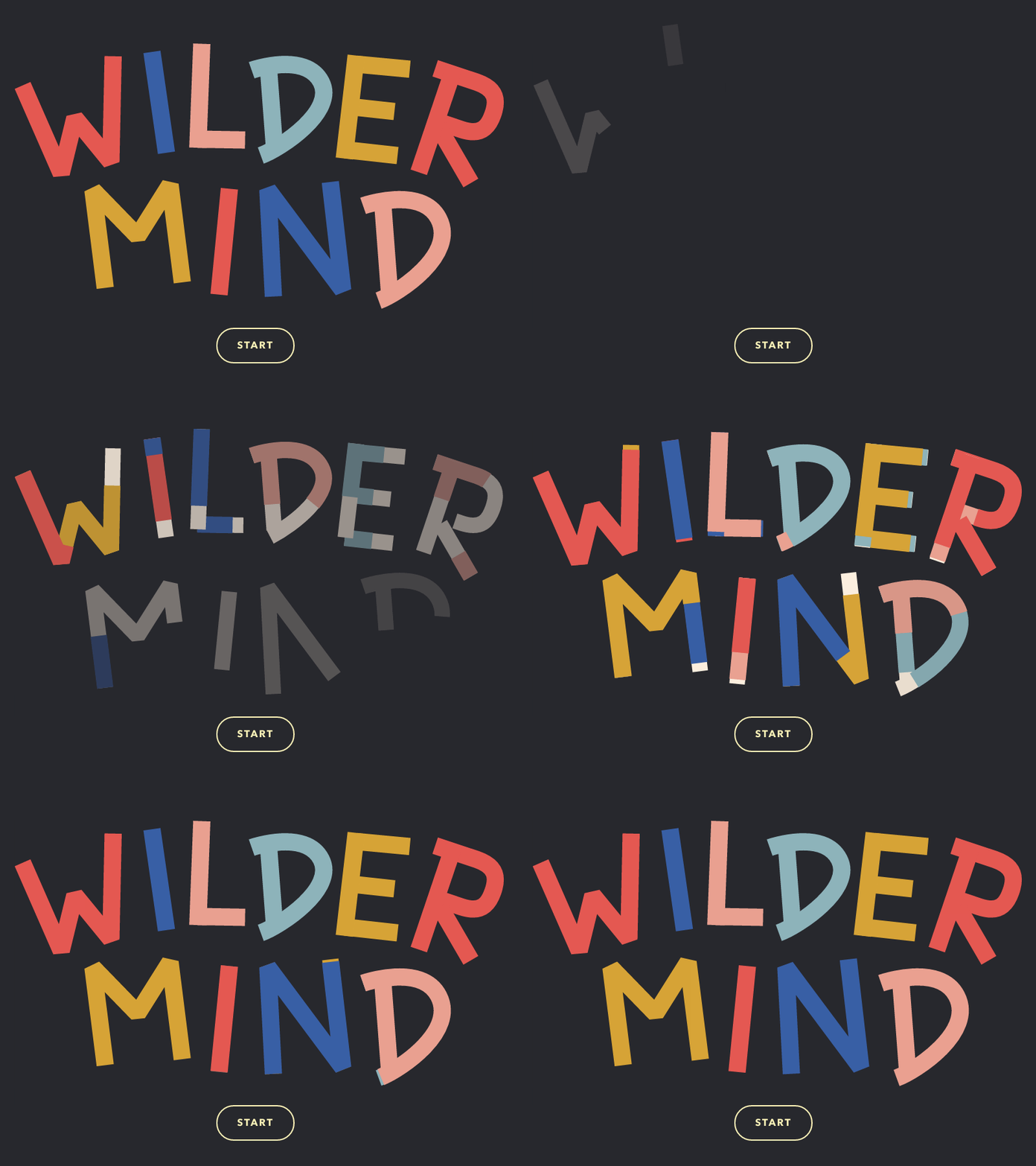
Cool HTML5 SVG text deformation animation effects
Brief Tutorial
This is a very cool HTML5 SVG text deformation animation effect. This special effect uses SVG and anime.js to complete various beautiful letter animation special effects through SVG stroke animation.
How to use

HTML structure
The HTML structure of the first DEMO is as follows:
<svg width="100%" height="100%" viewBox="0 0 320 180" class="letters letters--effect-1">
  <!--W-->
  <g class="letter letter--1">
    <g class="letter__part">
      <path class="letter__layer color-6" d="M25,39.7l22.4,51l7.9-32.2L76.2,84l1.3-61.2" />
      <path class="letter__layer color-1" d="M25,39.7l22.4,51l7.9-32.2L76.2,84l1.3-61.2" />
      <path class="letter__layer color-2" d="M25,39.7l22.4,51l7.9-32.2L76.2,84l1.3-61.2" />
    </g>
  </g>
  <!--I-->
  <g class="letter letter--2">
    <g class="letter__part">
      <path class="letter__layer color-6" d="M100,20.3l8.4,58.4" />
      <path class="letter__layer color-2" d="M100,20.3l8.4,58.4" />
      <path class="letter__layer color-3" d="M100,20.3l8.4,58.4" />
    </g>
  </g>
  <!--L-->
  <g class="letter letter--3">
    <g class="letter__part">
      <path class="letter__layer color-6" d="M126.4,70.8l27.6,0.5" />
      <path class="letter__layer color-3" d="M126.4,70.8l27.6,0.5" />
      <path class="letter__layer color-4" d="M126.4,70.8l27.6,0.5" />
    </g>
    <g class="letter__part">
      <path class="letter__layer color-6" d="M128.9,15.6l-2.3,60.2" />
      <path class="letter__layer color-3" d="M128.9,15.6l-2.3,60.2" />
      <path class="letter__layer color-4" d="M128.9,15.6l-2.3,60.2" />
    </g>
  </g>
  <!-- ...and so on -->
</svg>CSS style
Add some styles to SVG text:
/* Main SVG */

.letters {
  position: relative;
  display: block;
  min-height: 400px;
  max-height: 70vh;
  margin: 0 auto;
}


/* Letter path */

.letter__layer {
  fill: none;
  stroke-miterlimit: 3;
  stroke-linecap: butt;
  stroke-linejoin: bevel;
}

/* Styles for effect 1 */

.letters--effect-1 .letter__layer:first-child {
  stroke-width: 9px;
}

.letters--effect-1 .letter__layer:nth-child(2) {
  stroke-width: 9.5px;
}

.letters--effect-1 .letter__layer:nth-child(3) {
  stroke-width: 10px;
}


/* Effect 1 colors */

.color-1 { stroke: #dea521; }
.color-2 { stroke: #f84242; }
.color-3 { stroke: #3758a7; }
.color-4 { stroke: #f79c8c; }
.color-5 { stroke: #84b5bd; }
.color-6 { stroke: #feefde; }JavaScript
The animation of SVG text is driven by anime.js. The anime.js animation library plugin allows us to set different properties of animations, as well as handle different types of animations. This special effect mainly has two types of animation: the first is the movement of each letter, and the second is the stroke animation. Stroke animation is accomplished using stroke-dasharray and stroke-dashoffset.
Phrase.prototype.options = {
  outAnimation: {
    translateY: [0, 15],
    opacity: [1, 0],
    duration: 250,
    easing: 'easeInOutQuad'
  },
  // The animation settings for the ´in´ animation (when the letters appear again).
  inAnimation: {
    properties: {
      translateY: {
        value: [-30, 0],
        duration: 900,
        elasticity: 600,
        easing: 'easeOutElastic'
      },
      opacity: {
        value: [0, 1],
        duration: 500,
        easing: 'linear'
      },
    },
    delay: 40 // delay increment per letter.
  },
  // Stroke animation settings
  pathAnimation: {
    duration: 800,
    easing: 'easeOutQuint',
    delay: 200 // delay increment per path.
  }
};The above is the content of the cool HTML5 SVG text deformation animation special effects. For more related content, please pay attention to the PHP Chinese website (www.php.cn)!

Hot AI Tools

Undresser.AI Undress
AI-powered app for creating realistic nude photos

AI Clothes Remover
Online AI tool for removing clothes from photos.

Undress AI Tool
Undress images for free

Clothoff.io
AI clothes remover

Video Face Swap
Swap faces in any video effortlessly with our completely free AI face swap tool!

Hot Article

Hot Tools

Notepad++7.3.1
Easy-to-use and free code editor

SublimeText3 Chinese version
Chinese version, very easy to use

Zend Studio 13.0.1
Powerful PHP integrated development environment

Dreamweaver CS6
Visual web development tools

SublimeText3 Mac version
God-level code editing software (SublimeText3)

Hot Topics
 1387
1387
 52
52
 Table Border in HTML
Sep 04, 2024 pm 04:49 PM
Guide to Table Border in HTML. Here we discuss multiple ways for defining table-border with examples of the Table Border in HTML.
 HTML margin-left
Sep 04, 2024 pm 04:48 PM
Guide to HTML margin-left. Here we discuss a brief overview on HTML margin-left and its Examples along with its Code Implementation.
 Nested Table in HTML
Sep 04, 2024 pm 04:49 PM
This is a guide to Nested Table in HTML. Here we discuss how to create a table within the table along with the respective examples.
 HTML Table Layout
Sep 04, 2024 pm 04:54 PM
Guide to HTML Table Layout. Here we discuss the Values of HTML Table Layout along with the examples and outputs n detail.
 HTML Input Placeholder
Sep 04, 2024 pm 04:54 PM
Guide to HTML Input Placeholder. Here we discuss the Examples of HTML Input Placeholder along with the codes and outputs.
 Moving Text in HTML
Sep 04, 2024 pm 04:45 PM
Guide to Moving Text in HTML. Here we discuss an introduction, how marquee tag work with syntax and examples to implement.
 HTML Ordered List
Sep 04, 2024 pm 04:43 PM
Guide to the HTML Ordered List. Here we also discuss introduction of HTML Ordered list and types along with their example respectively
 HTML onclick Button
Sep 04, 2024 pm 04:49 PM
Guide to HTML onclick Button. Here we discuss their introduction, working, examples and onclick Event in various events respectively.


