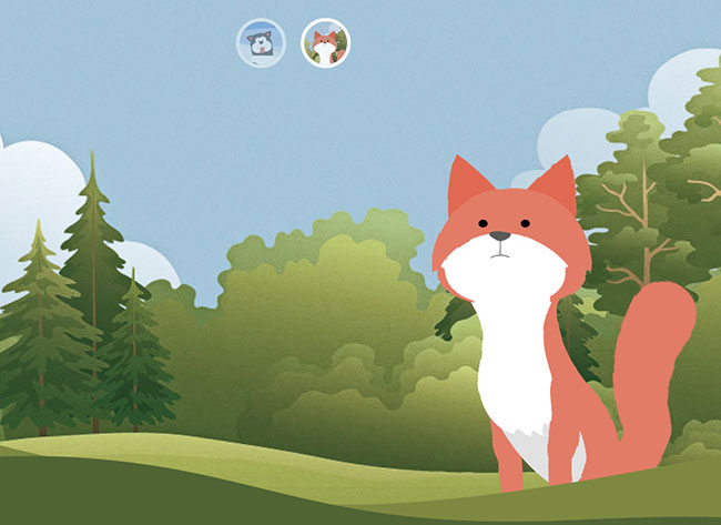
Cute cartoon animal animation special effects based on SVG and CSS3
Brief Tutorial
This is a cute animal animation special effect based on SVG filter and CSS3. This special effect uses HTML tags and SVG to create the shape of the animal, and uses CSS3 animation to create various animation effects of the animal.
How to use
HTML structure
This special effect uses different technologies when creating animals. When creating the husky, the CSS border-radius property is used, and when creating the husky, the CSS border-radius property is used. Fox uses an inline SVG background image.
Both examples use nested divs as the body of the animal. A reasonable combination of these elements is beneficial to creating animation effects for each part of the animal's movement.
<!-- Markup for the fox head -->
<div class="fox-head">
  <div class="fox-face">
    <div class="fox-ears">
      <div class="fox-ear"></div>
      <div class="fox-ear"></div>
    </div>
    <div class="fox-skull"></div>
    <div class="fox-front"></div>
    <div class="fox-eyes"></div>
    <div class="fox-nose"></div>
  </div>
</div>

<!-- Markup for the husky head -->
<div class="husky-head">
  <div class="husky-ear"></div>
  <div class="husky-ear"></div>
  <div class="husky-face">
    <div class="husky-eye"></div>
    <div class="husky-eye"></div>
    <div class="husky-nose"></div>
    <div class="husky-mouth">
      <div class="husky-lips"></div>
      <div class="husky-tongue"></div>
    </div>
  </div>
</div>Huskies’ bodies are mostly round and oval, so they need to use a lot of border-radius attributes to make them. For example, the CSS code of its hind legs is:
.husky-hind-leg {
  // ...
  border-top-left-radius: 35% 100%;
  border-top-right-radius: 40% 100%;
}Other parts cannot be made using the border-radius attribute alone and must be combined with transform, such as the front legs of a husky.
.husky-front-legs > .husky-leg:before {
  transform: skewY(-30deg) skewX(10deg);
  transform-origin: top right;
}For the creation of the fox body parts, the author used Adobe Illustrator to create the graphics and then saved the individual parts as SVG graphics. Finally, use Sass-SVG to convert it into a CSS style:
.fox-nose:before {
  @include svg((viewBox: (0 0 168 168))) {
    // the nose
    @include svg('path', (
      fill: $color-nose,
      d: 'M83.7,86.7c3.3,0,11.6-3.9,11.6-7.1c0-3.2-9.4-3.2-11.6-3.2c-2.2,0-11.6,0-11.6,3.2   C72.1,82.8,80.4,86.7,83.7,86.7z'
    ));

    // the line connecting the nose to the mouth
    @include svg('path', (
      stroke: $color-nose,
      fill: none,
      d: 'M83.7,102.3V86.7'
    ));

    // the mouth
    @include svg('path', (
      stroke: $color-nose,
      fill: none,
      d: 'M94.5,104.9c0,0-5.2-2.7-10.8-2.7c-5.6,0-10.8,2.7-10.8,2.7'
    ));
  }
}The above code will generate an encoded inline background image.
.fox-nose:before {
  background-image: url("data:image/svg+xml;charset=utf8,%3Csvg...");
}Husky:

Fox:

The above is a cute cartoon based on SVG and CSS3 For content on small animal animation special effects, please pay attention to the PHP Chinese website (www.php.cn) for more related content!

Hot AI Tools

Undresser.AI Undress
AI-powered app for creating realistic nude photos

AI Clothes Remover
Online AI tool for removing clothes from photos.

Undress AI Tool
Undress images for free

Clothoff.io
AI clothes remover

AI Hentai Generator
Generate AI Hentai for free.

Hot Article

Hot Tools

Notepad++7.3.1
Easy-to-use and free code editor

SublimeText3 Chinese version
Chinese version, very easy to use

Zend Studio 13.0.1
Powerful PHP integrated development environment

Dreamweaver CS6
Visual web development tools

SublimeText3 Mac version
God-level code editing software (SublimeText3)

Hot Topics
 1378
1378
 52
52
 How to achieve wave effect with pure CSS3? (code example)
Jun 28, 2022 pm 01:39 PM
How to achieve wave effect with pure CSS3? This article will introduce to you how to use SVG and CSS animation to create wave effects. I hope it will be helpful to you!
 Use CSS skillfully to realize various strange-shaped buttons (with code)
Jul 19, 2022 am 11:28 AM
This article will show you how to use CSS to easily realize various weird-shaped buttons that appear frequently. I hope it will be helpful to you!
 Let's talk about how to use SVG to achieve image mosaic effect
Sep 01, 2022 am 11:05 AM
How to use SVG to achieve image mosaic effect without using Javascript? The following article will give you a detailed understanding, I hope it will be helpful to you!
 How to hide elements in css without taking up space
Jun 01, 2022 pm 07:15 PM
Two methods: 1. Using the display attribute, just add the "display:none;" style to the element. 2. Use the position and top attributes to set the absolute positioning of the element to hide the element. Just add the "position:absolute;top:-9999px;" style to the element.
 How to implement lace borders in css3
Sep 16, 2022 pm 07:11 PM
In CSS, you can use the border-image attribute to achieve a lace border. The border-image attribute can use images to create borders, that is, add a background image to the border. You only need to specify the background image as a lace style; the syntax "border-image: url (image path) offsets the image border width inward. Whether outset is repeated;".
 It turns out that text carousel and image carousel can also be realized using pure CSS!
Jun 10, 2022 pm 01:00 PM
How to create text carousel and image carousel? The first thing everyone thinks of is whether to use js. In fact, text carousel and image carousel can also be realized using pure CSS. Let’s take a look at the implementation method. I hope it will be helpful to everyone!
 How to convert svg to jpg format
Nov 24, 2023 am 09:50 AM
svg can be converted to jpg format by using image processing software, using online conversion tools, and using the Python image processing library. Detailed introduction: 1. Image processing software includes Adobe Illustrator, Inkscape and GIMP; 2. Online conversion tools include CloudConvert, Zamzar, Online Convert, etc.; 3. Python image processing library, etc.
 How to enlarge the image by clicking the mouse in css3
Apr 25, 2022 pm 04:52 PM
Implementation method: 1. Use the ":active" selector to select the state of the mouse click on the picture; 2. Use the transform attribute and scale() function to achieve the picture magnification effect, the syntax "img:active {transform: scale(x-axis magnification, y Axis magnification);}".


