CSS3 creates frosted glass background effect

黄舟
Release: 2017-01-22 17:31:59
Original
2499 people have browsed it

Introduction

I saw this effect in the book CSS Secrets, and it feels very good;

The implementation principle is also quite simple;

Renderings and Implementation

Rendering
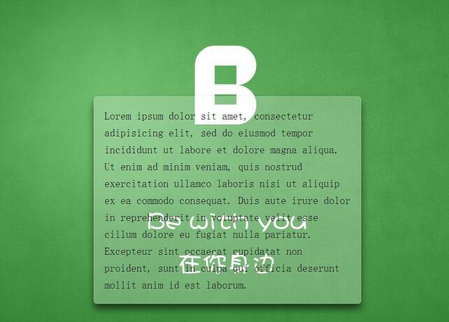
CSS3 creates frosted glass background effect

##Code implementation

<!DOCTYPE html>   

    <html>   

        <head>   

            <meta charset="UTF-8">   

            <title>Document</title>   

            <style>   

                        /**  

                         * 设置背景图全屏覆盖及固定  

                         * 设置内部元素偏移  

                         */  

                        body {   

                            /*此处背景图自行替换*/  

                            background: url(demo.jpg) no-repeat center center fixed;   

                            background-size: cover;   

                             min-height: 100vh;   

                            box-sizing: border-box;   

                            margin: 0;   

                            padding-top: calc(50vh - 6em);   

                            font: 150%/1.6 Baskerville, Palatino, serif;   

                        }   


                        /**  

                         * 整体居中功能;  

                         * 背景透明虚化  

                         * 溢出隐藏  

                         * 边缘圆角化  

                         * 文字增加淡阴影  

                         */  

                        .description{   

                            position: relative;   

                            margin: 0 auto;   

                            padding: 1em;   

                            max-width: 23em;   

                            background: hsla(0,0%,100%,.25) border-box;   

                            overflow: hidden;   

                            border-radius: .3em;   

                            box-shadow: 0 0 0 1px hsla(0,0%,100%,.3) inset,   

                                        0 .5em 1em rgba(0, 0, 0, 0.6);   

                            text-shadow: 0 1px 1px hsla(0,0%,100%,.3);   

                        }   


                        /*使用滤镜模糊边缘*/  

                        .description::before{   

                            content: &#39;&#39;;   

                            position: absolute;   

                            top: 0; rightright: 0; bottombottom: 0; left: 0;   

                            margin: -30px;   

                            z-index: -1;   

                            -webkit-filter: blur(20px);   

                            filter: blur(20px);   

                        }   

            </style>   

        </head>   

        <body>   

            <p>   

            Lorem ipsum dolor sit amet, consectetur adipisicing elit, sed do eiusmod   

            tempor incididunt ut labore et dolore magna aliqua. Ut enim ad minim veniam,   

            quis nostrud exercitation ullamco laboris nisi ut aliquip ex ea commodo   

            consequat. Duis aute irure dolor in reprehenderit in voluptate velit esse   

            cillum dolore eu fugiat nulla pariatur. Excepteur sint occaecat cupidatat non   

            proident, sunt in culpa qui officia deserunt mollit anim id est laborum.   

            </p>   

        </body>   

    </html>
Copy after login

Summary


This implementation mode is written with performance in mind , and maintenance considerations
- For example, using em, you can easily zoom in and out of the overall size
- hsla is used here, this is the first time I use this color value; I only adjusted this in PS before , a very good color mode. It is similar to RGBA, but HSLA is more in line with the viewing of human eyes;
- I also learned a new background abbreviation method

/*分开写*/    
  
    background-color:#ff0;     
  
    background-image:url(background.gif);     
  
    background-repeat:no-repeat;     
  
    background-attachment:fixed;     
  
    background-position:0 0;     
  
    background-size:cover;     


    /*简写*/    
  
    background: #ff0 url(background.gif) no-repeat / fixed cover;     
  
    /*设置background-size必须用单斜杠隔开*/
Copy after login

The above is how to create a frosted glass background effect with CSS3 Content, for more related content, please pay attention to the PHP Chinese website (www.php.cn)!

source:php.cn
Statement of this Website
The content of this article is voluntarily contributed by netizens, and the copyright belongs to the original author. This site does not assume corresponding legal responsibility. If you find any content suspected of plagiarism or infringement, please contact admin@php.cn
Popular Tutorials
More>
Latest Downloads
More>
Web Effects
Website Source Code
Website Materials
Front End Template