css3 transition and 2d transformation
1.transition
Syntax: transition: property duration timing-function delay;
Transition-property Set the css property name of the transition effect
Syntax: transition-property: none | all | property
None No properties will get transition effects
All properties will get transition effects.
property defines a list of CSS property names for applying transition effects. The list is separated by commas.
]over how many seconds or milliseconds it takes to complete the transition effect
Syntax: transition-duration: time; The default value is 0, which means there will be no effect.
Transition-timing-function specifies the speed curve of the speed effect.
Syntax: transition-timing-function: linear|ease|ease-in|ease-out|ease-in-out|cubic-bezier(n,n,n,n);
Linear specifies the same speed A transitional effect from start to finish.
ease stipulates to start at a slow speed, then go fast, and then end at a slow speed.
ease-in specifies an excessive effect that starts at a slow speed.
ease-out specifies an excessive effect that ends at a slow speed.
ease-in-out specifies a transition effect that starts and ends at a slow speed.
cubic-bezier(n,n,n,n) Define your own value in cubic-bezier. Possible values are values between 0 and 1.
transition-delay Defines when the transition effect starts
Syntax: transititon-delay: time;
time specifies the time to wait before the transition effect starts.
Example:
## Example: (Bezier curve)
1.295,0.000,1.610);}
.box:hover{width:500px;}
Result: As shown in the figure
uting Me >> .box{width:100px;height:100px;background :red; transition:1swidth,2s height,3s background;}
.box:hover{width:300px;height:150px;background:blue;}
Result: As shown in the figure

##2.transform
The letters are transformed. The meaning of change, in CSS3, transform mainly includes the following types, rotation rotate, skew, scale and translate, as well as matrix transformation matrix
Syntax: transform: none |
None means how to transform without entering;
But when using multiple attributes in transform, they need to be separated by spaces. Remember, they are separated by spaces.
rotate
over forward in word to specify a 2D rotation (2D rotation) on the original element through the specified angle parameter, you need to first define the transform-origin attribute.
ccogene Over in in >>, where angle refers to the angle of rotation
If the set value is a positive number, it means clockwise rotation, if the set value is a negative number, it means counterclockwise rotation.
Move at the same time); translateX(x) only moves in the horizontal direction (X-axis movement) translateY(Y) only moves in the vertical direction (Y-axis movement)
Scale
The scaleY(y) element only scales in the vertical direction (Y-axis scaling), but they have the same scaling center point and base,
Its center point is the center position of the element, and the scaling base is 1. If its value is greater than 1 element If the value is less than 1, the element will shrink. At the same time, it is distorted according to a certain angle value); skewX(x) only distorts the element in the horizontal direction (X-axis distortion);
skewY(y) only makes the element distorted in the vertical direction (Y Axis twist deformation)
Matrix matrix
Specifying a 2D transformation in the form of a six-valued (a, b, c, d, e, f) transformation matrix is equivalent to directly applying a [a b c d e f] transformation matrix, which is based on the horizontal direction (X axis). Reposition the element in the vertical direction (Y-axis) and change the base point of the element transform-origin. Its main function is to allow us to change the base point position of the element before performing the transform action,
.box:hover { -webkit-transform:rotate(45deg);}
## transition:2s;}
.box:hover{-webkit-transform:translate(-100px,200px);}
/p>
Result: The position of the element changes.
Example: (zoom) box: hover{webkit-transform:scale(2);}
# }
.box:hover{-webkit-transform:skewX(45deg);}
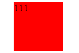
111
: As shown in the figure
Example: (matrix) 100px auto 0; transition:2s;}
111
Result: as shown
demo 示例:

Hot AI Tools

Undresser.AI Undress
AI-powered app for creating realistic nude photos

AI Clothes Remover
Online AI tool for removing clothes from photos.

Undress AI Tool
Undress images for free

Clothoff.io
AI clothes remover

Video Face Swap
Swap faces in any video effortlessly with our completely free AI face swap tool!

Hot Article

Hot Tools

Notepad++7.3.1
Easy-to-use and free code editor

SublimeText3 Chinese version
Chinese version, very easy to use

Zend Studio 13.0.1
Powerful PHP integrated development environment

Dreamweaver CS6
Visual web development tools

SublimeText3 Mac version
God-level code editing software (SublimeText3)

Hot Topics
 1386
1386
 52
52
 How to achieve wave effect with pure CSS3? (code example)
Jun 28, 2022 pm 01:39 PM
How to achieve wave effect with pure CSS3? This article will introduce to you how to use SVG and CSS animation to create wave effects. I hope it will be helpful to you!
 Use CSS skillfully to realize various strange-shaped buttons (with code)
Jul 19, 2022 am 11:28 AM
This article will show you how to use CSS to easily realize various weird-shaped buttons that appear frequently. I hope it will be helpful to you!
 How to hide elements in css without taking up space
Jun 01, 2022 pm 07:15 PM
Two methods: 1. Using the display attribute, just add the "display:none;" style to the element. 2. Use the position and top attributes to set the absolute positioning of the element to hide the element. Just add the "position:absolute;top:-9999px;" style to the element.
 How to implement lace borders in css3
Sep 16, 2022 pm 07:11 PM
In CSS, you can use the border-image attribute to achieve a lace border. The border-image attribute can use images to create borders, that is, add a background image to the border. You only need to specify the background image as a lace style; the syntax "border-image: url (image path) offsets the image border width inward. Whether outset is repeated;".
 How to enlarge the image by clicking the mouse in css3
Apr 25, 2022 pm 04:52 PM
Implementation method: 1. Use the ":active" selector to select the state of the mouse click on the picture; 2. Use the transform attribute and scale() function to achieve the picture magnification effect, the syntax "img:active {transform: scale(x-axis magnification, y Axis magnification);}".
 It turns out that text carousel and image carousel can also be realized using pure CSS!
Jun 10, 2022 pm 01:00 PM
How to create text carousel and image carousel? The first thing everyone thinks of is whether to use js. In fact, text carousel and image carousel can also be realized using pure CSS. Let’s take a look at the implementation method. I hope it will be helpful to everyone!
 How to set animation rotation speed in css3
Apr 28, 2022 pm 04:32 PM
In CSS3, you can use the "animation-timing-function" attribute to set the animation rotation speed. This attribute is used to specify how the animation will complete a cycle and set the speed curve of the animation. The syntax is "element {animation-timing-function: speed attribute value;}".
 Does css3 animation effect have deformation?
Apr 28, 2022 pm 02:20 PM
The animation effect in css3 has deformation; you can use "animation: animation attribute @keyframes ..{..{transform: transformation attribute}}" to achieve deformation animation effect. The animation attribute is used to set the animation style, and the transform attribute is used to set the deformation style. .


