 Web Front-end
 PS Tutorial
 PS Web Design Tutorial I - Create Stylish and Colorful WordPress Layouts in Photoshop
PS Web Design Tutorial I - Create Stylish and Colorful WordPress Layouts in Photoshop
As a coder, my art foundation is weak. We can refer to some mature web PS tutorials to improve our design capabilities. To paraphrase a sentence, "If you are familiar with three hundred Tang poems, you can recite them even if you don't know how to compose them."
The tutorials in this series come from online PS tutorials, all from abroad, and all in English. I try to translate these excellent tutorials. Due to limited translation capabilities, the details of the translation still need to be worked out. I hope that the majority of netizens will give me some advice.
Agreement:
1. The software used in this article is the Photoshop CS5 version
2. The screenshots of the original tutorial are in English. I re-screened them based on the re-production. Chinese version of Figure
3. Some operations in the original text do not give parameters. I measured some parameters through repeated testing, which are displayed in red text. For some wrong parameters, the correct parameters are displayed directly in red text
For example: (90, 22, 231, 77) , indicating that the coordinates of the upper left corner of the rectangle are (90, 22) , width 231, height 77
For example: (90,22), indicating that the coordinates of the upper left corner of the rectangle are (90,22), the other two parameters of the rectangle have been specified in the tutorial
4. My own experience will be attached at the end of the tutorial. Some are optimizations of some steps in the tutorial, etc.
Next, is the tutorial. Use sentence-by-sentence translation.
Hello and welcome to another tutorial here on trendyTUTS.com. For today I will create a trendy and colorful wordpress layout in Photoshop. If you're thinking to redesign your blog, you can follow this tutorial. I will try to explain step by step how you can create a similar wordpress layout in Photoshop.
Hi everyone, welcome to trendyTUTS.com to access this tutorial. Today I will use Photoshop to create a stylish and colorful WordPress layout. If you are thinking about redesigning your blog, you can follow this tutorial. I'll walk you through it step by step in Photoshop so you can create a similar WordPress layout.
Please note that in this tutorial I will explain only how to design this layout in Photoshop but I will not cover the conversion PSD to XHTML.
Please note that in this tutorial In the tutorial, I will only explain how to design this layout in Photoshop, but I will not explain how to convert this PSD to XHTML.
To create this tutorial I have used:
•The basic tools from Photoshop (Rectangle Tool – mostly)
•Some vector icons from our free pack
For this tutorial I used:
Basic tools of Photoshop (mostly the rectangle tool)
Some of our free vector icons
Let's start the tutorial. Open phootshop and create a new document. Dimensions: 1020 x 1710px
Let's start the tutorial. Open photoshop and create a new document. Size: 1020 x 1710px

Select paint Bucket Tool and fill your document with #d9cb9e. #d9cb9e Populate your document.
#Step1 – Creating the top area
Select rectangle tool create this 2 rectangles. For the rectangle on the back I have used this color: #d9b94c and for the top one I have used this color: #fed95d, then with Type Tool I will write “trendyTUTS” and I will apply this layer styles:
Step 1 - Create the top area
Select the Rectangle Tool Create 2 rectangles. The rear rectangle
(90, 22, 231, 77), color: #d9b94c; the front rectangle (74, 38, 231, 77) , color: #fed95d. Use the text tool to write "trendyTUTS" and then apply the following layer style:

Here's my result for logo:
This is The logo I made looks like:

Next on the right side I will create the search bar. Select Rectangle Tool and create 2 similar shapes. Dimensions 324x24px. For the back one I have used this color: #455352 and for the top one, this color: #738483.
Next I will create the search bar on the right. Select the Rectangle Tool and create 2 rectangles. Dimensions 324x34px. The rear rectangle (530, 54) , color: #455352; the front rectangle (526, 60) , color: #738483.
Having Rectangle Tool selected I will create again 2 more shapes . Dimensions: 51x34px. For the back shape I have used this color: #962418 and for the top one, this color: # dc3522. With type tool I will add some text, and here is my result for the search bar
Then use the rectangle tool to create 2 rectangles, size: 51x34px. The rear rectangle (862, 54) , color: #962418; the front rectangle (856, 60) , color: #dc3522. Use the type tool to add some text. Here is what the search bar I made looks like

Step 2 – Creating the navigation
First I select Rectangle Tool and I will create this 2 shapes. Dimensions: 949x54px. For the back shape I have used this color: #738483 and for the top one: #374140. For the top one I will apply this layer styles:
Step 2 - Create Navigation
First I select the Rectangle Tool and create 2 rectangles. Dimensions: 949x54px. The back rectangle (43, 155), color: #738483; the front rectangle (36, 162), color: #374140. Apply the following layer style to the front rectangle: Color in the image: #858585 .

Next I will select Rectangle Tool and I will create this red shape: #dc3522
Next I will select Rectangle Tool and I will create this red shape: , create a red rectangle (86, 170, 136, 68) , color: #dc3522.
Then I will select Pen Tool and I will create this triangle (in order to create a nice 3d effect for our red shape). Color use for this triangle: #962418
Then, select the Pen Tool and create a right triangle with the color: #962418 (so that our red rectangle has a nice 3d effect).
As shown below:

With type tool I will add the links for navigation. Here is my final result:
Use the text tool to add the text of the navigation link. The picture below is the final result:

Step 3 - Creating the featured area
First I will select Rectangle Tool and I will create this 2 shapes. The first one (the bluish one) it will be used for Featured Area and the second one (white one) will be used later for the content area.
Step 3-Create Featured Area
First I will select the Rectangle Tool, which will create 2 rectangles. The first one (the light blue (#3e5662) one) will be used for the featured area (60, 260, 925, 328) , and the second one (the white ( #dfdccd) that) will be used later for the content area (60, 588, 925, 973) .
Next on the top of our bluish shape I will create another one. Dimensions 925×328, color: #567989, I will apply this layer styles, also:
Next, on top of the light blue rectangle, I’m going to create another rectangle (37,283) with dimensions of 925×328 and color: #567989 and I’m going to add the following layer blending style


You should have something like this:
You should have something like this:


#I will select Rectangle Tool and I will create a yellow rectangle. Color: # fed95d
I use Rectangle tool, create a yellow rectangle
(650, 244, 283, 45), color: # fed95d
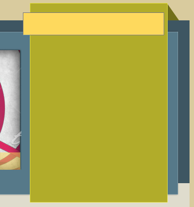
And again with Pen Tool I will make a triangle to create a nice 3d look. Color used: # 9d873e
and again with Pen Tool I will make a triangle to create a nice 3d look. Use color: # 9d873e


Step 4 – Creating the content area
First I will select Rectangle Tool and I will create this shape. Dimensions: 925X417px, color: #ece9df
Step 4 – Create content area
First I will select the Rectangle Tool and create a rectangle (37,626). Dimensions: 606x45px, color: #dc3522
Dimensions: 606x45px, color: #dc3522  Use the Rectangle Tool to create a red rectangle (17, 654). Size: 606x45px, Color: # dc3522
##As usual, I will select Pen Tool and I will create again a nice 3d look. Color used for this shape: # 9a291c, then with Type Tool I will add the title:
Like before, I use the Pen Tool again to create a nice 3d look. Color: # 9a291c and then use the text tool to add a title: 
With Rectangle Tool I will create another one rectangle over the red shape. Dimension: 178x39px , color: # 374140
Use the rectangle tool to create another rectangle  (426,669)
and add the corresponding text
.Then I will add an image and with type tool I will add some text
Then I will add an image and with type tool I will add some text Tool to add text
At the bottom of the article with Rectangle Tool I will create a shape and with Pen Tool I will create again a nice 3d look . Over this button with Type Tool I will write “See more”
In the bottom of the area, create a rectangle  (530, 988, 78, 37), color: # dc3523
Color: #9a231b
, to achieve a good 3d look. On this button, use the text tool to write "See more"On the right side I will create a sidebar again. I will use the same steps used to create the sidebar on featured area. I will use again Rectangle Tool (to create the horizontal and vertical rectangles) and with Pen Tool I will create again a nice 3d look.
on the right will recreate a Sidebar. You will use the same steps as creating the sidebar on the featured area. Use the Rectangle Tool again (to create a vertical rectangle  (665, 626, 275, 440), color: #d9b94c, stroke: #e4e041
(650, 654, 283, 45 ), color: #918d22
. ) and use the pen tool to create a nice 3d look,color: #5e5a1a
.
With some image and Type Tool I will add the content for the sidebar.
Some images and text will be added to the side of the content area Sidebar.

In the same way I will create another post on our wordpress layout and at the bottom I will create a pagination
Here is my final result for the content area:
Create another content area on the layout in the same way and create a pagination at the bottom (pagination color: #d9b94c, #374140). Add a triangle shadow to the left of the right sidebar, color: #737029.
Here is the final result of my content area:

Step 4 – Creating the footer
Well to create the footer it's quite easy. First I will add the logo (I have duplicated it) then on the right side, using Rectangle Tool I will create 2 shapes and using some icons from the free pack I will add a twitter and an rss icon.
Here is my final result for Footer
Step 4 – Create a Footer
Creating a footer is easy. First I will add the logo (the logo I made above), use the rectangle tool on the right to create 2 rectangles (directly copy the two rectangles in the logo area, then move them to the appropriate position on the right, and change the width to Original 250%, back rectangle color: #3e5662; front rectangle color: #557989.)And using some icons from the free pack, I added a twitter and rss icon.
Here is my final footer

The final layout is as follows:

Experience:
1. Accurately adjust the size and position of the rectangle in PS.
This is a confusing place. It seems that the size of the rectangle cannot be adjusted accurately in PS. In the free transformation tool, the width and height adjustments appear in the form of percentages. In fact, this is to fool it. Just enter the exact values directly into the width and height text boxes, but you need to bring the unit px. If there are only numbers and no units, and the default unit is percentage, this would be a tragedy.
For example: If I want to adjust the rectangle accurately (40, 40, 120, 50), just adjust it as shown below.

2. Simplified production of the logo of this tutorial
In this tutorial, the production of the logo is two rectangles (in There are two similar rectangles in several places in this tutorial). In fact, just a rectangle and adding a drop shadow can achieve the same effect.
a. Use the rectangle tool to add a rectangle, (74, 38, 231, 77), color: #fed95d
b. Add the following style and projection color to the rectangle: #d9b94c

The finished product is as follows: after adding the text, does it match the logo in the tutorial? Exactly the same.

3. Making triangle shadows
In the tutorial, it is mentioned many times to make triangle shadows to achieve a good 3D effect. In the tutorial, the pen tool is basically used to create triangle shadows. This is a matter of benevolence and wisdom. Some people are very proficient in using the pen tool and do not find it difficult at all. Some people (including me) cannot use the pen tool well, so they try to create a more convenient triangle shadow by themselves.
a. As shown below, first use the rectangle tool to create two rectangles

b. Click on the red layer in front, CTRL+J, copy This layer
c. Freely transform the copied layer, as shown in the following figure:

d. Move the transformed layer to Take the black layer behind and change it to dark red. As shown in the picture below:

# It’s almost the same as the shadow effect in the tutorial.
For more PS web design tutorials I - Create stylish and colorful wordpress layouts in Photoshop. For related articles, please pay attention to the PHP Chinese website!

Hot AI Tools

Undresser.AI Undress
AI-powered app for creating realistic nude photos

AI Clothes Remover
Online AI tool for removing clothes from photos.

Undress AI Tool
Undress images for free

Clothoff.io
AI clothes remover

Video Face Swap
Swap faces in any video effortlessly with our completely free AI face swap tool!

Hot Article

Hot Tools

Notepad++7.3.1
Easy-to-use and free code editor

SublimeText3 Chinese version
Chinese version, very easy to use

Zend Studio 13.0.1
Powerful PHP integrated development environment

Dreamweaver CS6
Visual web development tools

SublimeText3 Mac version
God-level code editing software (SublimeText3)

Hot Topics
 What are the common questions about exporting PDF on PS
Apr 06, 2025 pm 04:51 PM
Frequently Asked Questions and Solutions when Exporting PS as PDF: Font Embedding Problems: Check the "Font" option, select "Embed" or convert the font into a curve (path). Color deviation problem: convert the file into CMYK mode and adjust the color; directly exporting it with RGB requires psychological preparation for preview and color deviation. Resolution and file size issues: Choose resolution according to actual conditions, or use the compression option to optimize file size. Special effects issue: Merge (flatten) layers before exporting, or weigh the pros and cons.
 What is the reason why PS keeps showing loading?
Apr 06, 2025 pm 06:39 PM
PS "Loading" problems are caused by resource access or processing problems: hard disk reading speed is slow or bad: Use CrystalDiskInfo to check the hard disk health and replace the problematic hard disk. Insufficient memory: Upgrade memory to meet PS's needs for high-resolution images and complex layer processing. Graphics card drivers are outdated or corrupted: Update the drivers to optimize communication between the PS and the graphics card. File paths are too long or file names have special characters: use short paths and avoid special characters. PS's own problem: Reinstall or repair the PS installer.
 How to speed up the loading speed of PS?
Apr 06, 2025 pm 06:27 PM
Solving the problem of slow Photoshop startup requires a multi-pronged approach, including: upgrading hardware (memory, solid-state drive, CPU); uninstalling outdated or incompatible plug-ins; cleaning up system garbage and excessive background programs regularly; closing irrelevant programs with caution; avoiding opening a large number of files during startup.
 How to solve the problem of loading when PS is always showing that it is loading?
Apr 06, 2025 pm 06:30 PM
PS card is "Loading"? Solutions include: checking the computer configuration (memory, hard disk, processor), cleaning hard disk fragmentation, updating the graphics card driver, adjusting PS settings, reinstalling PS, and developing good programming habits.
 How to set password protection for export PDF on PS
Apr 06, 2025 pm 04:45 PM
Export password-protected PDF in Photoshop: Open the image file. Click "File"> "Export"> "Export as PDF". Set the "Security" option and enter the same password twice. Click "Export" to generate a PDF file.
 How to use PS Pen Tool
Apr 06, 2025 pm 10:15 PM
The Pen Tool is a tool that creates precise paths and shapes, and is used by: Select the Pen Tool (P). Sets Path, Fill, Stroke, and Shape options. Click Create anchor point, drag the curve to release the Create anchor point. Press Ctrl/Cmd Alt/Opt to delete the anchor point, drag and move the anchor point, and click Adjust curve. Click the first anchor to close the path to create a shape, and double-click the last anchor to create an open path.
 Is slow PS loading related to computer configuration?
Apr 06, 2025 pm 06:24 PM
The reason for slow PS loading is the combined impact of hardware (CPU, memory, hard disk, graphics card) and software (system, background program). Solutions include: upgrading hardware (especially replacing solid-state drives), optimizing software (cleaning up system garbage, updating drivers, checking PS settings), and processing PS files. Regular computer maintenance can also help improve PS running speed.
 Photoshop for Professionals: Advanced Editing & Workflow Techniques
Apr 05, 2025 am 12:15 AM
Photoshop's advanced editing skills include frequency separation and HDR synthesis, and optimized workflows can be automated. 1) Frequency separation technology separates the texture and color details of images. 2) HDR synthesis enhances the dynamic range of images. 3) Automate workflows to improve efficiency and ensure consistency.


