 Web Front-end
 PS Tutorial
 PS Web Design Tutorial IV – How to Create a Professional Blog Website Layout in Photoshop
PS Web Design Tutorial IV – How to Create a Professional Blog Website Layout in Photoshop
Tribute to the Talk-Mania website. Saw many good web design tutorials on this site a year ago. A year later, when I looked back to see if there were any new tutorials, I suddenly found that the website could no longer be opened. Maybe it was closed, maybe the website name was changed. Fortunately, I downloaded and saved several tutorials last year, and this tutorial is one of them. I also hope to see more PS web design tutorial websites and more excellent designs.
Agreement:
1. The software used in this article is the Photoshop CS5 version
2. The screenshots of the original tutorial are in English. I re-screened them based on the re-production. Chinese version of Figure
3. Some operations in the original text do not give parameters. I measured some parameters through repeated testing, which are displayed in red text. For some wrong parameters, the correct parameters are displayed directly in red text
For example: (90, 22, 231, 77) , indicating that the coordinates of the upper left corner of the rectangle are (90, 22) , width 231, height 77
For example: (90,22), indicating that the coordinates of the upper left corner of the rectangle are (90,22), the other two parameters of the rectangle have been specified in the tutorial
In this tutorial I will show you how to create a professional blog web layout in Photoshop.
In this tutorial I will show you how to create a professional blog web layout in Photoshop. Professional blog website layout.
We will use the 960 Grid System to create the web layout. Download the archive file from the site, unzip it and open the "960_grid_12_col 2.psd" file from the "photoshop" folder.
I will use 960 Grid System to create the website layout, download the file from the site, unzip it and open 960_grid_12_col 2.psd from the photoshop folder.
Since the Talk-Mania website is no longer accessible, and the PSD is actually a positioning auxiliary file, this file is not used in this translation.
Step 1
Increase the size of your document by going to Image > Canvas Size. Use the settings from the following image. Then select the Paint Bucket Tool ( G) and fill the background with the color #f6f0e2.
Step 1
From the menu: Image > Canvas Size, increase the size of your document. Use the configuration in the picture below, then select the paint bucket tool to add a background color to the document: #f6f0e2
Since the PSD is not open, this step becomes a new document, size: 1200* 1500px. Use the paint bucket tool to add a background color to the document: #f6f0e2

The result is as follows:

Step 2
Select the Rectangle Tool (U) and create a white rectangle with the width 940px from the top of your document to the bottom. Leave a distance of 30px from the bottom edge of your document. Name this layer "content bg", double-click on it to open the Layer Style window and add a 1px stroke using the color #ded6c4.
Step 2
In your document, use the rectangle tool Create a white rectangle (130, 0, 940, 1470) that is 940px wide from top to bottom and 20px from the bottom edge. Name the layer content bg, double-click the layer to open the layer style dialog box, add a stroke style to the rectangle, width 1px, color: #ded6c4


Step 3 - Creating the header
Click on the 'Create a new group' button from the bottom of the Layers panel to create a new group and name it "header".
Select the Rectangle Tool (U) and create a rectangle with the height 10px at the top of your document using the color #aa915c. Name this layer "top bar".
Step 3 - Create the Header
Click the 'Create New Group' button at the bottom of the Layers Panel to create a new group and name it header.
Use the rectangle tool to create a 10px high rectangle at the top of the document (0, 0, 1200, 10) , color: #aa915c, named top bar.

Step 4
Select the Line Tool (U), set the weight to 1px and create a horizontal line at the bottom of the rectangle you created at the previous step using the color #968051. Name this layer "1px line".
Hit Ctrl/Cmd + J to duplicate this layer. Change the color of the new line to #c3a76a. Then select the Move Tool (V) and hit the up arrow once to move this layer one pixel up.
Step 4
Use the straight line tool to draw a horizontal straight line with a width of 1px at the bottom of the rectangle just created, color : #968051. Name the layer 1px line
Ctrl+J and change the color of the new line to #c3a76a. Then select the move tool and press the up arrow key once to move the line up one pixel.

Step 5
Select the Rectangle Tool (U) and create a rectangle with the height 100px and the color #e8c271 underneath the first rectangle . Name this layer "header bg".
Create a rectangle with a height of 100px using the Rectangle Tool and color: #e8c271 below the upper rectangle. Name it header bg

Step 6
Ctrl/Cmd-click on the vector mask of the "header bg" layer to select it. Then go to Layer > New Fill Layer > Gradient. The selection that you made has now been transformed into a mask and the gradient will be visible only over the header.
Use the settings from the following image for the Gradient Fill layer and move the gradient in the left side of the header (to move the gradient, click on the image and drag the cursor white the Gradient Fill window is opened). Set the blend mode of this layer to Overlay 20%.
Step 6
Ctrl+click on the header bg layer to select it. Then click, Layers > New Fill Layer > Gradient. The selected area is converted into a mask so that the linear gradient is only visible in the head area.
Refer to the image below for the parameters of gradient filling, and then move the gradient layer to the left side of the head area (when moving the gradient layer, click the layer, and pay attention to the white cursor when dragging ), set the layer’s opacity to 20%


Select the Line Tool (U) and create two lines with the weight 1px at the bottom of the header. Use the color #f4d48f for the first line and #c6a661 for the second one.

Step 8
Select the Type Tool (T) and write the name of your web layout in the left side of the header using the color #f6eedd and the font Myriad Pro Bold Italic.
Activate the guides to help you position this text layer correctly.
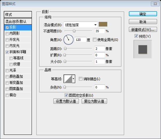
Double-click on this layer to open the Layer Style window and use the settings from the following image. I used the color #8e7849 for Drop Shadow.
Step 8
Use the text tool to write the name of your website on the left side of the header area of your website layout, color: #f6eedd, font: Myriad Pro, bold italic
Activate your auxiliary lines, Helps you position your text layer correctly.
Double-click your text layer to open the Layer Style dialog box, then set the parameters as shown below, and set the projection color to #8e7849


Step 9 - Creating the navigation bar
Create a new group and name it "navigation". Select the Rounded Rectangle Tool (U) and create a rounded rectangle with the dimensions 550px by 50px and the color #e9d09b. Name this layer "navbar" and use the Move Tool (V) to move it in the right side of your layout at 10px underneath the header. I used the color #cdbd9b for Drop Shadow.
Step 9 - Create Navigation Bar
Create a new group and name it navigation. Use the Rounded Rectangle Tool to create a rounded rectangle (500, 70) , size: 550px*50px, color: #e9d09b, name it navbar, use the Move Tool to move it to the right side of the document, with the lower edge at 10px below the header area. Add style and projection color as shown in the picture: #cdbd9b


Select the Type Tool (T) and write the name for your navigation menu items using the color #fffcf4. Add a shadow to your text layers using the settings from the following image.


##Step 11 - Creating the featured area
Create a new group and name it "featured". Then select the Rounded Rectangle Tool (U) and create a rectangle with the dimensions 900px by 280px and the color #d9cdb2. Name this layer "featured bg" and move it at a distance of 30px from the bottom edge of the header.
Step 11 - Create Featured Area
Create a new group and name it featured. Then use the Rounded Rectangle Tool to create a rounded rectangle (150, 140) , size: 900px*280px, color: #d9cdb2. Name this layer featured bg and move it 30px from the bottom edge of the head area.

Step 12
Select the Rectangle Tool (U) and create a rectangle inside the big rounded rectangle with the dimensions 600px by 260px and the color #f9f5ed.
Activate the guides to help you create this shape. Then name this layer "image holder".
Open an image in Photoshop and move it into your web layout document using the Move Tool (V). Name this layer "image" and put this image over the "image holder" layer. Right-click on the "image" layer and select Create Clipping Mask.
Step 12
Use the Rectangle Tool Create a rectangle (160,150) in the large rounded rectangle just now, size: 600px*260px, color: #f9f5ed
Activate the auxiliary lines to help you create the rectangle just now, name it This layer is image holder
Open an image in PS and use the move tool to move it to your web page layout. Name this layer image and move this layer above the image holder layer. Right-click on the image layer and select Create Clipping Mask

Step 13
Now we will create two arrows for the featured area. Select the Rounded Rectangle Tool (U) and create a small rounded rectangle with the color #d9cdb2. Double-click on this layer to open the Layer Style window and use the settings from the following image. For the Stroke I used the color #aaa18c . Name this layer "rounded rectangle".
Step 13
Now we are going to create 2 arrows in the featured area. Select the Rounded Rectangle Tool and create a small Rounded Rectangle Tool (710, 260, 60, 40) , color: #d9cdb2. Double-click this layer to open the layer style window and set the parameters as shown below. The stroke color is: #aaa18c. Name this layer rounded rectangle


##Step 14
Select the Custom Shape Tool (U) and create an arrow shape inside the rounded rectangle using the color #e8e0c8. Duplicate this arrow and move the new one to the left.Select the " rounded rectangle" layer and the two arrow layers and hit Ctrl/Cmd + G to put them inside a group. Name the group "right arrow".
Step 14
Select the Custom Shape Tool Create an arrow shape inside the rounded rectangle, color: #e8e0c8. Duplicate the arrow and move it a little to the left
Select the rounded rectangle layer and the two arrow layers, and use Ctrl+G to merge them into a group. Name the group right arrow.

Step 15
Use the Rectangular Marquee Tool (M) to select the right side of the small rounded rectangle. Make sure that the "right arrow" group is selected, then go to Layer > Layer Mask > Hide Selection.
Step 15
Use the Rectangle Selection Tool to select the right side of the small rounded rectangle. Make sure the right arrow group is selected, then click on the menu: Layer> Layer Mask> Hide Selection


Right-click on the "right arrow" layer and select Convert to Smart Object. Duplicate this layer (Ctrl/Cmd + J). Then go to Edit > Transform > Flip Horizontal. Name the new layer "left arrow" and move it in the left side of the featured area.

Select the Rectangle Tool (U) and create a rectangle with the size 280px by 260px and the color #f4ecd8. Put the rectangle next to the featured image and name this layer "text bg". Double-click on this layer to open the Layer Style and add a 1px stroke using the color # f8f4ea.
(760,150), size: 280px*260px, color: #f4ecd8. The rectangle is attached to the right side of the image in the featured area, named text bg. Double-click the layer to open the layer style, add a 1px stroke, and the stroke color: #f8f4ea


# #Step 18
Ctrl/Cmd-click on the vector mask of the "text bg" layer to select the rectangle. Then go to Layer > New Fill Layer > Gradient and use the settings from the following image. I used a #362D1A-to-transparent gradient. While the Gradient Fill window is opened, click on the image and move the gradient in the left side of the rectangle. Then set the opacity of this layer to 10%.
Step 18
Ctrl+click on the text bg layer to select the rectangle. Then click the menu: Layer > New Fill Layer > Gradient, and then set the parameters as shown below. In the Linear Gradient, set the color #362D1A to Transparent. When the Gradient Fill window opens, click on the gradient and move it to the left side of the rectangle. Then set the opacity to 10%.


Step 19
Create two vertical lines in the left side of the rectangle. Use the color #c7bca0 for the first line and #fffdf7 for the second one.
Step 19
Create two vertical straight lines on the left side of the rectangle, the color of the first straight line: #c7bca0, the color of the second straight line: #fffdf7

Select the Type Tool (T) and add some text for the featured area using the color #6e6758 and the font Helvetica.
(this translation uses Verdana font instead)

Select the Line Tool (U) and create a horizontal line underneath the featured area using the color #e7e1d5.
(150, 445, 900, 1) Below the featured area, color: # e7e1d5

##Step 22 - Creating the content area
Create a new group and name it "content". Then select the Rectangle Tool (U), hold down the Shift key and create a square with the size 200px by 200px and the color #d9cdb2. Name this layer "image holder ", double-click on it and use the settings from the following image to create a double stroke effect. I used the color #f4ecd8 for Inner Glow and #ada48f for Stroke.Select the Type Tool (T) and add some text next to the square.
Step 22 - Create content area
Create a new group named content. Use the Rectangle Tool and hold down the Shift key to create a square
(150, 470), size: 200px*200px, color: #d9cdb2. Name this layer image holder. Double-click the layer and set it as shown below to create a two-color stroke effect. The inner glow color: #f4ecd8; the stroke color: #ada48f. Use the text tool to add some text to the right side of the square


Duplicate the layers that you created at the previous step a couple of times. Use the Move Tool (V) to move the new layers underneath the original ones.
Step 23

Create a new group and name it "sidebar". Select the Line Tool (U) and create a vertical line next to the blog posts using the color #e7e1d5.
Select the Rectangle Tool (U) and create a rectangle with the dimensions 270px by 30px and the color #fcf9f4. Add a 1px stroke to this rectangle layer using the color #e0dace. Name this layer "search bar". Then select the Type Tool (T) and add the content for your sidebar.
Create a new group and name it sidebar. Use the straight line tool to create a vertical straight line (760, 470, 1, 675) on the right side of the area just now, color: #e7e1d5.
Use the rectangle tool to create a rectangle (780, 500) , size: 270px*30px, color: #fcf9f4. Add a 1px stroke with the color #e0dace. Name this layer search bar. Then use the text tool to add the text content of the sidebar.

Step 25 - Creating the footer area
Create a new group and name it "footer". Then select the Rectangle Tool (U) and create a rectangle with the height 40px and the color #b3a078 at the bottom of your layout. Name this layer "bottom bar". Then select the Line Tool (U) and create a horizontal line at the top of this rectangle using the color #918161.
Step 25 - Create the footer area
Create a new group and name it footer. Then select the Rectangle Tool and create a 40px high rectangle (130, 1430, 940, 40) at the bottom of the document, color: #b3a078. Name it bottom bar. Use the Line Tool to create a horizontal line at the top of the rectangle, color: #918161

Step 26
Create another rectangle with the height 250px and the color #d8c293 . Put this rectangle at the top of the previous one. Name this layer "footer bg".
Select the Line Tool (U) and create two lines at the top of this rectangle. Use the color #ece4d1 for the first line and #ada28b for the second one.
Step 26
Create another rectangle with a height of 250px(130,1180,940,250), color: #d8c293. Move this rectangle above the previous rectangle and name it footer bg
Use the straight line tool to create two straight lines on the top of this rectangle. The color of the first line is: #ece4d1; the color of the second line: # ada28b

Step 27
Use the Line Tool (U) to create two separators, each containing two lines - one with the color #ece4d1 and the other one with the color #ada28b. Put these layers inside a group and name the group "separators".
Step 27
Use the straight line tool to create two separators, one for each separator The line consists of two straight lines, one with color: #ece4d1 and the other with color: #ada28b. Merge these layers into a group named separators
The four straight lines from left to right are
(440, 1200, 1, 210), #ece4d1
(441, 1200, 1, 210), #ada28b
(760, 1200, 1, 210) ,#ece4d1
(761,1200,1,210),#ada28b 
Step 28
Add a mask to the "separators" group by going to Layer > Layer Mask > Reveal All. Then select the Gradient Tool (G) and drag two black to transparent gradients - one at the top of the separators and one at the bottom.
Step 28
Add a mask to the separators group, click the menu: Layer> Layer Mask> Show All. Select the gradient tool and drag two gradients from black to transparent - one at the top of the dividing line and one at the bottom of the dividing line
I feel there is no need to drag the gradient tool twice, just set it directly Use the gradient tool once, as shown in the picture below, and then drag it once


Step 29
Select the Type Tool (T) and add some content in the footer of your web layout.
Step 29
Use the text tool to add some content to the bottom area.

Step 30
Select the Type Tool (T) and add a copyright statement at the bottom of your layout using the color #867859.
Step 30
Use the text tool to add copyright information at the bottom of your layout, color: #867859


Hot AI Tools

Undresser.AI Undress
AI-powered app for creating realistic nude photos

AI Clothes Remover
Online AI tool for removing clothes from photos.

Undress AI Tool
Undress images for free

Clothoff.io
AI clothes remover

AI Hentai Generator
Generate AI Hentai for free.

Hot Article

Hot Tools

Notepad++7.3.1
Easy-to-use and free code editor

SublimeText3 Chinese version
Chinese version, very easy to use

Zend Studio 13.0.1
Powerful PHP integrated development environment

Dreamweaver CS6
Visual web development tools

SublimeText3 Mac version
God-level code editing software (SublimeText3)

Hot Topics
 1377
1377
 52
52
 How do I use Photoshop for creating social media graphics?
Mar 18, 2025 pm 01:41 PM
The article details using Photoshop for social media graphics, covering setup, design tools, and optimization techniques. It emphasizes efficiency and quality in graphic creation.
 How do I use Photoshop's Content-Aware Fill and Content-Aware Move tools effectively?
Mar 13, 2025 pm 07:35 PM
Article discusses using Photoshop's Content-Aware Fill and Move tools effectively, offering tips on selecting source areas, avoiding mistakes, and adjusting settings for optimal results.
 How do I prepare images for web use in Photoshop (file size, resolution, color space)?
Mar 13, 2025 pm 07:28 PM
Article discusses preparing images for web use in Photoshop, focusing on optimizing file size, resolution, and color space. Main issue is balancing image quality with quick loading times.
 How do I calibrate my monitor for accurate color in Photoshop?
Mar 13, 2025 pm 07:31 PM
Article discusses calibrating monitors for accurate color in Photoshop, tools for calibration, effects of improper calibration, and recalibration frequency. Main issue is ensuring color accuracy.
 How do I prepare images for print using Photoshop (resolution, color profiles)?
Mar 18, 2025 pm 01:36 PM
The article guides on preparing images for print in Photoshop, focusing on resolution, color profiles, and sharpness. It argues that 300 PPI and CMYK profiles are essential for quality prints.
 What is the reason why PS keeps showing loading?
Apr 06, 2025 pm 06:39 PM
PS "Loading" problems are caused by resource access or processing problems: hard disk reading speed is slow or bad: Use CrystalDiskInfo to check the hard disk health and replace the problematic hard disk. Insufficient memory: Upgrade memory to meet PS's needs for high-resolution images and complex layer processing. Graphics card drivers are outdated or corrupted: Update the drivers to optimize communication between the PS and the graphics card. File paths are too long or file names have special characters: use short paths and avoid special characters. PS's own problem: Reinstall or repair the PS installer.
 How do I prepare images for web using Photoshop (optimize file size, resolution)?
Mar 18, 2025 pm 01:35 PM
Article discusses optimizing images for web using Photoshop, focusing on file size and resolution. Main issue is balancing quality and load times.
 How do I create animated GIFs in Photoshop?
Mar 18, 2025 pm 01:38 PM
Article discusses creating and optimizing animated GIFs in Photoshop, including adding frames to existing GIFs. Main focus is on balancing quality and file size.


