 Web Front-end
 PS Tutorial
 PS Web Design Tutorial VII—Designing Cartoon Store Layout in Photoshop
PS Web Design Tutorial VII—Designing Cartoon Store Layout in Photoshop
As a coder, my art foundation is weak. We can refer to some mature web PS tutorials to improve our design capabilities. To paraphrase a sentence, "If you are familiar with three hundred Tang poems, you can recite them even if you don't know how to compose them."
The tutorials in this series come from online PS tutorials, all from abroad, and all in English. I try to translate these excellent tutorials. Due to limited translation capabilities, the details of the translation still need to be worked out. I hope that netizens will give you some advice.
Convention:
1. The software used in this article is Photoshop CS5 version
2. The screenshots of the original tutorial are in English. I took them again based on the re-production. Chinese version of Figure
3. Some operations in the original text do not give parameters. I measured some parameters through repeated testing, which are shown in red text. For some wrong parameters, the correct parameters are displayed directly in red text
For example: (90, 22, 231, 77) , indicating that the coordinates of the upper left corner of the rectangle are (90, 22) , width 231, height 77
For example: (90,22), indicating that the coordinates of the upper left corner of the rectangle are (90,22), the other two parameters of the rectangle have been specified in the tutorial
4. My own experience will be attached at the end of the tutorial. Some are optimizations of some steps in the tutorial, etc.
1. Firstly download the grid system, unzip the archive file you downloaded, go to the "templates" folder and then go to the Photoshop folder. Choose the 12 Grid file. The psd file will come with a premade grid guide to help you arrange the website. To activate the guides, go to View > Show > Guides.
Will need to make the canvas bigger, go to Image > Canvas Size and put in the new width and height below:
1. First download the grid system, unzip the file you downloaded, go to the templates folder, and go to the Photoshop subfolder. Select 12 Grid files. This PSD file comes with pre-made grid guides to help you align your web layout. Activate the guides, click: View > Display > Guides
We need to make the canvas larger, click: Image > Canvas Size, set the new width and height as shown below.
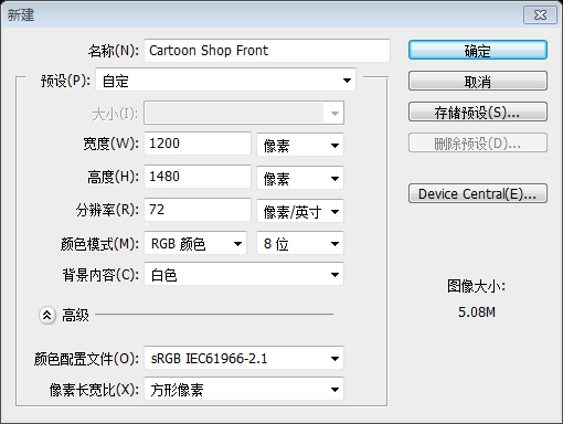
Since this translation tutorial does not use the grid system. Therefore, this step is changed to create a new document, document size: 1200px*1480px, as shown below:
2. To unlock the background layer click on the layer and press the lock icon to unlock.
2. Double-click the lock icon on the background layer to unlock the background layer
3. Using the Rectangle Tool draw a rectangle shape like below using the blue lines as a guide. Press ctrl+t to make the shape transformable and drag each top corner to in while holding down the alt key. Double click on the layer to bring up Blending Options and put in the settings below:
3. Use the rectangle tool to draw a rectangle (132, 200, 936, 135) , refer to the blue reference line as in the picture below. Press Ctrl+T to enter transformation mode, then hold down the Alt key and drag the top two control points as shown below (it should be after Ctrl+T, right-click and select Perspective, drag the upper left corner control point to move 70px inward) . Double-click the layer to open the layer blending options and set the style as shown below. Name this layer as roof

Gradient overlay color: #7e1416, #ee2a28


4. Using the circle draw a shape like below while holding down the shift key. Double click into Blending Options and make a stroke of 1px. Duplicate the circle by dragging it to the new layer icon. Make the circles alternate from dark red to white. If the circles don't fit hold down the ctrl key and select all the circle layers and drag them all to the new folder icon. On the folder press ctrl+t and drag a bottom corner across while holding down the shift key.
Use the Ellipse Tool and hold down the Shift key as shown in the PS Web Design Tutorial VII—Designing Cartoon Store Layout in Photoshop to draw a circle. Double-click to open the layer style and add a 1px stroke. Drag the layer to the Create New Layer icon to duplicate the layer multiple times. Make sure these circles alternate between dark red and white. If the circles don't appear in the right place, hold down the Ctrl key to select them all, drag them to the new group icon, press Ctrl+T on the group, hold down the Shift key, and drag a bottom control point Go to the appropriate position
Refer to the original picture, there are 12 circles in total. Calculation shows that the diameter of each circle is 78px. Follow the following operations to complete the operation of 12 semicircles
First use the Ellipse Tool to create a circle (132, 296, 78, 78) on the left side, and use dark red as the color: #7e1416

Double-click the layer to add the following style
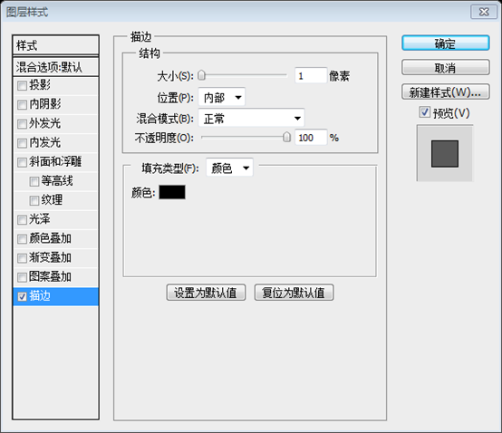
Ctrl+J to copy the layer, Ctrl+T to freely transform and move Move the new layer to 156px to the right of the original layer

Press Ctrl+Shift+Alt+T to copy the new layer and move it to the appropriate location Position (automatically moved to 156px on the right side of the original layer)

Repeat the operation just now until 6 dark red circles are created Okay

Use the same method to create 6 white circles

##Merge these circles into a new group, named circles, click: Layer> Layer Mask> Show All
As shown below, use a rectangular selection box Create a rectangular selection

Press the Delete key to not display the contents of the rectangular selection box. Press Ctrl+D to cancel the selection and move the roof layer. Go to the background layer and double click into Blending Options > Gradient Overlay and put in the colors below: 5. Return to the background layer and double-click to open the layer style window to add a gradient overlay style. The style is set as shown below.
Color of color overlay: #09a0df, #80ddff
6. Use the rectangle tool to create a rectangle (202, 142, 796, 58) above the roof, and add the same gradient overlay style as the roof layer. (Copy the roof layer style directly, and then paste it on this layer, including the stroke style)

Add some menu text on the rectangle, Font: Bebe Neue (The font cannot be found, use Arial Rounded MT Bold instead, font color: white) . Double-click the text layer and add the shadow layer style as shown below:

The related settings of the font are as follows:

Adjust the position of each menu, the results are as follows:

7. Using the rectangle tool draw a search box, double clock into Blending Options & put in the settings below. Next Go into Custom Shape tool and select the magnifying glass icon, holding down the shift key (so the shape stays perfect) draw the icon.
7. Use the rectangle tool to draw a search box (770, 152, 210, 36) , double-click the layer to add a layer style, and set the style as shown below. Next, select the Custom Shape Tool, select the magnifying glass icon, hold down the Shift key (to retain the intact shape) and draw the icon


##Add the text Type in here and Press Enter in the search box, set the format and font color as follows: #6d6d6d


(132, 335, 936, 1070) , double-click to open the layer style, and set the gradient overlay as shown below And add a 1px dark gray stroke
Gradient overlay color: #4b3226, #2b1915
Stroke color: #343434


9. Again with the rectangle tool draw a white 'window', double click into Blending Options and put in the settings below.
9. Then use the rectangle tool to draw the window (168, 335, 864, 274) , double-click to open the layer style, and set the style as shown below


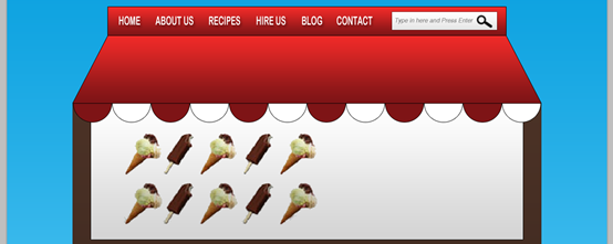
10. Next for the slider I've got some ice cream PS Web Design Tutorial VII—Designing Cartoon Store Layout in Photoshops, I've shrunk the PS Web Design Tutorial VII—Designing Cartoon Store Layout in Photoshops down (using the ctrl +t method we used earlier). To make the white background of the PS Web Design Tutorial VII—Designing Cartoon Store Layout in Photoshops transparent I've put all the ice cream PS Web Design Tutorial VII—Designing Cartoon Store Layout in Photoshops into a folder and set the Blending Mode to Multiply.
10. Next, on the left Use some ice cream pictures and shrink them (using the previous Ctrl+T method). To make the white background look transparent, I grouped the PS Web Design Tutorial VII—Designing Cartoon Store Layout in Photoshops together and set the group's blending options to Multiply

(using Pristina font substitution, the specific settings are as shown below) Add some text, press Ctrl+T, and rotate the text. I got some hand-drawn patterns, copied them to the canvas, used Ctrl+T to adjust the size, rotate the angle, double-click to open the layer style window, set the color overlay style to change the color
The formatting of the text is as shown below

Since the pattern is relatively simple, I just hand-painted it myself. First create a new layer, then use the brush tool to draw by hand on the new layer, just click carefully

##12. Now draw a box with the rounded rectangle tool, double click into Blending Options and put in the settings below & rotate the box. Using the circle tool draw a black circle & with the line tool draw 2 lines for strings. Place the blue sign layers into a folder .
12. Use a rounded rectangle to draw a square
(width 80px, height 60px). Double-click to open the layer style window and set the style as shown below. Rotate the square and draw it with the ellipse tool. Take a small black circle and draw two straight lines with the straight line tool. Merge the layers of these blue symbols into a group
## Colors for the gradient overlay: #3789cd, #2f6ba3, #3789cd

The angle of rotation of the block is recommended to be 159 degrees, because the gradient overlay angle set previously is 111 degrees. Through calculation, it can be seen that 159 degrees means that the direction of the gradient is consistent with the direction of the block.

13. Duplicate the blue sign folder by dragging them to the new layer icon. Go into the Custom Shape tool and choose the arrow , draw a white arrow on each blue sign.
13. Copy the folder of the blue symbol and drag it to the icon of the new layer. Using the Custom Shape Tool, select Arrows and add an arrow to each blue symbol

14. Next draw a 'title' box using the rectangle tool, double click into Blending Options and put in the same red gradient as the 'roof' & put in a 1px dark gray stroke. Next draw a white box with a 1px stroke. Holding down the ctrl key select the 2 shapes you created and duplicate them 4 more times. Place each of them where you want. To make a box larger press ctrl+t and stretch out the box.
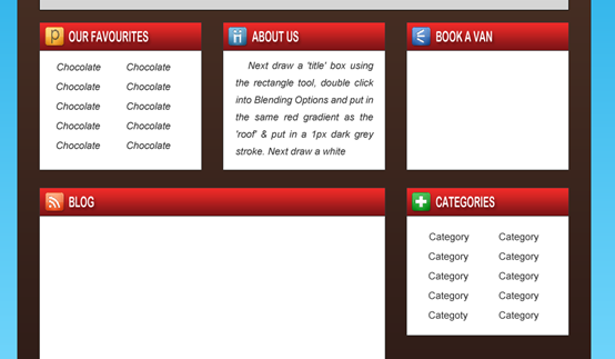
14. Next, use the rectangle tool to draw the title box(168, 630, 264, 45) , double-click to open the layer style window, add the same gradient overlay as the roof layer, and add a 1px dark gray (#343434) stroke , then draw a white square (168, 675, 264, 195) , with a stroke of 1px.

Hold down the Ctrl key to select two layers and copy them four times. Move each block to the appropriate location. Then use Ctrl+T to change the size of a block
As shown below, the positions of the five title blocks are (168, 630), (468, 630), (768, 630), (168 , 900), (768, 900)
The width of the large square in the lower left corner is 564px, and the height of the white square in the large square is 416

15. I've put in the headings with the font Bebe Neue, and written out the content in Arial font. I've gotten the icons from the Danish Royalty Free Icon set.
15. Write the title in each box using the font Bebe Neue; write the content in the font Arial. I got some free icons from Danish Royalty Free Icon
Directly copy the text layer on the roof layer, move it to the appropriate position, and modify the title text. The link to Danish Royalty Free Icon has expired. You can get the icon from other places instead
16. Use the rectangle tool to draw some squares in the contact form, with the color shown below (#ebebeb). Double-click to open the Layer Style window and add a 1px dark
(#343434) stroke. Use the Rounded Rectangle Tool to add a button, and give the button the same gradient overlay and stroke style as the title bar


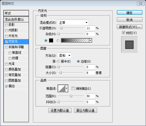
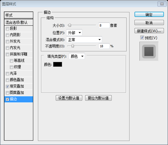
17, Next holding down the shift key draw 2 boxed with the rectangle tool like below, one white & small and the second large. On the larger box double click into Blending Options and put in the settings below:
17. Next, use the rectangle tool and hold down the Shift key to draw two squares, as shown in the picture below, one with a small white dot and one with a large white dot. . Double-click on the larger square to open the layer style, and set the style as shown below

In order to be eye-catching, the small white Change the color of the square to red
Write out the example post title & post description.
Write the title and description of the blog,The font of the title and The font in the title bar is the same, the color is red, the font of the description is the same as the font in other columns

This example has been changed to red for eye-catching purposes)



##Go into the Custom Shape Tool & choose this snow flake symbol & while holding down the shift key draw some snow flakes.
Switch to the custom shape tool, select the snowflake shape, hold down the Shift key, and add some snowflakes


Final Result

Postscript:
The coolness in summer. Since this tutorial is completed with reference to the 960 layout system, the sizes of some parts are more arbitrary. Calculating these dimensions took a lot of effort when translating.
For designers, they naturally have a good grasp of size. Even if they drag the mouse, they can get the size right.
For coders, in the initial learning stage, it is better to carefully calculate the size of each part. When you have done a lot in the future and feel that it is in place, it is not too late to be more casual.
For more PS web design tutorial VII - Designing cartoon store layout in Photoshop and related articles, please pay attention to the PHP Chinese website!

Hot AI Tools

Undresser.AI Undress
AI-powered app for creating realistic nude photos

AI Clothes Remover
Online AI tool for removing clothes from photos.

Undress AI Tool
Undress images for free

Clothoff.io
AI clothes remover

AI Hentai Generator
Generate AI Hentai for free.

Hot Article

Hot Tools

Notepad++7.3.1
Easy-to-use and free code editor

SublimeText3 Chinese version
Chinese version, very easy to use

Zend Studio 13.0.1
Powerful PHP integrated development environment

Dreamweaver CS6
Visual web development tools

SublimeText3 Mac version
God-level code editing software (SublimeText3)

Hot Topics
 1385
1385
 52
52
 What is the reason why PS keeps showing loading?
Apr 06, 2025 pm 06:39 PM
PS "Loading" problems are caused by resource access or processing problems: hard disk reading speed is slow or bad: Use CrystalDiskInfo to check the hard disk health and replace the problematic hard disk. Insufficient memory: Upgrade memory to meet PS's needs for high-resolution images and complex layer processing. Graphics card drivers are outdated or corrupted: Update the drivers to optimize communication between the PS and the graphics card. File paths are too long or file names have special characters: use short paths and avoid special characters. PS's own problem: Reinstall or repair the PS installer.
 What are the common questions about exporting PDF on PS
Apr 06, 2025 pm 04:51 PM
Frequently Asked Questions and Solutions when Exporting PS as PDF: Font Embedding Problems: Check the "Font" option, select "Embed" or convert the font into a curve (path). Color deviation problem: convert the file into CMYK mode and adjust the color; directly exporting it with RGB requires psychological preparation for preview and color deviation. Resolution and file size issues: Choose resolution according to actual conditions, or use the compression option to optimize file size. Special effects issue: Merge (flatten) layers before exporting, or weigh the pros and cons.
 How to solve the problem of loading when PS is always showing that it is loading?
Apr 06, 2025 pm 06:30 PM
PS card is "Loading"? Solutions include: checking the computer configuration (memory, hard disk, processor), cleaning hard disk fragmentation, updating the graphics card driver, adjusting PS settings, reinstalling PS, and developing good programming habits.
 How to set password protection for export PDF on PS
Apr 06, 2025 pm 04:45 PM
Export password-protected PDF in Photoshop: Open the image file. Click "File"> "Export"> "Export as PDF". Set the "Security" option and enter the same password twice. Click "Export" to generate a PDF file.
 How to speed up the loading speed of PS?
Apr 06, 2025 pm 06:27 PM
Solving the problem of slow Photoshop startup requires a multi-pronged approach, including: upgrading hardware (memory, solid-state drive, CPU); uninstalling outdated or incompatible plug-ins; cleaning up system garbage and excessive background programs regularly; closing irrelevant programs with caution; avoiding opening a large number of files during startup.
 How to solve the problem of loading when the PS opens the file?
Apr 06, 2025 pm 06:33 PM
"Loading" stuttering occurs when opening a file on PS. The reasons may include: too large or corrupted file, insufficient memory, slow hard disk speed, graphics card driver problems, PS version or plug-in conflicts. The solutions are: check file size and integrity, increase memory, upgrade hard disk, update graphics card driver, uninstall or disable suspicious plug-ins, and reinstall PS. This problem can be effectively solved by gradually checking and making good use of PS performance settings and developing good file management habits.
 How does PS feathering control the softness of the transition?
Apr 06, 2025 pm 07:33 PM
The key to feather control is to understand its gradual nature. PS itself does not provide the option to directly control the gradient curve, but you can flexibly adjust the radius and gradient softness by multiple feathering, matching masks, and fine selections to achieve a natural transition effect.
 How to pull the vertical reference line of PS
Apr 06, 2025 pm 08:18 PM
Pull vertical guides in Photoshop: Enable ruler view (View > ruler). Hover the mouse over the vertical edge of the ruler, and then the cursor becomes a vertical line with double arrows and hold and drag the mouse to pull out the reference line. Click Delete by dragging the guide, or hovering it into a cross.


