PS Web Design Tutorial X - Designing a Modern Blog Layout in PS
As a coder, my art foundation is weak. We can refer to some mature web PS tutorials to improve our design capabilities. To paraphrase a sentence, "If you are familiar with three hundred Tang poems, you can recite them even if you don't know how to compose them."
The tutorials in this series come from online PS tutorials, all from abroad, and all in English. I try to translate these excellent tutorials. Due to limited translation capabilities, the details of the translation still need to be worked out. I hope that netizens will give you some advice.
Convention:
1. The software used in this article is Photoshop CS5 version
2. The screenshots of the original tutorial are in English. I took them again based on the re-production. Chinese version of Figure
3. Some operations in the original text do not give parameters. I measured some parameters through repeated testing, which are shown in red text. For some wrong parameters, the correct parameters are displayed directly in red text
For example: (90, 22, 231, 77) , indicating that the coordinates of the upper left corner of the rectangle are (90, 22) , width 231, height 77
For example: (90,22), indicating that the coordinates of the upper left corner of the rectangle are (90,22), the other two parameters of the rectangle have been specified in the tutorial
4. My own experience will be attached at the end of the tutorial. Some are optimizations of some steps in the tutorial, etc.
Step 1
After you open the “960_grid_24_col.psd” file in Photoshop, go to Image > Canvas Size and use the settings from the following image to increase the dimensions of our document.
Step 1
After opening 960_grid_24_col.psd in PS, click: Image > Canvas Size, follow The image below resizes the document.
Since 960_grid_24_col.psd has not been downloaded, this step becomes a new document with a size of 1200*1400


Step 2
Create a new group (Layer > New > Group) and name it “top bar”. Then select the Rectangle Tool (U) and create a rectangle at the top of your layout with the height 10px and the color #829ea8. Name this layer “top bar”.Select the Line Tool (U), set the weight to 1px and create a horizontal line at the bottom of the rectangle which you created earlier using the color #6b838c. Name this layer “1px line”. Hit Ctrl/Cmd + J to duplicate this layer . Change the color of the new line to #a2c2cd, select the Move Tool (V) and hit the up arrow once to move this layer one pixel up.Step 2
Create a new group (Layer>New>Group) and name it top bar. Then use the Rectangle Tool to create a rectangle at the top of the layout with a height of 10px and color: #829ea8. Name this layer top bar. Use the Line Tool, set the thickness to 1px, and create a horizontal straight line at the bottom of the rectangle. Color: #6b838c. Name it 1px line. Hit Ctrl/Cmd + J to duplicate this layer. Change the new line color to: #a2c2cd, select the move tool and press the up arrow once to move this layer up one pixel
Step 3
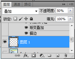
Use the Rectangular Marquee Tool (M) to create a selection underneath the top rectangle. Then create a new layer underneath the “top bar” group, select the Gradient Tool (G) and drag a black-to-transparent gradient from the top of the selection to the bottom. Hit Ctrl/Cmd + D to deselect. Name this layer “gradient” and set its blend mode to Overlay 50%.Step 3
Use the Rectangular Selection Tool to create a rectangular selection in the lower part of the rectangle(0, 10, 1200, 200) (After creating a selection, click: Select> Transform Selection , manually adjust the selection). Create a new layer below the top bar group, select the Gradient Tool, and create a black-to-transparent gradient from top to bottom of the selection. Press Ctrl/Cmd + D to cancel the selection. Name this layer gradient, set the blending options to Overlay and the opacity to 50%.

Step 4
#Create a new group underneath the “top bar ” group and name it “logo”. Select the Type Tool (T) and write the name of your layout using a bold font (such as “Myriad Pro Black Semiextended Italic”) and the color #c1de5d. Double-click on this text layer to open the Layer Style window and use the settings from the following image.
Activate the guides and put your text layer as you see in the image below.
Step 4
Create a logo group below the top bar group. Use the Type tool to write the name of your layout, using a bold font (like Myriad Pro Black Semiextended Italic) and the color: #c1de5d. Double-click the layer to open the layer style window, set the style
as shown below, activate the guides, and arrange your text layer as shown below. (Since there is no reference line, this step ignores )
The text font settings are as follows:

The text layer style is as follows:


##Step 5
Download the Lams vector pack and open the .AI file in Adobe Illustrator. Then use the Selection Tool (V) to select the green lamp. Hit Ctrl/Cmd + C to copy it, go back to Photoshop and hit Ctrl/Cmd + V to paste it as a smart object. Name this layer “lamp” and use Free Transform (Ctrl/Cmd + T) to change its size and move it above the logo. Hit Ctrl/Cmd + G to put this layer inside a group and name it “lamp”.Step 5
Download the Lams vector pack and open the .AI file in Adobe Illustrator. Select the green light, press Ctrl/Cmd + C to copy, return to PS and press Ctrl/Cmd + V to paste as a smart object. Name the layer lamp, change its size using Free Transform (Ctrl/+T) and move it above the logo. Press Ctrl/Cmd + G to put this layer into a new group and name the new group lamp
Select the Pen Tool (P) and make sure that the “Shape layers” button from the option bar above the image is active. Set the color to a bright yellow (#fbfcb6) and create a shape like the one you see in the image below. Name this layer “light”.
Step 6Select the Pen Tool and make sure the “Shape Layer” button is on the options bar is activated. Set the color to bright yellow (#fbfcb6) and create a shape like the image below. Name this layer light.
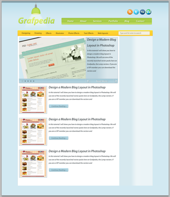
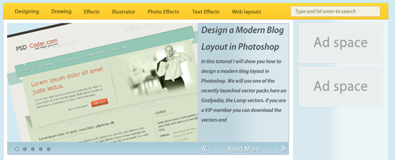
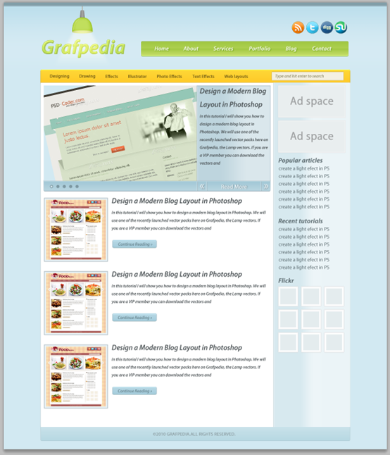
If you are not used to using the pen tool, please follow the steps belowCreate a new rectangle (158, 90, 176, 110), color: #fbfcb6. Name the layer light Press Ctrl/Cmd + T to free transform, right-click to select perspective, and drag the control point in the upper left corner 62px to the right Right-click on this layer and select Convert to Smart Object. Then go to Filter > Blur > Gaussian Blur and set the radius to 4px. Right-click on the layer and select Convert to Smart Object. Then click: Filter>Blur>Gaussian Blur, set the radius to 4px Step 7 Step 7 (755, 144) , size: 650px*46px, color: #adcf4f. Name this layer navbar and move it to the right side of the layout. Step 8 Step 8 ##Step 9 Step 9 Step 10 Step 10 Step 11 Step 11 (115,250) with dimensions of 970px*1080px. Name this layer content bg. (115, 250, 1, 1080) , color: #becdd2, name this layer 1px line . Duplicate this layer (Ctrl/Cmd + J) and move the new layer to the right side of the white rectangle (1084, 250, 1, 1080) . (115, 250, 970, 1) , color: #d5ae33 Step 12 Step 12 Create a new group categories below the content bg layer. Then select the rounded rectangle tool to create a rounded rectangle (115, 210, 970, 46) as shown below and set the style and color: #fecf2e. The bottom of the rounded rectangle meets the large white rectangle. Name this layer bar ##Step 13 Step 13 #Step 14 Step 14 (840, 218, 224, 25) on the right hand side of the yellow rectangle, color: #f4f0e2. Name this layer search bar, double-click the layer to add a 1px stroke, color: #c6ba92. #Step 15 Step 15 (125, 260) , size: 710px*300px, color as you like. Name this layer image holder Note: You can change the background color of the rectangle to #d2e9f2, so that even if the picture has free parts, the background color will be displayed in the free parts Step 16 Select the Rectangle Tool (U) and create a rectangle with the dimensions 230px by 300px and the color #dae7ec. Name this layer “text bg”, double-click on it and use the settings from the following image. Step 16 Use the rectangle tool Create a rectangle (605,260), size: 230px*300px, color: #dae7ec. Name this layer text bg. Double-click the layer to set the style as shown below #Step 17 Step 17 (605,260,230,1), left (605, 260, 1, 300) , right (834, 260, 1, 300) Draw three straight lines, color: #a1b3bb. Add another vertical line to the right of the left line (606, 260, 1, 300) , color: #d7e6ed Step 18 Step 18 Select the Rounded Rectangle Tool (U) and create a rounded rectangle underneath the “image holder” layer using the color #abcdda. Name this layer “bottom bar”, double-click on it and use the settings from the following image. For the Drop Shadow I used the color #819aa4. Use the Rounded Rectangle Tool to create a holder below the image holder layer Rounded rectangle , color: #abcdda. Name this layer bottom bar, double-click the layer and set the layer style as shown below. Color of projection: #819aa4 #Step 20 Create a new group and name it “bullet points”. Then select the Ellipse Tool (U) and create some circles using the color #7d98a2 and the dimensions 10 x 10px . Put these circles in the left hand area of the bottom rounded rectangle. Then create another circle inside the first one using the color #d6e8ef. Step 20 Create New group bullet points. Select the Ellipse Tool and create some circles, color: #7d98a2, size: 10px*10px. Arrange these circles on the left hand side of the rounded rectangle you just created. Create a small circle (6px*6px) Step 21 Create a new group and name it navigation. Then use the Line Tool (U) to create some separators as you see in the image below. I used the colors #a1b3bb and #d7e6ed. Select the Type Tool (T) and create an arrow symbol (») using the color #e9f2f6. Add a shadow to this layer using the settings from the image below. Duplicate this arrow (Ctrl/Cmd + J), go to Edit > Transform > Flip Horizontal and move it to the left. Select the Type Tool (T) and write the words “Read More” between the two arrows. Use the same color and shadow proprieties that you used for the first arrow. Step 21 New group naigation. Use the Line Tool to add some separators as shown below. The colors are: #a1b3bb and #d7e6ed The two straight lines of the first separator are (605, 560, 1, 30), Color: #d7e6ed (606, 560, 1, 30), color: #a1b3bb Merge these two straight lines to the separator group Copy the separator group twice and move it to (635, 560), (805, 560) respectively Use the text tool to create the arrow symbol (») , Color: #e9f2f6. Add a layer style to this layer as shown below. Copy the arrow (Ctrl/Cmd + J), click: Edit > Transform > Flip horizontally, and move it to the appropriate position on the left. Use the text tool to write text between the two arrowsRead More. Add the same color and drop shadow as the arrow. Step 22 Select the Line Tool (U) and create two horizontal lines at the top of the blue bar using the colors #b8d9e5 and #a1b3bb. Put these layers above all the other layers from the “image slider” group. Step 22 Use the straight line tool to create two horizontal straight lines above the blue rectangle, with the colors #b8d9e5 and #a1b3bb respectively. Move these two layers above the other layers in the image slider group. The two straight lines are (125, 559, 710, 1), color: #a1b3bb (125, 560, 710, 1), color: #b8d9e5 ##Step 23 Step 23 (125,612), size: 200px*200px. Double-click the layer to open the layer style window and set the style as shown below. Inner glow color: #e6f0f4, stroke color: #b6c1c6 Step 24 Create a new group and name it “button”. Then select the Rounded Rectangle Tool (U) and create a small rectangle using the color #add2e0. Double-click on this layer and use the settings from the following image. For the Stroke I used the color #97b3bd. Select the Type Tool (T) and write the words “Continue Reading »” inside the blue button using the color #68858f. Select the layers that are inside the “blog ” group and hit Ctrl/Cmd + G to put them inside another group. Name the new group “post 1″. Step 24 Create new group button. Use the Rounded Rectangle Tool to create a small rounded rectangle (340, 744, 139, 25) , color: #add2e0. Double-click the layer to set the style as shown below. The stroke color is #97b3bd. Use the text tool to write Continue Reading » in the middle of the blue button, color: #68858f Select all the layers in the blog group, press Ctrl/Cmd + G to group them, and name the group post 1 ##Step 25 Step 25 The last two positions are (125, 842) and (125, 1072) Step 26 Step 26 (845, 251, 240, 1079) as shown below, color: #ebf4f7. Name it sidebar bg, double-click the layer to set the gradient overlay as shown below Step 27 Step 27 (860, 260) , size: 210px*100px, color: #e9eeef. Double-click the layer to set the layer style as shown below. Inner glow color: #fdfdfd, stroke color: #d2d2d2. Use the text tool to add text Ad space in the middle of the rectangle. You can set the banners as you want The position of the other rectangle is (860, 370) Step 28 Select the Type Tool (T) and add some content inside your sidebar using the color # 626c70. Step 28 Use the text tool to add some text in the sidebar, color: #626c70 Step 29 I also created an area for Flickr images. To create the squares I used the Rectangle Tool (U) and I added a double-stroke effect like I did with the banners (with the size of the Inner Glow set to 5px). Step 29 I also want to create the Flick image area. Create a square with the rectangle tool and then add a double stroke effect just like in the previous ad (size 5px for the inner glow) First rectangle (860, 890, 62, 62), color : #e4ecee. Copy the layer style from step 27 and change the size of the inner glow to 5px Copy these rectangles 8 times and arrange them one after another, with the rectangles spaced 10px Step 30 Select the Line Tool (U) and create two vertical lines over the left edge of the sidebar. Use the color #becdd2 for the first line and #f0f6f8 for the second one. Step 30 Use the straight line tool to create two vertical straight lines at The left side of the sidebar. The first straight line (845, 251, 1, 1079) color: #becdd2, the second straight line (846, 251, 1, 1079) color: #f0f6f8 Step 31 Create a new group, name it “footer” and put it underneath the “content bg ” group. Then select the Rounded Rectangle Tool (U) and create a rounded rectangle at the bottom of your layout with the height 50px and the color #c0dde6. Double-click on this layer to open the Layer Style window and use the settings from the following image. For the Stroke I used the color #aec7ce. Name this layer “footer”. Step 31 Create a new group below the content bg group footer. Use the Rounded Rectangle Tool to create a rounded rectangle (115, 1224, 970, 56) at the bottom of the layout, height 50px, color: #c0dde6. Double-click to open the layer style window and set the layer style as shown below. The stroke color is #aec7ce. Name this layer footer Step 32 Select the Type Tool (T) and add a copyright statement in your footer using the color #8fa1a6. Step 32 Use the text tool to add copyright information in the footer, color: #8fa1a6 The final result is as follows: Postscript: This tutorial is the same as "PS Web Design Tutorial IV - How to Create a Professional Blog Website Layout in Photoshop", " PS Web Design Tutorial VI - Create a Food Blog Layout in Photoshop. The two tutorials have the same style and seem to be the work of the same person. If you look closely, you can find that even some sentences in the tutorials are exactly the same. However, in terms of details, these tutorials have their own merits, and some adjustments have been made. This also proves that the same effect can be achieved in different ways. For more PS web design tutorials 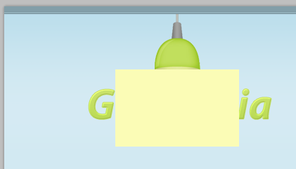







Hot AI Tools

Undresser.AI Undress
AI-powered app for creating realistic nude photos

AI Clothes Remover
Online AI tool for removing clothes from photos.

Undress AI Tool
Undress images for free

Clothoff.io
AI clothes remover

AI Hentai Generator
Generate AI Hentai for free.

Hot Article

Hot Tools

Notepad++7.3.1
Easy-to-use and free code editor

SublimeText3 Chinese version
Chinese version, very easy to use

Zend Studio 13.0.1
Powerful PHP integrated development environment

Dreamweaver CS6
Visual web development tools

SublimeText3 Mac version
God-level code editing software (SublimeText3)

Hot Topics
 How do I use Photoshop for creating social media graphics?
Mar 18, 2025 pm 01:41 PM
The article details using Photoshop for social media graphics, covering setup, design tools, and optimization techniques. It emphasizes efficiency and quality in graphic creation.
 How do I prepare images for web use in Photoshop (file size, resolution, color space)?
Mar 13, 2025 pm 07:28 PM
Article discusses preparing images for web use in Photoshop, focusing on optimizing file size, resolution, and color space. Main issue is balancing image quality with quick loading times.
 How do I use Photoshop's Content-Aware Fill and Content-Aware Move tools effectively?
Mar 13, 2025 pm 07:35 PM
Article discusses using Photoshop's Content-Aware Fill and Move tools effectively, offering tips on selecting source areas, avoiding mistakes, and adjusting settings for optimal results.
 How do I use Photoshop's video editing capabilities?
Mar 18, 2025 pm 01:37 PM
The article explains how to use Photoshop for video editing, detailing steps to import, edit, and export videos, and highlighting key features like the Timeline panel, video layers, and effects.
 How do I calibrate my monitor for accurate color in Photoshop?
Mar 13, 2025 pm 07:31 PM
Article discusses calibrating monitors for accurate color in Photoshop, tools for calibration, effects of improper calibration, and recalibration frequency. Main issue is ensuring color accuracy.
 How do I prepare images for web using Photoshop (optimize file size, resolution)?
Mar 18, 2025 pm 01:35 PM
Article discusses optimizing images for web using Photoshop, focusing on file size and resolution. Main issue is balancing quality and load times.
 How do I create animated GIFs in Photoshop?
Mar 18, 2025 pm 01:38 PM
Article discusses creating and optimizing animated GIFs in Photoshop, including adding frames to existing GIFs. Main focus is on balancing quality and file size.
 How do I prepare images for print using Photoshop (resolution, color profiles)?
Mar 18, 2025 pm 01:36 PM
The article guides on preparing images for print in Photoshop, focusing on resolution, color profiles, and sharpness. It argues that 300 PPI and CMYK profiles are essential for quality prints.


