 Web Front-end
 PS Tutorial
 PS Web Design Tutorial XVI - Create a Modern Laboratory Style Web Design in PS
PS Web Design Tutorial XVI - Create a Modern Laboratory Style Web Design in PS
As a coder, my art foundation is weak. We can refer to some mature web PS tutorials to improve our design capabilities. To paraphrase a sentence, "If you are familiar with three hundred Tang poems, you can recite them even if you don't know how to compose them."
The tutorials in this series come from online PS tutorials, all from abroad, and all in English. I try to translate these excellent tutorials. Due to limited translation capabilities, the details of the translation still need to be worked out. I hope that netizens will give you some advice.
Convention:
1. The software used in this article is Photoshop CS5 version
2. The screenshots of the original tutorial are in English. I took them again based on the re-production. Chinese version of Figure
3. Some operations in the original text do not give parameters. I measured some parameters through repeated testing, which are shown in red text. For some wrong parameters, the correct parameters are displayed directly in red text
For example: (90, 22, 231, 77) , indicating that the coordinates of the upper left corner of the rectangle are (90, 22) , width 231, height 77
For example: (90,22), indicating that the coordinates of the upper left corner of the rectangle are (90,22), the other two parameters of the rectangle have been specified in the tutorial
4. My own experience will be attached at the end of the tutorial. Some are optimizations of some steps in the tutorial, etc.
In this web design tutorial I will show you how to create a web layout with a sleek and modern look using Adobe Photoshop. We will go from finding sources of inspiration to setting up the document in Photoshop and creating design elements that fit with the theme of the web layout. I will also give you some practical examples of how using smart objects in a web design project can improve your workflow and save you some time.
In this web design tutorial, I'll show you how to use Adobe Photoshop to create a web layout with a sleek, modern look. We will find some resources in PS to design elements for the theme of the web layout and find some design inspiration. I'll also give you some practical examples of how using smart objects in a web design project can improve your workflow and save you time.
Step 1: Set Up the 960 Grid System
Step 1: Set Up the 960 Grid System
In this tutorial we will use the 960 Grid System to organize and arrange the elements of our web layout. Before we begin, download the grid system on your computer.
In this tutorial , we use the 960 layout system to organize and place page layout elements. Before we begin, download this layout system to your computer.
Unzip the archive file you downloaded, go to the "templates" folder and then go to the "photoshop" folder. You will find three .PSD files. Each of these files contains a grid with 12, 16 and 24 columns.
Extract the downloaded file to the photoshop folder in the templates folder. You can find 3 PSD files. These files include 12-column, 16-column, and 24-column grids
The .PSD files have some guides already set up, which will be very useful. To activate the guides, go to View > Show > Guides, or use the shortcut Ctrl/Cmd + ;.
This PSD file has some guides set up, which are very useful. To activate these guides, click: View > Display > Guides, or use the shortcut Ctrl/Cmd+;.
During this tutorial you will need to create shapes with specific dimensions. To see the exact size of a shape or selection while you are creating it, open the Info Panel by going to Window > ; Info. The width and the height of your shapes and selections will be displayed in this panel.
In this tutorial, you need to create some shapes of specific sizes. To see the exact dimensions of the shape or selection you created, click: Window > Info. The width and height of your shape or selection are displayed in this panel.
Tip: If you need a more thorough guide for using 960 GS, I suggest reading the guide called The 960 Grid System Made Easy. For reference on the 960 layout system, I recommend you read a reference: The 960 Grid System Made Easy.
#Step 2: Setting Up the Photoshop Grid
Open the Preferences window in Photoshop (Ctrl/Cmd + K), click on Guides, Grid & Slices and then set Gridline Every to 10px and Subpisions to 5px. To activate the grid, go to View > Show > ; Grid, or use the shortcut Ctrl/Cmd + '.
In Photoshop (Ctrl/Cmd+K), open the Preferences window, click Guides, Grids, and Slices, then Set the grid line spacing to 10px and subdivide it into 5px. To activate the grid, click: View > Show > Grid, or use the shortcut Ctrl/Cmd +'
You can activate the grid every time you create a shape such as a rectangle or an ellipse.
You can activate the grid every time you create a shape such as a rectangle or an ellipse.
Step 3: Setting Up the Document
Step 3: Set Up the Document
For this web layout we will use the 12-column grid. Open the "960_grid_12_col.psd" file in Photoshop. Then go to Image > Canvas Size and set the width to 1200px and the height to 1480px.
In this web page layout, we will use a 12-column grid. Open 960_grid_12_col.psd in PS. Then click: Image > Canvas Size. And set the width to 1200px and the height to 1480px
Since the 960 layout system is not used in this translation tutorial, this step is changed to create a new document, size: 1200px*1480px

Step 4: Create the Background
Step 4: Create the background
As you can see in the Layers Panel, the Background layer has a lock icon next to it. This means that we can't modify the layer unless we unlock it.
When you When you see the layers panel, there is a lock icon on the right side of the background layer. This means we can't edit until we unlock it.
To unlock the layer, click on the black lock icon from the top area of the Layers Panel (underneath the blending modes). Now we can edit the layer, but the position is still locked (the black lock icon changed into a white lock icon) which means that we can't move the layer. We don't need to change the position of this layer, so we'll leave it locked. However, if you do need a layer to be completely unlocked, click on the Lock Position icon (underneath the blending modes, next to the black lock icon). The black lock icon below the blending mode). Now we can edit the layer, but the position is still locked (the black lock icon changes to a white lock icon), which means we cannot move the layer. We don't need to change the layer's position, so we keep it locked. Of course, if you need a fully unlocked layer, click the position lock icon (below the blending mode, next to the black lock icon)
above Both steps are instructions when opening the 960 layout system. When creating a new document, the background layer is completely locked. Only by double-clicking the background layer can it be unlocked
Double-click on the thumbnail of the Background layer and change its color to #dfe4e6. Right-click on this layer and select Convert to Smart Object.
Double-click on the thumbnail of the Background layer and change its color to #dfe4e6. For: #dfe4e6. Right-click on the layer and select Convert to Smart Object
Since this is a new document, first double-click the background layer to unlock the background layer, and then use the paint bucket tool to change the background layer Color
Note: We converted the layer into a Smart Object because we will apply a noise filter to it and we will be able to edit the filter's settings at any time, just like the layer styles. If we apply a filter to a regular layer, we can't edit it anymore.
Note: We convert the layer to a smart object because we want to add a noise filter to it , we can edit filter settings at any time, just like layer styles. If we just add a filter on a normal layer, we don't need to do the conversion
Now go to Filter > Noise > Add Noise and use the settings from the following image.
Now click:
Filter> Noise> Add Noise. Set up as shown below


Step 5: Create diagonal stripe pattern
Create a new document (Ctrl/Cmd + N) with the dimensions 5px by 5px. Use the Zoom Tool (Z) to zoom in as much as you can.
Create a new document (Ctrl/Cmd+N), size: 5px*5px. Use the zoom tool to move it to a size that feels right to you
Then create a new layer (Ctrl/Cmd + Shift + N) and select the Pencil Tool. Set the size to 1px and use the Pencil Tool to create a diagonal line from the lower left corner of the document to the upper right corner. Hide the Background layer by clicking on its eye icon from the Layers Panel. Then go to Edit > Define Pattern, give your pattern a name and click OK. Now you can close this document.
then create new layer (Ctrl/Cmd + Shift + N)) and select the Pencil Tool, set the size to 1px, and use the Pencil Tool to create a diagonal line from the lower left corner to the upper right corner of the document Wire. Click the eye icon in front of the background layer on the layers panel to hide the background layer. Then click: Edit > Define Pattern, give your pattern a name, and click OK. Now you can close this document.

Step 6: Create a Bar at the Top
Step 6: Create a Bar at the Top The horizontal bars
Select the Rectangle Tool (U), activate the grid (Ctrl/Cmd + ') and create a rectangle with the height 20px at the top of the document using the color #b0b7ba.
Select the Rectangle Tool, activate the grid (Ctrl/Cmd+`), and create a 20px high rectangle (0, 0, 1200, 20) , color: #b0b7ba
Name this layer "top bar", double-click on it to open the Later Style window and use the settings from the following image. The color that I used for Bevel and Emboss Shadow Mode is #bec3c6 and the one I used for Stroke is #9da5a9.
Name this layer top bar, double-click to open the layer style window, and follow The settings shown below. Bevel and emboss color: #bec3c6, Stroke color: #9da5a9


##Step 7: Creating a Modern Laboratory Desk Design Element
Step 7: Create a modern experimental bench design element
Create a new group (Layer > New > Group) and name it "header". Activate the guides (Ctrl/Cmd + ;) and the grid (Ctrl/Cmd + '). Then select the Rectangle Tool (U) and create a rectangle with the dimensions 940px by 40px using the color # 535d62. Name this layer "top surface".Create a new group header (Layer> New> Group), activate guides (Ctrl/Cmd+;) and grid. Then select the Rectangle Tool to create a rectangle (130, 79) , size: 940px*40px, color: #535d62. Name this layer top surface
Use the Direct Selection Tool (A) to select the upper left corner of this rectangle. Then hold down the Shift key and hit the Right Arrow key on your keyboard 6 times to move this anchor point 60px to the right. Then select the upper right corner of this rectangle and move it 60px to the left.
UseDirect Selection ToolSelect the upper left corner of the rectangle. Then hold down the Shift key and press the right arrow key on your keyboard 6 times to move the control point 60px to the right. Then select the control point in the upper right corner of the rectangle and move it 60px to the left
##Double-click on the "top surface" layer to open the Layer Style window and use the settings from the following image . For Stroke I used the color #282f32.Double-click the top surface layer to open the layer style window, and set the style as shown below. Stroke color: #282f32


##Create a new rectangle underneath the top surface of the desk with the dimensions 940×10px and the color #414a4f. Name this layer "middle surface", right-click on it and use the settings from the following image for Stroke. The color that I used is #252b2e.
Create a rectangle below the top surface of the table, dimensions: 940px*10px, color: #414a4f. Name this layer middle surface, right-click on it and set the stroke as shown below. Stroke color: #252b2e


Select the Rectangle Tool (U) and create another rectangle underneath the middle surface of the desk with the dimensions 920×40px and the color #b0b7ba. We will use this area for the navigation bar. Create another rectangle
(140, 130)below the middle surface, size: 920px*40px, color: #b0b7ba. This part will be used for the navigation bar.
Double-click on this layer to open the Layer Style window and use the settings from the following image. For Stroke I used the color #818b8f. Name this layer "bottom surface" and put it underneath the "top surface" layer in the Layers Panel.Double-click the layer to open the layer style window and set it as shown below. Stroke color: #818b8f. Name this layer bottom surface, and then place this layer below the top surface layer in the Layers Panel.

 ##Now you can deactivate the grid and the guides.
Now you can hide guides and grids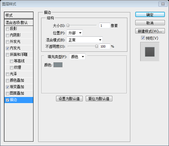

Step 8: Adding Noise to the Lab Desk
Step 8: Adding Noise to the Lab Desk Noise
Hold down the Ctrl/Cmd key and select the three surface layers that you created. Then right-click on one of them and select Convert to Smart Object from the menu that appears. Name this layer "desk", go to Filter > Noise > Add Noise and use the settings from the following image.
Hold down the Ctrl/Cmd key before selection Create 3 surface layers. Then right-click and select Convert to Smart Object in the menu that appears. Name this layer desktop, then click: Filter>Noise>Add noise, and set it as shown below


##Note: When you convert a layer into a smart object, you can no longer edit it directly (e.g., you can't use the Brush Tool to paint on the layer). If you need to edit a smart object, double-click on its thumbnail. A new document will be opened with the source of the smart object (the layers that you converted). After you edit the source document , save it, close that document and the smart object will be updated in your current document.
Note:When you convert a layer to a smart object, you can no longer edit it directly (Example: you can't paint on a layer with the Brush Tool). If you need to edit a smart object, double-click on its thumbnail. Your Smart Object (the layer you transformed) is opened in a new document as a source file. After you edit the source document, save it, close the document, and the smart objects in your current document will be updated.
Step 9: Creating the "Design Lab" Logo
Step 9: Creating the "Design Lab" Logo
Now we will create a logo related to the theme of the web layout. The name of our layout will be "Design Lab", and we will replace the letter "A" with a chemistry bottle. First, create a new group (Layer > New > Group) and name it "logo". Then select the Type Tool (T) and write "Design Lab" using the color #85a3b3. The font that I used is Futura Heavy .Now we will create a logo related to the web layout theme. The name of our layout will be Design Lab and we will replace the letter A with a chemical bottle. First, create a new group logo (Layer > New > Group). Then select Text Tool, write Design Lab, color: #85a3b3. Font: Futura Heavy.
Double-click on this text layer to open the Layer Style window and use the settings from the following image. The color I used for Drop Shadow is #6e8a99.Double-click the text layer to open the layer style window and set it as shown below. Color of projection: #6e8a99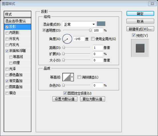


Create a new group (Layer > New > Group) and name it "chemistry bottle". Select the Pen Tool (P) and create a shape over the letter "A" of the text layer. Take a look at the following image for reference. The color is not important at the moment. I made my shape red so you can see it better. Name this layer "bottom area".
Create a new group chemistry bottle (Layer> New> Group). Select the Pen Tool and create a shape above the A in the text layer, as shown in the image below. Color is not very important at this point. I set it to red so you look a little more eye-catching. Name this layer bottom area
You can also use the rectangle tool to draw a rectangle, and then use the perspective in Free Transform to achieve the same effect.

Click and hold on the Pen Tool in the Tools Panel to reveal additional tools, and then select the Add Anchor Point Tool. Then click on the vector mask of the "bottom area" layer to make it active (if the vector mask is active, you can see the path of your shape, and the thumbnail has a white stroke).
click And hold down the Pen Tool in the tool panel to display the additional tools, then select the Add Anchor Point Tool. Then click on the vector mask of the bottom area layer to activate it. You can see the path of the shape and the thumbnail has a white stroke.
Zoom in, and then use the Add Anchor Point Tool to add an anchor point on the bottom path of the chemistry bottle, in the middle. Then use the Direct Selection Tool (A) to select that anchor point and drag it 2px down. This will make the bottom line of the chemistry bottle more rounded. Take a look at the following image for reference.
Enlarge and use the Add Anchor Point tool Add an anchor point in the middle of the bottom path of the chemical bottle. Then use Direct Selection Tool to select the anchor point just added and drag it down 2px. This will make the lines on the bottom of the chemical bottle look a little rounder, like in the picture below.

Select the Rectangle Tool (U) and create a rectangle like you see in the following image. This will be the neck of the chemistry bottle. Name this layer "middle area".
Use the Rectangle Tool to create a rectangle as shown below. This will be the chemical bottleneck. Name this layer middle area

Select the Ellipse Tool (U) and create an ellipse at the top of the chemistry bottle's neck using the color #85a3b3. Name this layer "top area", double-click on it and use the settings from the following image. For Stroke I used the color #708c9b. Create an ellipse on the top of the chemical bottle neck, color: #85a3b3. Name this layer top area, double-click and set the layer style as shown below. Stroke color: #708c9b


Change the color of the "bottom area" and "middle area" layers to #85a3b3. Then select the Pen Tool (P) and create a shape like you see in the following image. Use the color #b8d1df. Name this layer "water", double-click on it to open the Layer Style window and use the settings from the following image.
Change bottom area and The middle area layer color is: #85a3b3. Then select the Pen Tool to create a shape as shown below, color: #b8d1df. Name this layer water, double-click to open the layer style and set the style as shown below


Pen Tool again to create the following shape. This is the upper surface of the water. Name it water top, double-click to open the layer style, and set it as shown below. The stroke color: #9dbccd


##Hold down the Ctrl/Cmd key and select the three layers that form the chemistry bottle ("bottom area", "middle area" and "top area "). Right-click on one of these layers, select
Duplicate Layersfrom the menu that appears and click OK. With the duplicated layers selected, right-click on one of them and select Convert to Smart Object. Hold down the Ctrl/Cmd key to select the three layers of the chemical bottle (bottom area, middle area, top area). Right-click on it, select
Copy Layerin the menu that appears, and press OK. Keep these layers selected, right-click on one of them and select Convert to Smart Object.
Name the new layer "gradient" and move it above the "water top" layer. Double-click on the "gradient" layer to open the Layer Style window and use the settings from the following image.
Name the new layer gradient and move it above the water top layer. Double-click the gradient layer to open the layer style window and set it as shown below.


Note: By settings the Fill to 0%, the layer becomes completely invisible, but we are still able to add layer styles. If we set the Opacity of the layer to 0%, both the layer and the layer effects will be invisible. That's why we used the Fill property instead of Opacity.
Note:When the fill is set to 0%, the layer becomes completely invisible. But we can still add layer styles. If we set the layer's opacity to 0, both the layer and the layer effects will be invisible. This is why we use the fill property instead of opacity

Use the Pen Tool (P) to create a white shape on the left side of the chemistry bottle. Take a look at the following image for reference. Name this layer "highlight". Just like the picture below. Name this layer highlight
Duplicate this layer. Then go to Edit > Transform > Flip Horizontal. Change the color of this layer to black and move it in the right side of the chemistry bottle using the Move Tool (V). Name this layer "shadow".
Duplicate this layer. Then click:
Edit > Transform > Flip Horizontal. Change the color to black and use the move tool to move it to the right side of the chemical bottle. Name the layer shadow
 Set the blend mode of the "highlight" and "shadow" layers to Overlay 20%.
Set the blending mode of the highlight and shadow layers to Overlay and the opacity to 20%
 Now what's left to do is delete the "A " letter from the text layer. Before that, I selected the "LAB" word and changed its font from Futura Heavy to Futura Bold.
The next thing to do is to delete the letter A from the text layer. Before doing that, select the text LAB, change its font from Futura Heavy to Futura Bold
Using the Type Tool (T), select the "A" letter and delete it. To push the "B" letter to the right, you can use the space bar. Then select the Move Tool (V) and reposition the chemistry bottle icon between the letters "L" and "B". Now the logo is finished.
Use
Text ToolSelect the letter A and delete it. To push the letter B to the right, you press the space bar. Use the Move Tool to position the chemical bottle between the letters L and B. Now your logo is complete

Step 10: Add social media icons
Download these icons from Noupe and open in Photoshop the social icons that you want to use. I used the rss, twitter, facebook and email icons. Make sure that you use the 48px by 48px images.
Download these social media icons from Noupe and open the ones you need in Photoshop. I used rss, teitter, facebook and email icons, please make sure you are using 48px*48px images
To move the icons to your web layout document, select the Move Tool (V) and simply drag them over the document. Name each of these layers and group them (select the layers and hit Ctrl/Cmd + G). Name the group "social media icons".
Move these icons Go to your web layout document, select the
Move Toolsand drag them onto your document. Combine them into a group (select the layers and press Ctrl/Cmd+G). Name the group social media icons
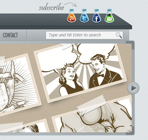
Using the Move Tool (V), place the icons in the right hand side of the layout, at a distance of 10px from each other. Take a look at the following image for reference.
Use Move Tool Place these icons on the right hand side of the layout, with a distance of 10px between each icon. Just like the picture below

These icons look a bit dark for our web layout. To make them brighter, I used some Brightness/Contrast adjustment layers . Go to Layer > New Adjustment Layer > Brightness/Contrast and set the Brightness to 20.
These icons look a bit dark in the web layout. To make them a little brighter, I'm going to use some Brightness/Contrast adjustment layers. Click: Layer> New Adjustment Layer> Brightness/Contrast, set the brightness to 20

Create Clipping Mask from the menu that appears. This way, the adjustment layer will only be applied on the layer underneath it. Repeat this process for the other icons as well.
Move this adjustment layer above the first icon layer, and selectCreate Clipping Mask from the menu that appears when right-clicking on the adjustment layer. . This means that the adjustment layer only affects the layers below it. Repeat the process for each icon

Text tool and write the text subscribe, using a script font. I used Handwriting Dakota (replaced by Pristina in this translation tutorial) , color: #696e70. Then create a new layer (Ctrl/Cmd+Shift+N), select the Brush Tool, set the Weight to 1px, the Hardness to 100%, and make an arrow pointing to the social media icons. Use the same color as the previous text. Name this layer arrow

Step 11: Adding the Navigation Bar Items
Step 11: Add navigation bar menu items
I already mentioned that we would use the bottom area of the desk as a navigation bar. Now we need to add the navigation items and some separators.I already mentioned that we will use the bottom area of the desktop as a navigation bar. Now we need to add navigation menu items and some separators. Create a new group (Layer > New > Group) and name it "navigation". Then select the Type Tool (T) and write the name for your navigation menu items. I used the font Futura Light Condensed and the color #313a3e.Create a new group navigation (Layer> New> Group). Then select Text Tool to write your navigation menu items. Font I used: Futura Light Condensed and color: #313a3e

##Create a new group (Layer > New > Group) and name it "separators". Zoom in so you can see the navigation bar better.
Create a new group of separators (
Layer> New> Group) and enlarge the navigation bar to the appropriate size
Select the Line Tool (U), set the Weight to 1px and the color #818b8f. Then hold down the Shift key and draw a straight vertical line from the top of the navigation bar to the bottom. Name this layer "1px line".
Select the Straight Line Tool, set the thickness to 1px, and color: #818b8f. Then hold down the Shift key and draw a vertical straight line from the top to the bottom of the navigation bar. Name this layer 1px line
Hit Ctrl/Cmd + J to duplicate this layer. Select the Move Tool (V) and hit the Right Arrow key on your keyboard once to move this layer 1px to the right. Change the color of this new line to #c0c5c8.
Press Ctrl/Cmd+J to duplicate the layer. Select the Move Tool and press the right arrow key on your keyboard once to move the layer 1px to the right. Change the color of the new layer: #c0c5c8

Convert to Smart Object from the menu. Name this layer "separator". Duplicate this layer as many times as you need and use the Move Tool (V) to put a separator between each of the navigation items.
Hold down the Ctrl/Cmd key to select the layers of the two straight lines. SelectConvert to Smart Object from the menu that appears when right-clicking on one of them. Name the layer separator, copy the layer as many times as you need, and then use the Move tool to move the separators between every two menu items

Tip: When you need to duplicate a layer many times, you can select the Move Tool (V), hold down the Alt/Option key , click on the image and drag the cursor to create a copy of that layer. In our case, you can hold down Alt/Option + Shift keys and when you click and drag a copy of the current separator to the right you'll see that it's easier to move the new layer sideways and not go up or down.
Tip:When you need to copy a layer multiple times, you can choose theMove tool , hold down the Alt/Option key, click on the image and drag the cursor to create a copy of the layer. In our step, you can hold Alt/Option+Shift while you click and drag a copy of the current separator to the right so that the new layer can be moved sideways more easily, rather than up or down. .
Note: Another advantage of smart objects is that if you edit one smart object, all the copies of that smart object will be updated as well. For example, if you have the separators as shape layers and you want to change their colors, you would have to edit each layer inpidually. By creating one separator, converting it into a smart object and duplicating that smart object as many times as we needed, we can now double-click on the thumbnail of a separator layer, edit the source of the smart object (which contains the two line layers that we converted), save the document and then all the other separator layers will be updated.
Note:Another advantage of smart objects is that if you edit a smart object, all copies of the smart object will be updated. For example, if you have several separator shape layers and you want to change their colors, you will have to edit each layer individually. As often as possible when you create a separator, convert it to a smart object and then copy that smart object as many times as we need, we can now double-click on the separator's thumbnail and edit the source smart object (which contains the two already converted line layer), save the document, and all other separators will be updated.
Step 12: Creating a Search Bar
Step 12: Creating a search bar
Create a new group (Layer > New > Group) and name it "search". Select the Rectangle Tool (U) and create a rectangle with the dimensions 260×26px and the color #f4f4f4. Add a 1px Stroke to this rectangle using the color #7f898d.Create a new group search (Layer> New> Group). Select the Rectangle Tool to create a rectangle (780, 138) , size: 260px*26px, color: #f4f4f4. Add a 1px stroke to the rectangle, stroke color: #7f8989d
Download this set of icons from Smashing Magazine and open the "search.png" image in Photoshop. Move the icon into your first document using the Move Tool (V). Put the icon inside the search bar and use Free Transform ( Ctrl/Cmd + T) to change the size of the icon.
Download the set of icons from Smashing Magazine and open search.png in PS. Use the Move Tool to move the icon to your first document. Place your icon in the search bar and use Free Transform Tool (Ctrl/Cmd + T) to change the size of the icon
Select the Type Tool (T) and write "Type and hit Enter to search" inside your search bar. I used the font Helvetica Oblique and the color #848e92. Type and hit Enter to search. The font I used is Helvetica Oblique
(replaced with Tahoma), color: #848e92
##Now we're done with the header. Let's move on to creating an image slider.
Step 13: Creating an Image Slider Area
Step 13: Creating an Image Slider
To keep the laboratory look of our layout, we will create an image slider that looks like a white board. Create a new group (Layer > New > Group) and name it "image slider".
To make our layout look like a lab, we will create an image slider that looks like a whiteboard. Create a new group image slider (Layer > New > Group
).Activate the guides and the grid. Then select the Rounded Rectangle Tool (U), set the Radius to 6px and create a rounded rectangle with the dimension 960×320px. Name this layer " image_slider_bg", right-click on it and select Convert to Smart Object
from the menu.Activate guides and grid. Then select theRounded Rectangle Tool , set the radius to 6px, and create a rounded rectangle (120, 169)
, size: 960px*320px,color: #b0b7ba, name this layer image_slider_bg, right-click on the menu that appears and select Convert to Smart Object Double-click on this layer to open the Layer Style window and use the settings from the following image. The color that I used for Stroke is #818b8f.
Double-click the layer to open the layer style window, and set the style as shown below. The stroke color is #818b8f.

 Then click:
, and set it as shown below

Activate the grid (Ctrl/Cmd + '), select the Rectangle Tool (U), hold down the Shift key and create a square with the dimensions 30×30px and the color #848d91. Put this square in the upper left corner of the rounded rectangle you created. Name this layer "top left corner".
Activate the grid (Ctrl/Cmd + `), select the Rectangle tool, hold down the Shift key to create a 30px*30px square (120, 169) , color: #848d91. Move this square to the upper left corner of the rounded rectangle you just created and name this layer top left corner

Duplicate this layer three times and put one square in each corner of the big rounded rectangle. Then hold down the Ctrl/Cmd key, select all the square layers, right-click on one of them and select Create Clipping Mask. Now the squares will be visible only on the surface of the big rounded rectangle. Set the Opacity of these layers to 80%.
Duplicate this layer 3 times, then move these squares to each corner of the big rounded rectangle. . Hold down the Ctrl/Cmd key, select these square layers, right-click on one of the layers, and select Create Clipping Mask. Now the squares are only exposed on the surface of the larger rounded rectangle. Set the opacity of these layers to 80%
The coordinates of the upper right corner (1050, 169), the coordinates of the lower left corner (120, 459), and the coordinates of the lower right corner (1050, 459)

Activate the grid (Ctrl/Cmd + '), select the Rounded Rectangle Tool (U), set the Radius to 4px and create a rounded rectangle with the dimensions 940×300px. Take a look at the following image for reference. Name this layer "image_holder".
Activate the grid (Ctrl/Cmd + `) and selectrounded corners Rectangle tool , set the radius to 4px, create a rounded rectangle, size: 940px*300px. Just like the picture below. Name this layer image_holder

Now you can add an image above this layer, right-click on it and select Create Clipping Mask to make it visible only over the "image_holder" layer.
Now you can add an image on this layer, right-click on it and select Create Clipping Mask to make Only the part of the image in the image_holder layer is displayed

Step 14: Creating Navigation Arrows for the Image Slider
Step 14: Add navigation arrows to the image slider
Create a new group (Layer > New > Group) and name it " right arrow". Select the Ellipse Tool (U), activate the grid, hold down the Shift key and create a circle with the dimensions 40×40px. Double-click on this layer to open the Layer Style window and use the settings from the Following image. For Stroke I used the color #818b8f.
Create a new group right arrow (Layer> New> Group). Select the Ellipse Tool , activate the grid, hold down the Shift key to create a circle (1075, 329) , size: 40px*40px, color: #c0c6c8. Double-click the layer to open the layer style window and add styles as shown below. Stroke color: #818b8f


Select the Pen Tool (P) and create an arrow shape like you see in the image below. Use the color #656b6e. Name this layer "arrow", double-click on it to open the Layer Style window and use the settings from the following image for Gradient Overlay. ##Pen Tool
Create an arrow shape as shown below. Color: #656b6e. Name this layer arrow, double-click to open the layer style window and set the gradient overlay as shown below

Convert to Smart Object
. Press Ctrl/Cmd + J to duplicate the layer. Then click:Edit > Transform > Flip Horizontal. Name this layer left arrow, select the Move tool and move it to the left of the image slider (148, 306)

Step 15: Creating the Main Content Area
Step 15: Creating the main content area
Create a new group (Layer > New > Group) and name it "content". Create another group inside the first one and name it "services".Create a new group content (Layer > New > Group), create another new group services Activate the grid (Ctrl/Cmd + ') and the guides (Ctrl/Cmd + ;). Select the Rounded Rectangle Tool (U) and set the Weight to 4px. Then create a square with the dimensions 300×300px and the color #f9f9f9. Leave a distance of 30px between the image slider and this square.Activate Grid (Ctrl/Cmd + `) and guides (Ctrl/Cmd + ;). Select the
Rounded Rectangle Tool
and set the radius to 4px. Then create a square(130,520), size: 300px*300px, color: #f9f9f9. Keep the distance between the image slider and this square 30px
Name this layer "services_bg", double-click on it to open the Layer Style window and add a 1px Stroke using the color #a5adb1.Name this layer services_bg, double-click to open the layer style window, add a 1px stroke, and the stroke color: #a5adb1 

In order to save some time later, we can save the layer style that we applied to the "services_bg" layer and use it again whenever we need it.
In order to save time later, we can save to The layer style added by services_bg can be called directly when needed in the future.
Open the Styles Panel (Window > Styles). Make sure that the "services_bg" layer is selected and click on the Create new style button from the bottom of the Styles Panel. A new window will appear. Name this style "content area 1px stroke". Leave the Include Layer Effects option checked and click OK. Now, when we need to use this layer style, you can click it from the Styles Panel to apply it to any layer you want.
Open the Styles panel (Window> Styles). Make sure the services_bg layer is selected, then click the Create New Style button at the bottom of the Styles panel. A new window appears. Name this style content area 1px stroke. Check Include layer effects and click OK. Now, when we need this layer style, you can click this style in the style panel to add it to the layer you need
Select the Rectangle Tool (U) and create a rectangle with the dimensions 300×60px and the color #c2c9cc. Name this layer "top bar" and put it at the top of the white rounded square. Double-click on this layer to open the Layer Style window and use the settings from the following image . For Stroke I used the color #a5adb1 and for Pattern Overlay I used the diagonal stripe pattern that we created in this tutorial. 520)
, size: 300px*60px, color: #c2c9cc. Name this layer top bar and place it on top of the white rounded rectangle. Double-click to open the layer style window and set the style as shown below. Stroke color: #a5adb1, pattern overlay uses the diagonal pattern created in this tutorial


 Right-click on the top bar layer and select Create Clipping Mask, only the part in the white square will be displayed
##Again, save the layer style that you applied to the "top bar" layer so you can use it later when we'll need it.
Again, save the layer style you added to the top bar layer so you can use it directly later Used
Move tool
to move your images onto your page layout. Name this layer services icon. Activate the grid and place the icons as shown below Select the Type Tool (T) and write the word "Services" next to the icon. I used the color #4f5254 and the font Futura Extra Bold Condensed. 用Text ToolWrite the text Services next to the icon. Color: #4f5254, Font: Futura Extra Bold Condensed Write the words "what we can do" underneath the "Services" headline using the color #6a6e70 and a script font (such as Handwriting Dakota). Use the grid to help you align these text layers. Replace Copy Group Text Tool
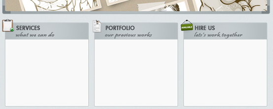
##Logo Design » (color_wheel.png) Web & Mobile Apps » (applications.png) to write the service list in the white area, color: #6a6e70. The following is my service list, and the file name of the icon corresponding to each service Search Engine Optimization » (speed_kmh.png) Logo Design » (color_wheel.png) Web & Mobile Apps » (applications.png) Go to the Portfolio group and create a new group images Activate the grid (Ctrl/Cmd + '). Then select the Rectangle Tool (U ), hold down the Shift key and create a square with the dimensions 80×80px using the color #e6ebec. Name this layer "square 1", double-click on it to open the Layer Style window and use the settings from the following image . The color that I used for Stroke is #d2d2d2. Duplicate this square layer 5 times (Ctrl/Cmd + J) and arrange them as you see in the image below. Activate the grid (Ctrl/Cmd + `). Then select the Rectangle Tool , hold down the Shift key to create a rectangle (470, 600) , size: 80px*80px, color: #e6ebec. Name this layer square 1, double-click to open the layer style window, and set the style as shown below. Stroke color: #d2d2d2. Duplicate this layer 5 times (Ctrl/Cmd + J) and align it as shown below The positions of the remaining five squares are (560,600), (650,600), (470,700), (560,700), (650,700) Now you can add some images over each of the blue squares and use the Create Clipping Mask command to make the images visible only over the squares. Now you can add an image to each square, using the Create Clipping Mask command so that only the image inside the square is displayed Go to the "contact" group, create a new group inside it and name it "contact form". Go to the contact group, create a new group inside it contact form Use the Rectangle Tool (U) to create three rectangles using the color #e6ebed, like you see in the image below. Add a 1px Stroke to these rectangles using the color #c5ccd0. Use Rectangle Tool to create 3 rectangles, color: #e6ebed, as shown below. Add a 1px stroke to these rectangles, stroke color: #c5ccd0 The three rectangles are (790, 600, 210, 30), (790, 640, 210, 30), ( 790, 680, 260, 80) Select the Type Tool (T) and write labels (e.g., Name, E-mail and Message) inside the input fields. I used the font Helvetica and the color #6a6e70. Use Text tool to add some text labels inside the rectangle (for example: Name, Email, Message) , Font: Helvetica (replace with Tahoma) , Color: #6a6e70 Step 16: Create a Patterned Button for the Web Form Step 16: Create a pattern button for the web form Now we'll create a button for the contact form. Create a new group (Layer > New > Group) and name it "button". Select the Rounded Rectangle Tool (U), set the Radius to 2px and create a rounded rectangle with the dimensions 80×28px and the color #85a3b3. For Stroke I used the color #6d8794. Now we are going to create a button for the contact form. Create a new group button (Layer > New > Group). Select the Rounded Rectangle Tool, set the radius to 2px, and create a rounded rectangle (969,771), size: 80px*28px, color: #85a3b3. Add some styles as shown below, stroke color: #6d8794 Text toolWrite text inside the buttonSend », Color: #ecf1f3. Font: Futura Heavy. Set the style as shown below. Now go to the Styles panel to save this layer style and name it text drop shadow Step 17: Creating the Blog Area Step 17: Create a blog area Layer> New>Group). Activate the grid and guides. Select the Rounded Rectangle Tool, set the radius to 4px, and create a rounded rectangle(130,850), size: 620px*530px, color: #f9f9f9 Rectangle Tool Create a rectangle (130, 850) , size: 940px*60px, color: #c2c9cc. Name this layer top bar and place it on top of the white rounded rectangle. Right-click on this layer and select Create Clipping Mask. Then click top bar style in the style panel Add an icon in the upper left corner of the blog area. Use the grid to help you align it. I used the icon "moleskine_black.png". Add an icon in the upper left corner of the blog area. Use the grid to help you align it. The icon I used is moleskine_black.png Select the Type Tool (T) and write the word Blog as a headline and underneath it write "tutorials, articles, resources". Use the same fonts and colors that you used for the services, portfolio and contact areas. Use the same fonts and colors as before in the services, portfolio and contact areas Step 18: Create content for the blog area Create a new group (Layer > New > Group) and name it " blog". Activate the grid, select the Rectangle Tool (U) and create a square with the dimensions 180×180px. Leave a distance of 20px between the top and left edges of the white area and this square. Name this layer "image_holder" , double-click on it to open the Layer Style window, and use the settings from the following image. For Inner Glow I used the color #ebebeb and for Stroke I used #a5a5a5. Create new group blog( ). Activate the grid, select the , and create a square with dimensions: 180px*180px. Keep the distance between the top edge of the square and the left margin white rectangle at 20px. Name this layer image_holder, double-click to open the layer style window, and set the style as shown below. Inner glow color: #ebebeb, stroke color: #a5a5a5 ##Open an image that you like in Photoshop and move it over the square you created. Name this layer "image", right-click on it and choose Create Clipping Mask from the menu. Create Clipping Mask ##Use the Type Tool (T ) to add some content next to the image you added at the previous step. For the headline I used the font Futura Bold Condensed (#648393) and for the block of text I used Helvetica (#6a6e70). to add some text to the right side of the previous rectangle. The font used for the title text is Futura Bold Condensed (#648393), and the font used for the text block is Helvetica (#6a6e70). Select the Rounded Rectangle Tool (U), set the Radius to 2px and create a rounded rectangle with the dimensions 160×26px and the color #85a3b3. Apply the "button" style to this layer (you saved the layer style after creating the contact web form button earlier). Select the Rounded Rectangle Tool , set the radius to 2px, and create a rounded rectangle (350, 1110) , size: 160px*26px, color: #85a3b3. Add a button style to this layer (the layer style of the button of the web form that you saved in the contact area) Select the Type Tool (T) and write the words "Continue Reading »" inside your button using the color #ecf1f3. The font that I used is Futura Heavy. Add the "text drop shadow" layer style to this layer. The button's inner text is written with the text Continue Reading », color: #ecf1f3. The font is Futura Heavy. Add the layer style of the text drop shadow in the styles panel Create another blog post just like the first one you created. Step 19: Creating a list of categories Create a new group (Layer > New > Group) and name it "categories". Activate the grid and the guides. Then select the Rounded Rectangle Tool (U ), set the Radius to 4px and create a rounded rectangle with the dimensions 300×290px. Name this layer "categories_bg" and apply the "content area 1px stroke" style from the Styles Panel. Create new group categories ( ). Activate the grid and guides. Select the , set the radius to 4px, and create a rounded rectangle(770,850), size: 300px*290px, color: #f9f9f9 . Name this layer categories_bg and select the Rectangle Tool (U) and create a rectangle with the dimensions 300×40px and the color from the content area 1px stroke style #c2c9cc at the top of the white rounded rectangle. Name this layer "top bar", right-click on it and choose Create Clipping Mask from the menu that appears. For this layer use the "top bar" style that you saved in the Styles Panel. Select Create a rectangle on top of the white rounded rectangle , size: 300px*40px, color: #c2c9cc . Name this layer top bar, right-click and select Create Clipping Mask in the menu that appears. Add the top bar style previously saved in the layer style panel to this layer Add an icon in the upper left corner of the categories area. I used the "tag_white.png" icon. Select the Type Tool (T) and write the word "Categories" next to the icon using the same font and color that you used for the headlines of the other content areas. Use the Type Tool (T) to write a list of categories. I used the font Helvetica Regular and the color #6a6e70. Leave a distance of 20px from the top of the white area and 40px from the left edge. Select Write the text Categories on the right side of the icon using and Same font and color as before in other area titles. Use to write a category list. The font I used is Helvetica Regular (replaced with Tahoma) , color: #6a6e70. Keep the distance 20px from the top of the white area and 40px from the left Create a new group (Layer > New > Group) and name it "bullet points". Then select the Ellipse Tool (U), hold down the Shift key and create a circle with the dimensions 5×5px and the color #6a6e70. Name this layer "bullet point" and put it in front of the first item from the categories list. Duplicate this layer as many times as you need and put a bullet point in front of each list item. Create a new group bullet points (Layer > New > Group). Then select the Ellipse Tool, hold down the Shift key to create a circle, size: 5px*5px, color: #6a6e70. Name this layer bullet point and move it to the front of the first item in the category list. Duplicate this layer and place a Create a new group twitter (Layer> New> Group). Then create the background for this area just like you did for the categories area. The icon I use is social_twitter_bird.png The position of the white rounded rectangle (770, 1160, 300, 220), the rectangular position of the top bar (770, 1160, 300, 40) Add a couple of tweets in this area. I used the font Helvetica Oblique with the color #6a6e70 for tweet and #bcbcbc for the time information. 在Add a pair of tweets to this area. The font I used is Helvetica Oblique (replaced with Tahoma) , the color of the tweet: #6a6e70, the color of the time information: #bcbcbc #Step 20: Creating the Footer Step 20: Creating the footer Create a new group (Layer > New > Group) and name it "footer". Select the Rounded Rectangle Tool (U) and create a rounded rectangle with the dimensions 940px by 50px and the color #c2c9cc. Name this layer "footer_bg" and apply to it the "top bar" style from the Styles Panel. Create a new group footer (Layer> New> Group). Select the Rounded Rectangle Tool to create a rounded rectangle (130, 1400), size: 940px*50px, color: #c2c9cc. Name this layer footer_bg, and then add the top bar style in the style panel Select the Type Tool (T) and add a copyright statement in the middle of the footer area using the color #6a6e70 and the font Helvetica. Select the Text toolAdd copyright information in the center of the footer area, color: #6a6e70, font: Helvetica (replace with Tahoma) The final result: Postscript: This tutorial is also a very detailed tutorial. A custom diagonal pattern was used to achieve beautiful light stripes. At the same time, smart objects are explained in detail in the tutorial, which was not found in the previous tutorials. This tutorial is the same as " PS Web Design Tutorial XV - How to Create a Vibrant Portfolio of Web Design in Photoshop", in Tutorial Chemistry The bottle making process is very detailed, and it would be a good tutorial if taken alone. For more PS web design tutorial XVI - Create a modern laboratory-style web design in PS and related articles, please pay attention to the PHP Chinese website! 
Text Tool
Web Design & Development » (browser.png)
 Go to the "portfolio" group, create a new group inside it and name it " images".


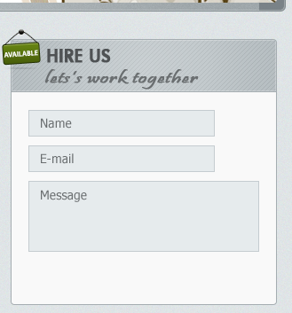


 Use the
  Create another blog post just like you created the first one.


# in front of each list item. Create a new group (Layer > New > Group ) and name it "twitter". Then create a background for this area just like you did for the "categories" area. The icon that I used is "social_twitter_bird.png".


Hot AI Tools

Undresser.AI Undress
AI-powered app for creating realistic nude photos

AI Clothes Remover
Online AI tool for removing clothes from photos.

Undress AI Tool
Undress images for free

Clothoff.io
AI clothes remover

Video Face Swap
Swap faces in any video effortlessly with our completely free AI face swap tool!

Hot Article

Hot Tools

Notepad++7.3.1
Easy-to-use and free code editor

SublimeText3 Chinese version
Chinese version, very easy to use

Zend Studio 13.0.1
Powerful PHP integrated development environment

Dreamweaver CS6
Visual web development tools

SublimeText3 Mac version
God-level code editing software (SublimeText3)

Hot Topics
 1386
1386
 52
52
 What is the reason why PS keeps showing loading?
Apr 06, 2025 pm 06:39 PM
PS "Loading" problems are caused by resource access or processing problems: hard disk reading speed is slow or bad: Use CrystalDiskInfo to check the hard disk health and replace the problematic hard disk. Insufficient memory: Upgrade memory to meet PS's needs for high-resolution images and complex layer processing. Graphics card drivers are outdated or corrupted: Update the drivers to optimize communication between the PS and the graphics card. File paths are too long or file names have special characters: use short paths and avoid special characters. PS's own problem: Reinstall or repair the PS installer.
 How to solve the problem of loading when PS is always showing that it is loading?
Apr 06, 2025 pm 06:30 PM
PS card is "Loading"? Solutions include: checking the computer configuration (memory, hard disk, processor), cleaning hard disk fragmentation, updating the graphics card driver, adjusting PS settings, reinstalling PS, and developing good programming habits.
 What are the common questions about exporting PDF on PS
Apr 06, 2025 pm 04:51 PM
Frequently Asked Questions and Solutions when Exporting PS as PDF: Font Embedding Problems: Check the "Font" option, select "Embed" or convert the font into a curve (path). Color deviation problem: convert the file into CMYK mode and adjust the color; directly exporting it with RGB requires psychological preparation for preview and color deviation. Resolution and file size issues: Choose resolution according to actual conditions, or use the compression option to optimize file size. Special effects issue: Merge (flatten) layers before exporting, or weigh the pros and cons.
 How to speed up the loading speed of PS?
Apr 06, 2025 pm 06:27 PM
Solving the problem of slow Photoshop startup requires a multi-pronged approach, including: upgrading hardware (memory, solid-state drive, CPU); uninstalling outdated or incompatible plug-ins; cleaning up system garbage and excessive background programs regularly; closing irrelevant programs with caution; avoiding opening a large number of files during startup.
 How to set password protection for export PDF on PS
Apr 06, 2025 pm 04:45 PM
Export password-protected PDF in Photoshop: Open the image file. Click "File"> "Export"> "Export as PDF". Set the "Security" option and enter the same password twice. Click "Export" to generate a PDF file.
 How to use PS Pen Tool
Apr 06, 2025 pm 10:15 PM
The Pen Tool is a tool that creates precise paths and shapes, and is used by: Select the Pen Tool (P). Sets Path, Fill, Stroke, and Shape options. Click Create anchor point, drag the curve to release the Create anchor point. Press Ctrl/Cmd Alt/Opt to delete the anchor point, drag and move the anchor point, and click Adjust curve. Click the first anchor to close the path to create a shape, and double-click the last anchor to create an open path.
 How to solve the problem of loading when the PS opens the file?
Apr 06, 2025 pm 06:33 PM
"Loading" stuttering occurs when opening a file on PS. The reasons may include: too large or corrupted file, insufficient memory, slow hard disk speed, graphics card driver problems, PS version or plug-in conflicts. The solutions are: check file size and integrity, increase memory, upgrade hard disk, update graphics card driver, uninstall or disable suspicious plug-ins, and reinstall PS. This problem can be effectively solved by gradually checking and making good use of PS performance settings and developing good file management habits.
 How to pull the vertical reference line of PS
Apr 06, 2025 pm 08:18 PM
Pull vertical guides in Photoshop: Enable ruler view (View > ruler). Hover the mouse over the vertical edge of the ruler, and then the cursor becomes a vertical line with double arrows and hold and drag the mouse to pull out the reference line. Click Delete by dragging the guide, or hovering it into a cross.


